Focus
Funnel and Cohort Analysis: How to Find Where Customers Drop Off and Whether They Come Back
Alexandre Suon · 2026-09-28
Funnel analysis tells you where customers drop out of your conversion funnel, between product page and order. Cohort analysis tells you whether the customers you won come back. This deep dive shows how to build both correctly, in GA4, in product analytics tools and in BigQuery, with worked e-commerce examples, the statistics that keep you honest, and how to turn a leak into a tested fix.
Executive summary
- A funnel is defined by five settings, not by its steps alone. Entry rule (open or closed), step ordering, conversion window and counting unit (users, sessions or every attempt) can each change the answer, so write them next to every funnel you share.
- Rank leaks by revenue at stake, not by the size of the drop. In our illustrative funnel, 91.5% of mobile product viewers never add to bag, yet the step worth most is delivery: closing half the gap to desktop there is worth about €65,000 a month.
- Small segments produce confident-looking noise. With 100 users entering a step, a 56% conversion rate has a 95% confidence interval of roughly 46% to 65%. Put an interval on every segment comparison before you act on it.
- Cohorts separate what changed in your product from what changed in your traffic. Read the table across (how one group decays), down (whether newer groups do better) and along the diagonals (calendar events such as sales or releases).
- Repeat purchase is front-loaded. In one agency dataset, 76.4% of second orders arrived within 90 days; in another, the median brand's monthly repeat rate fell from 5.17% in month one to 1.49% by month five. Choose your windows from your own curve.
- AI assistants can now run funnels and cohorts through MCP servers, but they inherit every definition error. Ask them for the settings they used, check one number by hand, and treat their output as a draft until a person has verified it.
Section 1 · Definitions
Funnels show where customers leave; cohorts show whether they come back
Our essential guide to product analytics introduced funnels and cohorts as two of the core analyses. This article goes one level deeper. It is the hands-on version: the settings that change the numbers, worked examples you can copy, the statistics that stop you chasing noise, and the SQL to do it yourself on the GA4 export.
Funnel analysis measures the share of people who complete a defined sequence of steps, such as product viewed, added to bag, checkout started and order placed, and where they leave. Cohort analysis groups people by a shared starting point, such as the month of their first order, and tracks what share of each group comes back in each later period.
The two analyses answer different questions and fail in different ways. A funnel is a snapshot of one journey inside a time window. It is good at locating friction, and bad at telling you whether the customers who got through were worth having. A cohort is a film of the same group over weeks or months. It is good at showing whether value lasts, and slow: you need to wait for the months to pass.
| Funnel analysis | Cohort analysis | |
|---|---|---|
| Question it answers | Where do people drop out of a journey? | Do the people we acquired come back, and are newer groups doing better? |
| Unit of time | Minutes to days (a conversion window) | Weeks to months (periods since the start event) |
| Typical e-commerce use | Product page to order, search to add-to-bag, checkout steps | Repeat purchase by month of first order, app retention by install week |
| Main trap | Mixing segments with different intent; small samples | Changing definitions over time; confusing calendar effects with cohort effects |
| What it leads to | A hypothesis about friction at one step, then a test | A view on product, offer or channel quality, then a retention programme or test |
If you are new to event data, read the guide to web analytics first: everything below assumes that events such as add_to_cart and purchase are tracked consistently and tied to a stable user identifier.
Section 2 · Building a funnel
Five settings decide what a funnel says, so fix them before you look at the result
Most arguments about funnel numbers are really arguments about settings. Two analysts can build a "product to order" funnel on the same data and get rates that differ by a factor of two, because one counted sessions and the other users. Exhibit 1 lists the five decisions.
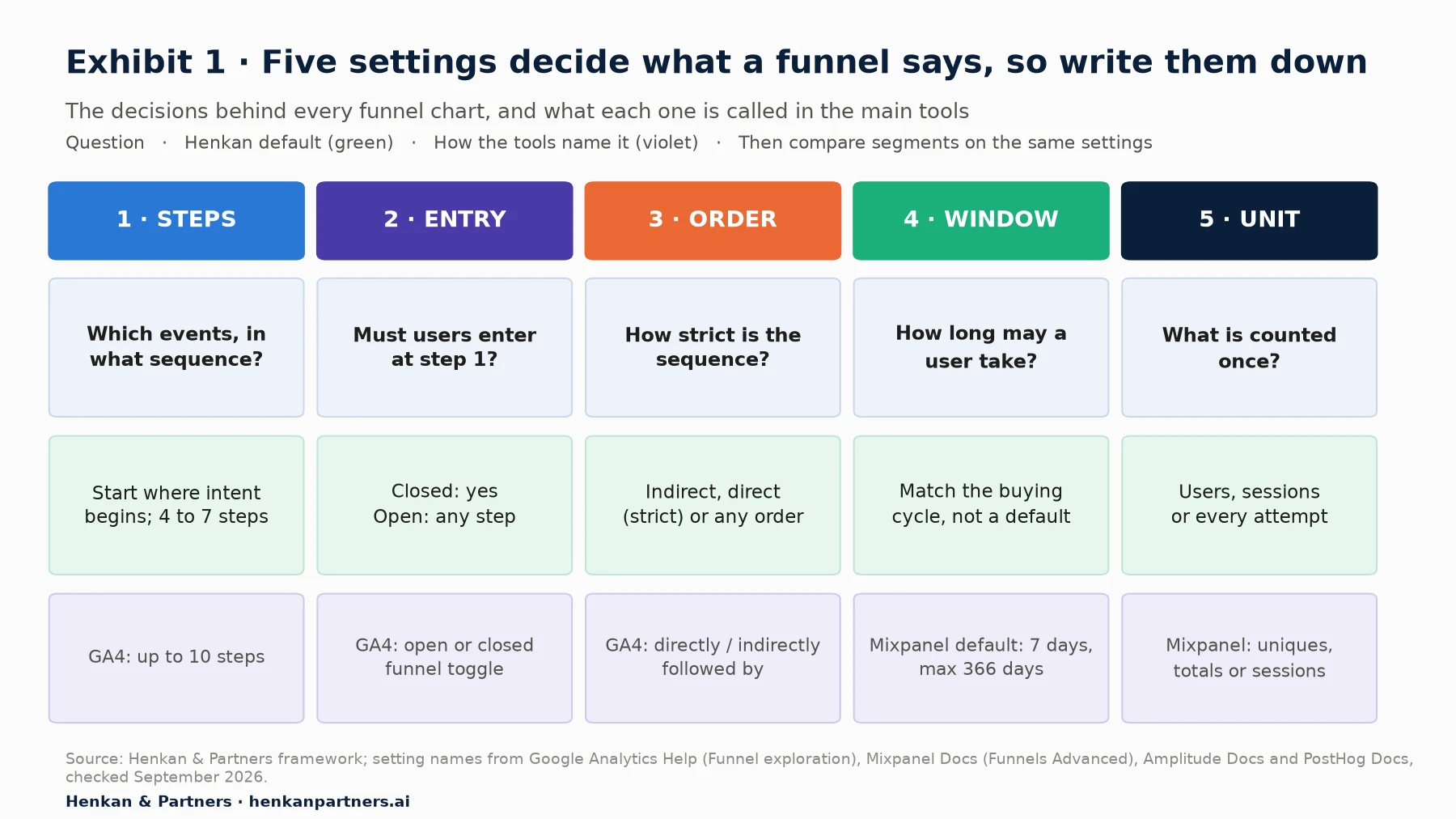
What this shows. Each setting is a choice, and each tool has a default you did not choose. If a funnel is shared without its settings, nobody can reproduce it or compare it with last quarter's. We recommend a short line under every funnel: steps, open or closed, ordering, window, unit, date range and segment.
1. Steps: start where intent begins
Choose steps that match real decisions. For a retailer, a useful main funnel is view_item → add_to_cart → begin_checkout → add_shipping_info → add_payment_info → purchase, which are Google's recommended e-commerce event names. Start where intent begins: a funnel that starts at "session started" mixes browsers, returning customers checking an order and bots, and the first step's drop will dwarf everything else. In our experience four to seven steps is the useful range. Fewer hides where people leave; more produces tiny step counts at the end.
Make each step an event, not a page view, where you can. A checkout redesign that merges two pages will break a page-based funnel overnight, while an event such as add_shipping_info survives. If you need extra context on each step, such as delivery method or payment type, send it as a parameter; our note on e-commerce custom dimensions covers how.
2. Entry: open or closed
In a closed funnel, people must enter at step one. In an open funnel, they can enter at any step. Use closed funnels to measure a journey, such as product page to order. Use open funnels to measure a stage that has several entry points, such as checkout, which shoppers can reach from the bag, a quick-buy button or an abandoned-basket email. An open funnel will usually show more people at later steps than a closed one, so never compare the two directly.
3. Ordering: how strict is the sequence?
Tools offer three levels of strictness, with different names:
- Indirect order. Step B must happen after step A, but other events may happen in between. GA4 calls this is indirectly followed by; Amplitude calls it this order; PostHog calls it sequential. This is the right default for e-commerce.
- Direct or strict order. Step B must follow step A with nothing in between. GA4's is directly followed by, Amplitude's exact order and PostHog's strict order. Use it sparingly: a background event firing between two steps will silently remove people.
- Any order. All steps must happen, in any sequence. Mixpanel, Amplitude and PostHog offer it. It is useful for checklists such as onboarding tasks, rarely for a purchase path.
4. Conversion window: match the buying cycle
The conversion window is how long a person has to complete the funnel after entering it. Mixpanel's default is seven days from step one, with a maximum of 366 days; GA4 lets you set a time limit on individual steps. A one-hour window suits a food delivery app; a sofa or a luxury handbag may take weeks. Check the time between first product view and purchase in your own data, then set the window to cover most completed journeys. Too short, and you count slow buyers as drop-offs. Too long, and recent entrants have not had time to finish, which makes the latest weeks look worse than they are.
5. Counting unit: users, sessions or attempts
Mixpanel makes the choice explicit with three counting methods: uniques (a person enters the first time they do step one in the period), totals (a person can re-enter after finishing or leaving an attempt) and sessions (a person can enter in each qualifying session). GA4's funnel exploration counts users, and if someone completes the steps several times in the date range, only the first sequence is reported.
Per-user funnels answer "what share of shoppers eventually buy?". Per-session funnels answer "what share of visits end in an order?" and look much worse, because many shoppers visit several times before buying. Neither is wrong. Mixing them in one deck is.
Then compare segments on identical settings
A single funnel rarely tells you what to do. The same funnel split by device, traffic source, new versus returning customers or country usually does. Keep every setting identical across segments and check how each tool assigns people to a segment value: GA4 attributes users to the first instance of a breakdown value, and PostHog lets you choose first touch, last touch, all steps or a specific step. A shopper who browses on mobile and buys on desktop can land in either bucket depending on that rule.
Section 3 · Funnel analysis in GA4
Funnel analysis in GA4: the Funnel exploration does most of the job if you know its rules
GA4's standard reports include a purchase journey, but the flexible tool is the Funnel exploration in the Explore section. Here is how to build a useful one, with the settings Google documents as of September 2026. For how GA4 collects and processes the underlying events, see our explainer on how GA4 works.
- Create the exploration. Explore → Blank → change the technique to Funnel exploration.
- Define the steps. You can define up to 10 steps. Base each on an event, for example view_item, then add_to_cart, and add parameter conditions where needed, such as a product category.
- Set the ordering for each step. Choose is indirectly followed by (other actions can happen in between) or is directly followed by (the step must come immediately after the previous one). You can also add a within time constraint to a step.
- Choose open or closed. Toggle Make open funnel if people may enter at any step; leave it off for a closed funnel.
- Add a breakdown and segments. Break down by device category or first user source, and apply up to four segments to compare groups side by side.
- Turn on elapsed time and next action. Show elapsed time displays the average time between steps. Next action shows the top five values of a dimension, such as event name or page, that follow each step: a first clue to where people go instead.
- Switch to a trended funnel. The trended (line chart) view shows every step's rate over time, which is how you spot a release or a campaign that broke a step.
| GA4 setting | What it does | Watch out for |
|---|---|---|
| Steps | Up to 10 per funnel | Too many steps leave tiny counts at the end |
| Open funnel toggle | Lets users enter at any step | Not comparable with a closed funnel |
| Directly / indirectly followed by | Strict or loose sequence per step | Strict order drops users when any event fires in between |
| Within (time constraint) | Maximum time for a step to follow the previous one | Set it from observed time-to-purchase, not by habit |
| Segments | Up to 4 compared side by side | Small segments trigger wide intervals and thresholding |
| Breakdown | Splits each step by a dimension | Users go to the first instance of the breakdown value |
| Counting | Users; only the first sequence in the date range is reported | Repeat buyers are counted once |
| Next action | Top 5 following actions per step | Shows where people went, not why |
Three platform behaviours explain most "the funnel does not match the report" questions:
- Sampling. On standard GA4 properties, explorations can be sampled when a query exceeds 10 million events. Shorten the date range or use BigQuery for exact counts.
- Thresholds. GA4 withholds data from cards when user counts are low, particularly with demographic dimensions or Google signals, to prevent identification. Small segments may simply vanish.
- Consent and modelling. With consent mode, GA4 can model the behaviour of users who declined analytics cookies once a property meets its thresholds (for example, 1,000 events a day with analytics storage denied for at least seven days). Modelled data is not included in the BigQuery export, so UI and warehouse numbers will differ.
For marketers. Build one closed funnel from landing page view to purchase, broken down by first user source, and trend it weekly. It shows whether a channel sends people who browse or people who buy, and whether a campaign change moved the second step or only the first.
For leaders. Ask that every funnel slide carry its settings line and date range. It costs the analyst ten seconds and prevents most of the arguments that start with "but my number is different".
Section 4 · Worked funnel example
Rank leaks by revenue at stake, not by the size of the drop
The most common funnel mistake is to fix the step with the biggest percentage drop. In e-commerce that is almost always the first one, product page to bag, because most product views are research, not intent. A better question is: if we improved this step to a realistic level, how much revenue would we gain? Here is a fully worked example. All numbers are illustrative, invented for teaching.
The data
A fashion retailer builds a closed funnel over one month, counting users, with a seven-day window, and splits it by device. Mobile has 300,000 product viewers and an average order value (AOV) of €80; desktop has 100,000 and an AOV of €95.
| Step | Desktop users | Desktop step rate | Mobile users | Mobile step rate | Gap (points) |
|---|---|---|---|---|---|
| Product viewed | 100,000 | 300,000 | |||
| Added to bag | 10,000 | 10.0% | 25,500 | 8.5% | 1.5 |
| Checkout started | 5,500 | 55.0% | 12,750 | 50.0% | 5.0 |
| Delivery completed | 4,180 | 76.0% | 7,140 | 56.0% | 20.0 |
| Payment submitted | 3,762 | 90.0% | 4,855 | 68.0% | 22.0 |
| Order placed | 3,574 | 95.0% | 4,515 | 93.0% | 2.0 |
| Overall | 3.57% of viewers | 1.51% of viewers |
Three analysts look at this table and reach three different conclusions:
- The drop-off view. 91.5% of mobile product viewers never add to bag. That is the largest drop, so fix the product page.
- The point-gap view. Mobile trails desktop by 22 points at payment, the largest gap, so fix payment.
- The revenue view. Estimate what closing part of each gap is worth. This is the one to use.
The calculation
Funnel rates multiply: orders = viewers × rate₁ × rate₂ × … × rate₅. So if one step's rate rises by a given proportion, orders rise by the same proportion, all else equal. That gives a simple way to size each leak. We assume, conservatively, that mobile can close half of its gap to desktop at one step at a time.
Extra orders at step k = Current orders × (Target rate − Current rate) ÷ Current rate
Target rate = Current rate + 0.5 × (Desktop rate − Mobile rate)
Revenue at stake = Extra orders × AOV

Delivery step: 4,515 × (66% − 56%) ÷ 56% = 806 extra orders × €80 = €64,500 a month
Payment step: 4,515 × (79% − 68%) ÷ 68% = 730 extra orders × €80 = €58,400 a month
Add to bag: 4,515 × (9.25% − 8.5%) ÷ 8.5% = 398 extra orders × €80 = €31,900 a month
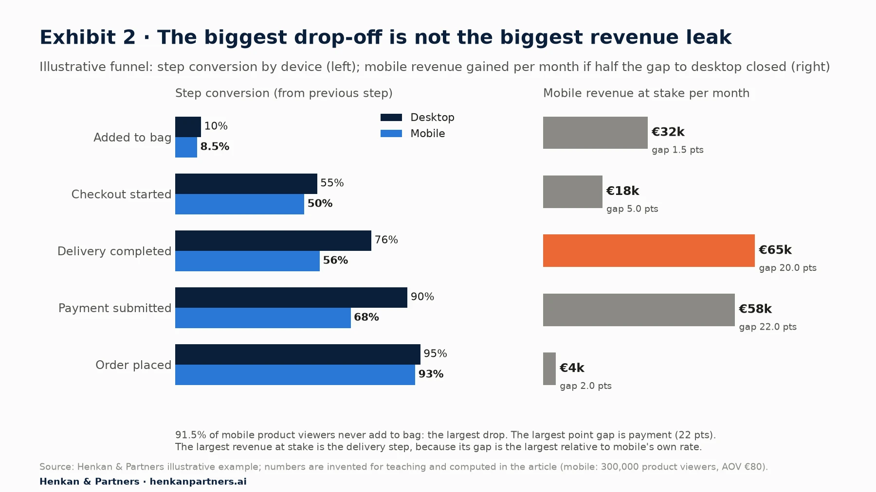
What this shows. The delivery step is worth most, about €64,500 a month or €774,000 a year, even though its point gap is smaller than payment's. What matters is the gap relative to mobile's own rate (20 points on a base of 56% is a 36% relative gap; 22 points on 68% is 32%). The add-to-bag step, which looks like the disaster, is worth half as much, because desktop shoppers barely do better there.
What the calculation does not tell you
- Segments differ in intent, not only in experience. Some of the mobile gap is people browsing on the sofa who will buy later on a laptop. That is why we assume only half the gap can close, and why cross-device identity matters.
- Steps interact. Fixing delivery may bring less committed shoppers to the payment step and lower its rate. Size one change at a time and let an experiment measure the real effect.
- Effort and certainty vary. A €65,000 opportunity that needs a new delivery provider may rank below a €58,000 one that needs a clearer payment form. Use revenue at stake as the numerator of your prioritisation, not the whole score.
- Benchmarks are context, not targets. Baymard Institute's average documented cart abandonment rate is 70.22% across 50 studies. Your own best segment is usually a better target than an industry average. Our guide for product owners shows how to size opportunities before committing a roadmap.
Section 5 · Statistical care
Small segments lie: put a confidence interval on every step conversion rate
Every step rate is an estimate from a finite number of people. With a few thousand users it is precise; with a hundred it is a wide range. Most funnel dashboards show neither the count nor the uncertainty, and teams end up acting on differences that are pure noise, especially once they slice by device, country and channel at the same time.
The Wilson interval for a step rate
For a step where k of n users converted, the observed rate is p̂ = k ÷ n. The textbook interval, p̂ ± 1.96 × √(p̂(1 − p̂) ÷ n), behaves badly with small samples or rates near 0% or 100%. The Wilson score interval is the better default; the NIST/SEMATECH handbook notes it was recommended by Agresti and Coull for virtually all combinations of n and p.
Wilson 95% interval (z = 1.96):

centre = (p̂ + z² ÷ 2n) ÷ (1 + z² ÷ n)
margin = [ z × √( p̂(1 − p̂) ÷ n + z² ÷ 4n² ) ] ÷ (1 + z² ÷ n)
interval = centre ± margin

Example: 94 of 180 users complete delivery in a small segment (mobile, paid social, Belgium)
p̂ = 52.2%   →   95% interval ≈ 45.0% to 59.4%
All mobile users: 7,140 of 12,750   →   56.0%, interval ≈ 55.1% to 56.9%
The small segment looks four points worse than mobile as a whole, but its interval comfortably contains 56%. There is no evidence yet that Belgian paid-social shoppers struggle more with delivery. Exhibit 3 shows how quickly the interval narrows as the step count grows.
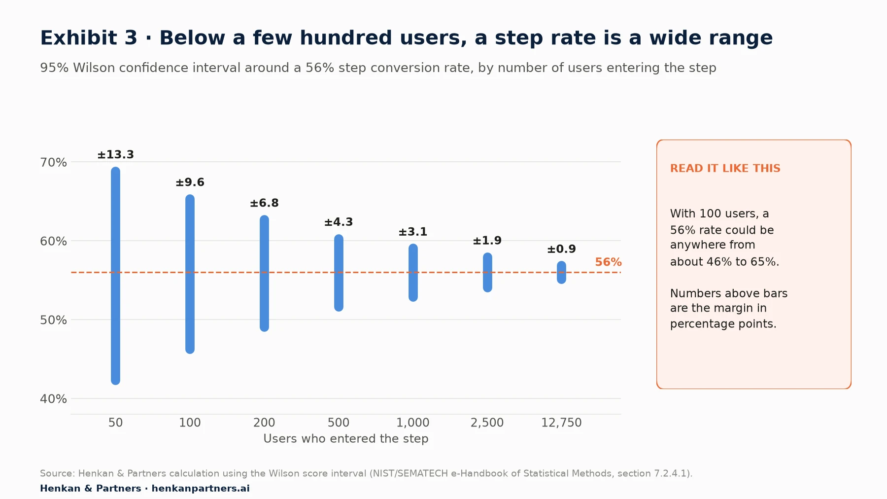
What this shows. Below about 500 users entering a step, the margin is wider than most of the differences teams debate. Precision grows with the square root of the sample: to halve the margin you need four times the users. Show the count next to every rate, and grey out segments whose interval is wider than the effect you care about.
Comparing segments and periods
- Overlap is a rough test only. Two intervals that do not overlap indicate a real difference; two that overlap slightly may still differ. For a proper comparison use a two-proportion test, the same maths as an A/B test.
- Slicing multiplies false alarms. Compare 20 segments at 95% confidence and you should expect about one "significant" difference by chance. Decide the few splits you care about before you look, or correct for multiple comparisons.
- Rule of thumb. In our experience, do not act on a segment-level step rate built on fewer than a few hundred users at that step unless the gap is very large. Our note on A/B test statistical models explains the tests themselves.
Section 6 · Cohort analysis
Cohort analysis separates what changed in the product from what changed in the traffic
A monthly repeat-purchase rate that falls from 30% to 25% could mean the experience got worse. It could equally mean that a big acquisition campaign brought in many new, less loyal customers. An aggregate metric cannot tell the two apart. Cohorts can, because they compare like with like: customers who started at the same time, followed for the same number of periods.
Acquisition cohorts and behavioural cohorts
- Acquisition cohorts group people by when they started: first visit, app install or, most useful in retail, first order. They show whether the product, offer or customer mix is improving over time.
- Behavioural cohorts group people by what they did: used the size guide, bought in the sale, joined the loyalty programme, first bought from the beauty category. They show which behaviours go with better retention. Be careful: association is not cause. People who join a loyalty programme were probably more loyal already.
GA4's Cohort exploration supports both. The cohort inclusion criterion can be first touch (acquisition date), any event, any transaction, any conversion (key event) or a specific event. The return criterion defines what counts as coming back, for example any transaction.
The retention table and the retention curve
A cohort retention table has one row per cohort (for example, customers whose first order was in January), one column per period since the start (month 1, month 2 and so on), and in each cell the share of the cohort that met the return criterion in that period. Averaging the rows, weighted by cohort size, and plotting them gives the retention curve. The table is always a triangle: recent cohorts have not yet lived through later periods.
N-day, unbounded and bracket retention
Retention has several definitions, and the choice changes the numbers a lot:
| Definition | What a "day 7" or "month 3" cell means | Tool names | When to use it |
|---|---|---|---|
| N-day (return on) | Share who returned on exactly that day or in exactly that period | Amplitude: Return On; GA4: Standard | Engagement products used frequently; spotting decay |
| Unbounded (return on or after) | Share who returned on that day or any time later | Amplitude: Return On or After | Infrequent purchases; "are they still a customer at all?" |
| Bracket | Share who returned within a custom range, such as days 8 to 30 | Amplitude: Return On Custom | Aligning periods to a buying cycle |
| Rolling | Share who returned in that period and every previous period | GA4: Rolling | Habit strength; very strict |
| Cumulative | Share who returned in any period up to that point | GA4: Cumulative | Repeat purchase: "has bought again by month k" |
Watch period boundaries too. GA4's weekly cohorts run Sunday to Saturday and its monthly cohorts follow calendar months, not rolling windows. Amplitude marks days with incomplete data with an asterisk: never read the last, partial cell as a drop.
Our view. For e-commerce, use first-order cohorts by month and two metrics: the standard (N-period) rate to see when people buy again, and the cumulative rate to see what share has bought again by 90 and 180 days.
A worked cohort analysis example
Here is a cohort analysis example with illustrative numbers. A retailer groups first-time buyers by month of first order in 2026 and shows, for each later month, the share who ordered again in that month (the standard, N-period definition). Data runs to the end of August 2026.
| First order | Buyers | M1 | M2 | M3 | M4 | M5 | M6 |
|---|---|---|---|---|---|---|---|
| Jan 2026 | 4,200 | 6.0% | 3.8% | 3.2% | 2.9% | 4.2% | 2.6% |
| Feb 2026 | 3,900 | 6.0% | 3.8% | 3.2% | 4.4% | 2.7% | 2.6% |
| Mar 2026 | 4,400 | 6.0% | 3.8% | 4.7% | 2.9% | 2.7% | |
| Apr 2026 | 4,600 | 7.2% | 5.9% | 3.8% | 3.5% | ||
| May 2026 | 4,800 | 8.7% | 4.4% | 3.8% | |||
| Jun 2026 | 5,600 | 7.2% | 4.4% | ||||
| Jul 2026 | 5,100 | 7.2% |
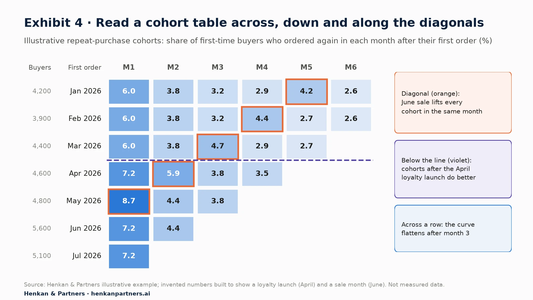
What this shows. Three readings come from one table. Across a row, repeat purchase is highest in the first month and flattens after month three. Down a column, cohorts from April onward start higher, which coincides with a loyalty launch. Along the orange diagonal, every cohort jumps in the same calendar month, June, which points to the sale rather than to anything about the cohorts themselves.
Across: is the curve flattening?
Read each row left to right. A healthy curve drops fast, then flattens: the customers left after the early drop keep buying at a steady rate. A curve that keeps falling towards zero means you are not building a base of repeat customers, whatever the acquisition numbers say. In the example, rows settle at about 2.6% to 2.9% a month from month four. That plateau, multiplied by the size of each cohort, is the recurring revenue you can plan on.
Down: are newer cohorts better?
Read each column top to bottom. If month-one repeat rises from 6.0% for January to March to 7.2% from April onward, something changed for customers who started in April. Check the calendar of releases and campaigns: in the example, a loyalty programme launched in April. Remember that the cohort mix may also have changed: a cohort acquired through heavy discounting may look worse for reasons that have nothing to do with the product.
Along the diagonals: calendar events
Cells on the same diagonal fall in the same calendar month. A diagonal that lights up across all cohorts, like June here, is a calendar effect: a sale, a season, a site outage or a tracking change. It says nothing about cohort quality. Leave it out when you compare cohorts, or compare each cohort's cumulative rate at the same age instead. A diagonal that suddenly drops to zero is often a tracking break, not a customer exodus.
For leaders. Ask for one cohort chart each month: the cumulative share of first-time buyers who ordered again within 90 days, by month of first order. If recent cohorts are not beating older ones, product and CRM work is not improving the customer experience, whatever the conversion rate says.
Section 7 · Repeat purchase benchmarks
In e-commerce, repeat purchase is front-loaded, so measure it early and against your own history
Published benchmarks for retention and repeat purchase are thin, use different definitions and mostly come from vendors or agencies measuring their own customers. Use them to understand the shape of a curve and the order of magnitude, never as a target. Three sources are useful.
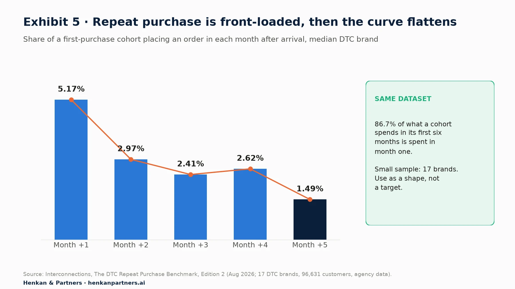
What this shows. The first month after purchase is when a second order is most likely; the rate roughly halves by month two and then drifts down slowly. The same dataset finds that 86.7% of what a cohort spends in its first six months is spent in the first month. The sample is small, 17 brands, and the publisher withdrew category comparisons for that reason, so treat it as an example of shape.
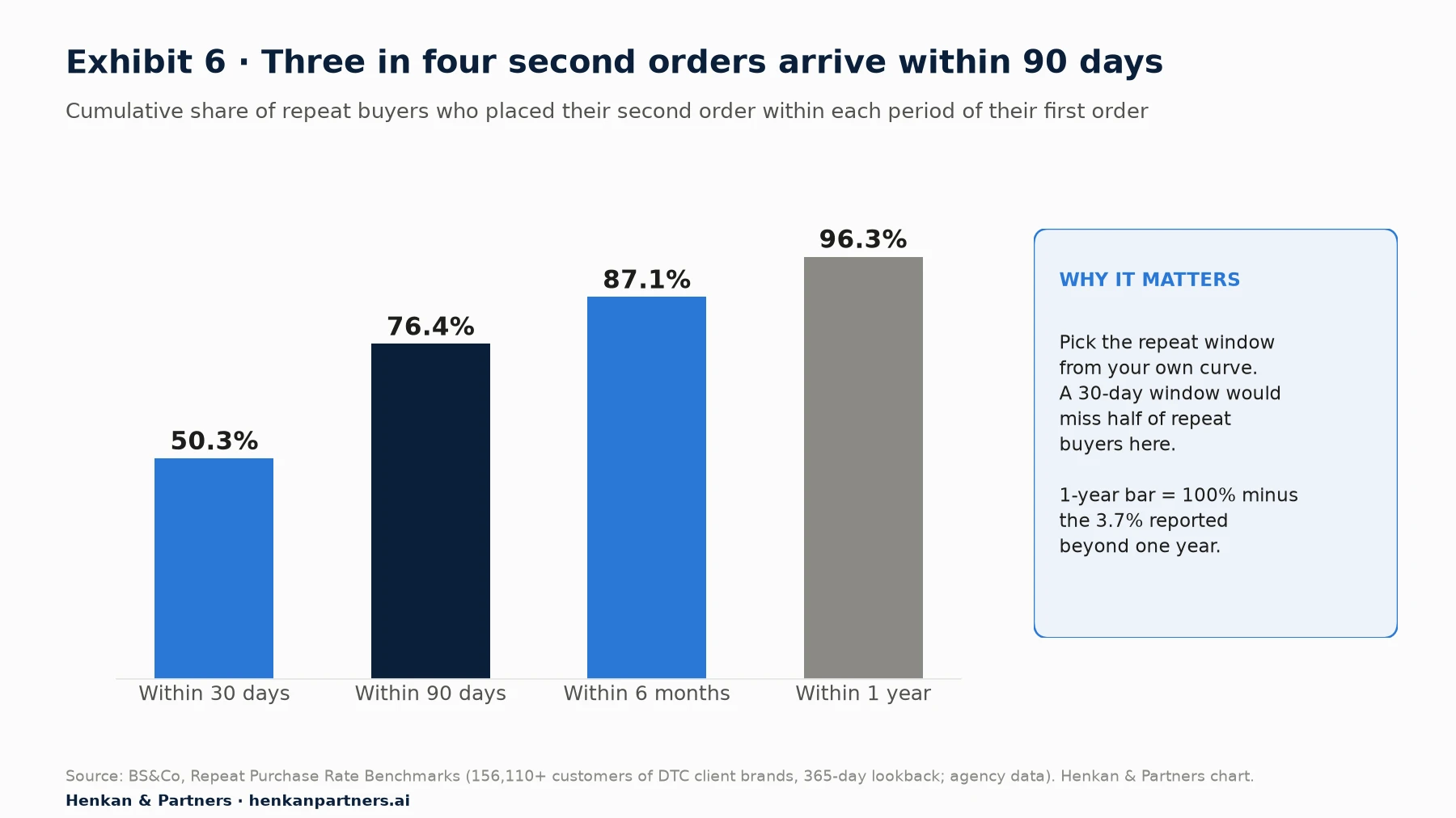
What this shows. Half of second orders arrived within 30 days and three quarters within 90. This is the evidence to use when choosing a cohort window: a 30-day repeat metric would miss half of eventual repeat buyers in this dataset, while 90 days captures most of them. The same source reports an average repeat purchase rate of 18.8% over 365 days, with typical ranges of 30% to 40% in consumables and 12% to 17% in fashion.
A third, larger source gives a sense of the spread. Amplitude's 2025 benchmark, built from anonymised data from more than 2,600 companies, reports that the median e-commerce product keeps 2.8% of users at three months, while the top 10% keep 18.9% (vendor data). Amplitude also reports that 69% of products with strong early activation were strong three-month retention performers. Its definition is product usage, not orders, so it is not directly comparable with repeat-purchase rates.
Choosing your own windows
- Plot time to second order for customers whose first order was at least a year ago, so the full year is observed.
- Set the repeat window at the point where most second orders have arrived, often 90 days for fashion and beauty, shorter for consumables, and consider 180 or 365 days for furniture or luxury.
- Use monthly first-order cohorts and report the cumulative rate at that window, plus the standard rate by month to see timing.
- Split the cohorts by first category, acquisition channel, discount used and whether the customer created an account. These splits usually explain more than any external benchmark.
Section 8 · SQL, BigQuery and tools
BigQuery on the GA4 export gives you funnels and cohorts you can control and audit
The GA4 interface is quick, but its funnels are limited to 10 steps, may be sampled or thresholded, and apply rules you cannot inspect. The BigQuery export gives you raw events: each row is one event with its name, timestamp and parameters. Standard GA4 properties can export up to 1 million events a day in the daily export; streaming export has no volume limit but costs extra. The export creates one table per day, named events_YYYYMMDD.
The fields you need are few: event_date, event_timestamp (in microseconds, UTC), event_name, user_pseudo_id (the pseudonymous browser or app identifier), user_id (if you send one on login), ecommerce.transaction_id and ecommerce.purchase_revenue. Session identifiers sit inside the event_params record as the ga_session_id parameter.
A closed funnel in SQL
The query below builds a closed, per-user, indirectly ordered funnel with a seven-day window from the first product view. Each step looks for the first qualifying event after the previous step. Replace the project and dataset names with your own.
WITH ev AS (
  SELECT user_pseudo_id AS u, event_name AS e, event_timestamp AS t
  FROM `my-project.analytics_123456.events_*`
  WHERE _TABLE_SUFFIX BETWEEN '20260801' AND '20260831'
    AND event_name IN ('view_item','add_to_cart','begin_checkout','purchase')),
s1 AS (SELECT u, MIN(t) AS t1 FROM ev WHERE e = 'view_item' GROUP BY u),
s2 AS (SELECT s1.u, s1.t1, MIN(ev.t) AS t2 FROM s1 JOIN ev ON ev.u = s1.u
       WHERE ev.e = 'add_to_cart' AND ev.t > s1.t1
         AND ev.t <= s1.t1 + 7*24*3600*1000000 GROUP BY s1.u, s1.t1),
s3 AS (SELECT s2.u, s2.t1, MIN(ev.t) AS t3 FROM s2 JOIN ev ON ev.u = s2.u
       WHERE ev.e = 'begin_checkout' AND ev.t > s2.t2
         AND ev.t <= s2.t1 + 7*24*3600*1000000 GROUP BY s2.u, s2.t1),
s4 AS (SELECT s3.u FROM s3 JOIN ev ON ev.u = s3.u
       WHERE ev.e = 'purchase' AND ev.t > s3.t3
         AND ev.t <= s3.t1 + 7*24*3600*1000000 GROUP BY s3.u)
SELECT (SELECT COUNT(*) FROM s1) AS viewed, (SELECT COUNT(*) FROM s2) AS added,
       (SELECT COUNT(*) FROM s3) AS checkout, (SELECT COUNT(*) FROM s4) AS purchased
Two simplifications to note. It anchors each person on their first product view in the month, like GA4's first-sequence rule. And it identifies people by user_pseudo_id, so the same shopper on two devices counts twice unless you map user_id to a stable customer key first. Events near the end of the date range have less than seven days to complete: either extend the table suffix by a week for later steps, or exclude the last seven days of entrants.
A repeat-purchase cohort in SQL
For cohorts, work from orders rather than events. Build one row per order with a customer key (user_id where available), the order date and the transaction ID, deduplicated on transaction ID because purchase events can fire twice. Then find each customer's first order month and count, for each later month, the distinct customers with an order:
orders   = one row per distinct transaction_id: customer_key, order_date
first    = per customer_key: MIN(order_date) → cohort_month
activity = join orders to first; months_since = DATE_DIFF(order month, cohort_month, MONTH)
result   = per cohort_month and months_since ≥ 1:
           COUNT(DISTINCT customer_key) ÷ cohort size   → standard (N-period) rate
cumulative rate at month k = customers with any order in months 1..k ÷ cohort size
Visualise the result in Looker Studio or any BI tool as a heatmap table. For most retailers the order data in the e-commerce platform or CRM is more complete than GA4's purchase events, because it is not affected by consent choices or ad blockers. Use it for cohorts when you can.
Which tool for which question
| Tool | Funnels | Cohorts and retention | Best for |
|---|---|---|---|
| GA4 explorations | Up to 10 steps, open or closed, direct or indirect order, trended view | Cohort exploration: daily, weekly or monthly; standard, rolling or cumulative; up to 60 cohorts | Marketing and e-commerce teams already on GA4 |
| Amplitude | This order, any order, exact order | Return On, Return On or After, custom brackets | Product teams needing behavioural cohorts |
| Mixpanel | Uniques, totals or sessions; window up to 366 days; up to 3 properties held constant | Retention and cohorts, exportable to other tools | Fast self-serve analysis across teams |
| PostHog | Sequential, strict or any order; time to convert; historical trends | Retention and lifecycle views | Teams wanting analytics, replay and experiments in one tool |
| Looker Studio | Visualises GA4 or BigQuery results | Heatmap tables from BigQuery | Sharing dashboards, not doing the analysis |
| Warehouse (BigQuery, Snowflake) | Any logic you can write in SQL | Order-based cohorts joined with CRM and returns | Exact, auditable numbers and custom definitions |
Section 9 · AI assistants
AI assistants can now run funnels and cohorts, but you must check their settings
The Model Context Protocol (MCP) is an open standard that lets AI assistants such as Claude or ChatGPT call external tools. Most analytics vendors now publish MCP servers, which means you can ask "where do mobile shoppers drop out of checkout this month?" and the assistant runs the query for you:
- Google Analytics MCP server. Published by Google Analytics on GitHub, read-only, using the Data and Admin APIs. Its tools include run_report, run_realtime_report and run_funnel_report.
- Mixpanel MCP. Its Run-Query tool executes insights, funnels, flows and retention queries, and it connects to Claude, ChatGPT, Cursor, Gemini CLI and others.
- Amplitude and PostHog. Both offer MCP servers that bring charts, cohorts and events into AI assistants.
This is useful for a first pass, such as ten segment splits in a minute or a draft of the SQL above. It is also a new way to be wrong quickly: an assistant does not know that your begin_checkout event fires twice on one checkout variant, and it will pick a window, an ordering rule and a counting unit, often without telling you.
How to check an AI-generated funnel or cohort
- Ask for the settings. Make the assistant state steps, entry rule, ordering, window, counting unit, date range and filters. If it cannot, do not use the number.
- Reproduce one number by hand. Check the first step count against GA4's standard report or your order system. A 10% gap is a question; a factor of two is a definition error.
- Ask for counts, not only rates, and apply the confidence-interval rule from Section 5 to any segment it highlights.
- Watch for invented events. Assistants sometimes query event names that sound right but do not exist in your tracking plan. Give them the plan.
- Keep access read-only and let the assistant propose, not publish, dashboards and audiences.
Disclosure: Henkan & Partners provides analytics and experimentation services and develops its own analytics platform with an MCP interface. The tools above are described from their public documentation, not as endorsements.
Section 10 · From insight to action
A funnel finds where to look; replay and surveys explain why; an A/B test proves the fix
Knowing that 44% of mobile shoppers who start checkout never complete the delivery step tells you where, not why. The next steps are qualitative, then experimental:
- Watch the leaking step. Filter session recordings to mobile users who reached the delivery step and did not complete it. Look for repeated taps, error messages, keyboard problems and long pauses. Our session replay guide covers how to sample recordings without bias.
- Ask the people who leave. A one-question exit survey on the delivery step ("What stopped you from continuing?") often names the issue in a day. See the Voice of Customer guide for question design.
- Check the next action. GA4's next-action view shows whether people go back to the bag, open the delivery information page or leave. Each points to a different hypothesis.
- Write a hypothesis tied to the step. For example: "Showing delivery cost and date on the product page will raise delivery-step completion on mobile, because shoppers currently discover cost late."
- Test it. Run an A/B test with the step rate as a secondary metric and revenue per visitor or conversion as the primary. Size the test with the revenue-at-stake estimate from Section 4. Our A/B testing guide covers the method.
- Follow the cohort. A fix that lifts first orders by attracting discount hunters may lower 90-day repeat. Tag test participants and compare their repeat purchase later.
Our view. The best funnel work we see ends every analysis with one of three outputs: a test, a bug ticket, or a decision not to act because the gap is within noise. A funnel review that produces only a slide has not finished.
Section 11 · Mistakes to avoid
Five traps make funnels and cohorts confidently wrong
1. Simpson's paradox: the total points one way, the segments the other
When segments have very different sizes and rates, an overall rate can move in the opposite direction to every segment. The classic case is from UC Berkeley's 1973 graduate admissions, shown in Exhibit 7.
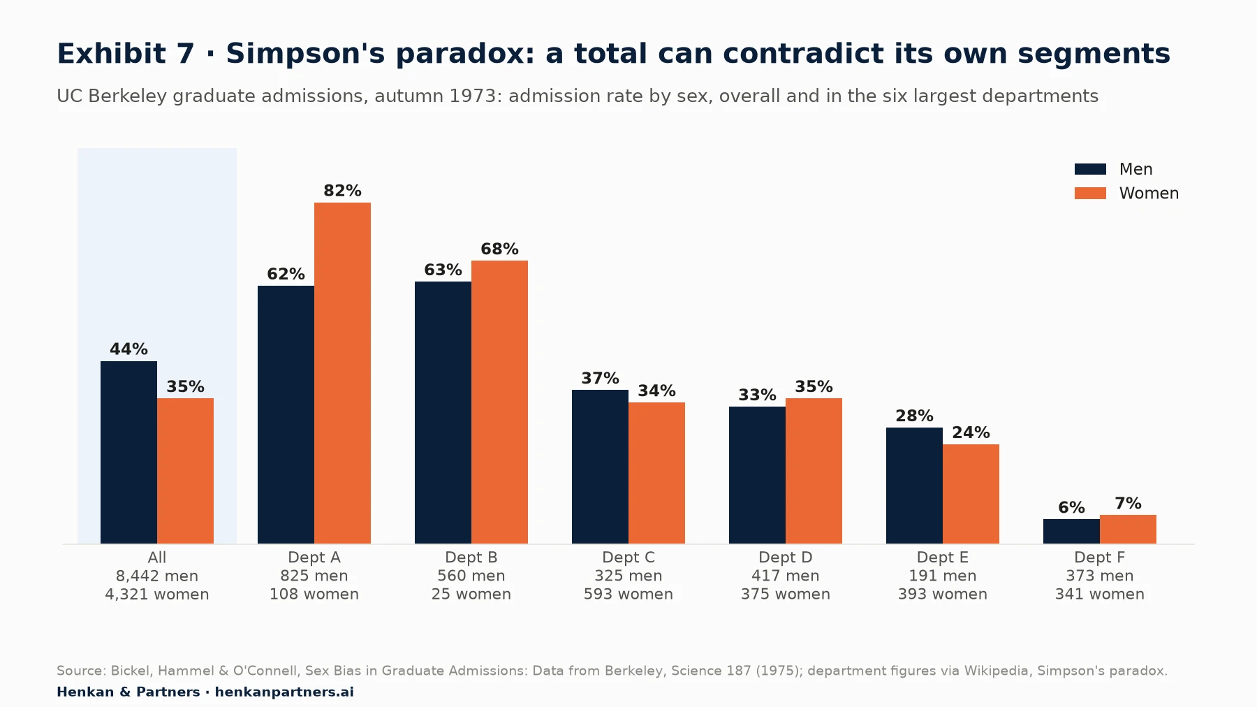
What this shows. Overall, men were admitted at 44% and women at 35%. Yet in four of the six largest departments women were admitted at a higher rate. Women applied mostly to competitive departments with low admission rates, which dragged their total down. In e-commerce the same thing happens with device and channel mix: a conversion rate can fall overall while rising on both mobile and desktop, simply because mobile's share of traffic grew.
An illustrative e-commerce version: in month one, desktop converts 3.0% of 40,000 sessions and mobile 1.5% of 60,000, an overall 2.1%. In month two, desktop improves to 3.2% on 30,000 sessions and mobile to 1.6% on 90,000. Both improved, yet the overall rate falls to 2.0%. Always split by device and channel before concluding that a change hurt conversion.
2. Survivorship bias
Analysing only the customers who are still active, or only the people who reached checkout, tells you what survivors look like, not what made them survive. "Our loyal customers all use the wishlist" does not mean the wishlist creates loyalty. Compare with the people who left, and use cohorts from the start event rather than today's active base.
3. Changing definitions mid-series
A renamed event, a new checkout step, a consent banner change or a switch from session to user counting will create a break that looks like a behaviour change. Keep a change log next to your funnels and cohort tables, annotate releases in the trended funnel, and when a definition changes, recompute the history or start a new series. A diagonal of zeros in a cohort table is almost always tracking.
4. Bots and internal traffic
Imperva's 2026 Bad Bot Report estimates that automated traffic made up 53% of all web traffic in 2025, up from 51% in 2024 (vendor data). Most analytics tools filter known bots, but not all. Bots inflate the top of the funnel and depress every rate below it. Watch for sudden spikes in product views from one country or network, sessions with zero engagement and impossible speeds between steps, and exclude staff, agency and QA traffic.
5. Consent gaps and identity breaks
If a share of visitors declines analytics cookies, your funnels see only those who accepted, and that group may behave differently. GA4 can model some of the gap in its reports, but not in the BigQuery export. Cohorts suffer more: a returning customer who cleared cookies or switched device looks like a new one, which understates retention. Use logged-in customer IDs and order data for repeat-purchase cohorts, and read our view on consent in e-commerce for what is changing.
Section 12 · What to do next
What to do next: five steps to funnels and cohorts you can act on
1. Write a settings line for your main funnel
Pick your product-to-order funnel and document its steps, entry rule, ordering, window, counting unit and date range. Rebuild it with those settings in GA4 or your product analytics tool so everyone reads the same number.
2. Split by device and channel, then size each leak in euros
Compare segments on identical settings, compute the revenue at stake for each step using the formula in Section 4, and rank the steps. Show counts and confidence intervals next to every rate.
3. Build a monthly first-order cohort table
Use order data where you can. Plot time to second order to choose your repeat window, then report the cumulative repeat rate at that window each month. Read it across, down and along the diagonals.
4. Move the exact numbers to the warehouse
Set up the GA4 BigQuery export if you have not, adapt the SQL above, and join orders with your CRM. Use the interface for exploration and the warehouse for the numbers that go to leadership.
5. Turn the biggest leak into a test
Watch recordings and ask shoppers at the leaking step, write one hypothesis, and test it. If you want help auditing your funnel settings, building cohort reporting or prioritising your first tests, talk to us.
FAQ
Frequently asked questions about funnel and cohort analysis
Frequently asked questions
What is cohort analysis?
Cohort analysis groups people by a shared starting point, such as the month of their first order, and tracks what share of each group returns in each later period. It shows whether retention is improving for newer customers and separates product changes from changes in the customer mix.
What is funnel analysis?
Funnel analysis measures the share of people who complete a defined sequence of steps, such as product view, add to bag, checkout and purchase, and where they drop out. Its result depends on the steps, the entry rule, the ordering, the conversion window and the counting unit.
What is the difference between an open and a closed funnel?
In a closed funnel people must enter at the first step. In an open funnel they can enter at any step, so later steps usually show more people. Use closed funnels for a full journey and open funnels for a stage with several entry points, such as checkout.
How do I do funnel analysis in GA4?
Use Explore, choose Funnel exploration, define up to 10 steps, set each step as directly or indirectly followed by the previous one, choose open or closed, add breakdowns and up to four segments, and switch on elapsed time, next action or the trended view as needed.
What is a good cohort retention rate for e-commerce?
There is no universal figure. Amplitude's 2025 benchmark (vendor data) puts three-month retention at 2.8% for the median e-commerce product and 18.9% for the top 10%. One agency dataset reports an 18.8% average one-year repeat purchase rate. Compare against your own earlier cohorts first.
What is the difference between N-day and unbounded retention?
N-day retention counts people who returned on exactly day N or in exactly period N. Unbounded retention counts people who returned on day N or any time after. Unbounded figures are always higher and suit infrequent purchases.
How do I read a cohort analysis example table?
Read each row across to see how one cohort decays and whether the curve flattens, each column down to see whether newer cohorts do better, and each diagonal to spot calendar events such as a sale or a tracking break that hit all cohorts in the same month.
How many users do I need before trusting a funnel step rate?
It depends on the difference you care about. With 100 users a 56% step rate has a 95% interval of about 46% to 65%; with 1,000 it is about 53% to 59%. In our experience, treat segment rates built on fewer than a few hundred users as indicative only.
Can AI tools do funnel and cohort analysis?
Yes. Through MCP servers from Google Analytics, Mixpanel, Amplitude and PostHog, AI assistants can run funnel and retention queries. Ask them to state the settings they used, reproduce one number by hand, and treat their output as a draft.
Key terms
- Funnel analysis
- The share of people completing a sequence of steps and where they drop out. It locates friction worth investigating.
- Cohort analysis
- Tracking groups that share a starting point over later periods. It separates changes in the product from changes in the customer mix.
- Closed funnel
- A funnel people must enter at step one. It measures a complete journey and is the default for product-to-order analysis.
- Open funnel
- A funnel people can enter at any step. It suits stages with several entry points, but is not comparable with a closed funnel.
- Conversion window
- The time allowed to complete the funnel after entering. Set too short, it counts slow buyers as drop-offs.
- Step conversion rate
- Users at a step divided by users at the previous step. It is the unit for comparing segments and sizing leaks.
- Revenue at stake
- Extra orders from a realistic improvement at one step, multiplied by average order value. It ranks leaks by value rather than by size of drop.
- Wilson score interval
- A confidence interval for a proportion that behaves well with small samples. It shows whether a segment difference could be noise.
- Acquisition cohort
- A group defined by when people started, such as month of first order. It shows whether newer customers retain better.
- Behavioural cohort
- A group defined by what people did, such as joining a loyalty programme. It reveals behaviours linked with retention, though not their cause.
- N-day retention
- The share returning on exactly day or period N. It shows when customers come back.
- Unbounded retention
- The share returning on day N or any later day. It suits infrequent purchases and answers whether someone is still a customer.
- Calendar effect
- A change that hits all cohorts in the same calendar period, visible on a cohort table's diagonal. It must be separated from cohort quality.
- Simpson's paradox
- When an overall rate moves opposite to the rates of its segments because the mix changed. It is why funnels must be split before concluding.
- MCP (Model Context Protocol)
- An open standard that lets AI assistants call external tools such as analytics APIs. It makes conversational analysis possible but needs checking.
Sources
Methodology. This article was researched in September 2026 and the sources below were checked in September 2026; the Berkeley department figures were taken from the Wikipedia reproduction of Bickel et al. (1975). Product settings and limits come from vendor documentation and may change. Amplitude and Imperva figures are vendor data; Interconnections and BS&Co figures are agency data from their own client bases, with small samples, and are used to show shapes rather than targets. Exhibit 1 is a Henkan & Partners framework. Exhibits 2 and 4 and the funnel, cohort and Simpson's paradox e-commerce examples in the text are illustrative, with invented numbers. Exhibit 3 is a Henkan & Partners calculation.
- Google Analytics Help (2026). [[GA4] Funnel exploration](https://support.google.com/analytics/answer/9327974).
- Google Analytics Help (2026). [[GA4] Cohort exploration](https://support.google.com/analytics/answer/9670133).
- Google Analytics Help (2026). About data sampling.
- Google Analytics Help (2026). About data thresholds.
- Google Analytics Help (2026). About behavioral modeling for consent mode.
- Google Analytics Help (2026). BigQuery Export.
- Google Analytics Help (2026). BigQuery Export schema.
- Google for Developers (2026). Measure ecommerce.
- Google Analytics (2026). Google Analytics MCP server (GitHub).
- Mixpanel Docs (2026). Funnels Advanced Concepts.
- Mixpanel Docs (2026). Mixpanel MCP Server.
- Amplitude Docs (2026). Build a funnel analysis.
- Amplitude Docs (2026). Interpret your retention analysis.
- Amplitude (2025). The Product Benchmarks Every Retail and Ecommerce Company Should Know.
- Amplitude (2026). Amplitude brings behavioral data into AI tools with MCP launch.
- PostHog Docs (2026). Funnels.
- PostHog Docs (2026). Model Context Protocol (MCP).
- Interconnections (2026). The DTC Repeat Purchase Benchmark, Edition 2.
- BS&Co (n.d.). Repeat Purchase Rate Benchmarks.
- Baymard Institute (2026). Cart Abandonment Rate Statistics.
- NIST/SEMATECH (n.d.). e-Handbook of Statistical Methods, 7.2.4.1 Confidence intervals.
- Bickel, P.J., Hammel, E.A. and O'Connell, J.W., Science (1975). Sex Bias in Graduate Admissions: Data from Berkeley.
- Wikipedia (2026). Simpson's paradox.
- Imperva, a Thales company (2026). Bad Bot Report 2026: Bots in the Agentic Age.