Teardown
Suitsupply: How to Sell a €399 Suit to Someone Who Can't Try It On
Alexandre Suon · 2026-10-28
Fit is personal, fabric is something you touch, and €399 is a real decision. Suitsupply sells suits online anyway. The E-commerce Teardown takes one site we admire every two weeks and breaks it down screen by screen. Issue nº1: what Suitsupply does better than almost everyone, and the five tests we would run next.
Executive summary
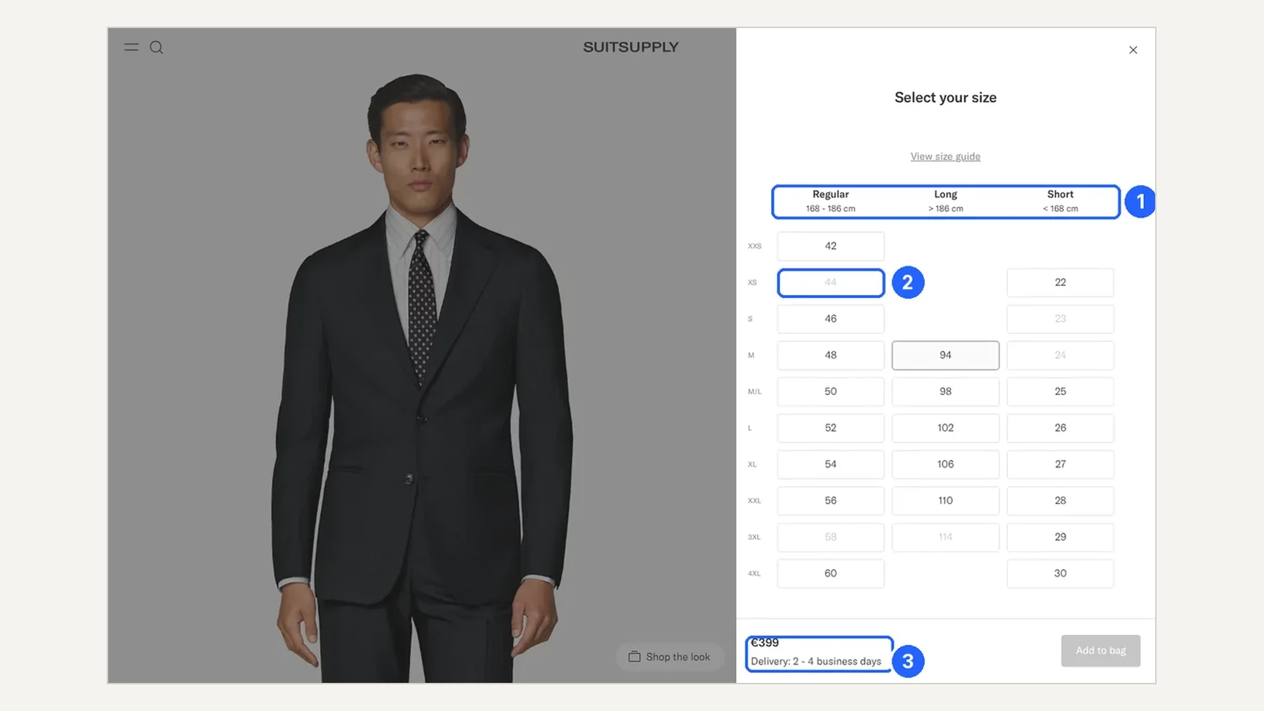
- The size picker is the strategy. Instead of a size chart, Suitsupply asks for your height first (Short, Regular or Long, each with a range in centimetres), then your size: 25 sizes in one panel.
- The price is justified before the click. Every product card names the colour, the fabric, the mill and its country, so a €399 suit reads like a label sewn inside the jacket.
- Navigation follows occasions, not a taxonomy. Seven tiles (Classic, Perennial, Wedding, Luxury, Winter, Wrinkle-Free, Tuxedo) open the suits page before any filter.
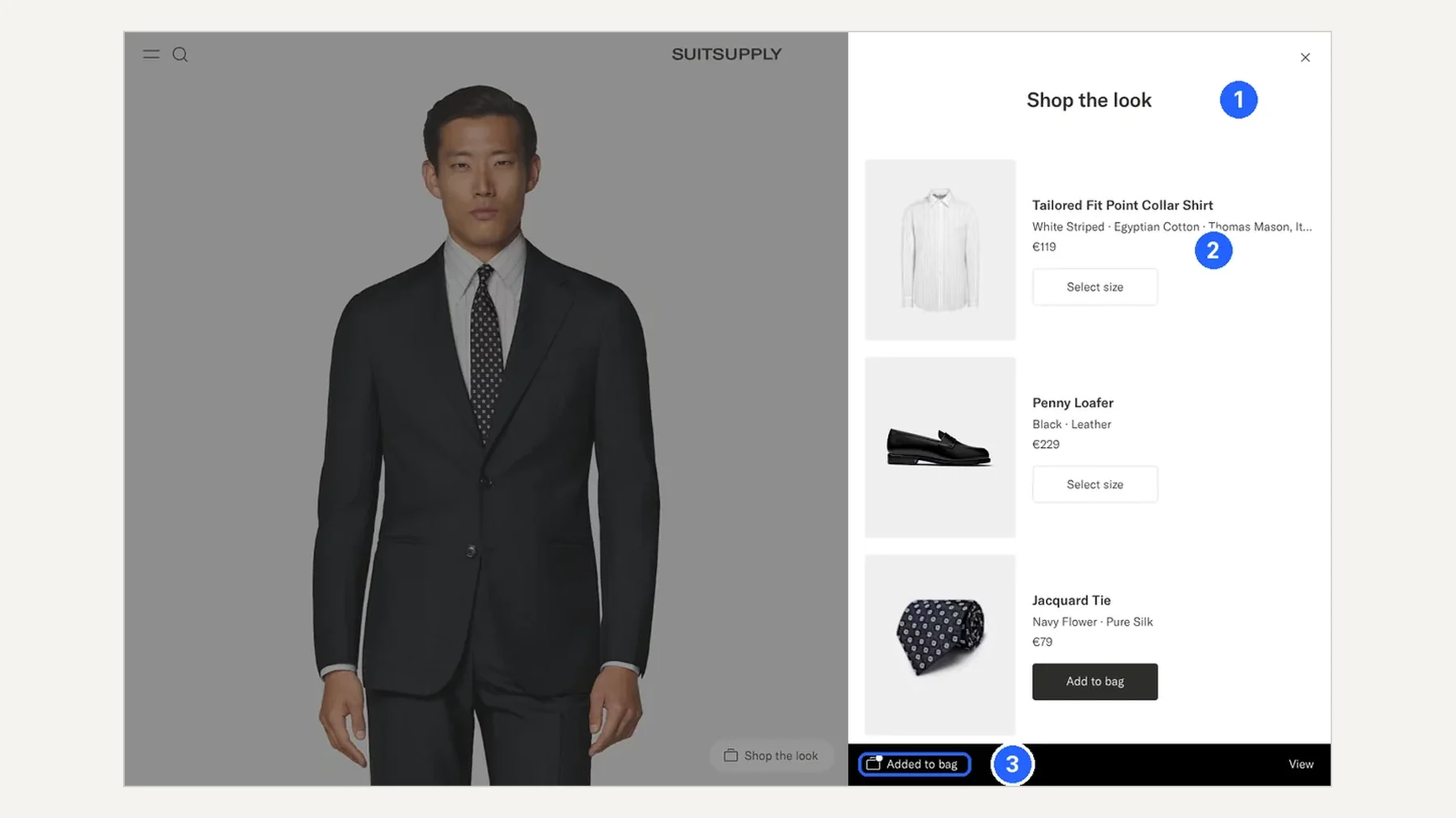
- The look is sold right after the suit. Adding the suit to the bag opens the exact outfit from the photo: €506 of add-ons on a €399 suit, each with its own size picker.
- The stores sit inside the funnel. Collect in store, in-store alterations and Size Passport turn about 150 stores into a reason to buy online.
- The biggest gap is reassurance about fit. There are no reviews, ratings or fit feedback anywhere on the journey, the product people buy without trying on.
Section 1 · Homepage
The homepage is a magazine first and a shop second
The homepage opens on a campaign: red curtain, a three-piece suit, mirror-ball dancers. It is pure brand. On mobile, the first screen offers a single way into the catalogue, a small "New Arrivals" label.
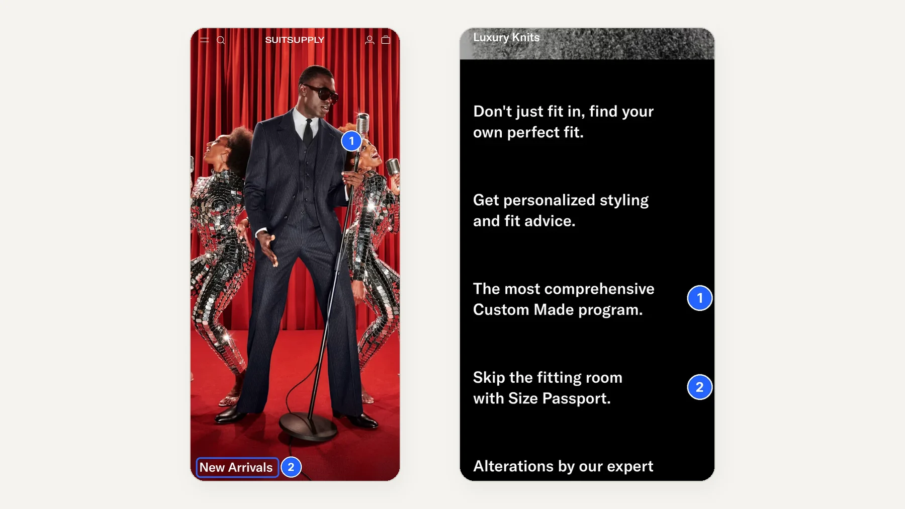
The real sales argument sits lower on the page: personal styling, Custom Made, Size Passport and in-store alterations. Those lines answer the one fear that stops people buying a suit online. A visitor who came for "a navy suit for a wedding" may never scroll that far.
Section 2 · Listing
The listing sells by occasion, and the fabric justifies the price
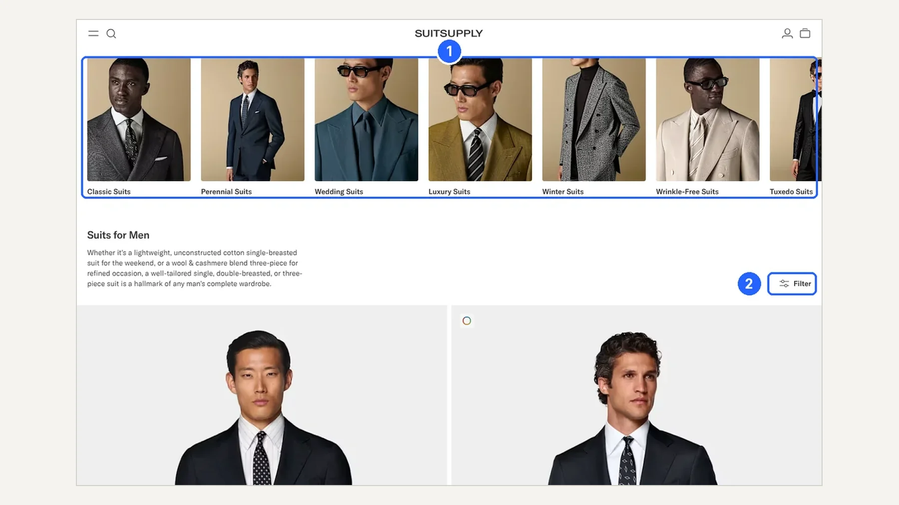
The suits page opens with seven tiles: Classic, Perennial, Wedding, Luxury, Winter, Wrinkle-Free and Tuxedo. That is how people think about a suit, by the moment they will wear it, not by a product taxonomy. A single Filter button replaces the usual sidebar, so the products get the full width.
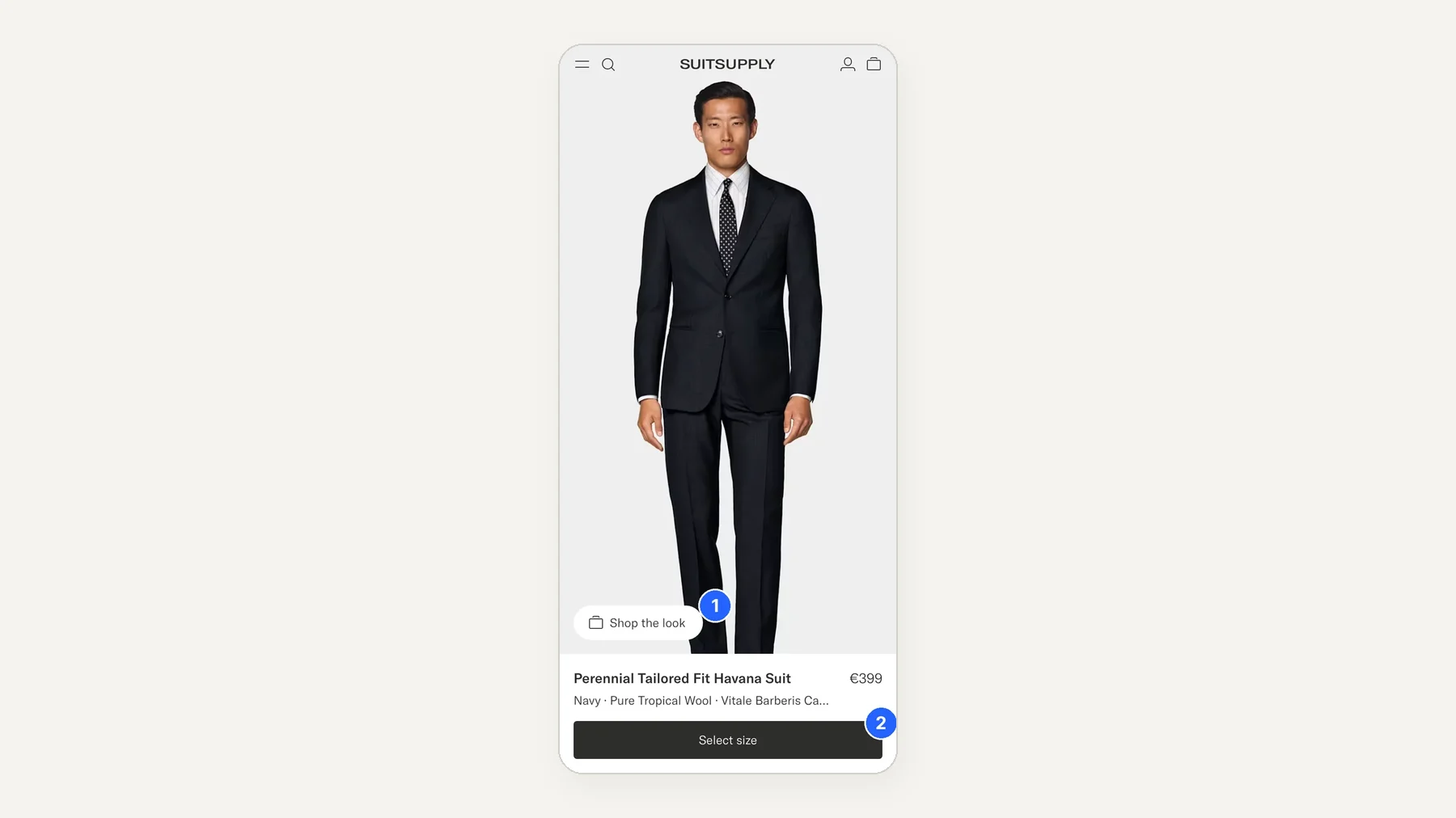
Each product card then does something few fashion sites do. Under the name, a second line reads like a label sewn inside the jacket: colour, fabric, mill, country. "Navy · Pure Tropical Wool · Vitale Barberis Canonico, Italy". The price is justified before the visitor even clicks.
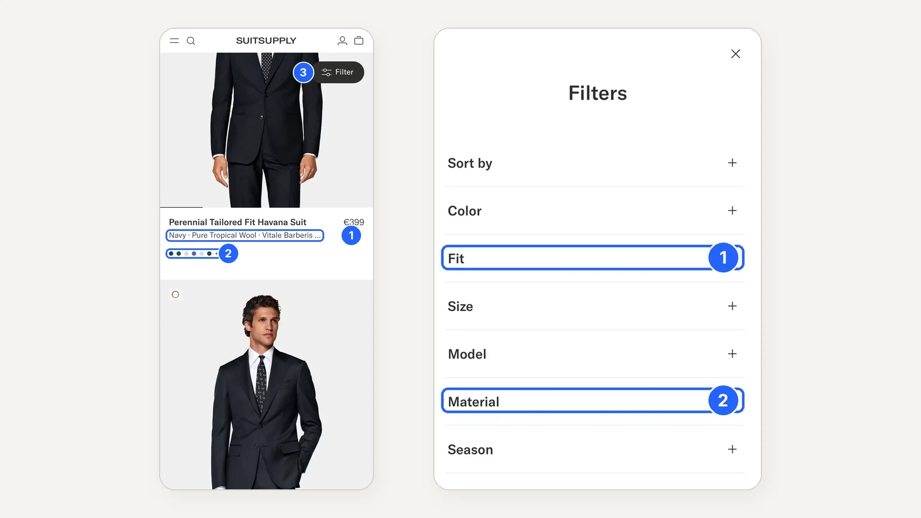
One thing we would test: on mobile, each suit takes almost a full screen. That is beautiful for a single product and slow when you want to compare ten navy suits.
Section 3 · Product page
On the product page, the size picker does the selling
"What's my size?" is the question that kills online suit sales. Suitsupply does not answer it with a size chart. It answers with a decision table: pick your height column, then your size. Sold-out sizes stay visible, greyed out, and the price and delivery time stay pinned next to the button.
On mobile, the first screen holds the photo, the name, the fabric line, the price and a single action, "Select size". The copy below tells the mill's story: founded in 1663. Price justification again, in one sentence.
The biggest gap we found. There are no reviews, no ratings and no fit feedback ("runs small", "true to size") anywhere: not on the cards, not on the product page, not in the structured data. Returns information sits in a closed accordion. For a product people buy without trying on, this is where we would start testing.
Section 4 · Add to bag
Adding the suit to the bag opens the whole look
Most sites show a small "added to bag" pop-up with two buttons. Suitsupply opens a drawer with the exact look from the photo: the shirt (€119), penny loafers (€229), the tie (€79) and the belt (€79). That is €506 of add-ons on a €399 suit, each with its own size picker in place.
Section 5 · Bag and checkout
Checkout is short, free, and opens a door to the store
The bag is calm: free gift wrapping, free delivery, total including VAT, one button. Checkout is a single page with express payment first, PayPal and a pay-later option. "Collect in Store" sits next to home delivery as an equal choice: the stores become a delivery option and a reason to come in for alterations.
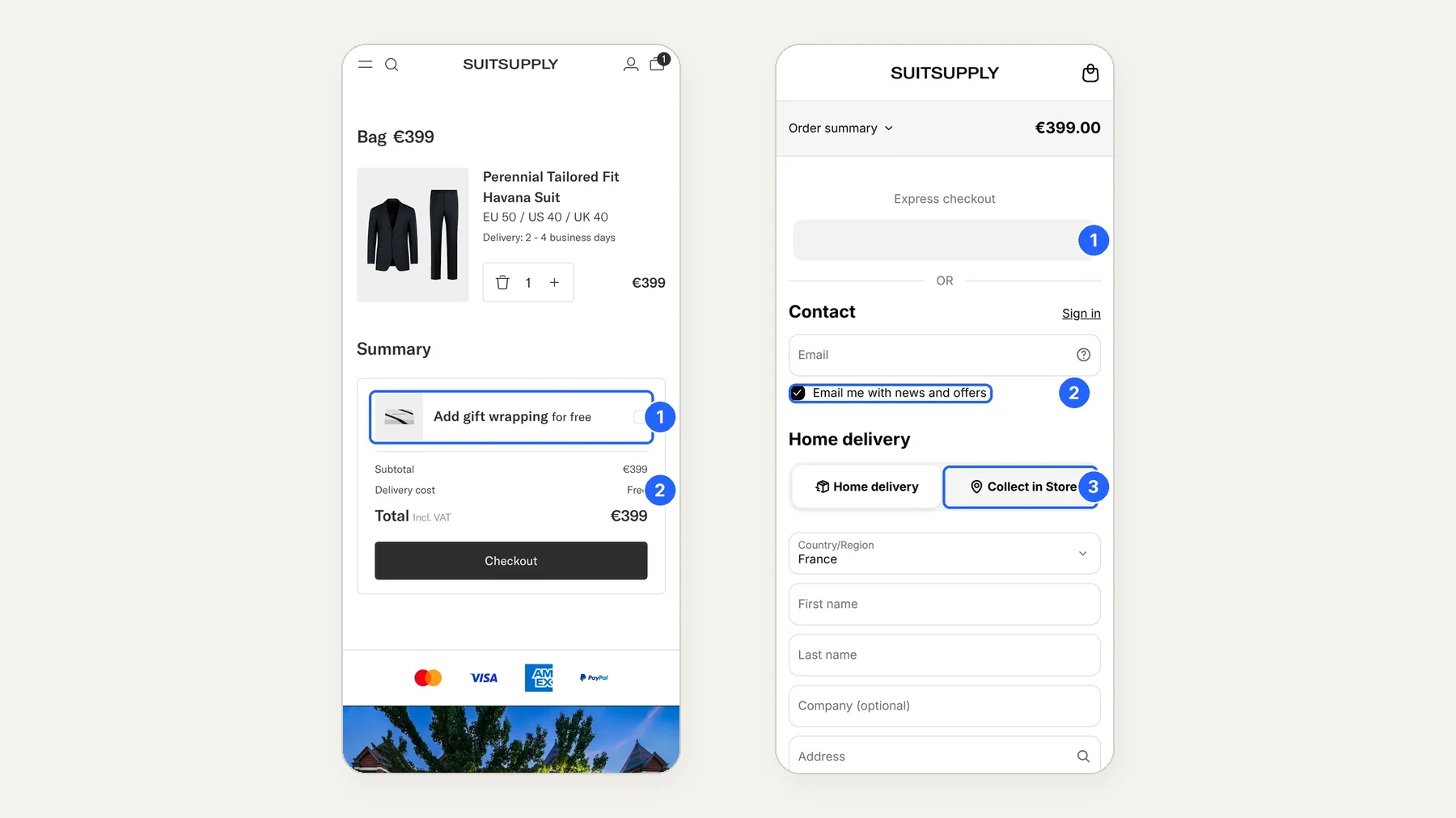
Two things we would question. The bag no longer suggests the rest of the look, even though the drawer did a minute earlier. And the "Email me with news and offers" box is ticked by default: good for list growth, but in Europe that is a consent question worth checking with legal.
Section 6 · SEO
The unglamorous SEO basics are done well
- Title tags that carry the fabric: "Navy Perennial Tailored Fit Havana Suit in Pure Tropical Wool".
- Product structured data that lists every size as a variant.
- About 70 country and language versions declared on every page.
- Filter and search URLs blocked in robots.txt, so Google indexes categories rather than thousands of filter combinations.
- Fast pages: the product page finished loading in 0.8 seconds in our mobile test (one lab run, not field data).
The gap mirrors the product page: without reviews there is no review markup, so no star ratings in Google results.
Section 7 · What we would test
Five tests we would run next
| Test | Hypothesis | Main metric |
|---|---|---|
| Fit feedback next to the size picker | Showing how past buyers' sizes fit, from returns data, reduces size doubt. | Add-to-bag rate, size-related returns |
| Three entry tiles under the homepage hero | Suits, Wedding and Custom Made give first-time visitors a way in without the menu. | Homepage to listing click-through |
| Two-column mobile listing | Shoppers comparing suits see more options per scroll and open more product pages. | Listing to product page rate |
| "Complete the look" in the bag | Bringing the look back at the bag recovers the add-ons skipped in the drawer. | Average order value |
| Returns and alterations line under "Select size" | Free returns and in-store alterations, said early, lower the risk of a first purchase. | Add-to-bag rate for new visitors |
Want the same teardown of your own site, with the tests ranked for your traffic? Talk to us. The next issue lands in two weeks: follow The E-commerce Teardown.
Key terms
- Teardown
- A screen-by-screen review of a site's customer journey, from homepage to checkout, on desktop and mobile.
- Listing page (PLP)
- The category page that shows a grid of products, with filters and sorting.
- Product page (PDP)
- The page for a single product, where the visitor picks a size or option and adds it to the bag.
- Shop the look
- A module that sells the other items worn in the product photo, usually after or next to the main product.
- Structured data
- Code in the page that describes the product (price, sizes, reviews) in a format search engines read.
- A/B test
- Showing two versions of a page to randomly split visitors at the same time to measure which performs better.
Method
Screens captured on 18 October 2026 on suitsupply.com (France store, English), desktop at 1,440 px and an iPhone-size mobile viewport, up to the payment step without placing an order. Prices and features may have changed since. Henkan & Partners is not affiliated with Suitsupply.