Guide
The Essential Guide to Web Analytics for Product Designers
Alexandre Suon · 2026-09-27
Research tells designers why people struggle. Analytics tells them where, how often and for how many. This guide shows product designers how to combine the two: which UX metrics to use, how to read behaviour data, heatmaps and session replays, why speed and accessibility are design problems, how to test designs and how to prove their impact, for teams of every size.
Executive summary
- Analytics and user research answer different questions, and designers need both. Analytics shows what people do at scale; interviews and usability tests explain why. Nielsen Norman Group suggests five users for qualitative tests but about 40 participants for quantitative studies. Use each for what it does well.
- Measure the experience with a small set of UX metrics, not everything the tool offers. Google's HEART framework (Happiness, Engagement, Adoption, Retention, Task success) and its Goals, Signals and Metrics method help designers choose. Standard measures such as the System Usability Scale, whose average score is 68, make results comparable.
- Behaviour data points to friction you can see and fix. In Contentsquare's 2026 benchmark (vendor data), 35.2% of sessions were affected by friction such as rage clicks, errors or slow pages. Mobile carried about 70% of visits but converted at 2.0%, against 3.4% on desktop.
- Speed and accessibility are design outcomes. Only 48% of mobile websites passed all three Core Web Vitals in 2025, and 95.9% of the top million home pages had detectable accessibility failures in 2026. Speed affects conversion, and accessibility is now a legal requirement for many EU online services.
- Test designs where you can, and report their impact in business terms. Most tested ideas do not improve their target metric, and a small design change can be worth millions. Present design results as changes in task success, conversion or retention, not as screens delivered.
- Use session replay and AI with care. Replays and AI summaries save hours of analysis, but they record real people. Mask personal data by default, sample sessions and respect consent: France's data protection authority, the CNIL, proposed in 2026 that session replay should require prior consent.
Web analytics for product designers is the use of quantitative data about how people use a website or app (traffic and funnels, clicks, scrolls and errors, speed, accessibility and experiment results) to find design problems, decide what to change and show whether a new design works. It complements qualitative research, which explains why people behave as they do.
Section 1 · Why it matters
Analytics shows designers where and how often people struggle; research explains why
Designers already know how to learn from users: interviews, usability tests, diary studies. What these methods rarely show is scale. A usability test with five people can reveal that the delivery options confuse users; it cannot tell you whether that confusion costs 1% of orders or 20%. Analytics can.
Jen Cardello of Nielsen Norman Group describes three uses of analytics in UX work. Issue indication: the data flags a problem, such as a page where many users leave. Investigation: the data helps locate its cause, such as the step or device where it happens. Triangulation: the data confirms or questions what qualitative research found. She also warns that analytics can become "a distracting black hole of 'interesting' data without any actionable insight" if it is not tied to a design question.
The friction is real and measurable. Contentsquare's 2026 benchmark (vendor data), covering 99 billion sessions on more than 6,500 websites, found that 35.2% of sessions were affected by friction such as rage clicks, errors or slow pages. Slow page loads alone affected 10.9% of sessions, and API errors, where the page fails to get data it needs, rose 16% in a year.
For designers. Start every design brief with two numbers: how many users the problem affects, and what it costs today in conversion, task success or support contacts. It turns a design opinion into a business case.
Section 2 · Quant and qual
Quantitative data tells you what and how much; qualitative research tells you why, and the best designs use both
Nielsen Norman Group's advice on sample sizes shows why the two kinds of research are different tools. For qualitative usability testing, Jakob Nielsen wrote in 2000 that "the best results come from testing no more than 5 users and running as many small tests as you can afford": five users typically reveal about 85% of the usability problems in a design. For quantitative studies, where the goal is a reliable number, NN/g now recommends about 40 participants. Analytics and A/B tests work with thousands.
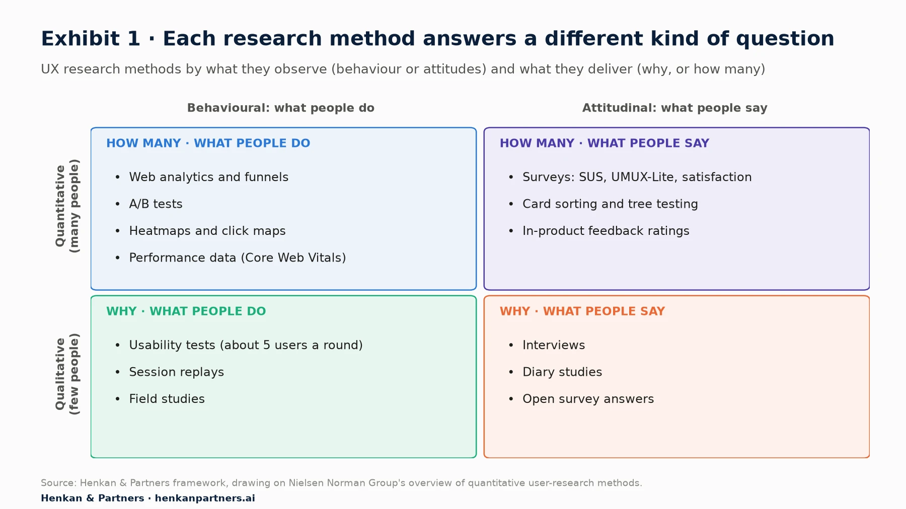
What this shows. Web analytics, heatmaps and A/B tests sit in the same corner: they show what many people do. On their own they cannot explain motives or expectations. A strong design process moves around the map: analytics flags where the problem is, replays and usability tests show what happens, interviews explain why, and a test or a tracked release checks whether the new design fixed it.
| Question | Best method | What analytics adds |
|---|---|---|
| Where do users drop off? | Funnel analysis in web analytics | The step, device and segment where it happens |
| What do they do on the page? | Heatmaps, scroll maps, session replay | Patterns across thousands of visits |
| Why do they struggle? | Usability tests, interviews | Which problems affect the most users |
| How usable is it overall? | SUS or UMUX-Lite survey, task success in tests | Trends over time and between releases |
| Does the new design work better? | A/B test | Measured effect on conversion, task success and guardrails |
For design leads. Pair each quantitative finding with at least one qualitative observation before redesigning, and each qualitative finding with a number that shows how many users it affects. Neither alone is enough to justify a large change.
Section 3 · UX metrics
A few user-centred metrics, chosen from goals, measure the experience better than everything the tool reports
Analytics tools report hundreds of numbers. Few of them say whether the experience is good. In 2010, Kerry Rodden, Hilary Hutchinson and Xin Fu at Google published the HEART framework to fix this. It groups user-centred metrics into five categories: Happiness (attitudes such as satisfaction and likelihood to recommend), Engagement ("frequency, intensity, or depth of interaction"), Adoption (new users of a product or feature), Retention (users who come back) and Task success (efficiency, effectiveness and error rate).
The framework comes with a process called Goals, Signals, Metrics. First state the goal of the product or feature. Then identify "how success or failure in the goals might manifest itself in user behavior or attitudes". Finally turn those signals into metrics "suitable for tracking over time on a dashboard". Not every category fits every project; pick the ones that match the goal.
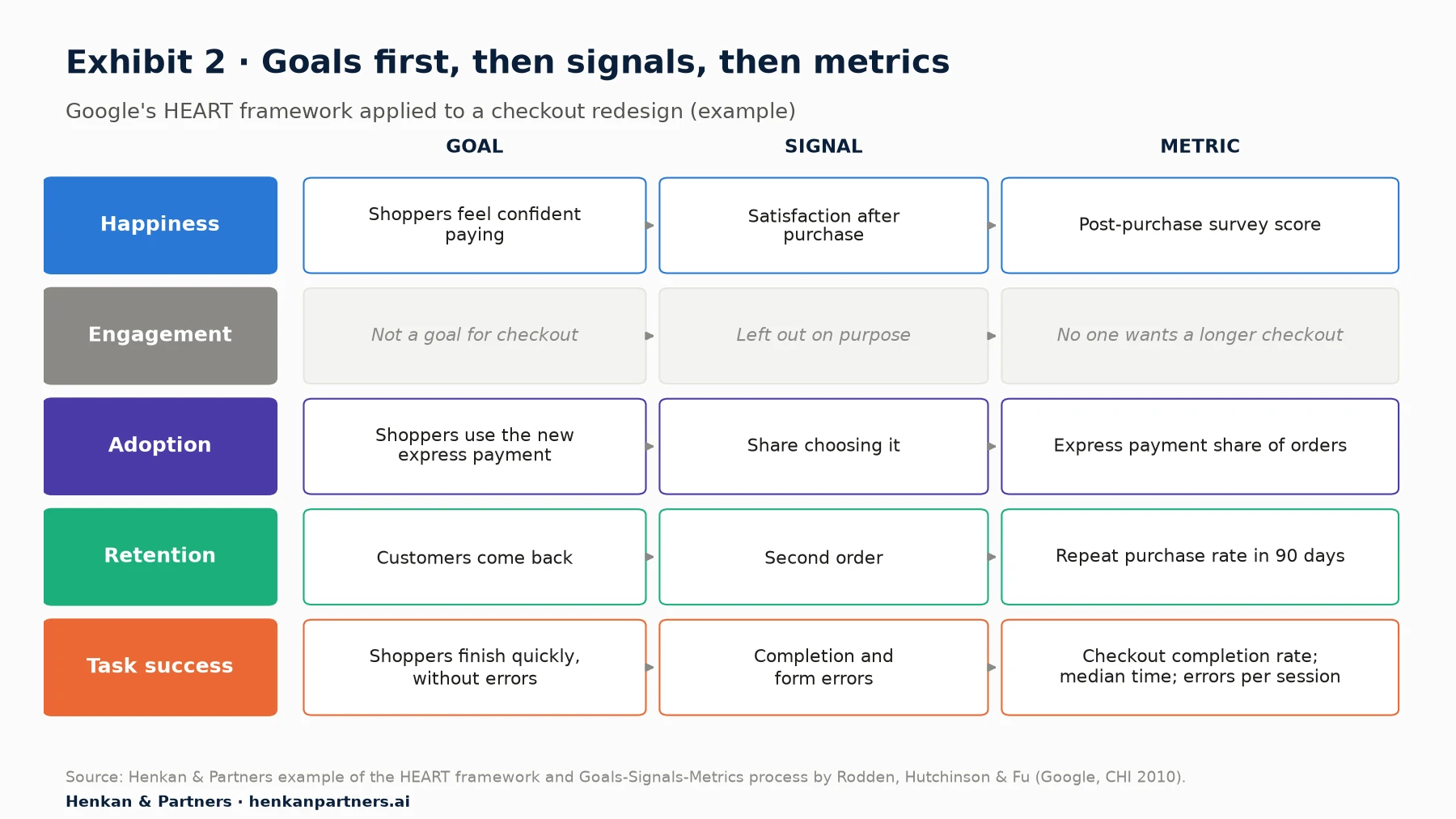
What this shows. For a checkout, task success and happiness matter most, and engagement is deliberately left out: nobody wants shoppers to spend longer in checkout. Choosing what not to measure is part of the method, and it stops a team from celebrating a metric that rose for the wrong reason.
Standard measures make results comparable
A few standard measures are worth knowing because they come with benchmarks. The System Usability Scale (SUS), released by John Brooke in 1986, is a ten-item questionnaire scored from 0 to 100; across 500 studies the average is 68, according to Jeff Sauro of MeasuringU. The two-item UMUX-Lite correlates highly with SUS and is short enough to show inside a product. Task success rate, the share of users who complete a task, is what NN/g calls the simplest usability metric; Sauro's analysis of almost 1,200 tasks found an average completion rate of 78%.
For designers. Pick one metric per HEART category you care about for each project, write down the baseline before you start, and agree with the product owner which one decides success. Our guide for product owners shows how these fit into the team's wider metric tree.
Section 4 · Behaviour analytics
Heatmaps, session replays and frustration signals show the friction behind the numbers
Standard web analytics counts pages, events and conversions. Behaviour analytics, also called digital experience analytics, records how people interact with each page: where they click, how far they scroll, where they hesitate and where they give up. Tools include Contentsquare (which is absorbing Hotjar), Microsoft Clarity, FullStory and the session replay features of product analytics tools.
Their most useful output for designers is a set of automatic frustration signals. Definitions differ slightly between tools, so check yours:
- Rage clicks. Microsoft Clarity defines them as the user clicking "multiple times in a clustered area in rapid succession"; Hotjar used five clicks on the same element within 500 milliseconds. They usually mean something looks clickable but does not respond fast enough.
- Dead clicks. A click that gets no response. Clarity notes they "can signify broken elements, high latency requests, or misleading UX", such as a product image users expect to enlarge.
- Excessive scrolling and quick backs. Scrolling far more than usual suggests users cannot find what they need; returning quickly to the previous page suggests the page did not match their expectation.
- Errors. JavaScript and API errors that users actually encounter, linked to the sessions where they happened.
These signals matter most on mobile, where most visits now happen. In Contentsquare's 2026 benchmark (vendor data), mobile made up about 70% of visits but sessions lasted 2 minutes 20 seconds, against 4 minutes 46 seconds on desktop, and users scrolled less. One visit in three started on a product page, and 61% of those visits ended without a second page.
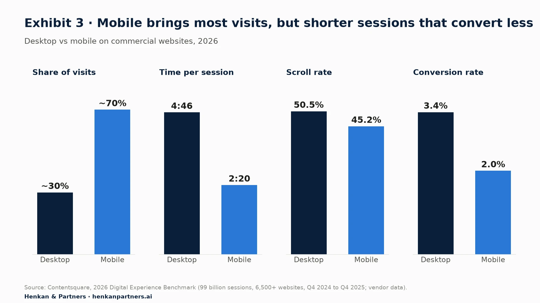
What this shows. The mobile experience is where most users judge a site, and where the gap to desktop is largest. Designing mobile product pages, navigation and checkout first, and reviewing heatmaps and replays by device, targets the biggest opportunity. Part of the gap reflects intent, since some people browse on mobile and buy on desktop, so compare mobile with its own history as well as with desktop.
How to use replays without drowning in them
Watching random replays is slow and misleading. Start from a question and a segment: sessions that reached checkout on mobile and left, or sessions with rage clicks on a given page. Watch ten to twenty, note the recurring problems, then go back to the numbers to see how many sessions show the same pattern. Our session replay guide covers the method in more detail.
For designers. Add frustration signals to your design review: for each page you are redesigning, note the top rage-click and dead-click elements and the scroll depth by device before you start, and check them again two weeks after release.
Section 5 · Funnels and forms
Funnels and form analytics point to the design problems that cost the most
A funnel shows the share of users who reach each step of a journey: product page, basket, checkout, payment, confirmation. For designers, its value is focus. The step with the largest avoidable drop, split by device, is usually the best place to spend design time.
Checkout remains the most studied example. Baymard Institute's average of 50 studies puts online cart abandonment at 70.22%. Many abandoners were only browsing, but among US shoppers who abandoned for other reasons, the most common cause was extra costs such as shipping, taxes and fees that were too high (40%). Several of the others are design problems: being forced to create an account (18%), a checkout that was too long or complicated (17%) and a total cost that could not be seen up front (12%).
Baymard's benchmark of 343 leading US and European e-commerce sites rates the user experience of each part of the journey. It finds most sites falling short, even among the largest retailers.
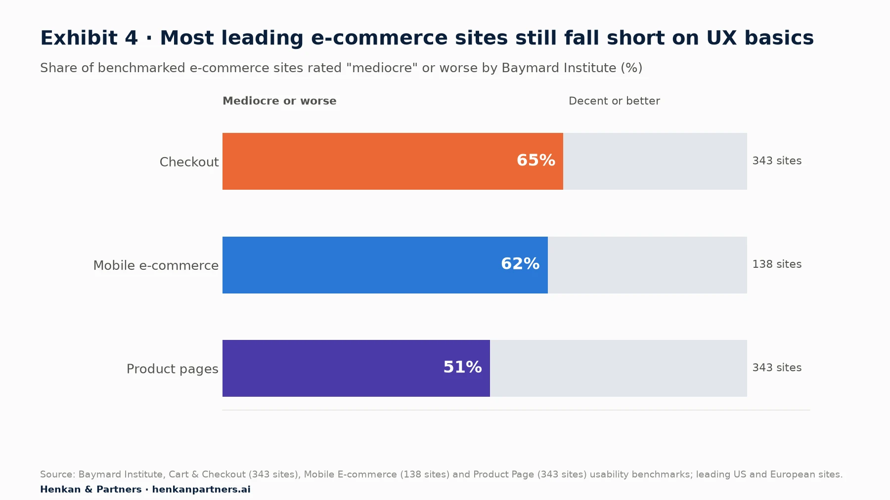
What this shows. The basics are not solved, even on the biggest sites. Baymard estimates that large e-commerce sites could gain a 35.26% increase in conversion rate from better checkout design. For designers, that is a strong argument for spending time on unglamorous details: clear costs, guest checkout, fewer fields and helpful error messages.
Measure forms field by field
Forms are where good intentions become abandonment. Baymard found that the average checkout in 2024 had 5.1 steps and 11.3 form fields, while most sites need only 8. Form analytics, available in most behaviour analytics tools or through a few custom events, shows which fields users hesitate on, which trigger errors and which they abandon. Track three things for each important form: the share of users who start it and finish it, the fields with the most errors, and the fields where users leave.
| Signal | What it suggests | Typical design response |
|---|---|---|
| Long time on a field | Unclear label or unexpected request | Rewrite the label, add an example, or remove the field |
| High error rate | Strict validation or unclear format | Accept more formats, validate inline, explain the rule |
| Abandonment at a field | Sensitive or unexpected question | Explain why it is needed, make it optional, or move it later |
| Many returns to an earlier field | Information needed later was not clear earlier | Show the requirement up front |
Section 6 · Speed
Speed is a design outcome: most mobile sites still fail Google's page experience thresholds
Page speed is often treated as an engineering topic, but design choices drive much of it: image sizes, fonts, carousels, pop-ups and third-party widgets. Google's Core Web Vitals measure three aspects of the experience at the 75th percentile of real page loads: loading, with Largest Contentful Paint within 2.5 seconds; responsiveness, with Interaction to Next Paint of 200 milliseconds or less; and visual stability, with Cumulative Layout Shift of 0.1 or less. Interaction to Next Paint replaced First Input Delay as a Core Web Vital on 12 March 2024.
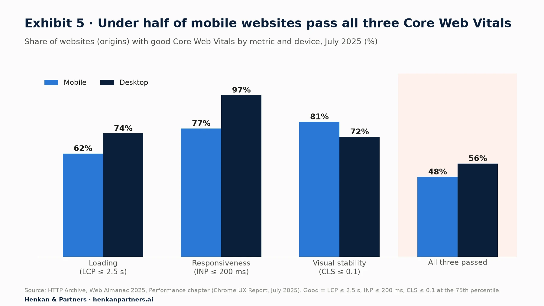
What this shows. Loading speed on mobile is the weakest point, and layout shift is actually worse on desktop. Late-loading banners and images without reserved space are common causes of layout shift. Both are within a designer's influence: specifying image dimensions, limiting heavy hero media and avoiding elements that push content down after the page appears.
Speed affects business results. In a Google-commissioned study by 55 and Deloitte of 37 European and American brand sites, a 0.1-second improvement in mobile site speed was associated with 8.4% more conversions for retail sites and 10.1% more for travel sites, and retail shoppers spent 9.2% more. At Bing, Kohavi and colleagues found that every 100 milliseconds of speed-up improved revenue by 0.6%.
For designers. Add a performance budget to your design specifications: the maximum weight of hero images, the number of web fonts and the rule that every image and embedded element has reserved space. Check Core Web Vitals for your key templates in Google Search Console after each release.
Section 7 · Accessibility
Accessibility failures are widespread, measurable and now a legal issue for many EU online services
Accessibility is part of the experience for a large share of users, and analytics-style tools can measure much of it. WebAIM's annual analysis of the top one million home pages found detectable failures of the Web Content Accessibility Guidelines (WCAG) on 95.9% of them in February 2026, with an average of 56.1 errors per page, up from 51 a year earlier. Automated tests only find some issues, so the real picture is worse.
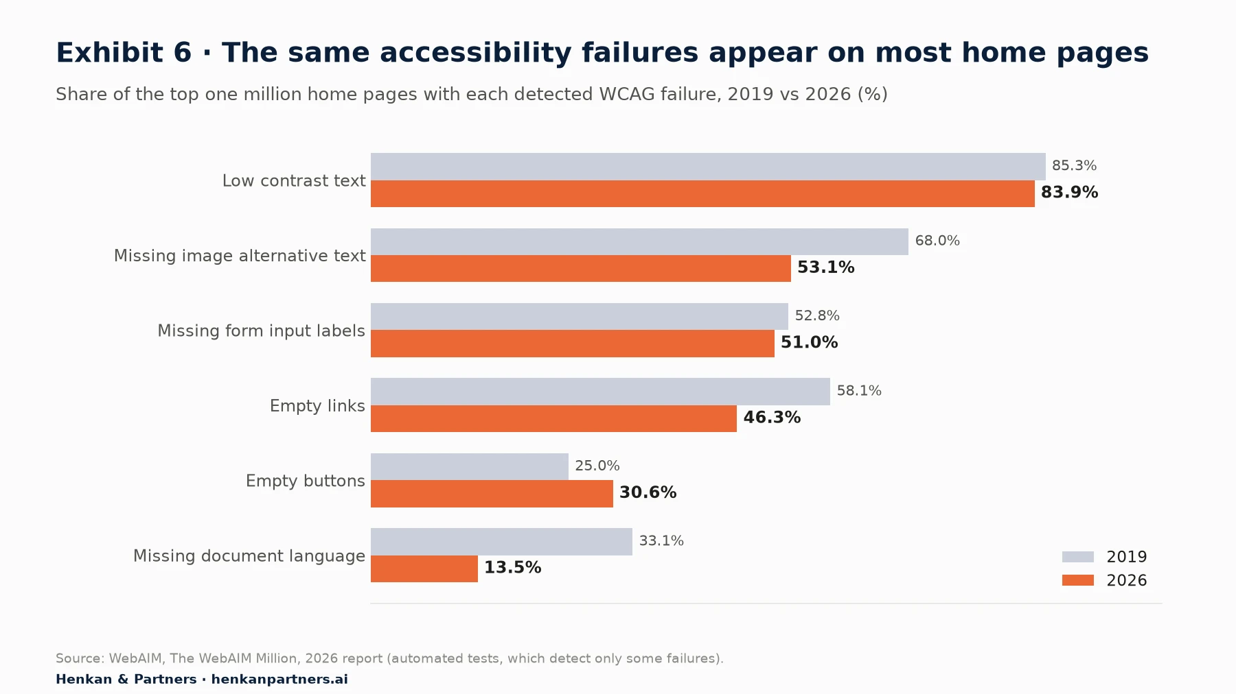
What this shows. The most common failures are design decisions: low-contrast text appears on 83.9% of home pages, and forms without labels on 51%. WebAIM notes that these most common errors have been the same for the last seven years. Fixing them is mostly a matter of design standards and component libraries, not complex engineering.
The legal context has changed. The European Accessibility Act, Directive (EU) 2019/882, applies to services provided to consumers after 28 June 2025, including e-commerce services delivered through websites and mobile apps. For many online shops, banks and travel companies selling in the EU, accessibility is now a compliance requirement as well as a design quality.
For design leads. Build accessibility checks into the design system: contrast ratios in the colour palette, labels and error messages in form components, and text alternatives in image guidelines. Track the number of automated accessibility errors on key templates as a design guardrail, next to conversion and speed.
Section 8 · Testing designs
Controlled experiments show whether a design works, and they often surprise the people who made it
A before-and-after comparison is the most common way to judge a redesign and one of the least reliable, because traffic, campaigns and seasons change at the same time. An A/B test shows the old and new designs to randomly split groups of users over the same period, so the difference in results can be attributed to the design.
Tests are humbling. At Microsoft, only about a third of ideas tested improved the metric they were designed to improve; at Bing and Google, by some measures, only about 10% to 20% did. The reverse is also true: small changes can have large effects. At Bing, a change to how ad headlines were displayed increased revenue by 12%, more than $100 million a year in the United States, "without significantly hurting key user-experience metrics". The idea had waited in the backlog for months because nobody expected much from it.
What designers should test, and what they should not
| Situation | Approach | Why |
|---|---|---|
| High-traffic page, clear hypothesis, reversible change | A/B test | Enough users to measure realistic effects within weeks |
| Low-traffic page or small audience | Usability tests before release, then monitor after | A test would take months and remain inconclusive |
| Accessibility or legal fix | Ship, then monitor guardrails | The decision is already made |
| Large redesign of many elements | Test the riskiest parts first, or roll out gradually with a holdout group | A single test of everything shows whether it worked, not why |
Agree the primary metric, the guardrails and the test duration before launch, and resist stopping when the first results look good. Ronny Kohavi's rules of thumb are a useful warning: changes rarely have a big positive impact, and "reducing abandonment is hard, shifting clicks is easy". A design that attracts clicks to a new element may simply take them from another. Our Essential Guide to A/B Testing explains how to set tests up.
For designers. Write each design hypothesis as "Because we saw [evidence], we believe [change] will cause [effect] for [users], measured by [metric]". It forces the link between research, design and measurement, and makes the result useful whichever way it goes.
Section 9 · Privacy
Session replay and heatmaps record real people, so privacy has to be designed in
Behaviour analytics records detailed interactions, sometimes including what users type. That makes it valuable and sensitive. In Europe, the rules are tightening. France's data protection authority, the CNIL, allows some audience measurement without consent only when it is strictly limited to measuring audience. In February 2026 it published a draft recommendation on session replay stating that its purposes are subject to users' prior consent, that masking should apply by default when nothing is configured, and that sessions should be sampled rather than all recorded. The consultation closed in April 2026; check the final text before relying on it.
Tools have moved in the same direction. Microsoft Clarity masks content typed into input boxes in all modes, and its default "Balanced" mode also masks numbers and email addresses. Hotjar suppresses user input by default. Defaults are a floor, not a guarantee: pages that display personal data, such as account pages or order confirmations, need specific masking.
- Mask by default all inputs and any page that shows personal, payment or health information; unmask only what you need.
- Collect consent where the law requires it, and make sure the tool respects the choice.
- Sample and limit retention. You rarely need every session, or replays older than a few months.
- Restrict access to people who need replays for their work, and never share recordings outside the team.
Our focus on user consent in e-commerce explains the wider consent picture for analytics.
Section 10 · Proving impact
Design earns its budget when its impact is reported in the same terms as the business
Design teams are often asked to prove their value, and often reach for statistics that do not hold up. The claim that "every dollar invested in UX returns $100" is widely repeated, but we have not found a primary study that supports it, and the book it is usually credited to does not contain it. The best-known credible evidence is McKinsey's 2018 study of 300 listed companies over five years: those in the top quarter of its Design Index had 32 percentage points higher revenue growth and 56 percentage points higher total returns to shareholders than their industry peers over the period. It shows a link between design maturity and results, not the return on a single project.
The more convincing proof is local. A design team that measures its own work can show the effect of each release on the metrics the business already follows.
| Evidence | Strength | Example |
|---|---|---|
| A/B test result | Strongest: shows cause | New delivery-cost display raised checkout completion by 2.1% on mobile |
| Staged roll-out with a holdout group | Strong | Redesigned search kept for 90% of users; holdout 10% compared over six weeks |
| Before and after, with segments and seasonality checked | Moderate | Task success in quarterly usability tests rose from 71% to 84% |
| UX metric trend | Supportive | SUS score rose from 64 to 72 after three releases |
| Single quote or replay | Illustration only | Useful to explain a result, not to prove it |
For design leads. Keep a one-page log of every significant design release: the problem, the evidence, the metric, the expected effect and the measured result. After a year it becomes the most persuasive document your team owns.
Section 11 · AI
AI speeds up analysis and summarises replays, but designers still need to check the evidence
AI is arriving in both design and analytics tools. Contentsquare introduced AI summaries of session replays in 2025, which describe key events and friction across many sessions with links to the moments that matter. Microsoft Clarity's Copilot answers questions about dashboards in plain language and can build filters for recordings. General analytics tools such as Google Analytics now have conversational assistants too.
Designers are cautious adopters. Figma's 2025 AI report, a vendor survey of 2,500 Figma users, found that only 31% of designers used AI in core design work, against 59% of developers in theirs. Across all respondents, designers and developers, 78% agreed that AI makes their work more efficient, but only 32% said they can rely on its output.
That caution is healthy for analytics. An AI summary of a hundred replays is a hypothesis, not a finding: it can miss rare but serious problems and overstate frequent but harmless ones. Use AI to decide what to watch and what to count, then check the numbers and a sample of sessions yourself.
Section 12 · What to do next
Five habits bring data into design work, whatever the size of the team
| Team | Start with | Then add |
|---|---|---|
| One designer | A free heatmap and replay tool with masking on, plus GA4 funnels by device for the main journey | SUS or UMUX-Lite after major releases; Core Web Vitals for key pages |
| A small design team | HEART metrics for each project, frustration signals in design reviews, an accessibility checklist in the design system | A/B tests on high-traffic pages with the product team; a design impact log |
| A design organisation | Shared UX metrics across products, a research repository that links studies and data, and governed replay access | A continuous experimentation programme; AI summaries on consented, masked data |
1. Start each project with a number
Before designing, measure the problem: how many users it affects, where, on which devices and at what cost.
2. Choose HEART metrics and a baseline
Pick the categories that match the goal, write down today's values and agree which metric decides success.
3. Combine data with research
Use analytics to find and size problems, replays and usability tests to understand them, and interviews to explain them.
4. Treat speed and accessibility as design requirements
Put performance budgets and accessibility rules in the design system, and track them as guardrails for every release.
5. Measure and share every release
Test where traffic allows, measure where it does not, and keep a log of what each design changed.
FAQ
Frequently asked questions about web analytics for product designers
Frequently asked questions
How can UX designers use web analytics?
Designers use web analytics to find where users struggle (funnels and drop-offs), to size problems before redesigning, to understand behaviour on each page (heatmaps and session replays), and to check whether a new design worked (A/B tests and tracked releases). It works best alongside qualitative research, which explains why users behave as they do.
What UX metrics should designers track?
Choose from Google's HEART framework: Happiness, Engagement, Adoption, Retention and Task success, using the Goals, Signals, Metrics process. Common choices are task success rate, time on task, error rate, a System Usability Scale or UMUX-Lite score, conversion at key steps and frustration signals such as rage clicks.
What is a good System Usability Scale score?
The average SUS score across 500 studies analysed by MeasuringU is 68, so scores above 68 are above average. Compare your score with your own previous releases as well as with that benchmark.
What is the difference between quantitative and qualitative UX research?
Quantitative research measures behaviour or attitudes with numbers across many people and shows how much and how often. Qualitative research observes or interviews a few people and shows why. Nielsen Norman Group suggests about five users per round of qualitative testing and about 40 participants for quantitative studies.
Is session replay legal under GDPR?
It can be, with care. Mask personal data and form inputs, collect consent where required, sample sessions, limit retention and restrict access. In France, the CNIL's 2026 draft recommendation states that session replay purposes require users' prior consent and that masking should apply by default.
What are Core Web Vitals and why should designers care?
Core Web Vitals are Google's measures of loading (Largest Contentful Paint within 2.5 seconds), responsiveness (Interaction to Next Paint of 200 milliseconds or less) and visual stability (Cumulative Layout Shift of 0.1 or less). Design choices such as image sizes, fonts and late-loading banners affect all three, and faster sites convert better.
Key terms
- Quantitative research
- Research that measures behaviour or attitudes with numbers, such as conversion rates, task success or survey scores. It shows how much and how often, and whether differences are real.
- Qualitative research
- Research that observes or listens to a small number of people, such as usability tests and interviews. It explains why people struggle and what they expect.
- HEART framework
- Google's set of five UX metric categories: Happiness, Engagement, Adoption, Retention and Task success. It helps teams choose user-centred metrics for a product or feature.
- Goals, Signals, Metrics
- The process that goes with HEART: state the goal, identify the behaviour or attitude that would show success (the signal), then turn it into a metric you can track.
- System Usability Scale (SUS)
- A ten-question survey that scores perceived usability from 0 to 100. The average across 500 studies is 68, which makes it a useful benchmark.
- Task success rate
- The share of users who complete a task, such as finding a product or finishing checkout. It is the simplest and most telling usability metric.
- Heatmap
- A visual summary of where users click, move or scroll on a page. It shows patterns across many sessions at a glance.
- Session replay
- A reconstruction of an individual visit, showing clicks, scrolls and page changes. It shows the detail behind a metric, but it records real people and must be handled with care.
- Rage click
- Several rapid clicks in the same area, usually because something does not respond. It is a strong signal of frustration.
- Dead click
- A click on something that produces no response, such as an image users mistake for a button. It signals misleading design or broken elements.
- Core Web Vitals
- Google's three measures of page experience: loading (Largest Contentful Paint), responsiveness (Interaction to Next Paint) and visual stability (Cumulative Layout Shift).
- WCAG
- The Web Content Accessibility Guidelines, the international standard for making websites usable by people with disabilities. The European standard used to show compliance with EU accessibility law, EN 301 549, builds on it.
- A/B test
- A controlled experiment that shows different designs to randomly split groups of users and compares the results. It shows whether a design caused a change.
- Masking
- Hiding personal or sensitive content, such as form inputs, names or card numbers, in heatmaps and session replays before it is stored.
Sources
Methodology. This guide was researched in September 2026 from UX research literature (Google Research, Nielsen Norman Group, MeasuringU), independent research bodies (Baymard Institute, WebAIM, HTTP Archive), official documentation and regulation (web.dev, EUR-Lex, CNIL, Microsoft, Hotjar) and vendor benchmarks and surveys, which are labelled as vendor data in the text. Every source was opened and checked on 27 September 2026. Exhibits 1 and 2 are Henkan & Partners frameworks and contain no measured data.
- Rodden, Hutchinson and Fu, Measuring the User Experience on a Large Scale, CHI 2010 (Google Research)
- Rodden, Hutchinson and Fu, paper PDF
- MeasuringU, Measuring usability with the System Usability Scale
- MeasuringU, UMUX-Lite
- MeasuringU, What is a good task-completion rate?
- Nielsen Norman Group, Success rate: the simplest usability metric
- Nielsen Norman Group, Quantitative user-research methodologies: an overview
- Nielsen Norman Group, Three uses for analytics in user-experience practice
- Nielsen Norman Group, Why you only need to test with 5 users
- Nielsen Norman Group, How many participants for quantitative usability studies
- Contentsquare, 2026 Digital Experience Benchmark
- Contentsquare, How frustration impacts digital experiences in 2026
- Contentsquare, Engagement in 2026
- Microsoft Learn, Clarity semantic metrics
- Hotjar Documentation, Use cases for filtering recordings
- Contentsquare, Hotjar to Contentsquare
- Baymard Institute, Cart abandonment rate statistics
- Baymard Institute, Cart and checkout usability research
- Baymard Institute, Checkout optimization: minimize form fields
- Baymard Institute, Product page UX research
- Baymard Institute, Mobile e-commerce usability
- web.dev, Web Vitals
- web.dev, Interaction to Next Paint becomes a Core Web Vital
- HTTP Archive, Web Almanac 2025, Performance
- web.dev, Milliseconds make millions
- Kohavi, Deng, Longbotham and Xu, Seven Rules of Thumb for Web Site Experimenters, KDD 2014
- WebAIM, The WebAIM Million 2026
- EUR-Lex, Directive (EU) 2019/882 (European Accessibility Act)
- European Commission, European Accessibility Act
- Kohavi and Thomke, The Surprising Power of Online Experiments, Harvard Business Review, 2017
- Kohavi, Tang and Xu, Trustworthy Online Controlled Experiments, chapter 1
- CNIL, Cookies: solutions pour les outils de mesure d'audience
- CNIL, Rejeu de session: consultation publique
- CNIL, Projet de recommandation sur le rejeu de session (PDF)
- Microsoft Learn, Clarity masking
- Hotjar Documentation, How to suppress text, images, videos and user input
- McKinsey, The business value of design, 2018
- Chuk Moran, ROI from UX: fake facts
- Contentsquare, AI-powered session replay summaries
- Microsoft Learn, Clarity Copilot
- Figma, Figma's 2025 AI report
- Henkan & Partners, The Essential Guide to Web Analytics for Product Owners
- Henkan & Partners, The Essential Guide to Web Analytics
- Henkan & Partners, The Essential Guide to A/B Testing