Focus
10 A/B Testing Mistakes That Fake a Result (and How to Catch Them)
Alexandre Suon · 2026-09-29
Most A/B testing mistakes that cost money are not bugs in the test. They happen when the result is read: a p-value taken as a 95% chance to win, a test stopped on a good day, a segment that 'won' after the fact, a revenue lift driven by three orders. This article covers the ten analysis and interpretation errors that make a result look real when it isn't, how to spot each one in a report, and how to prevent it, with the research and our own simulations behind every point.
Executive summary
- A significant result is not a 95% chance that the variation wins. When only 10% of tested ideas truly work, as Booking.com, Google Ads and Netflix have reported, Kohavi, Deng and Vermeer (KDD 2022) calculate that 22% of statistically significant results are false positives. Report the confidence interval and the false positive risk, not just 'p < 0.05'.
- Early stops and small tests do not just risk false wins; they inflate true ones. In our simulation of tests with a real 5% lift, those stopped at the first significant look reported 9.0% on average, and 21% when stopped at the first look. A test run at 20% power that 'wins' overstates the effect by a factor of about 2.25.
- Every extra metric and segment is another chance for noise to look like a finding. With 20 independent comparisons and no real effect, the chance of at least one 'significant' result is 64%. Fix one primary metric in advance and treat segment results as hypotheses for the next test.
- Some results are broken before anyone reads them. About 6% of Microsoft's experiments show a sample ratio mismatch, which in most cases invalidates the result. Analysing page views when you randomised users pushed the false positive rate from 5% to 22% in our simulation at ten views per user; Microsoft once saw 30% of A/A tests 'significant' on some metrics for this reason.
- Revenue metrics, time effects and shifting splits distort even correct tests. Capping revenue per user cut the sample Bing needed for a well-behaved mean by more than ten times; in our simulation, capping order values nearly doubled power. Novelty effects fade, and a traffic split that changes mid-test can make a variation that wins every period lose overall (Simpson's paradox).
- The defence is a short, written analysis plan and a habit of doubt. Pre-register the power, unit, metric caps and stopping rule; check the sample ratio before anything else; apply Twyman's law to any surprisingly large lift; and replicate the wins that matter. AI assistants can run these checks quickly, but they will also write a convincing story for a false result if asked.
Section 1 · Why it matters
A/B testing mistakes rarely break the test; they break the conclusion drawn from it
A/B testing mistakes are errors in the design, monitoring, analysis or reporting of an online controlled experiment that make a result look real, larger or more certain than it is. The most damaging ones are not technical failures but interpretation errors: reading a p-value as the probability of winning, stopping when the numbers look good, searching segments for a winner, or trusting a lift that is too good to be true.
An A/B test turns noise into a decision: statistics tell you whether the gap between two groups is larger than chance would produce. Most of the ways it goes wrong leave no visible trace. The dashboard shows a green 'winner', the confidence reads 97%, and nobody asks how the number was produced.
The cost is not only a bad launch. A programme that ships false winners inflates forecasts and loses credibility when the promised uplift never appears in the P&L. In our audits we often find a year of reported wins that add up to more than the site's total growth. Our article on measuring personalisation ROI explains why summed test wins rarely match the business result.
This article is for the people who read and report results. Launch quality assurance, day-one sample ratio checks and the basic peeking problem are covered in our A/B test QA checklist, and the statistical models themselves in our guide to A/B test statistical models. Here we go deeper on what happens after the data arrives.
The ten mistakes at a glance
| Mistake | How it fakes a result | How to catch it |
|---|---|---|
| 1. Reading p < 0.05 as a 95% chance to win | Overstates certainty; ignores how rarely ideas work | Report the interval and the false positive risk |
| 2. Peeking and stopping early | Turns noise into winners and inflates true lifts | Fixed horizon, or a sequential method declared in advance |
| 3. Underpowered tests (winner's curse) | Only exaggerated estimates reach significance | Compute power before launch; distrust wins from small tests |
| 4. Metric and segment fishing | More comparisons, more false 'findings' | One primary metric; segments as new hypotheses |
| 5. Ignoring a sample ratio mismatch | The groups are no longer comparable | Chi-square test on the split before reading anything |
| 6. Novelty, primacy and one-off events | The first weeks' lift is not the lift you keep | Plot the effect over time; run full weeks |
| 7. Wrong unit of analysis | Error bars too narrow; false positives multiply | Analyse at the level you randomised |
| 8. Uncapped revenue metrics | A few large orders decide the test | Cap or transform, decided before looking |
| 9. Changing the split mid-test (Simpson's paradox) | Pooled result can reverse the true direction | Stable allocation; analyse by period |
| 10. Believing a result that is too good | Tracking artefacts read as behaviour | Twyman's law: find the bug first, then replicate |
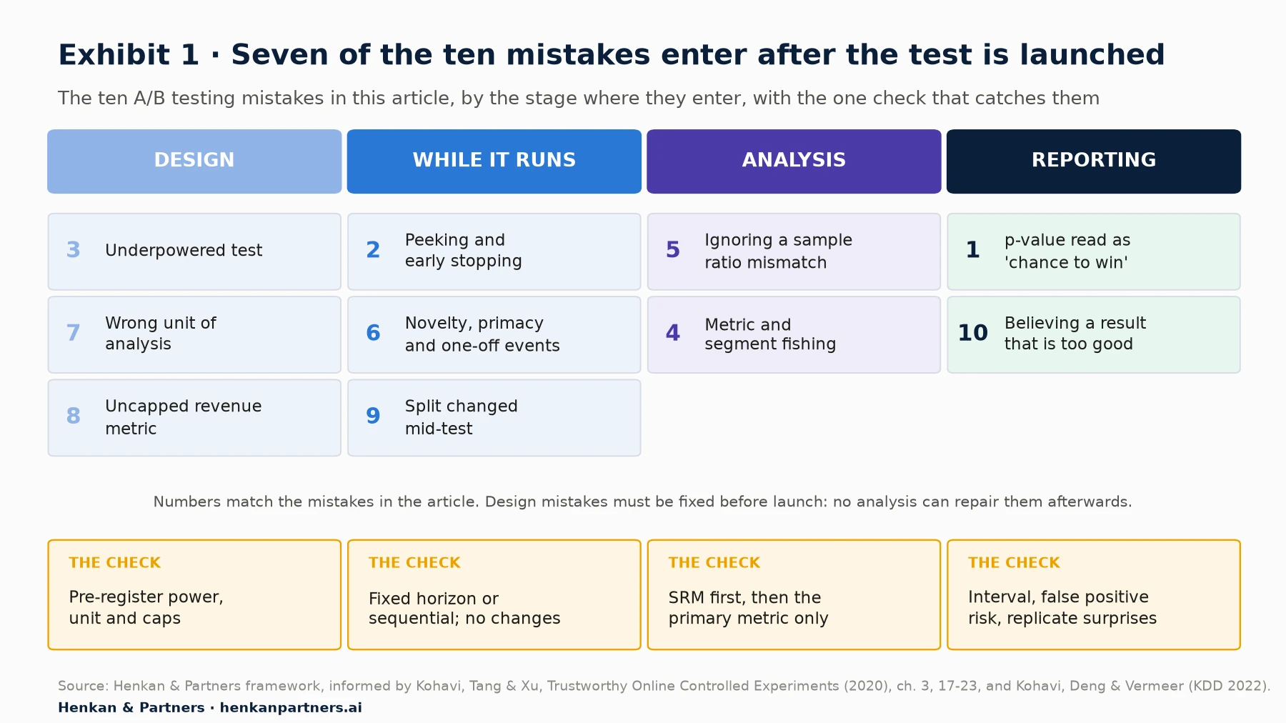
What this shows. Seven of the ten mistakes enter after launch, which is why a clean QA process is necessary but not enough. The three design mistakes are different in kind: no amount of careful analysis can repair a test that was too small, measured at the wrong unit or built on an uncapped revenue metric. They have to be fixed in the test plan.
Section 2 · Mistake 1 · p-values
A p-value of 0.05 does not mean a 95% chance that the variation wins
The most common sentence in test reports is also the most often wrong: 'the variation is a winner with 95% confidence', read as 'there is a 95% chance it is better'. The p-value answers a narrower question. It is the probability of seeing a difference at least as large as the one observed if there were no real difference. Netflix's experimentation team puts it plainly: when a test is not significant, 'we never conclude the coin is fair'; we only conclude we have not collected enough evidence.
What leaders actually want to know is the reverse: given that the test came out significant, how likely is it that the effect is real? That depends on something the p-value ignores, namely how often your ideas work in the first place. Kohavi, Deng and Vermeer call the answer the false positive risk (FPR) and show in 'A/B Testing Intuition Busters' (KDD 2022) how it changes with the success rate of tested ideas.
False positive risk = α × π / [α × π + (1 − β) × (1 − π)]

α = significance level for an improvement (0.025 for a two-sided 5% test)
π = share of tested ideas with no real effect (1 − success rate)
1 − β = statistical power (0.80)

Worked example, success rate 10%: 0.025 × 0.9 / (0.025 × 0.9 + 0.8 × 0.1) = 0.0225 / 0.1025 ≈ 22%
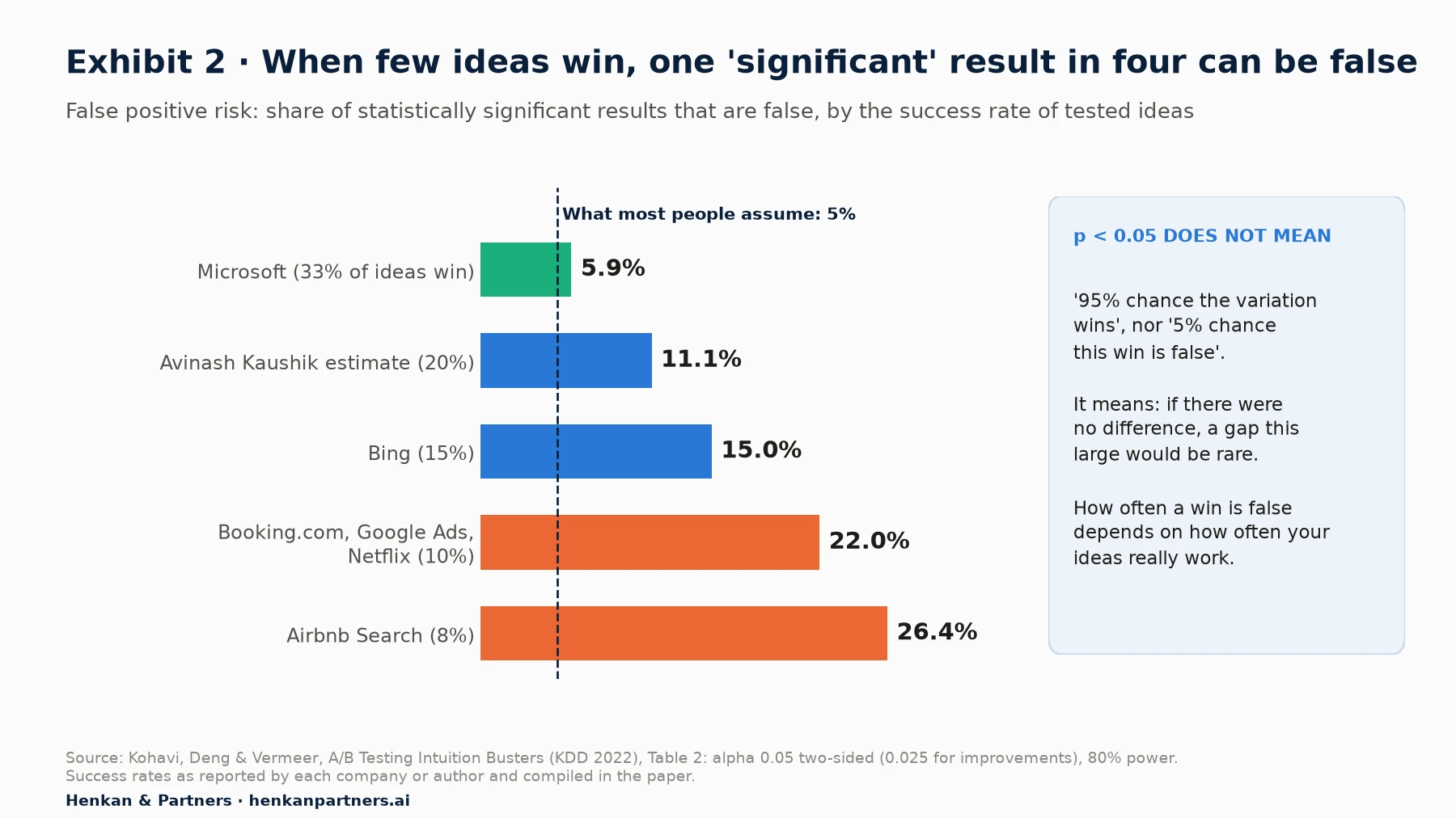
What this shows. At Microsoft's reported success rate of one idea in three, about 6% of significant results are false, close to what most people assume. At the 10% success rate reported for Booking.com, Google Ads and Netflix, it is 22%, and at Airbnb Search's 8% it is 26%. Mature programmes with good ideas still produce a false 'winner' in every four or five.
Two consequences follow. First, a p-value just under 0.05 is weak evidence where most ideas fail; Kohavi and his co-authors recommend showing the false positive risk alongside p-values, and demanding lower p-values for surprising results. Second, the 'probability to beat control' shown by Bayesian tools is a different quantity again, which depends on the prior the tool assumes. Read the documentation before quoting it in a board deck; our guide to A/B test statistical models compares the main approaches.
How to report a result honestly
- Report the effect with its confidence interval, for example '+3.1% (95% interval: +0.4% to +5.8%)', not only 'significant'.
- State the false positive risk for your programme. If you know your historical win rate, compute it with the formula above. If you do not, assume 10% to 20%, in line with most of the rates in Exhibit 2.
- Separate 'no evidence of an effect' from 'no effect'. A flat test with a wide interval has not shown the change is harmless.
- Ask for replication of wins that matter. A result that changes pricing, checkout or a large share of revenue deserves a second test before a permanent roll-out.
Section 3 · Mistake 2 · Peeking
Stopping at the first significant look turns noise into winners and inflates real lifts
Peeking means checking a fixed-horizon test repeatedly and stopping as soon as it crosses the significance line. The damage to the false positive rate is well known: in our QA checklist simulation, checking an A/A test 20 times pushed the rate of false winners from 5% to about 25%. What is less known is the second effect. Even when the variation is genuinely better, stopping early exaggerates how much better it is.
The reason is selection. Early in a test, the estimate swings widely. A test that crosses the significance line on day two does so because it caught an upswing. Stopping there locks in the upswing as the reported result. We simulated 20,000 tests with a real 5% relative lift on a 3% conversion rate, each planned at 203,000 visitors per arm (80% power) and checked 20 times.
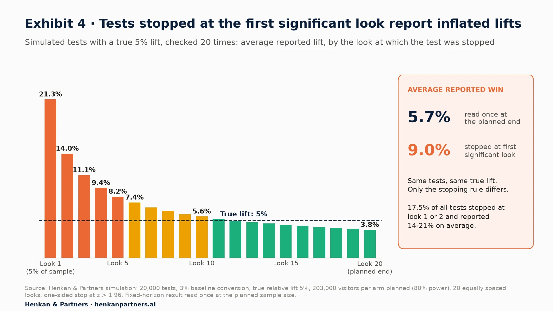
What this shows. Every test here has the same true effect. Tests stopped at the first look, after 5% of the planned sample, reported a 21% lift on average; those stopped at the second look, 14%. Together they were 17.5% of all tests. Read once at the planned end, winners reported 5.7%, close to the truth. Stopping at the first significant look raised the average reported win to 9.0%, nearly double the real effect.
Inflated lifts feed business cases and forecasts. A team that routinely stops early overstates its contribution even if every one of its winners is real.
What to do instead
- Fix the sample size and read the primary metric once, at the planned end. Monitor guardrails and data quality during the test, but not the decision metric.
- If you need to monitor, use a sequential method designed for it and declare it in the test plan. Johari, Koomen, Pekelis and Walsh (KDD 2017) developed always-valid p-values for this purpose, and several commercial tools now offer sequential options. In Georgiev's analysis of 1,001 tests run with Analytics-Toolkit, 90% used a sequential design.
- Treat early stops as a reason to discount the estimate. Even a valid sequential test that stops early reports an estimate biased upwards. Use the lower end of the interval in forecasts.
Section 4 · Mistake 3 · Underpowered tests
An underpowered test that wins almost always overstates the effect
Statistical power is the probability that a test detects an effect of a given size if it exists. Most teams think of low power as a problem of missed winners. It is worse than that. In a low-powered test, the only estimates that reach significance are the ones that happen to be much larger than the true effect. The result is the winner's curse: the smaller the test, the more a 'win' exaggerates.
Gelman and Carlin formalised this in 2014 as two errors that sit alongside the classic false positive. A Type M (magnitude) error is the factor by which a significant estimate exaggerates the true effect. A Type S (sign) error is the chance that a significant estimate has the wrong sign. In their worked example, a study with 6% power had a 24% chance of a wrong-sign result and an expected exaggeration factor of 9.7. They note that exaggeration becomes a problem below 50% power, and sign errors below 10%.
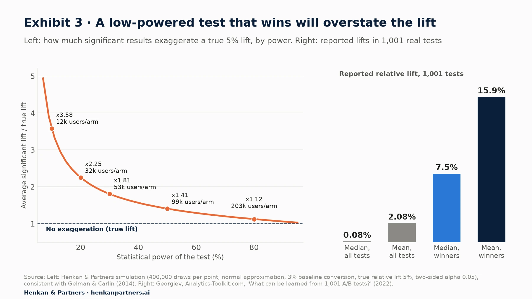
What this shows. At 80% power, a significant result overstates the true lift by about 12%, matching the factor of 1.12 in Gelman and Carlin's paper. At 20% power, the average significant result is 2.25 times the truth; at 10%, 3.6 times, and about 4% of significant results point the wrong way. The right-hand panel shows the selection at work in real programmes: across 1,001 tests the median lift was 0.08%, but the median reported lift among winners was 7.5%.
To detect a 5% relative lift on a 3% conversion rate with 80% power, you need about 203,000 visitors per arm. At 32,000 visitors per arm, the test has about 20% power, and a 'winning' result reporting a 10% lift is consistent with a true lift of about 4.4%.
Kohavi, Deng and Vermeer open their paper with a published test from GuessTheTest: 82 visitors in control with 3 conversions, 75 in treatment with 12, a 337% lift and a p-value of 0.009. Its pre-experiment power to detect a 10% lift was about 3%. Even assuming the highest success rate in Exhibit 2, they estimate a 63% chance that the result is a false positive. The authors add that in tens of thousands of tests they have never seen a change improve conversion anywhere near this amount.
Why wins shrink when you re-test or roll out
The winner's curse explains why lifts shrink on re-test or roll-out. This is regression to the mean: selection picked the tests whose noise pointed upwards, and the next measurement has no reason to repeat that luck. Etsy's engineering team describes the same selection bias and applies a Bayesian correction that discounts each win based on the history of past experiments, with noisier tests discounted more. Airbnb's Lee and Shen (KDD 2018) proposed a correction for the total effect of launched features for the same reason.
Our view. Build power into the test plan, not the readout. If a page cannot reach 50% power for an effect you would care about within four to six weeks, do not A/B test small changes on it: test bolder changes, move the test to a higher-traffic page, or use a more sensitive metric. When you must report a win from a low-powered test, report it as 'directionally positive, size uncertain' and use the lower end of the interval in any forecast.
Section 5 · Mistake 4 · Metrics and segments
Every extra metric and segment is another lottery ticket for a false win
A test report with 12 metrics and a breakdown by device, country, new versus returning visitors and traffic source contains dozens of comparisons. Each carries its own 5% chance of a false positive. If there is no real effect, the chance that at least one of them shows a 'significant' difference rises quickly.
P(at least one false positive) = 1 − 0.95ᵏ, for k independent comparisons at α = 0.05

k = 1 → 5%
k = 10 → 40%
k = 20 → 64%
k = 40 (5 metrics × 8 segments) → 87%
Real comparisons are correlated, so exact figures differ, but the direction does not. The most dangerous version is post-hoc segment fishing: the overall result is flat, someone slices by device and country, and 'mobile users in Germany' show a significant lift. The segment is then presented as the result.
Rules for metrics and segments
- One primary metric decides the test. Choose it before launch, together with two to four guardrail metrics that can stop a harmful launch. Our article on guardrail metrics for A/B tests covers how to pick them. Everything else is diagnostic.
- Pre-register the segments you care about, with a reason, and size the test for them.
- Correct when you test many things at once. A Bonferroni correction (divide α by the number of comparisons) is conservative but simple; false discovery rate methods such as Benjamini-Hochberg are less strict. Either is better than none.
- Treat unplanned segment wins as hypotheses and test them in a new, targeted experiment. If the effect is real, it will replicate.
- Distrust opposite effects in segments. A flat test that 'wins on mobile and loses on desktop' is most often noise on both sides.
For marketers. When a stakeholder asks 'but how did it do on mobile?', answer with the pre-registered segments only, and say how many comparisons you looked at in total.
For leaders. Ask one question of every win: was this the metric and segment written in the plan before launch? If not, treat it as a lead, not a result.
AI makes segment fishing faster, so the rule matters more
AI assistants connected to testing tools, through built-in copilots or a Model Context Protocol (MCP) server, can slice a test by every dimension in seconds and explain whatever they find. Asked 'why did the variation win in Germany?', they will produce a plausible reason whether or not the effect exists. In our experience, the safe pattern is to give the assistant the analysis plan and ask it to check the result against the plan (primary metric, pre-registered segments, SRM, power) rather than to search for insights. Our article on AI agents in the experimentation workflow covers where agents help and where they need a human sign-off.
Section 6 · Mistake 5 · Sample ratio mismatch
A result from a test with a sample ratio mismatch is not a result
A sample ratio mismatch (SRM) occurs when the observed split of users between variations differs from the configured split by more than chance allows. Fabijan and colleagues found it in about 6% of experiments at Microsoft and about 10% of triggered analyses at LinkedIn, and wrote that SRM 'in most cases completely invalidates experiment results'. If one variation lost or gained users for a reason other than randomisation, the difference in outcomes may come from who is in each group rather than what they saw.
Our QA checklist explains how to run the chi-square check from day one and what to do when it fires at launch. The analysis-stage version of the mistake is subtler. An SRM can be created after the test by the analysis itself, even when assignment was perfect:
- Filters applied after exposure. Removing bots, internal users or 'outliers' with a rule that the variation affects (for example, users with very long sessions) removes more users from one side. Fabijan et al. describe a bot filter that removed highly engaged treatment users and made a positive result look negative.
- Triggering conditions that depend on the variation. Analysing only users who 'saw the new component' when the component loads differently in each variation.
- Joins that drop data. Merging test assignments with order data on a key that is missing more often in one variation.
The rule is to run the SRM check on the exact population you analyse, not only on the assignment logs. Fabijan et al. suggest a useful diagnostic: if the unfiltered population is balanced and the filtered one is not, the filter or trigger is the cause. Kameleoon and Eppo both use a chi-square test with a p-value threshold of 0.001 for SRM alerts, and Optimizely runs a sequential SRM check automatically. If your tool does not, the calculation takes one line in a spreadsheet.
Our view. Do not 'adjust' for an SRM by reweighting the groups. You do not know which users are missing or why, so you cannot correct for them. Find the cause, fix it, and re-run the test. The only exception is when the cause can be fully isolated, for example one browser version, and excluded from both groups with a rule that does not depend on the variation.
Section 7 · Mistake 6 · Time effects
The first weeks' lift is often not the lift you will keep
A test measures how users react during the test window. That reaction is not always stable. Sadeghi and colleagues at Microsoft define two opposite patterns in 'Novelty and Primacy: A Long-Term Estimator for Online Experiments' (Technometrics, 2022). A novelty effect is the initial attraction to something new that fades as it becomes familiar: for example, a new badge or animation that draws clicks in its first week and fewer once it is familiar. A primacy effect runs the other way: users need time to learn a new layout, so early results understate the long-term benefit, or a change that disrupts habits looks worse at first than it will be.
A well-documented example of long-term user learning comes from Google. Hohnhold, O'Brien and Tang (KDD 2015) measured how users' propensity to click ads changed over time depending on the quality of the ads they had previously seen ('ads blindness' and 'sightedness'), a learning effect that short tests cannot capture. Their long-term measurement led to a 50% reduction of the ad load on Google's mobile search interface.
Many 'trends' in the first days are an optical illusion
Before diagnosing novelty, rule out the simpler explanation. In 'Five Puzzling Outcomes Explained' (KDD 2012), Kohavi and colleagues show that cumulative results often appear to trend simply because early estimates are noisy and the interval narrows as data arrives. They calculate that the first day's estimate has a 67% chance of falling outside the 95% confidence interval at the end of the experiment. Early swings that settle down are therefore expected even when the effect is perfectly stable.
The way to tell the two apart is to plot the effect by cohort of first exposure rather than cumulatively. If users who first saw the variation in week three respond as strongly in their first days as users in week one did, there is no novelty effect; if each cohort's effect decays with its own time since exposure, there is.
Seasonality, promotions and one-off events
Randomisation protects you against events that hit both groups equally, such as a sale or a TV campaign, but not against events that interact with the change. A variation that emphasises free delivery will look better during a period when a competitor raises delivery prices; a new product-listing layout may help during a sale with many discounted items and not otherwise. The result is real, but it does not generalise.
- Run whole weeks, at least two, so that weekday and weekend behaviour are both represented.
- Note external events in the test record (campaigns, promotions, outages, competitor moves) and check whether the effect differs before and after.
- Avoid launching tests just before peak periods such as Black Friday, unless the test is about that period.
- For high-stakes changes, keep a small holdout after roll-out to measure the long-term effect. Our article on measuring personalisation ROI describes how to size one.
Section 8 · Mistake 7 · Unit of analysis
Analyse at the level you randomised, or your error bars are too narrow
Most web tests randomise users (through a cookie or a login), so that each person sees one version consistently. Many reports then analyse sessions, page views or clicks: conversion per session, click-through rate per page view. The standard formulas treat each session or page view as an independent observation. They are not. The same user's sessions are correlated: a keen buyer converts in many of them, a browser in none. Treating them as independent understates the variance, so the confidence interval is too narrow and the false positive rate rises.
Kohavi and Longbotham describe discovering this at Microsoft by running 6,000 simulated A/A tests: certain metrics came out 'significant' 30% of the time instead of the expected 5%, because the units were correlated. Their lesson: 'beware of classical statistical formulas that assume independence'. We ran our own simulation to show how the problem grows with the number of page views per user.
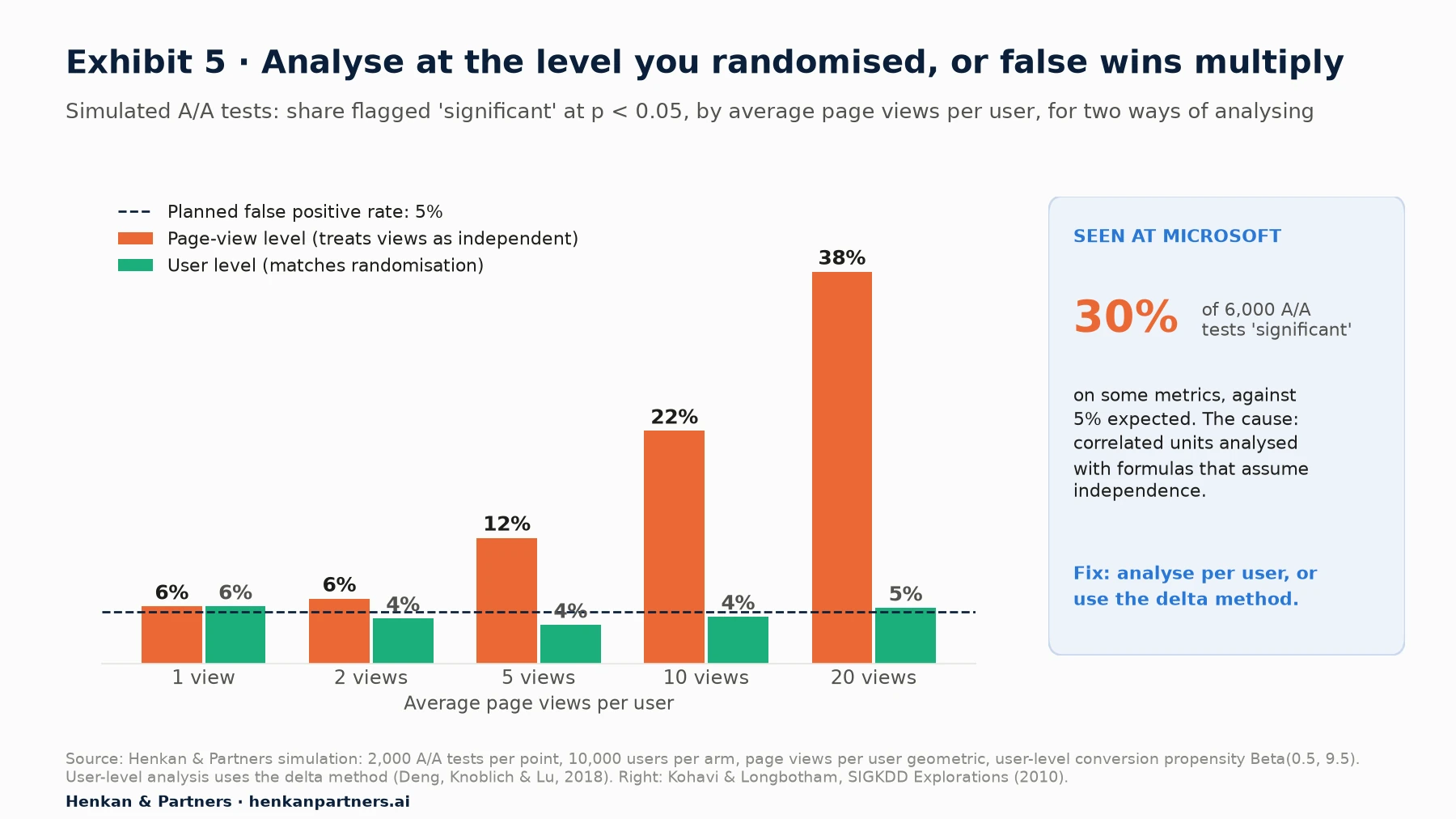
What this shows. When each user has one page view, both methods agree. With five page views per user, the naive page-level analysis flags 12% of A/A tests as significant; with 20, 38%, more than seven times the planned rate. Analysing at the user level, or using the delta method for ratio metrics, keeps the rate close to 5% in every scenario.
The fix is not to avoid session or page-view metrics but to compute their variance correctly. There are two standard approaches:
- Aggregate to the randomisation unit first. Compute each user's conversions and sessions, then compare users. For conversion, 'share of users who bought' is often the simplest and most robust primary metric.
- Use the delta method or a bootstrap for ratio metrics. Deng, Knoblich and Lu (KDD 2018) give a practical guide to the delta method for metrics such as clicks per page view, where the numerator and denominator are both sums over users. Kohavi, Tang and Xu cover the same pitfalls in chapter 18 of their book.
Check which unit your testing tool and analytics tool use by default: a session-level export can disagree with the tool's user-level result for exactly this reason.
Section 9 · Mistake 8 · Revenue outliers
A handful of large orders can decide a revenue test, so cap before you look
Revenue per visitor is the metric most businesses care about and the hardest to test. Most visitors spend nothing and a very few place orders many times the average, so the mean moves a lot when one extreme value lands in one group.
An illustrative calculation shows the scale. With 100,000 visitors per arm and an average order value of about €90 at a 3% conversion rate, revenue per visitor is about €2.70. A single €3,000 order adds €0.03 to its group, about 1.1% of revenue per visitor, or a fifth of a 5% lift you might be trying to detect. Three such orders landing on one side can create or erase a 'significant' result.
Kohavi, Deng, Longbotham and Xu quantify the problem in 'Seven Rules of Thumb for Web Site Experimenters' (KDD 2014). Their rule of thumb for the sample needed before the mean behaves normally is 355 × s² users per variant, where s is the skewness. At Bing, revenue per user had a skewness of 17.9, so about 114,000 users were needed. After capping revenue at $10 per user per week, skewness fell to 5.2, and the capped metric could detect a change 30% smaller. (The conference version printed 18.2 and 5.3; the authors later corrected both figures.)
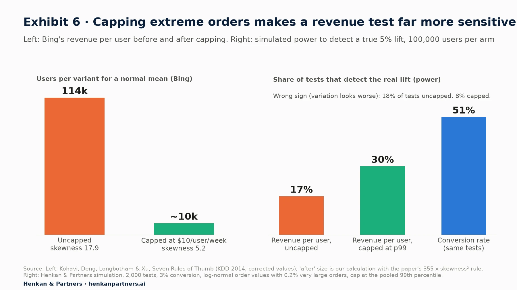
What this shows. Capping cut the sample Bing needed for a well-behaved mean from about 114,000 users to about 10,000, using the paper's own rule. In our simulation of an e-commerce test with a real 5% lift, capping order values at the 99th percentile raised power from 17% to 30% and cut wrong-sign results from 18% to 8%. Conversion rate on the same tests had 51% power: revenue per visitor is a much noisier metric, even when capped.
How to handle outliers without faking a result
- Decide the rule before you see the results, and apply it to both groups identically. Capping at a fixed value or a percentile of the pooled data (both groups together) is safe. Kohavi, Deng and Vermeer cite work by André (2021) showing that removing outliers within each variant separately can push false positive rates as high as 43%.
- Cap rather than delete. Winsorising (replacing values above the cap with the cap) keeps the customer in the sample and keeps the SRM check valid. Deleting users can create a mismatch.
- Check the largest orders separately. B2B buyers, resellers or fraud often explain them.
- Use conversion rate as a companion metric. If revenue per visitor wins and conversion does not move, check whether a few baskets explain the whole difference.
- Consider variance reduction. CUPED, which adjusts for each user's pre-experiment behaviour, reduced variance by about 50% in Bing experiments (Deng, Xu, Kohavi and Walker, WSDM 2013), the equivalent of doubling traffic. Use it where your tool supports it.
Section 10 · Mistake 9 · Simpson's paradox
Changing the traffic split mid-test can reverse the result
Simpson's paradox is the case where a trend that holds in every subgroup reverses when the groups are combined. In A/B testing it appears most often when the allocation changes during the test, for example a ramp from 10% to 50%, and the underlying conversion rate changes at the same time, for example between weekdays and weekends or before and after a campaign.
Kohavi and Longbotham document a real case from Microsoft in 'Unexpected Results in Online Controlled Experiments' (SIGKDD Explorations, 2010). The treatment ran at 1% of users for 26 days, then 5% for a week, then 50% for the last two days. Overall, it was 4% worse than control; yet it was better than control on almost every single day. The last two days fell on a weekend with lower activity, and they contributed a far larger share of the treatment's users than of the control's.
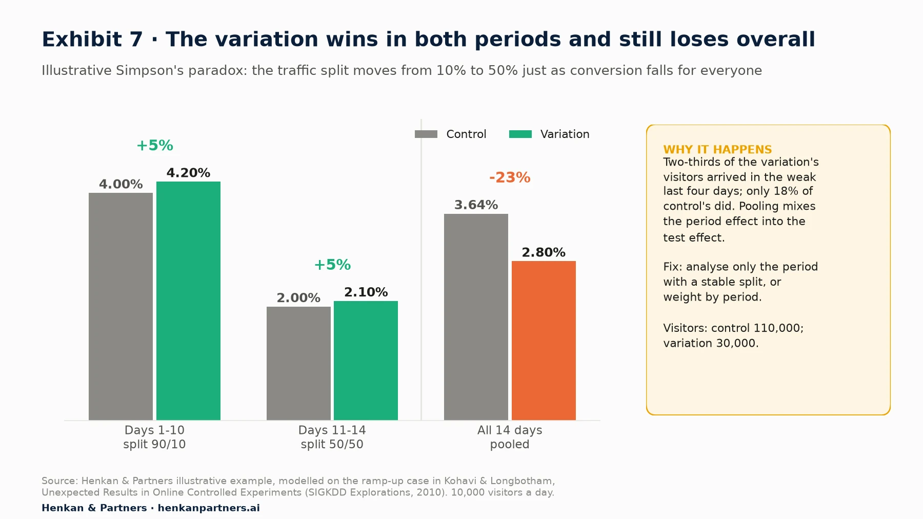
What this shows. In this illustrative example, the variation converts 5% better than control in both periods. Pooled over 14 days, it appears 23% worse, because 20,000 of its 30,000 visitors arrived in the last four days, when conversion was lower for everyone. Control drew only 20,000 of its 110,000 visitors from that period. Nothing about the variation changed; only the mix did.
- Keep allocation constant during the period you analyse. If you ramp, start the analysis window after the ramp is complete. Our QA checklist covers safe ramping.
- If the split did change, analyse by period and combine the period estimates with weights, rather than pooling raw totals.
- Apply the same logic to segments. When device or traffic-source mix differs between groups, a pooled comparison can mislead in the same way. That is one more reason to check the sample ratio by segment.
Concurrent tests rarely distort each other
Teams often worry about the opposite kind of mixing: two tests running at the same time on overlapping users. The evidence suggests this worry is usually overdone. Microsoft's Experimentation Platform examined hundreds of thousands of pairs of concurrent A/B tests across four major products. Three products showed no detected interactions at all; the fourth found interactions in 0.002% of test-pair metrics, about 1 in 50,000, and none with significant effects in opposite directions. The authors conclude that interactions are real but rare, and that people 'often worry more than they need to'.
Isolate tests only when the changes plausibly interact, such as two tests on the same component (their example is red text on a red background). Otherwise, running tests in parallel is the better trade-off.
Section 11 · Mistake 10 · Twyman's law
If a result looks too good, look for the bug before the celebration
Twyman's law, as Kohavi and colleagues quote it, states that 'any figure that looks interesting or different is usually wrong'. It is one of the most useful rules in experiment analysis because it points your effort where errors are most likely: at the surprising results that are about to be celebrated, shared and rolled out. The same authors note in 'Seven Rules of Thumb' that most changes fail, and those that succeed typically improve key metrics by 0.1% to 1.0% on the large sites they studied. A 20% lift from a button colour is far more likely to be a measurement artefact than a breakthrough.
Their 'Five Puzzling Outcomes' paper gives two classic examples of results that were real in the data and false in meaning:
- A bug that 'improved' the business. A ranking bug in a Bing experiment showed users very poor search results. Distinct queries per user went up over 10% and revenue per user over 30%, because users had to search more to find what they wanted. By the chosen metrics the bug was a huge win. The lesson was that the metric, not the change, was wrong; the paper recommends measures such as sessions per user, which reward satisfied users coming back.
- Tracking that changed with the variation. Adding JavaScript that ran when users clicked a link slowed the experience slightly, yet the experiment showed users clicking more. The explanation lay in how browsers handle tracking requests when a user navigates away: the variation captured clicks that the control's tracking lost. The 'lift' was in the measurement, not in behaviour.
E-commerce equivalents are common in the programmes we audit: a purchase event that fires twice in one variation, an add-to-basket button moved inside a component the tracking does not see, or a banner that links to a page counted as a conversion goal.
The Twyman's law checklist for any surprising result
- Re-run the SRM check on the analysed population.
- Check the event counts per user, not just rates. A jump in events per converting user points to double-firing.
- Compare with a second data source, for example orders in the back office against conversions in the testing tool.
- Look at the guardrails. A real improvement rarely comes with a collapse in another metric.
- Check the size against history. If the lift is larger than anything in your test repository, it needs more evidence, not less.
- Replicate before the roll-out when the result would change a major decision.
For leaders. Celebrate the analyst who finds the bug in the big win as much as the team that produced the win. A culture that punishes disappointing re-analysis will stop getting it. Our article on building an experimentation culture covers how to make honest results safe to report.
Section 12 · What to do next
What to do next
1. Write a one-page analysis plan for every test
Before launch, write down the primary metric, guardrails, analysis unit, outlier rule, pre-registered segments, sample size, power and stopping rule. It removes mistakes 2, 3, 4, 7 and 8 at source. Our complete guide to A/B testing includes the planning basics.
2. Audit your last ten wins against this list
Check your ten most recent reported winners against Table 1: stopped early, underpowered, metric different from the plan, unbalanced split, uncapped revenue? In our experience, this usually changes the team's view of its own win rate.
3. Change the result template
Replace 'winner at 95% confidence' with the effect and its interval, the false positive risk at your programme's success rate, the SRM result and the power at the planned sample size. When the template asks for these, people start to plan for them.
4. Run A/A tests on your own set-up
An A/A test, with identical experiences in both groups, checks that your set-up produces about 5% significant results when nothing changes. Run a batch, or simulate them on historical data, for each primary metric. A metric that comes out significant far more often has a unit-of-analysis or tracking problem.
5. Replicate the wins that matter, and keep a repository
Re-test the few results that drive large decisions, and record every test, including losses, in a searchable repository. Over time it gives you your own success rate, the number you need to judge the false positive risk of future wins.
6. Get an independent review of your results
Henkan & Partners audits experimentation programmes and re-analyses test results for e-commerce teams, from power and SRM checks to revenue metric design. Disclosure: Henkan & Partners is a Kameleoon Platinum partner and works with several of the testing tools mentioned in this article. If you want a second opinion on a result, or on how your team reads results, talk to us.
FAQ
Frequently asked questions about A/B testing mistakes
Frequently asked questions
What are A/B testing mistakes, and which are the most common?
A/B testing mistakes are errors that make a result look real, larger or more certain than it is. The most damaging are reading p < 0.05 as a 95% chance to win, stopping early, underpowered tests, metric and segment fishing, ignoring a sample ratio mismatch, novelty effects, the wrong unit of analysis, uncapped revenue metrics, a split changed mid-test and believing results that are too good to be true.
Does a 95% confidence level mean a 95% chance the variation is better?
No. The p-value is the probability of seeing a difference this large if there were no real difference. The chance that a significant result is false depends on how often your ideas work. Kohavi, Deng and Vermeer (KDD 2022) estimate that at a 10% success rate, 22% of significant results are false positives.
What is the winner's curse in A/B testing?
The winner's curse is the tendency of winning tests to overstate the true effect. In low-powered tests, only estimates that happen to be much larger than the truth reach significance. In our simulation, a test with 20% power that wins overstates a true 5% lift by a factor of about 2.25; at 80% power the exaggeration is about 12%.
Why does my A/B test lift disappear after roll-out?
The usual causes are the winner's curse and regression to the mean, early stopping, novelty effects that fade, a result tied to a period such as a promotion, or a tracking artefact that changed counting rather than behaviour.
Is it wrong to look at segments after an A/B test?
Looking is fine; deciding on them is the mistake. With 20 independent comparisons and no real effect, there is a 64% chance that at least one looks significant. Pre-register the segments you care about, and treat any unplanned segment win as a hypothesis for a new, targeted test.
What is a sample ratio mismatch and why does it matter?
A sample ratio mismatch (SRM) is when the observed split between variations differs from the configured split by more than chance allows. It affected about 6% of experiments at Microsoft and, according to Fabijan et al. (KDD 2019), in most cases completely invalidates the result, because the groups are no longer comparable.
How should I handle outliers in a revenue A/B test?
Decide the rule before looking at results and apply it to both groups: cap order values or revenue per user at a fixed value or a percentile of the pooled data. At Bing, capping revenue per user cut skewness from 17.9 to 5.2. Never remove outliers separately within each variant, which can inflate false positives dramatically.
Do concurrent A/B tests interfere with each other?
Rarely. Microsoft examined hundreds of thousands of pairs of concurrent tests across four products and found interactions in at most 0.002% of test-pair metrics. Isolate tests only when the changes plausibly interact, for example two tests on the same page component.
What is Simpson's paradox in A/B testing?
It is when a variation wins in every period or segment but loses when the data is pooled. It typically happens when the traffic allocation changes during the test while the underlying conversion rate also changes, for example a ramp to 50% that coincides with a weekend. Analyse the period with a stable split, or weight results by period.
Can AI help avoid A/B testing mistakes?
Yes, if it checks results against a written plan: AI assistants connected to testing tools can run SRM checks, power calculations and segment scans quickly. They are risky when asked open questions such as 'why did this win?', because they will produce a convincing explanation for noise. Keep the calculations in code and the decision with a person.
Key terms
- p-value
- The probability of seeing a difference at least as large as the one observed if there were no real difference. It matters because it is often misread as the probability that the variation wins, which it is not.
- False positive risk (FPR)
- The share of statistically significant results that are in fact false. It depends on the significance level, power and how often tested ideas work, and it tells you how much to trust a 'win'.
- Statistical power
- The probability that a test detects an effect of a given size if it exists. Low power means missed winners and, worse, exaggerated estimates for the winners you do find.
- Winner's curse
- The systematic overestimation of effects among tests selected because they won. It explains why lifts shrink on re-test and roll-out.
- Type M and Type S errors
- Gelman and Carlin's names for the exaggeration of a significant estimate (magnitude) and the chance it has the wrong sign. They matter most for tests below 50% power.
- Peeking
- Checking a fixed-horizon test repeatedly and stopping when it looks significant. It raises the false positive rate and inflates the reported lift.
- Sequential testing
- A family of methods designed to allow repeated looks while controlling the error rate. It is the correct alternative when a team needs to monitor results continuously.
- Multiple comparisons
- Testing many metrics or segments at once, each with its own chance of a false positive. Without a correction, a 'finding' becomes almost certain.
- Sample ratio mismatch (SRM)
- An observed split between variations that differs from the configured split more than chance allows. It signals that the groups are not comparable and usually invalidates the result.
- Novelty and primacy effects
- Changes in the treatment effect over time: novelty fades as users get used to something new; primacy grows as users learn. Both make short-term results unreliable for long-term decisions.
- Unit of analysis
- The level at which a metric is computed (user, session, page view). When it differs from the randomisation unit, standard formulas understate variance and inflate false positives.
- Delta method
- A statistical technique for computing the variance of ratio metrics, such as clicks per page view, when users are randomised. It keeps error rates correct without aggregating everything to users.
- Capping (winsorising)
- Replacing values above a threshold with the threshold. For revenue metrics it sharply reduces variance and makes tests more sensitive, provided the rule is set before looking.
- Simpson's paradox
- A trend that appears in every subgroup but reverses when groups are combined. In A/B tests it is usually caused by a traffic split that changes while conversion rates also change.
- Twyman's law
- The principle that any figure that looks interesting or different is usually wrong. It directs analysts to look for bugs in surprising results before acting on them.
Sources
All sources were checked in September 2026. Figures attributed to Microsoft, Bing, LinkedIn, Google, Etsy and Airbnb come from papers and posts by their own researchers. Georgiev's 1,001-test analysis is based on tests run by users of Analytics-Toolkit, a commercial tool he develops, and should be read as vendor data. Exhibits 3 (left), 4, 5 (left) and 6 (right) are Henkan & Partners simulations run in Python with fixed random seeds; Exhibit 7 is an illustrative example; Exhibit 1 and Table 1 are Henkan & Partners frameworks.
- Kohavi, R., Deng, A. & Vermeer, L. (2022). A/B Testing Intuition Busters: Common Misunderstandings in Online Controlled Experiments. KDD 2022.
- Kohavi, R., Tang, D. & Xu, Y. (2020). Trustworthy Online Controlled Experiments: A Practical Guide to A/B Testing. Cambridge University Press (ch. 3, 17, 18, 21 and 23).
- Kohavi, R., Deng, A., Frasca, B., Longbotham, R., Walker, T. & Xu, Y. (2012). Trustworthy Online Controlled Experiments: Five Puzzling Outcomes Explained. KDD 2012.
- Kohavi, R., Deng, A., Longbotham, R. & Xu, Y. (2014). Seven Rules of Thumb for Web Site Experimenters. KDD 2014.
- Kohavi, R. & Longbotham, R. (2010). Unexpected Results in Online Controlled Experiments. SIGKDD Explorations 12(2).
- Fabijan, A., Gupchup, J., Gupta, S., Omhover, J., Qin, W., Vermeer, L. & Dmitriev, P. (2019). Diagnosing Sample Ratio Mismatch in Online Controlled Experiments: A Taxonomy and Rules of Thumb for Practitioners. KDD 2019.
- Gelman, A. & Carlin, J. (2014). Beyond Power Calculations: Assessing Type S (Sign) and Type M (Magnitude) Errors. Perspectives on Psychological Science 9(6).
- Deng, A., Knoblich, U. & Lu, J. (2018). Applying the Delta Method in Metric Analytics: A Practical Guide with Novel Ideas. KDD 2018.
- Sadeghi, S., Gupta, S., Gramatovici, S., Lu, J., Ai, H. & Zhang, R. (2022). Novelty and Primacy: A Long-Term Estimator for Online Experiments. Technometrics 64(4).
- Hohnhold, H., O'Brien, D. & Tang, D. (2015). Focus on the Long-Term: It's Better for Users and Business. KDD 2015.
- Jeng, M. / Microsoft Experimentation Platform (2023). A/B Interactions: A Call to Relax. Microsoft Research.
- Johari, R., Koomen, P., Pekelis, L. & Walsh, D. (2017). Peeking at A/B Tests: Why it matters, and what to do about it. KDD 2017.
- Lee, M. & Shen, M. (2018). Winner's Curse: Bias Estimation for Total Effects of Features in Online Controlled Experiments. KDD 2018.
- Shao, S. / Etsy (2022). Mitigating the winner's curse in online experiments. Etsy Code as Craft.
- Tingley, M. et al. / Netflix (2021). Interpreting A/B test results: false positives and statistical significance. Netflix Technology Blog.
- Deng, A., Xu, Y., Kohavi, R. & Walker, T. (2013). Improving the Sensitivity of Online Controlled Experiments by Utilizing Pre-Experiment Data. WSDM 2013.
- Georgiev, G. (2022). What can be learned from 1,001 A/B tests? Analytics-Toolkit.com (vendor data).
- Kameleoon (n.d.). Sample ratio mismatch; Eppo (n.d.). Sample Ratio Mismatch; Optimizely (n.d.). Optimizely's automatic sample ratio mismatch detection (vendor documentation).
- Henkan & Partners (2026). Simulations of the winner's curse, early stopping, unit of analysis and revenue capping (numpy, fixed seeds), and the illustrative Simpson's paradox and single-order calculations in this article.