Focus
On-Site Survey Design: How to Build Website Surveys People Answer
Alexandre Suon · 2026-09-28
An on-site survey is the fastest way to learn why visitors hesitate, leave or buy, but only if it asks the right question, of the right people, at the right moment. This deep dive covers the six types of website survey, how to trigger and target them, how to write questions that survey research shows people answer honestly, 20 survey question examples for e-commerce, and how many answers you need before you act.
Executive summary
- Choose the survey type from the decision, not the tool. Page-level intercepts, exit-intent surveys, in-checkout micro-surveys, thank-you page surveys, feedback tabs and email follow-ups each answer a different question. Most teams need two or three of them, not all six.
- Trigger on behaviour, not on arrival, and keep pop-ups out of payment steps. In Survicate's 2025 benchmark of 3,029 pop-up surveys (vendor data), surveys triggered by a visitor action had a median response rate of 11.7%, against 3.8% for exit intent. Exit intent still matters, but on most tools it only works on desktop.
- Write for respondents who take shortcuts. Survey research calls this satisficing: when a question is hard or the respondent is busy, people pick the first reasonable answer or simply agree. Across 10 studies, 52% agreed with a statement while only 42% disagreed with its opposite. Neutral, item-specific, one-idea questions reduce the bias.
- Keep it to two or three questions. In Survicate's 2025 data (vendor data), 2–3-question surveys had a median completion rate of 86.8%, against 77.4% for 4–6 questions. One closed question to count and one open question to understand is the workhorse design.
- Size the sample before launch. With 100 answers a percentage can move about ±10 points by chance; with 400, about ±5. Divide your target number of answers by your expected response rate to know how many displays, and how many days, you need.
- Link every answer to behaviour, lawfully. Pass a survey and answer code to your analytics as an event, never the free text, and plan for consent: survey scripts that store identifiers are not among the CNIL's consent-exempt trackers. Then analyse open answers with a validated workflow and turn the top themes into A/B tests.
Section 1 · The basics
An on-site survey is only as good as the moment it interrupts
An on-site survey (also called a website survey or web intercept) is a short questionnaire shown to visitors while they use a website or app, triggered by the page they are on, an action they take or a moment in their journey, such as leaving the cart or completing an order. Its purpose is to capture the reason behind a behaviour while the experience is still fresh.
On-site surveys sit in a useful gap. Analytics tells you where people drop off; session replay shows how they struggled; an on-site survey asks why, in the visitor's own words, seconds after it happened. Our Essential Guide to Voice of Customer explains where surveys fit among reviews, tickets and interviews, and why VoC is the missing layer in most optimisation programmes. This deep dive is the practical manual: which survey to run, when to show it, how to word it and how many answers to wait for.
Every question is a small trade with the visitor
Don Dillman's Tailored Design Method, the standard reference on self-administered surveys, rests on social exchange theory: people respond when the survey reduces their costs, increases the benefits of answering and builds trust that the benefits outweigh the costs. On a website the costs are sharp. The visitor came to buy, compare or find something, and your survey stands in the way. That leads to three design rules we apply to every on-site survey:
- Lower the cost. One tap to start, two or three questions, no required open text, easy to close.
- Raise the benefit. Ask at a moment when the question makes sense to the visitor ("Did you find what you were looking for?" right after a search), and say in one line how answers are used.
- Build trust. Show who is asking, never ask for identity or contact details you do not need, and link to your privacy notice.
Tired or busy respondents take shortcuts, and the design decides how many
Jon Krosnick's theory of satisficing (1991) explains much of the bad data that surveys produce. Answering a question well takes four steps: understand it, search memory, form a judgement and map it onto the answer options. When a question is hard, or motivation is low, people do those steps less carefully ("weak satisficing") or skip retrieval and judgement altogether and pick an answer that merely looks reasonable ("strong satisficing"). Krosnick and Presser name three drivers: task difficulty, respondent ability and respondent motivation. An on-site survey controls only the first, and it strongly affects the third. Section 4 turns that into writing rules.
For marketers. Before you write a single question, write one sentence: "We will use the answers to decide ___ by ___ (date)." If you cannot fill the blanks, do not launch the survey.
For leaders. Judge a survey programme by the decisions it changes, not by the number of responses. A 400-answer exit survey that reorders the test roadmap is worth more than 40,000 unread NPS scores.
Section 2 · Survey types
Six survey types each answer a different question, so pick by the decision you need to make
The word "survey" hides very different tools. A pop-up on a product page, a question on the order confirmation page and an email three days after delivery reach different people, in different states of mind, with different response rates. The table below maps each type to the question it answers best and the traps to avoid.
| Survey type | Where and when | Question it answers best | Typical format | Watch out for |
|---|---|---|---|---|
| Page-level intercept | Landing, category, product or search page, after time, scroll or an action | What are visitors trying to do, and what is missing on this page? | Slide-in or corner widget, 1–3 questions | Showing it on arrival; asking before the visitor has formed a view |
| Exit-intent survey | When the cursor moves to leave the page, typically cart or product page | Why are people leaving without buying? | Pop-up or slide-in, 1–2 closed questions plus optional open text | Desktop only on most tools; low response by design |
| In-checkout micro-survey | Inline on a checkout step, never as an overlay | Is anything unclear or worrying on this step? | One Yes/No question, open text only if Yes | Any pop-up on payment steps; slowing the checkout |
| Thank-you page (post-purchase) survey | Order confirmation page, immediately after purchase | What nearly stopped buyers, why they chose you, how they heard of you | Embedded, 1–3 questions, attribution list | Only reaches buyers; recall bias on attribution |
| Feedback tab | Always-on button on every page; visitor chooses to open it | What is broken or frustrating right now? | Side tab, category plus open text | Self-selected, skews to problems; not a measure of prevalence |
| Email follow-up | 3–10 days after delivery or a service contact | Did the product, delivery or return meet expectations? | Link survey, CSAT or effort score plus open reason | Different audience from on-site; slower feedback loop |
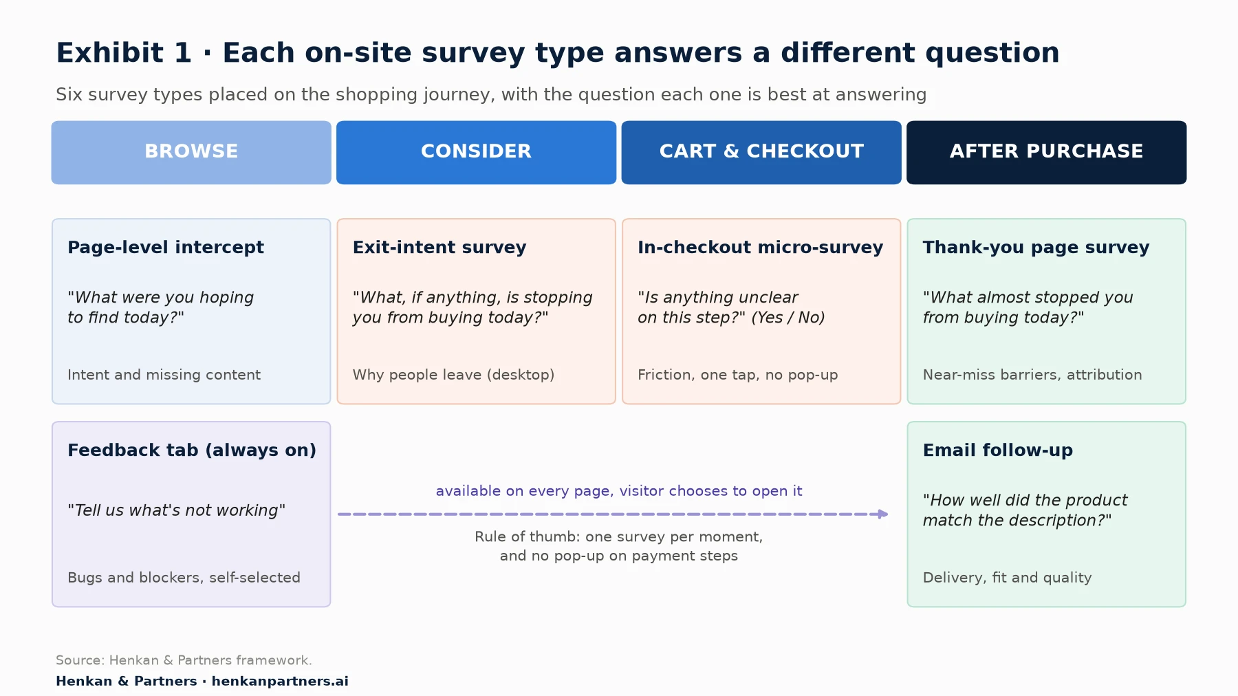
What this shows. Each moment in the journey supports a different question. Early in the visit you can ask about intent and missing content; at the cart you can ask about barriers; after the purchase you can ask what almost stopped the buyer. The feedback tab runs across the whole journey but only hears from people who choose to speak, so treat it as a bug and blocker detector, not a measure of how common a problem is.
Which two to start with
If you run nothing today, start with a thank-you page survey and a cart exit survey. The first reaches motivated buyers and tells you what nearly stopped them; the second reaches people who did not buy. Comparing the two is one of the fastest ways to separate real barriers from noise: a reason that appears among leavers but rarely among buyers is a stronger test candidate than one that appears in both. Add page-level intercepts when you are working on a specific page, and an email follow-up when post-purchase experience (delivery, fit, returns) is the issue.
Section 3 · Triggers and targeting
Trigger on behaviour, not on arrival, and never interrupt the checkout
Targeting decides who sees the survey; the trigger decides when. Together they decide both your response rate and whether the answers mean anything. A survey shown to everyone on page load mixes people who have not yet formed a view with people who have, and it interrupts the task of all of them.
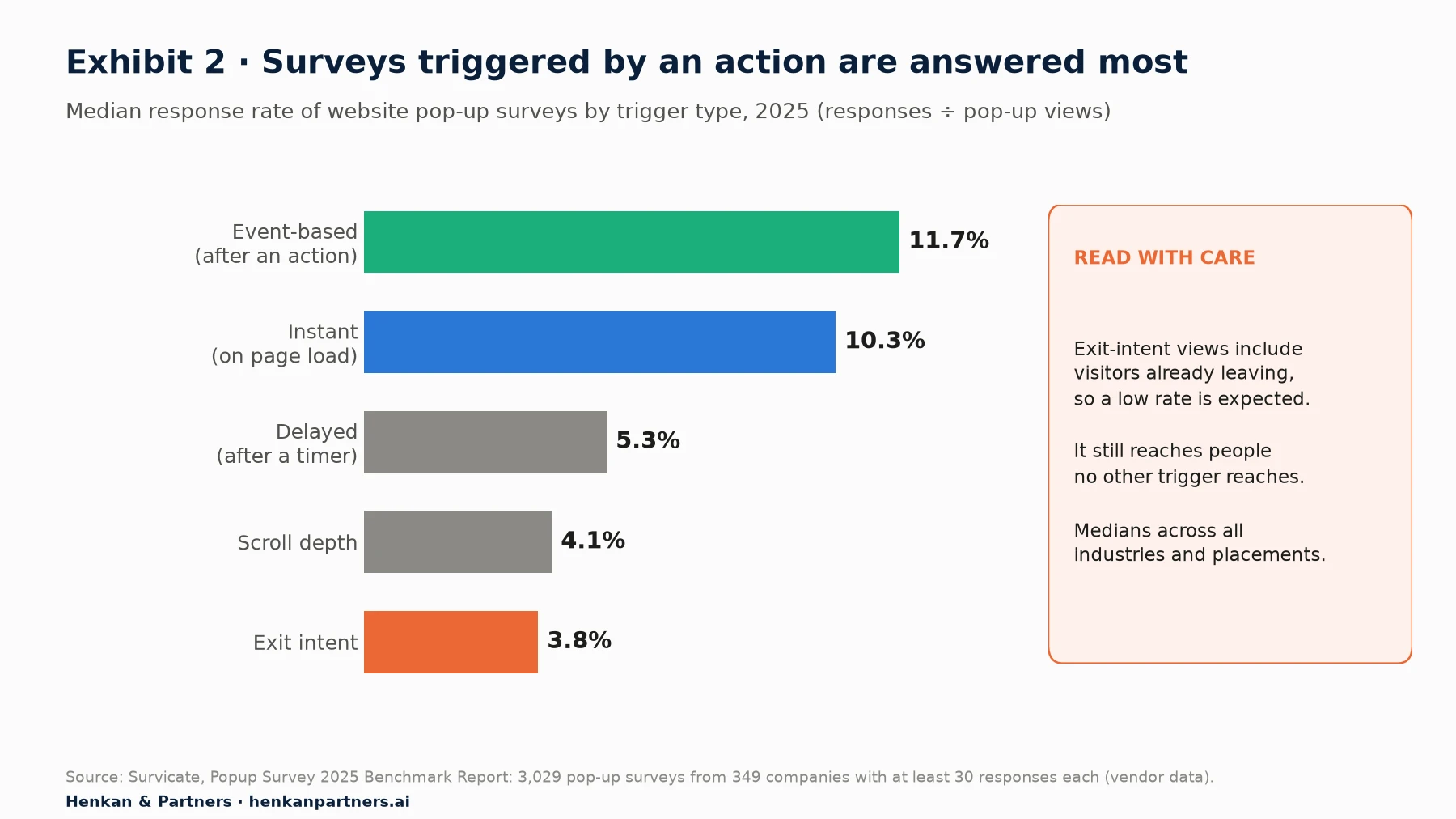
What this shows. Surveys triggered by something the visitor did were answered about three times as often as exit-intent surveys. Part of the gap is mechanical: exit-intent views are counted for people who are already leaving. The lesson is not to drop exit intent, which is the only way to reach some leavers, but to expect low rates from it and to use event triggers wherever a clear event exists.
The five trigger families
- Page (URL) rules. Show the survey on pages that match a rule, such as all product pages or the cart. Hotjar, for example, supports exact, starts-with, contains and regular-expression matches. Use page rules to define where, then add a behavioural trigger to define when.
- Events. Fire the survey from your own code when something happens: a search with zero results, a failed promo code, a size-guide opened twice, a return to the cart after viewing delivery costs. Hotjar and Survicate both support event-based triggers. Events give the most relevant questions and, in Survicate's data, the highest response.
- Time on page. A delay (for example 20–30 seconds on a product page) filters out bounces. It is a blunt proxy for engagement; prefer an event if you have one.
- Scroll depth. Useful on long content or category pages, where scrolling past a point shows interest. Median response was 4.1% in Survicate's data, lower than events.
- Exit intent. Detects the cursor moving towards the top of the window. Survicate's documentation states that its exit-intent surveys "only work on web browsers that are opened on desktop and laptop devices"; mobile visitors never see them. Typeform's embed library offers the same trigger with an adjustable sensitivity. On mobile, use events such as inactivity or scrolling back up instead.
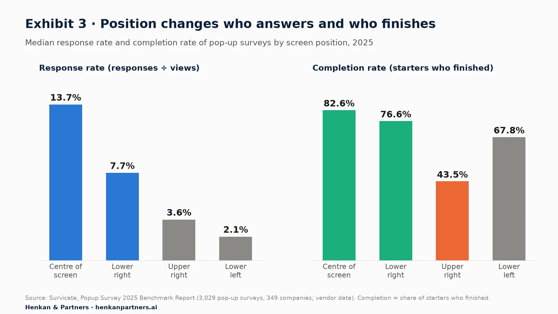
What this shows. Centred surveys got the most responses and the best completion, but they are also the most intrusive, and Google's guidance warns against dialogs that obscure the page. Lower-right slide-ins are the practical default: half the response of a centred pop-up, good completion and far less disruption. Upper-right placements had a completion rate of only 43.5%, so avoid them for multi-question surveys.
Targeting: who should, and should not, see the survey
- Device. Build separate desktop and mobile versions. Triggers, layout and even questions may differ, and you want to report them separately.
- Segment. Target by new versus returning visitors, logged-in status, traffic source, cart value or country when the question only makes sense for one group. Most tools accept custom attributes; Hotjar documents user-attribute targeting.
- Exclusions. Exclude people who already answered, recent buyers from barrier questions, staff and internal IP ranges, and visitors in an A/B test cell unless you deliberately survey both cells equally (Section 9).
- Checkout. Never show an overlay on shipping or payment steps. If you must ask during checkout, use an inline, one-question micro-survey that does not block the form.
Sampling and frequency capping protect both the visitor and the data
You rarely need to show a survey to every eligible visitor. Sampling shows it to a random share, which spreads the burden, reduces annoyance and still collects enough answers. Frequency capping limits how often one person sees any survey. Qualtrics, for instance, lets intercepts check whether a survey "has already been displayed to website visitors recently", and its XM Directory adds contact frequency rules for signed-in visitors. Set the sampling rate from the number of answers you need:
Displays needed = target answers ÷ expected response rate
Sampling rate = displays needed ÷ eligible visitors in the collection window

Example: 400 answers ÷ 3.8% (exit intent) ≈ 10,530 displays
With 30,000 eligible cart exits in two weeks: sampling rate ≈ 35%
Our default rules, which we adjust per site: one survey per visitor per session; no more than one survey display per person every 30 days across all surveys; never two surveys on the same page; and a global owner who sees every live survey on one calendar, so teams do not stack them.
Our view. The best trigger is a specific event that makes the question obvious to the visitor. "Did you find what you were looking for?" after two searches in a row needs no explanation. "How would you rate our website?" on arrival does.
Section 4 · Question writing
How to write survey questions: make the honest answer the easiest one to give
Most advice on how to write survey questions is common sense. The research behind it is less well known and more useful, because it tells you which rules matter most. In their chapter on question and questionnaire design in the Handbook of Survey Research (2010), Krosnick and Presser summarise decades of experiments into eight conventional rules: use simple, familiar words; use simple syntax; avoid ambiguous words; be specific and concrete; make options exhaustive and mutually exclusive; avoid leading or loaded questions; ask about one thing at a time; and avoid single or double negatives. The evidence below shows why they matter.
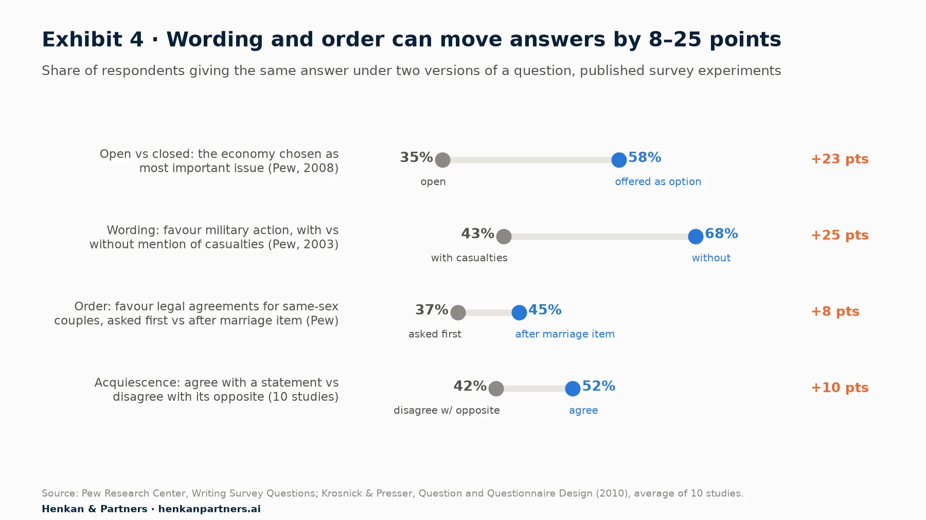
What this shows. The same people give different answers when the options, a few words or the preceding question change. None of these gaps is small: the smallest is 8 points and the largest 25. If a few words can shift a political poll that much, a leading question on your cart page certainly can. Treat wording as part of the measurement, and keep it fixed when you compare periods or segments.
Replace agree/disagree statements with item-specific questions
Agree/disagree (A/D) scales are everywhere in website surveys ("The product information was helpful: strongly disagree to strongly agree"). They invite acquiescence, the tendency to agree regardless of content. Krosnick and Presser report that across 10 studies, 52% of people agreed with an assertion while only 42% disagreed with its opposite. A randomised multitrait-multimethod study by Saris, Revilla, Krosnick and Shaeffer (2010) found that answers to A/D questions "had much lower quality" than answers to comparable item-specific questions, which name the dimension being rated. Pew adds that the bias is stronger among less educated and less informed respondents.
So ask "How helpful was the product information?" with options from Not at all helpful to Extremely helpful, not "The product information was helpful: agree or disagree?" The same applies to yes/no and true/false versions of opinions.
Use closed questions to count and open questions to discover
Closed and open questions produce different distributions, not just different formats. In a 2008 Pew experiment, 58% chose the economy as the most important issue when it was offered as an option, against 35% who volunteered it unprompted; and 43% of open-ended respondents gave answers not on the closed list, against 8% who added an unlisted answer when options were offered. In practice:
- Start open when you do not know the answer space. Run an open question for the first 100–200 answers, code them, then build the closed list from what people actually said. Our guide to analysing open-ended answers with LLMs covers the coding step.
- Switch to closed once the list is stable, and keep "Other (please specify)" to catch new reasons. Closed questions are faster to answer, easier to track over time and easier to join to analytics.
- Use open questions for quantities. Krosnick and Presser note that open questions are usually preferable for numbers ("How many times have you ordered from us in the last 12 months?"), because ranges can be misread.
- Keep one optional open question. It is where unexpected reasons appear. Make it optional; a required text box is a common cause of abandonment.
Control order: general before specific, and randomise option lists
Order matters twice. Question order: an earlier question changes how later ones are read. Pew found support for legal agreements for same-sex couples was 45% when asked after a question on marriage, against 37% without it. Krosnick and Presser recommend moving from general to specific within a topic and starting with easy questions. For an exit survey, ask the broad closed question (the main barrier) before any specific one (delivery cost), or you will prime the answer.
Response order: in self-administered surveys people tend to pick options near the top of a list (a primacy effect). Malhotra (2008) found that low-education respondents who completed a web survey most quickly were the most prone to primacy effects on rating scales, a direct sign of satisficing. Randomise the order of unordered lists (reasons, channels, features), keep "Other" and "Nothing" fixed at the bottom, and never randomise ordered scales.
Scales, 'don't know' and 'nothing'
- Label every point. Reliability is higher when all scale points are labelled with words rather than only the ends.
- Choose the length for the screen. Krosnick and Presser suggest 7 points are probably optimal in many cases; on a phone, a fully labelled 5-point scale is a pragmatic compromise (our view). Avoid unlabelled 0–10 grids except for NPS, where the standard format is part of the benchmark.
- Do not add a 'don't know' reflexively. Research reviewed by Krosnick and Presser found that "DK filters do not improve measurement" and can invite satisficing. What you do need, for exhaustive lists, is "Nothing" (for barrier questions) and "Other".
- Ask about the past, not the future. "What almost stopped you?" measures an experience; "Would you buy more if…?" asks for a prediction people are poor at making.
| Instead of this | Ask this | Why |
|---|---|---|
| "How much did you love our new checkout?" | "How easy or difficult was it to complete your order today?" (5 labelled points) | Leading wording assumes the answer |
| "Was delivery fast and affordable?" | Two questions: speed, then cost; or "What, if anything, concerned you about delivery?" | Double-barrelled: a "No" cannot be interpreted |
| "The product information was helpful." Agree / Disagree | "How helpful was the product information?" Not at all … Extremely | Agree/disagree invites acquiescence; item-specific is more reliable |
| "Would you buy more if we offered free returns?" | "What almost stopped you from buying today?" (options incl. returns) | Hypothetical; people predict their behaviour poorly |
| "How was the PDP UX?" | "How easy was it to find the information you needed on this page?" | Jargon; visitors do not speak your team's language |
| "Why didn't you buy?" Price / Shipping | "What, if anything, is stopping you from checking out today?" 7 options + Other + Nothing | Accusatory; list not exhaustive |
| "Do you shop with us regularly?" | "How many orders have you placed with us in the last 12 months?" (number) | Vague quantifier; open numbers are clearer |
| "Don't you think our returns policy isn't unclear?" | "How clear or unclear is our returns policy?" | Double negative and leading |
| "Which device are you using?" | Do not ask: capture it automatically | Every question has a cost; never ask what you already know |
| "Rate our website 1–10" (on arrival) | After an action: "Did you find what you were looking for today?" Yes / No, then "What were you looking for?" | Vague, too early and not actionable |
For marketers. Pilot every new survey with five people, reading the questions aloud to them, and read the first 30 live answers before you let it run. Confused answers ("?", "what do you mean", answers to a different question) show up immediately.
Section 5 · Question library
Twenty survey question examples cover most e-commerce decisions
The library below is the starting set we use with e-commerce clients. Each question is written to the rules in Section 4. Adapt the options to your category, keep the wording stable once live, and never run more than three at once in the same survey. Questions marked "closed" need an exhaustive, randomised option list with "Other" (and "Nothing" where relevant) at the bottom.
| Goal | Question | Format | Where and when |
|---|---|---|---|
| Visit intent | "Which best describes your visit today?" | Closed: just browsing, comparing options, planning to buy today, buying for someone else, other | Home or category page after 20–30 s; cart exit |
| Visit intent | "What brings you to [brand] today?" | Open (first 200 answers), then closed | Landing pages from paid campaigns |
| Findability | "Did you find what you were looking for?" | Yes / No / Still looking | After 2+ searches or a zero-result search |
| Findability | "What were you hoping to find?" | Open, optional | Follow-up to a No |
| Content gaps | "Is anything missing from this page that you need to decide?" | Yes / No, then open | Product page after 30–60 s or second visit |
| Content gaps | "What question do you have that this page doesn't answer?" | Open, optional | Product page, event: size guide or reviews opened |
| Fit confidence | "How confident are you about which size to choose?" | 5 labelled points, not at all to completely | Apparel or footwear product page after size selector interaction |
| Barriers | "What, if anything, is stopping you from checking out today?" | Closed, randomised: delivery cost, delivery time, total price, returns, payment options, trust, still deciding, other, nothing | Cart exit intent (desktop), cart inactivity (mobile) |
| Barriers | "What would have helped you decide?" | Open, optional | Follow-up if a barrier was chosen |
| Competition | "Where else are you considering buying this?" | Closed list of competitors + other, or open | Cart or product page exit |
| Checkout friction | "Is anything unclear or worrying on this step?" | Yes / No inline, open if Yes | Inline on shipping step; never a pop-up |
| Checkout effort | "How easy or difficult was it to complete your order?" | 5 labelled points | Thank-you page |
| Near-miss barriers | "What almost stopped you from buying today?" | Closed, same list as cart barriers + nothing | Thank-you page |
| Choice drivers | "What made you choose [brand] over other options?" | Open, optional | Thank-you page, after a closed question |
| Attribution | "How did you first hear about us?" | Closed, randomised channels + other; follow-up for social platform | Thank-you page, first-time buyers |
| Purchase context | "Who is this order for?" | Myself / a gift / someone else in my household | Thank-you page |
| Use case | "What will you mainly use this for?" | Open, then closed | Thank-you page or delivery email |
| Product match | "How well did the product match its description and photos?" | 5 labelled points + optional reason | Email 3–7 days after delivery |
| Delivery | "How satisfied are you with the delivery of your order?" | 5 labelled points (CSAT) + "What's the main reason for your score?" | Email after delivery |
| Bugs and blockers | "What's not working on this page?" | Category + open text + optional screenshot | Feedback tab, all pages |
A note on 'How did you hear about us?'
Post-purchase attribution surveys have become popular because they capture channels that tracking misses: podcasts, word of mouth, creators, offline. Tools such as Fairing and KnoCommerce are built around this question, with follow-ups such as asking which social platform after "Social media". Treat the answers as a view of memory, not a measurement of the last click. People remember the most salient touchpoint, and "first hear" and "what made you buy today" are different questions. Randomise the channel list, ask it only of first-time buyers, and compare it with your analytics attribution rather than replacing one with the other.
NPS, CSAT and CES placement: match the metric to the moment
Three standard metrics appear in most survey programmes, and each belongs at a different point. Net Promoter Score (NPS) asks "How likely are you to recommend us to a friend or colleague?" on a 0–10 scale; Bain defines promoters as 9–10, passives as 7–8 and detractors as 0–6, and the score as the percentage of promoters minus the percentage of detractors. It grew out of Fred Reichheld's 2003 Harvard Business Review article on the recommendation question. Customer satisfaction (CSAT) asks how satisfied someone is with a specific interaction. Customer Effort Score (CES) asks how easy it was to get something done; Dixon, Freeman and Toman introduced it in Harvard Business Review in 2010, drawing on a study of more than 75,000 people who contacted service centres or used self-service, and reported that it predicted loyalty better than satisfaction or NPS in that service context.
| Metric | Question (example) | Scale | Best placement | Avoid |
|---|---|---|---|---|
| NPS | "How likely are you to recommend us to a friend or colleague?" | 0–10, standard format | Email or logged-in account area, on a fixed schedule; relationship view of the brand | Exit pop-ups and anonymous page intercepts: the visitor has no relationship to rate yet |
| CSAT | "How satisfied are you with the delivery of your order?" | 5 labelled points + optional reason | Right after a specific interaction: delivery, support contact, return | Asking about "the website" in general, which produces a vague score |
| CES | "How easy or difficult was it to complete your order?" | 5 or 7 labelled points | Thank-you page, after a return, after a search or account task | Mixing it with NPS in the same two-question survey |
In our experience the most useful on-site metric for optimisation is effort, because it points at a task you can redesign and test. NPS is a board-level relationship metric: keep its standard wording so it stays comparable, collect it away from the shopping flow, and always follow it with "What's the main reason for your score?", which is where the actionable material sits.
Section 6 · Response rates and sample sizes
Plan for single-digit response rates and size the sample before you launch
A good survey response rate depends on channel, trigger, placement and audience, and every vendor defines it slightly differently. Use benchmarks to set expectations, not targets, and measure your own rate from the first week.
| Survey context | Benchmark | Definition and base |
|---|---|---|
| Website pop-up surveys, all triggers | 7.3% median response | Responses ÷ pop-up views; 3,029 surveys, 349 companies, 2025 (Survicate, vendor data) |
| B2C vs B2B pop-ups | 8.7% vs 5.8% median | Same base |
| Exit-intent pop-ups | 3.8% median | Same base |
| Website widget surveys | 7.64% median | 3,095 widget surveys from 365 companies, 2025, each with 30+ responses (Survicate, vendor data) |
| In mobile app surveys | 18.69% median | 1,025 in-app surveys from 130 companies, same 2025 report (Survicate, vendor data) |
| Post-purchase surveys (Shopify) | 45% average (vendor claim); 20–30% described as good | Respondents who started and submitted; base not published (KnoCommerce, vendor data) |
Post-purchase surveys perform far better than pop-ups because the buyer has just finished their task and feels goodwill. The KnoCommerce figure is a vendor claim without a published base, so treat it as an upper bound. For pop-ups, single digits are normal. Plan the collection window accordingly.
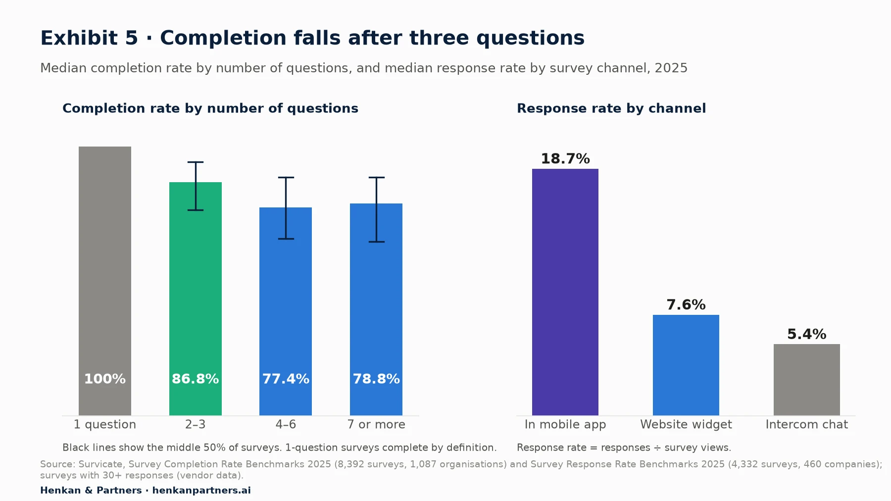
What this shows. Completion drops about 9 points between 2–3 and 4–6 questions, then flattens; the longest surveys are probably sent to more committed audiences. The right-hand panel shows why in-app surveys are attractive: people inside an app they chose to open answer more than twice as often as website visitors. For a website, the practical design is two or three questions, with the most important one first.
How many answers you need: the margin of error
Survey percentages are estimates. The margin of error tells you how far the true share could be from what you measured, at a chosen confidence level (usually 95%). For a share p measured on n answers:
Margin of error (95%) = 1.96 × √( p × (1 − p) ÷ n )

Example: 20% of 400 answers name delivery cost
1.96 × √(0.20 × 0.80 ÷ 400) = 0.039 → 20% ± 3.9 points (16.1% to 23.9%)
| Answers (n) | Share near 50% | Share near 20% | Share near 5% |
|---|---|---|---|
| 50 | ±13.9 | ±11.1 | ±6.0 |
| 100 | ±9.8 | ±7.8 | ±4.3 |
| 200 | ±6.9 | ±5.5 | ±3.0 |
| 400 | ±4.9 | ±3.9 | ±2.1 |
| 1,000 | ±3.1 | ±2.5 | ±1.4 |
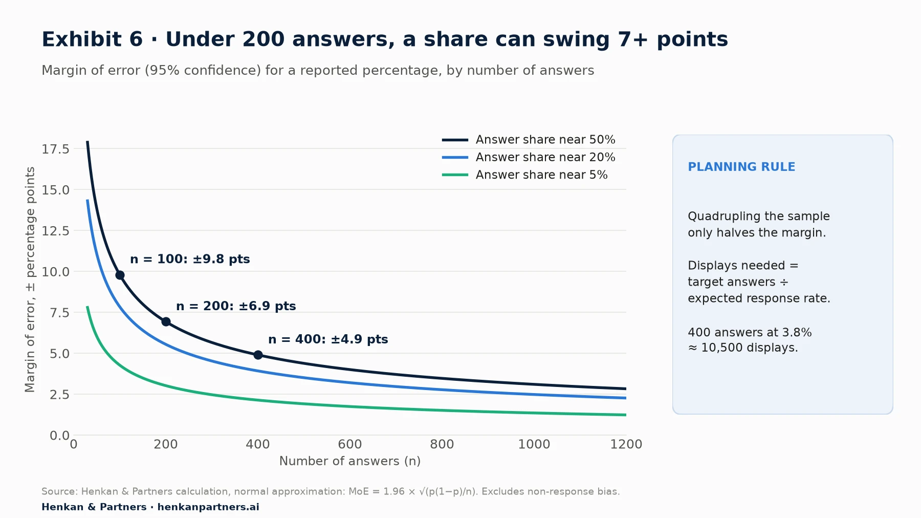
What this shows. The margin shrinks quickly up to about 200 answers and slowly after that: quadrupling the sample only halves it. That is why we plan most on-site surveys for 200–400 answers per segment we want to compare. Remember that the margin covers only random sampling error. If mainly annoyed visitors answer, a large sample will still be biased.
- Comparing two groups needs more. The uncertainty on a difference between two shares is larger than on each share. If you want to compare mobile and desktop, plan the sample for each.
- Themes from open text need fewer answers to discover, more to size. A few dozen answers usually surface the main themes; sizing them reliably needs the numbers above.
- Decide the stopping rule in advance. Fix the target number of answers and the review date before launch, so you do not stop the moment the result looks interesting.
Section 7 · Mobile, accessibility and privacy
Design for the thumb, the screen reader and the regulator before launch
Mobile: no exit intent, less space, more interruption
In our experience mobile carries most of the traffic on consumer e-commerce sites, yet many survey programmes are designed on a desktop. Three differences matter:
- Exit intent does not exist on touch screens. There is no cursor to track. Replace it with events: inactivity on the cart, scrolling back to the top after reaching the delivery information, or returning to the product list after viewing the cart.
- Overlays cost more. Google's Search Central guidance says "Don't obscure the entire page with interstitials" and recommends banners that "take up only a small fraction of the screen". A bottom sheet covering a third of the screen, triggered after engagement, is the mobile equivalent of a lower-right slide-in.
- Typing is expensive. Keep open text optional and short, show one question per screen, use large answer buttons rather than dropdowns or grids, and make sure the on-screen keyboard does not hide the text field or the submit button.
Accessibility: two WCAG 2.2 criteria that survey widgets often fail
A survey widget is part of your interface, so accessibility rules apply to it. Beyond keyboard access and labelled fields, two WCAG 2.2 Level AA criteria are frequently missed by survey widgets:
- Target size (2.5.8). Pointer targets must be "at least 24 by 24 CSS pixels", with exceptions for sufficient spacing. Small rating dots and tiny close icons fail this.
- Focus not obscured (2.4.11). A focused component must not be "entirely hidden due to author-created content". W3C's guidance names sticky footers and non-modal dialogs as typical culprits: a slide-in survey can hide the focused field of the page underneath.
Also check that the survey can be closed with the keyboard, that focus returns to where the visitor was, and that the thank-you message is announced to screen-reader users.
Privacy: consent for the script, minimisation for the answers
Surveys raise two separate privacy questions: the technology that shows the survey, and the answers people give. Our guide to user consent in e-commerce covers the consent landscape in depth; here is what applies to surveys specifically.
- The survey script may need consent. In France, Article 82 of the Loi Informatique et Libertés, which transposes the ePrivacy Directive, requires prior consent for trackers unless they are strictly necessary or fall under a listed exemption. The CNIL's exemptions cover authentication, shopping-cart, interface-personalisation, load-balancing and some audience-measurement trackers. Survey tools are not on that list, and sampling and frequency caps usually rely on a cookie or local-storage identifier. Plan to load survey scripts after consent, and check your vendor's configuration.
- Do not collect what you do not need. GDPR Article 5 requires data to be "adequate, relevant and limited to what is necessary". Do not ask for names or emails in a barrier survey, and add a hint under every open field: "Please don't include personal details such as your name, email or order number."
- Expect personal data in free text anyway. People type emails, phone numbers and health details into open fields. Redact before sharing verbatims widely or sending them to an AI model, and never send free text to Google Analytics: Google's policy is that "no data be passed to Google that Google could use or recognize as personally identifiable information".
- Set a retention period. GDPR requires that data be kept "for no longer than is necessary", and the CNIL states plainly that personal data "ne peuvent pas être conservées indéfiniment". A common approach (our view) is to keep raw verbatims for 12–24 months and aggregated, anonymised themes for longer.
- Say who is asking and why. A one-line purpose statement and a link to the privacy notice in the widget meet the transparency expectation and, following Dillman, build the trust that raises response.
Section 8 · Tools and AI
Most teams already own a capable survey tool, and AI now drafts and probes, but a human must own the wording
The tool matters less than the design, but features differ in ways that affect triggers, mobile coverage and the link to behaviour. The table lists capabilities we verified in each vendor's documentation in September 2026. Check again before buying; these products change often.
| Tool | Survey formats and triggers (verified) | Link to behaviour and data | Best fit |
|---|---|---|---|
| Hotjar (Contentsquare) | Popover, button, bubble, embedded, full-screen and link surveys; full-screen can show on load, after a delay, on exit (cursor leaves the top) or at half-page scroll; URL, event and user-attribute targeting | Watch the recording that includes a response; AI summary (minimum 20 text answers), sentiment and AI tags | Teams that want surveys next to replays and heatmaps |
| Contentsquare Voice of Customer | 40+ templates, AI survey generator, always-visible feedback button, exit-intent and NPS surveys | Replays linked to feedback; AI summary reports and sentiment | Enterprises already on Contentsquare |
| Qualtrics Website & App Insights | Intercepts (display rules) and creatives such as pop-overs and feedback buttons; targeting by cookies, URL and recent display | Contact frequency rules with XM Directory; wider Qualtrics analytics | Large organisations running VoC across channels |
| Survicate | Website, in-app and link surveys; URL conditions and triggers; exit intent on desktop only; 400+ templates | Custom attributes; integrations with analytics, replay and CRM tools | Mid-market teams wanting web and app in one tool |
| Typeform | Embeds as popup, slider, popover, side tab or inline widget; auto-open on load, exit, scroll or time; option to prevent reopening | Hidden fields and tracking parameters passed to the form; Typeform AI builds forms from a prompt, with an MCP integration for Claude and ChatGPT | Well-designed longer forms and research recruitment |
| KnoCommerce | Post-purchase surveys with 12 question types | Segment answers by order value, products and 60+ data points; integrations include Klaviyo and Triple Whale | Shopify brands focused on attribution and zero-party data |
| Fairing | Post-purchase attribution surveys on the order confirmation page; adaptive follow-ups (e.g. which social platform) | Syncs answers to GA4, Meta, TikTok, Klaviyo, Segment and Google Sheets | Shopify brands measuring "How did you hear about us?" |
| Microsoft Clarity | No survey or feedback feature listed in its documentation (September 2026) | Free replays and heatmaps, Google Analytics integration and custom tags | Pair with one of the above to see behaviour behind answers |
Disclosure: Henkan & Partners is a Contentsquare partner, works with clients on several of the tools above and sells Voice of Customer services. This table is not a ranking.
AI in survey design: useful for drafts, probes and pre-tests
AI now appears at three points in survey design:
- Drafting surveys. Hotjar offers AI help when building a survey, Contentsquare an AI survey generator, and Typeform says its AI "builds world-class forms" from a prompt, including through Claude and ChatGPT via MCP. These drafts are a fast start. They still need checking against the rules in Section 4: generated questions are often double-barrelled, too long or in agree/disagree format, in our experience.
- Adaptive follow-ups. Instead of a fixed follow-up, the survey asks a follow-up that depends on the answer. Fairing uses adaptive follow-ups on attribution answers. The research is encouraging: in a field study of about 600 people published in ACM Transactions on Computer-Human Interaction, Xiao and colleagues found that an AI chatbot asking open questions elicited responses that were more informative, relevant, specific and clear than a standard online survey, across more than 5,200 free-text answers.
- Pre-testing wording. Asking an LLM to critique a draft for leading language, double-barrelled items, jargon and missing options is a cheap first review (our view). It does not replace five real people reading the questions.
The risks are specific. Generated follow-ups differ from one respondent to the next, so answers are harder to compare and count; a model can lead ("Was it the delivery price?"); free text sent to a third-party model is personal data processing that needs a contract and a lawful basis; and AI-simulated respondents are not customers, so treat them as a source of ideas, not evidence. Once answers are in, use a validated analysis workflow, as described in Analysing Surveys with LLMs.
Our view. Let AI write the first draft and the follow-up probes, and let a person with survey-design training approve the final wording. Freeze the wording of any question you want to track over time, whether a person or a model wrote it.
Section 9 · Linking answers to behaviour
An answer becomes evidence when it is joined to what the same visitor did
A survey answer alone is an opinion. The same answer next to the visitor's session, cart value, device, traffic source and test variant is evidence you can size and act on. Four links make that possible:
- Pass context into the survey. Send identifiers and attributes into the survey tool: a pseudonymous session or visitor ID, device, page type, cart value band, test variant. Typeform supports hidden fields and tracking parameters; Survicate and Hotjar support custom or user attributes. Avoid names and emails.
- Send the coded answer to analytics. Push an event when someone answers, for example `gtag('event', 'survey_response', {survey_id: 'cart_exit_v1', question_id: 'q2', answer_code: 'delivery_cost'})`. Send codes, not text: GA4 caps event parameter values at 100 characters, and free text risks sending personal data. Register the parameters as custom dimensions so you can build segments.
- Segment behaviour by answer. Compare conversion, return rate and revenue for visitors who gave each answer. Visitors who say "just browsing" and later buy tell you something different from those who named delivery cost and never came back.
- Survey both arms of an A/B test. Run the same survey, with the same trigger and sampling, in control and variant. The test tells you which version won; the answers suggest why. Our A/B testing guide explains how to keep the test clean.
The link also works in reverse. Replay tools let you watch the session behind an answer: when someone writes "the promo code didn't work", the replay shows whether it was a bug, an expired code or a confusing field. That is often the fastest route from a verbatim to a fix, as our session replay guide explains.
For leaders. The strategic asset is the joined record of what customers did and what they said. When you choose tools, favour those that export answers with identifiers and push coded answers to your analytics, so the data does not stay locked inside one vendor.
Section 10 · Worked example
A three-question exit survey plan shows how the pieces fit together (illustrative)
The example below is illustrative. It uses a fictional mid-size fashion retailer and planning assumptions, not client results. The funnel shows a high cart exit rate on desktop, and the team must choose which cart change to test first.
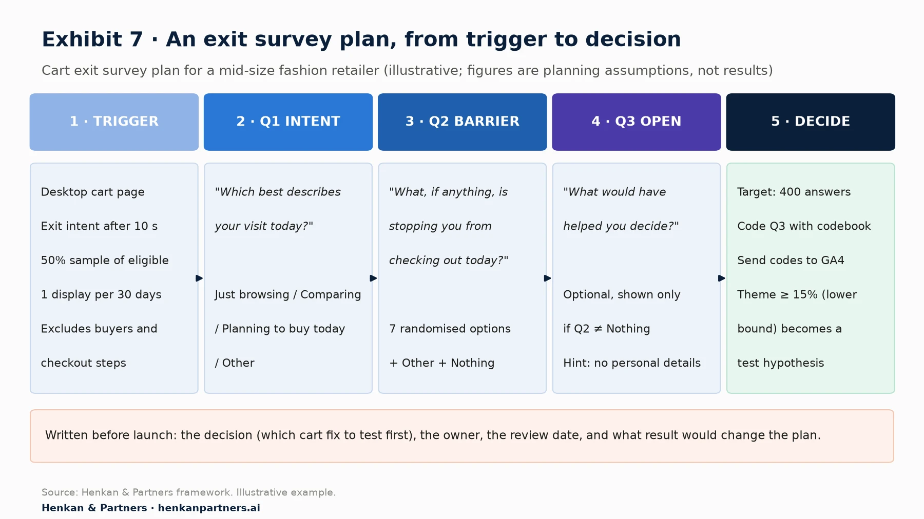
What this shows. Every design decision is written down before launch: who sees the survey, the exact wording, the number of answers, and the rule that turns a result into a test. Q1 is easy and general, Q2 is the main closed measurement, and Q3 is optional and only shown when there is something to explain. The decision rule uses the lower bound of the margin of error, so the team acts only on themes that are large with reasonable certainty.
The brief
- Decision: which cart change to test first in the next quarter.
- Audience and trigger: desktop visitors on the cart page who show exit intent after at least 10 seconds; 50% random sample; one survey display per person every 30 days; excludes anyone who has ordered in the last 30 days and all checkout steps. Mobile gets a separate version triggered by 45 seconds of inactivity on the cart.
- Q1: "Which best describes your visit today?" Just browsing / Comparing options / Planning to buy today / Other.
- Q2: "What, if anything, is stopping you from checking out today?" Delivery cost / Delivery time / Total price / Returns policy / Payment options / Not sure about size or fit / Want to check other sites / Other / Nothing. Options randomised; Other and Nothing fixed at the bottom.
- Q3 (optional, if Q2 is not Nothing): "What would have helped you decide?" with the hint "Please don't include personal details."
The numbers
Assume 12,000 desktop cart exits a week. A 50% sample gives 6,000 displays; at an assumed 5% response rate (between the exit-intent and overall pop-up medians in Exhibit 2), that is about 300 answers a week, so the target of 400 is reached in under two weeks. If 20% of respondents name delivery cost, the 95% margin of error at 400 answers is ±3.9 points, so the true share is likely between about 16% and 24%. Under the rule "act when the lower bound is at least 15%", delivery cost becomes a test hypothesis.
From answer to test
The team codes Q3 answers (using the LLM workflow in our survey analysis guide), finds that most delivery-cost comments mention the threshold for free delivery rather than the fee itself, and checks GA4: visitors who named delivery cost have cart values clustered just below the free-delivery threshold. The hypothesis becomes: "Showing progress towards free delivery in the cart will increase checkout starts for carts within €20 of the threshold." That is specific, measurable and ready for an A/B test. Our guide to turning customer insights into a test backlog shows how to score and prioritise hypotheses like this one against the rest of your roadmap.
Section 11 · Mistakes
Ten design mistakes cause most bad survey data, and each has a simple fix
| Mistake | What goes wrong | Fix |
|---|---|---|
| 1. No decision behind the survey | Answers pile up; nothing changes | Write the decision, owner and review date first |
| 2. Pop-up on arrival | Interrupts everyone; answers from people with no view yet | Trigger on an event, time or scroll; use a slide-in |
| 3. Overlay on checkout steps | Adds friction where it costs most | Inline micro-survey, or ask on the thank-you page |
| 4. Exit intent only | Mobile visitors are never asked | Add a mobile version triggered by events |
| 5. Leading, double-barrelled or agree/disagree items | Answers reflect the wording, not the visitor | Neutral, single-idea, item-specific questions (Section 4) |
| 6. Non-exhaustive, fixed-order lists | Missing reasons; top options over-picked | Build the list from open answers; randomise; add Other and Nothing |
| 7. Too many questions or required text | Completion falls; the best respondents quit | Two or three questions; open text optional |
| 8. Stacked surveys and no frequency cap | Survey fatigue; annoyed customers | One owner, one calendar, caps across all surveys |
| 9. Reading noise as a finding | Teams react to 50-answer swings | Plan 200–400 answers; report margins of error |
| 10. Answers never joined to behaviour | Opinions without size or context | Pass IDs, send answer codes to analytics, survey both test arms |
Section 12 · Next steps
What to do next
1. Inventory what is already live
List every survey, feedback tab and pop-up running on your site and app, with owner, trigger and question. In our experience, many teams find overlaps, orphaned surveys and a pop-up on a checkout step. Switch off anything without an owner or a decision.
2. Launch two surveys with a written brief
Start with a thank-you page survey ("What almost stopped you from buying today?") and a cart exit survey with a mobile equivalent. Write the decision, audience, trigger, sampling, target answers and review date on one page before you build anything.
3. Rewrite your questions against the research
Run every live question through the bad-versus-better table in Section 4: remove agree/disagree formats, split double-barrelled items, make lists exhaustive and randomised, and make open text optional.
4. Connect answers to analytics and replays
Pass pseudonymous IDs into the survey, push answer codes to GA4 as events, register the dimensions and build segments by answer. Check consent and retention settings with your data protection lead at the same time.
5. Analyse, decide and test
When the target number of answers is reached, code the open answers, size the themes with their margins of error, and turn the top themes into test hypotheses using a structured insight-to-backlog process. If you want help designing the programme or linking it to your experimentation roadmap, Talk to us.
FAQ
Frequently asked questions about on-site survey design
Frequently asked questions
What is an on-site survey?
An on-site survey, or website survey, is a short questionnaire shown to visitors while they use a website or app, triggered by a page, an action or a moment such as leaving the cart or completing an order. It captures why visitors behave as they do while the experience is fresh.
What is an exit intent survey?
An exit intent survey appears when a visitor's cursor moves towards the top of the browser window, a sign they are about to leave. It asks why they are leaving, typically on the cart or product page. On most tools it only works on desktop, so mobile needs a separate, event-triggered version.
What is a good survey response rate for a website survey?
For website pop-up surveys, single digits are normal. In Survicate's 2025 benchmark of 3,029 pop-up surveys (vendor data), the median was 7.3%, with 11.7% for event-triggered and 3.8% for exit-intent surveys. Post-purchase and in-app surveys usually get much higher rates.
How many questions should an on-site survey have?
Two or three. In Survicate's 2025 data (vendor data), surveys with 2–3 questions had a median completion rate of 86.8%, against 77.4% for 4–6 questions. A common design is one closed question to count and one optional open question to understand.
How do you write survey questions that are not biased?
Use simple words, ask about one thing at a time, avoid leading wording and double negatives, prefer item-specific scales to agree/disagree statements, make option lists exhaustive with 'Other', randomise unordered options, and ask about past experience rather than future intentions. Pilot with five people before launch.
What are good post-purchase survey questions?
'What almost stopped you from buying today?', 'How did you first hear about us?', 'What made you choose us over other options?' and 'How easy or difficult was it to complete your order?' Ask two or three at most, on the order confirmation page.
How many survey responses do I need?
For a percentage, about 100 answers gives a margin of error of roughly ±10 points and 400 answers about ±5 points at 95% confidence. Plan 200–400 answers for each segment you want to compare, and divide by your expected response rate to find how many displays you need.
Do website surveys need cookie consent?
Often, yes, in the EU. Survey scripts usually store an identifier to sample visitors and cap frequency, and survey tools are not among the CNIL's consent-exempt trackers. Load them after consent, avoid collecting personal data in answers and set a retention period.
Where should I put an NPS survey on my website?
Usually not in a pop-up. NPS measures the relationship with the brand, so ask it by email or in the logged-in account area on a fixed schedule, with the standard 0–10 wording. On the site itself, effort (CES) and satisfaction (CSAT) questions tied to a specific task are more actionable.
Can AI write my survey questions?
AI can draft a survey and generate adaptive follow-up questions, and research on AI chatbots shows they can elicit more informative open answers. But drafts often contain leading, double-barrelled or agree/disagree items, so a trained person should review and freeze the final wording.
Key terms
- On-site survey
- A short questionnaire shown on a website or app, triggered by a page, action or moment. It captures the reason behind behaviour while the experience is fresh.
- Intercept
- The rule that decides when and to whom a survey is shown. Good intercepts reach the right people at a moment when the question makes sense.
- Exit-intent trigger
- A trigger that fires when the cursor moves towards the top of the window. It reaches visitors about to leave but usually only works on desktop.
- Post-purchase survey
- A survey on the order confirmation page or in a follow-up email. Buyers respond far more often than browsers, but it misses people who did not buy.
- Sampling rate
- The share of eligible visitors who are shown a survey. It spreads the burden and lets you collect just enough answers.
- Frequency cap
- A limit on how often one person sees surveys. It prevents fatigue and protects the customer experience.
- Satisficing
- Answering with less effort than a question needs, for example picking the first reasonable option. It is a major source of poor survey data, and design can reduce it.
- Acquiescence bias
- The tendency to agree with a statement regardless of its content. It makes agree/disagree questions less reliable than item-specific ones.
- Item-specific question
- A question whose answer options name the dimension being measured, such as 'Not at all helpful' to 'Extremely helpful'. It produces higher-quality data than agree/disagree formats.
- Double-barrelled question
- A question that asks about two things at once, such as speed and cost. The answer cannot tell you which one the respondent meant.
- Primacy effect
- The tendency, in written surveys, to pick options near the top of a list. Randomising option order spreads it evenly.
- Response rate
- Responses divided by survey views (definitions vary by vendor). It tells you how many displays you need to reach a target number of answers.
- Completion rate
- The share of people who start a survey and finish it. It falls as surveys get longer, so it tells you when a survey is asking too much.
- Margin of error
- The range around a survey estimate that likely contains the true value at a given confidence level. It tells you whether a difference is real or noise.
- HDYHAU
- Short for 'How did you hear about us?', the classic post-purchase attribution question. It captures remembered channels that tracking misses, but it measures memory, not clicks.
Sources
All sources were checked in September 2026. Response-rate and completion-rate benchmarks from Survicate and KnoCommerce are vendor data drawn from each vendor's own customer base, with their own definitions; the KnoCommerce average does not publish its base. Tool features come from vendor documentation and change often. Exhibits 1 and 7, the question library, the NPS/CSAT/CES placement guidance, the bad-versus-better table, the mistakes table and the planning rules are Henkan & Partners frameworks; Exhibit 6 and the margin-of-error table are Henkan & Partners calculations. The worked example is illustrative.
- Krosnick, J. A. & Presser, S. (2010). Question and Questionnaire Design, Handbook of Survey Research (2nd ed.).
- Krosnick, J. A. (1991). Response strategies for coping with the cognitive demands of attitude measures in surveys, Applied Cognitive Psychology.
- Saris, W. E., Revilla, M., Krosnick, J. A. & Shaeffer, E. M. (2010). Comparing Questions with Agree/Disagree Response Options to Questions with Item-Specific Response Options, Survey Research Methods.
- Malhotra, N. (2008). Completion Time and Response Order Effects in Web Surveys, Public Opinion Quarterly.
- Pew Research Center (n.d.). Writing Survey Questions.
- Dillman, D. A., Smyth, J. D. & Christian, L. M. (2014). Internet, Phone, Mail, and Mixed-Mode Surveys: The Tailored Design Method, 4th edition.
- Washington State University SESRC (n.d.). The Tailored Design Method.
- Survicate (2026). Popup Survey 2025 Benchmark Report.
- Survicate (2026). 2025 Benchmark Report: What's a Good Survey Response Rate?.
- Survicate (2026). 2025 Benchmark Report: What's a Good Survey Completion Rate?.
- Survicate (n.d.). Run exit-intent surveys to understand bounce rate.
- Survicate (n.d.). Website surveys.
- KnoCommerce (n.d.). How to increase survey response rate.
- KnoCommerce (n.d.). Customer post-purchase surveys.
- Fairing (n.d.). Attribution surveys.
- Hotjar (n.d.). Types of Surveys.
- Hotjar (n.d.). What is a Survey?.
- Contentsquare (n.d.). Voice of Customer.
- Qualtrics (n.d.). Website & App Insights / Website & App Feedback support.
- Typeform (n.d.). Embed library README.
- Typeform (n.d.). Typeform AI.
- Microsoft (n.d.). Microsoft Clarity documentation.
- Bain & Company (n.d.). Measuring Your Net Promoter Score.
- Reichheld, F. (2003). The One Number You Need to Grow, Harvard Business Review.
- Dixon, M., Freeman, K. & Toman, N. (2010). Stop Trying to Delight Your Customers, Harvard Business Review.
- Xiao, Z. et al. (2020). Tell Me About Yourself: Using an AI-Powered Chatbot to Conduct Conversational Surveys with Open-ended Questions, ACM TOCHI.
- Google Search Central (n.d.). Avoid intrusive interstitials and dialogs.
- W3C (2023). Understanding Success Criterion 2.5.8: Target Size (Minimum).
- W3C (2023). Understanding Success Criterion 2.4.11: Focus Not Obscured (Minimum).
- Google (n.d.). Best practices to avoid sending personally identifiable information (PII).
- Google (n.d.). GA4 event collection limits.
- Google for Developers (n.d.). Set up events (GA4).
- European Union (2016). GDPR Article 5: Principles relating to processing of personal data.
- CNIL (n.d.). Cookies et traceurs : que dit la loi ?.
- CNIL (n.d.). Les durées de conservation des données.