Focus
From Customer Insight to Test Backlog: Writing and Prioritizing A/B Test Hypotheses
Alexandre Suon · 2026-09-28
Most A/B test ideas lose, and the ones that start from an opinion lose most often. This deep dive shows how to turn Voice of Customer, session replay and analytics findings into a strong A/B test hypothesis, how to compare test prioritization frameworks such as ICE, PIE and PXL honestly, and how to run a CRO backlog that gets smarter with every result.
Executive summary
- Research-led tests win more often, and their wins are more likely to be real. When only 8–10% of ideas work, as Kohavi, Deng and Vermeer report for Airbnb Search, Booking.com, Google Ads and Netflix, about one statistically significant "win" in four is a false positive; at Microsoft's 33% success rate the risk falls to about 6%.
- Triangulate before you hypothesise. Analytics tells you where and how many, session replay and usability tests show what happens, and Voice of Customer (VoC) explains why. Score each insight on a 0–5 evidence-strength scale based on how many sources agree.
- A strong hypothesis has five parts. Because we saw [evidence], we believe [change] for [audience] will [outcome], measured by [metric]. If you cannot fill in the evidence, you have an idea, not a hypothesis.
- No test prioritization framework is neutral. ICE rewards confidence you cannot yet have, PIE rewards guessed potential, PXL rewards research but ignores value, RICE and cost of delay reward reach and speed. Speero found 58% of surveyed programmes had no clear framework at all.
- Score evidence and value, then gate on traffic. Our hybrid score weights evidence twice, adds value at stake, urgency and ease, and only lets an idea into the test queue if it can reach its minimum detectable effect in a few weeks. Ideas that fail the gate go to other methods, not to the bin.
- The backlog is a system with a memory. Statuses, owners, a weekly cadence and a searchable learning repository, tagged by page, lever and psychology principle, turn past results into better future ideas. AI helps cluster insights and draft hypotheses, but it also produces generic ideas and must never invent evidence.
Section 1 · Why research
Tests built on evidence win more often, and their wins are more likely to be real
Research-driven testing is the practice of generating A/B test ideas only from observed customer evidence (analytics, session replay, usability tests, surveys and past experiments) and writing each one as a falsifiable A/B test hypothesis that names the evidence, the change, the audience, the expected outcome and the metric that will decide it.
This is the last step of our Listen to your customers learning path. The Voice of Customer guide covers how to ask customers, the session replay guide how to watch them, and the A/B testing guide how to run a trustworthy test. This article covers the step in between: how a finding becomes a hypothesis, how hypotheses compete for a place in the queue, and how the queue learns.
The case for research starts with an uncomfortable fact: most ideas do not work. Ronny Kohavi, Alex Deng and Lukas Vermeer compiled published success rates in their 2022 KDD paper A/B Testing Intuition Busters: about 33% of tested ideas improved their target metric at Microsoft, 15% at Bing, around 10% at Booking.com, Google Ads and Netflix, and 8% in Airbnb Search. Optimizely reports, from its own customer base of 127,000 experiments (vendor data), that only 12% produce a statistically significant improvement on the primary metric.
A low success rate does not only mean fewer wins. It also means that more of the wins you see are noise. The false positive risk is the probability that a statistically significant result is not real, and it depends on how many of your ideas were good to begin with.
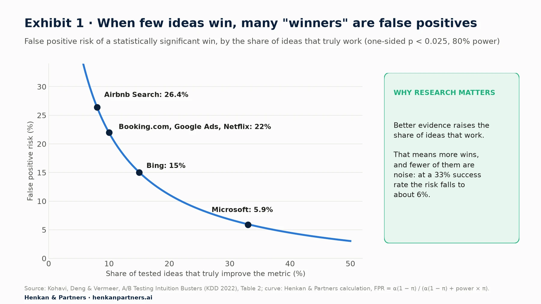
What this shows. At an 8–10% success rate, roughly one significant win in four is a false positive. At 33% it is about one in seventeen. Anything that raises the share of good ideas entering your tests, and research is the most direct lever, makes every result you ship more trustworthy, not just more frequent.
What the data says about where ideas come from
Direct evidence on win rates by idea source is thin, and all of it is observational. The best collection we found is a 2024 article by Jakub Linowski of GoodUI, who asked practitioners to share their data:
- Optimizely (vendor data). Teams that used analytics as an input had a 32% higher win rate than teams with no analytics, and teams that also had heatmaps enabled saw their win rate increase by 48%.
- Conversion.com (agency data). Of seven idea sources tracked, copying competitors, analytics, the test archive and UX research tended to increase the odds of an impactful experiment, while gut feeling performed worst. Ideas inspired by the test archive won 38% of the time. That competitor patterns score well is a reminder that any real-world signal beats none.
- Further (agency data, 102 experiments). Iterating on a previous experiment had some of the highest odds of success; experiments with no research input had the lowest.
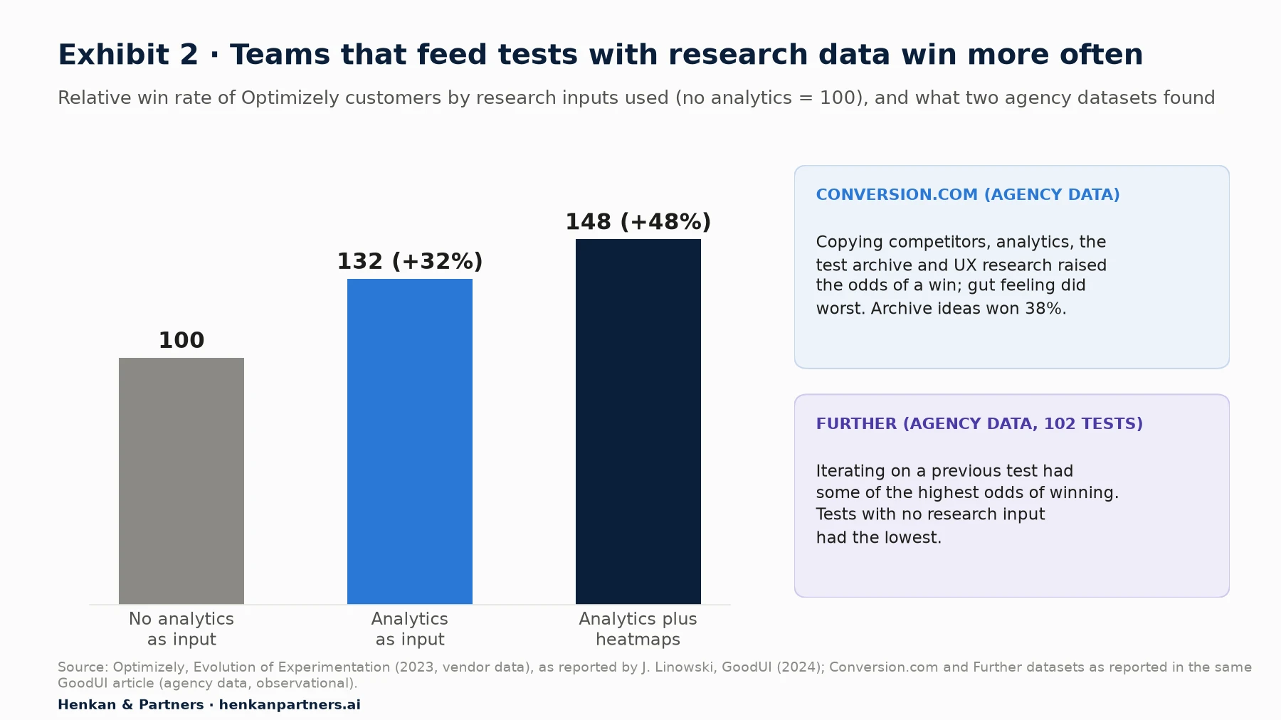
What this shows. Three independent datasets point the same way: the more evidence goes into an idea, the better its odds. None of them is a controlled study, and teams that use analytics may also be more mature in other ways. Treat the direction as reliable and the exact percentages as indicative.
Our view. In our experience across e-commerce programmes, the biggest gain from research is not a higher win rate on its own. It is that losing tests become informative. When a test built on a clear customer problem loses, you learn that this solution does not fix that problem, and the problem stays in the backlog with a better-informed next attempt. When a test built on an opinion loses, you learn almost nothing.
Section 2 · Triangulation
Each research source answers a different question, so a strong hypothesis needs at least two
Triangulation means looking at the same question through more than one method so that each covers the blind spots of the others. Kathryn Whitenton of Nielsen Norman Group recommends matching the rigour of triangulation to the risk of the decision: a full redesign deserves several methods; a small, reversible change needs less.
For conversion work, the three core sources divide the labour cleanly. Analytics tells you where customers struggle and how many are affected. Session replay and usability testing show what they actually do. Voice of Customer tells you why. A fourth source, your own past experiments, tells you what has already been tried.
| Source | Answers | Typical e-commerce signal | Blind spot |
|---|---|---|---|
| Analytics (GA4, product analytics) | Where, how many, how much revenue | Mobile add-to-basket rate on one category is half the site average | Cannot say why; shows only what you track |
| Session replay and heatmaps | What happens on the page | Shoppers tap the same swatch repeatedly, then leave | Easy to over-read a few vivid sessions; no motive |
| Usability tests (moderated or remote) | What happens and what people think aloud | Four of five testers cannot find delivery costs before checkout | Small samples; lab behaviour differs from real purchase |
| Voice of Customer (on-site polls, reviews, support tickets) | Why, in the customer's words | Open answers mention "not sure which size" or "hidden fees" | Self-selected respondents; what people say is not what they do |
| Past experiments | What was tried and what happened | A size-guide test won on dresses but not on shoes | Only as good as the documentation |
An evidence-strength scale makes triangulation measurable
To bring evidence into prioritisation, give each insight a score. Our scale runs from 0 to 5 and is deliberately simple, so two people scoring the same insight usually agree. It is inspired by Itamar Gilad's Confidence Meter (2018), which ranks evidence from self-conviction and other people's opinions at the bottom up to test results and launch data at the top.
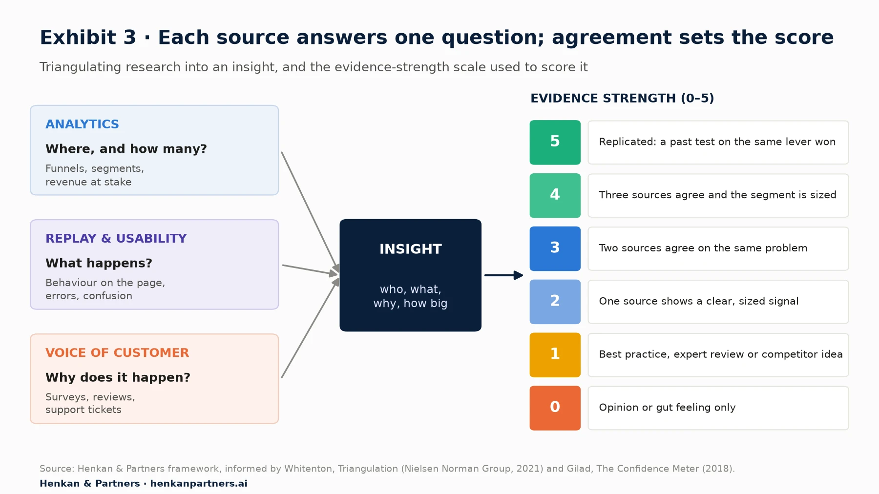
What this shows. The score rises with independent agreement, not with the volume of data from one source. A thousand survey answers saying the same thing is still one source. The top of the scale is reserved for evidence that has already survived a controlled test, which is why a well-kept test archive is the most valuable research asset a programme owns.
For marketers. Best practice is not zero, but it is weak: Baymard-style guidelines and competitor patterns tell you what often helps, not whether it helps your customers. Use them to generate ideas, then look for your own evidence before the idea earns a high score.
For leaders. Ask for the evidence score on every test brief. It is the quickest way to see whether the programme is testing customer problems or internal opinions.
Section 3 · Synthesis
Turn raw observations into insight statements before you write a single hypothesis
Research produces observations: a funnel drop, a replay clip, a survey quote. Hypotheses need insights: a statement of a customer problem, who has it and how big it is. The step in between is synthesis, and it is where most programmes cut corners.
Affinity mapping groups observations into themes
Nielsen Norman Group defines affinity diagramming as organising related observations, ideas or findings into distinct clusters. The method has three steps: write each observation on its own note, group notes into clusters and name them, then prioritise the clusters. It works on a wall or in a digital whiteboard. For e-commerce research, we write one note per observation, tag it with its source (analytics, replay, usability, VoC, past test) and its page type, then cluster by customer problem, not by page or by source.
For large volumes of open-ended feedback, a language model can do the first clustering pass. Our article on analysing surveys with LLMs explains how to build a codebook and validate the model's coding against people before you trust the counts. Well-designed questions make synthesis easier, which is the subject of our article on on-site survey design.
An insight statement names the who, the problem, the cause and the size
A theme such as "sizing" is not yet an insight. Rewrite each cluster as one sentence that a colleague could disagree with:
[Audience] struggles to [task] because [cause], which shows up as [measured symptom] affecting [size].

Example: Mobile shoppers on dress pages struggle to choose a size because the size chart uses a different system from their usual brand, which shows up as repeated opening of the chart and a 12-point lower add-to-basket rate, affecting about 30% of dress-page sessions. (illustrative)
The cause is often the weakest part. If you cannot name one, go back to VoC or run a few usability sessions: the same symptom can come from different causes, and each cause leads to a different fix.
Jobs to be done keeps the insight about progress, not features
Clayton Christensen and colleagues described "jobs to be done" in Harvard Business Review in 2016: when we buy a product, we "hire" it to help us do a job; the circumstances matter more than customer characteristics; and jobs are never only functional, they have powerful social and emotional dimensions. Framing an insight as a job stops the team from jumping to a feature. "When I'm replacing my foundation, help me find my exact shade so I don't waste money on the wrong one" opens more solutions than "add a shade quiz".
Section 4 · Hypotheses
A strong A/B test hypothesis names the evidence, change, audience, outcome and metric
A hypothesis is a prediction that a test can prove wrong. Microsoft's experimentation team recommends keeping it simple and, for complex changes, breaking the change down into a series of simple changes, each with its own hypothesis. Booking.com's platform goes further: according to Kaufman, Pitchforth and Vermeer (2017), experiment owners must specify up front which customer behaviour they want to change and how, and which metrics will support their hypothesis. That is pre-registration, and it stops teams from picking the flattering metric after the fact.
Because we saw [evidence],
we believe that [change]
for [audience]
will [outcome],
measured by [primary metric], with [guardrail metrics] not getting worse.
We need [minimum detectable effect] to call it, which takes [weeks] at current traffic.
Each slot has a job. Evidence links back to the insight and its score. Change is specific enough for a designer to build without a meeting. Audience is a segment you can target and measure. Outcome is the behaviour you expect to move. Metric decides the test; guardrails such as revenue per visitor, return rate or page speed protect the business. The last line comes from the feasibility check in Section 6.
Hypothesis examples: from weak to strong
The examples below are illustrative. The weak versions are all real patterns we see in backlogs; the strong versions show what the template adds.
| Weak idea | Strong hypothesis (illustrative) | What changed |
|---|---|---|
| Make the Add to basket button bigger and green | Because replays show mobile shoppers scrolling past a below-the-fold button on long product pages, we believe a sticky Add to basket bar for mobile visitors will increase add-to-basket rate, with revenue per visitor as guardrail | A cause, a segment and a metric replace a colour opinion |
| Add urgency messages | Because 22% of exit-poll answers on sale items say "I'll wait for a better price", we believe showing the real sale end date for sale-page visitors will increase checkout starts, measured by conversion, without raising returns | Urgency is tied to a stated objection and must be true |
| Offer free shipping | Because 34% of basket-page poll answers under the €50 threshold cite delivery cost, we believe a progress bar to free delivery for baskets under €50 will raise average order value, measured by revenue per visitor | The audience is the segment that has the problem |
| Simplify checkout | Because analytics shows 18% of mobile checkouts stall at account creation and usability testers ask "do I need an account?", we believe making guest checkout the default for new visitors will increase checkout completion | "Simplify" becomes one change with one metric |
| Improve site search | Because 9% of searches return zero results and replays show shoppers retyping plurals and misspellings, we believe typo-tolerant search with synonyms for all visitors will raise search-to-product-view rate and revenue per searcher | The failure mode is named, so the fix is testable |
| Add reviews to product pages | Because survey respondents on high-price items ask "is the quality worth it?" and reviews exist but sit below the fold, we believe moving the rating summary next to the price for products over €150 will lift add-to-basket rate | The change is about placement for one audience, not about having reviews |
| Add a size guide | Because "wrong size" is the top return reason for dresses and replays show shoppers opening the size chart repeatedly, we believe a fit recommendation based on the shopper's usual brand size on dress pages will lift add-to-basket rate without raising the return rate | A guardrail on returns stops a "win" that costs money later |
| Test a new homepage banner | Because 61% of homepage visitors from paid social land and leave without clicking, and the banner promotes a category they did not come for, we believe matching the hero to the campaign's category for paid-social visitors will increase homepage click-through and revenue per visitor | The audience and cause come from analytics, not from the marketing calendar |
Our view. Write the hypothesis before anyone designs the variant. Teams that design first tend to reverse-engineer a hypothesis to fit the design, and the metric quietly drifts toward whatever the variant is most likely to move.
Section 5 · Frameworks
No test prioritization framework is neutral, so pick the one whose bias you can live with
Every programme has more hypotheses than test slots. A prioritisation framework turns the queue into a transparent decision. Yet Speero's 2025 benchmark of 154 surveyed programmes found most teams still decide by other means.
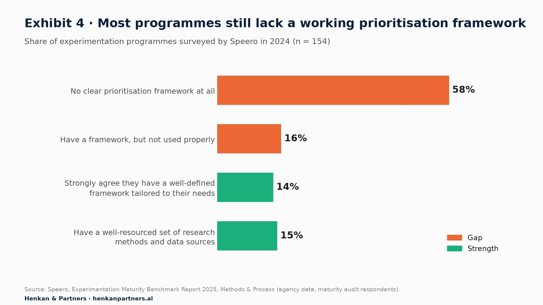
What this shows. Only about one programme in seven has a prioritisation framework it trusts, and about as few have strong research inputs. The two gaps are linked: without research, there is little evidence to score, so prioritisation falls back on opinion or on whoever asks loudest. Speero also found that even among its most mature "transformative" programmes, only 57% strongly agreed they had prioritisation in place.
Six approaches compared
The CRO guide introduces PIE, ICE and PXL. Here we compare them with three approaches borrowed from product management and large experimentation platforms, and say plainly where each goes wrong.
| Framework | How it scores | Strength | Weakness |
|---|---|---|---|
| PIE (Chris Goward, Conversion) | Potential, Importance, Ease, applied to pages or areas | Directs effort to valuable templates; quick | "Potential" is a guess; scores areas, not individual ideas |
| ICE score (Sean Ellis) | Impact, Confidence, Ease, each 1–10, averaged | Fast; works for any growth idea | Subjective; no reach factor; anchoring in group scoring; as Peep Laja asks, if you could guess the impact, why test? |
| PXL framework (Peep Laja, CXL, 2016) | Mostly yes/no questions: above the fold, noticeable in five seconds, adds or removes elements, supported by user testing, qualitative feedback, heatmaps or analytics, high-traffic page; effort bands | Rewards research and bold changes; less room for opinion | No explicit value or traffic feasibility; many columns to maintain |
| RICE (Sean McBride, Intercom, 2018) | Reach × Impact × Confidence ÷ Effort; confidence at 100%, 80% or 50% | Adds reach; "total impact per time worked" | Built for product features; impact still a guess; ignores whether a test can detect the effect |
| Cost of delay / CD3 / WSJF (Don Reinertsen; SAFe) | Value and urgency of delay divided by duration; WSJF adds time criticality and risk reduction | Captures seasonality and deadlines; favours small, valuable work | Hard to estimate cost of delay for a single test; can starve slow, strategic research |
| Platform practice (Booking.com, Microsoft) | Pre-registered hypothesis and metrics; simple changes; searchable history of past results | Makes evidence and learning part of every test | Needs volume, tooling and culture; not a scoring model on its own |
Two lessons come out of the comparison. First, the frameworks that ask "how confident are you?" invite opinion, while the ones that ask "what evidence do you have?" reward research. PXL's evidence columns are its best feature. Second, none of the classic CRO frameworks checks whether the test can actually detect the effect you hope for, which is the most common reason a well-scored test ends inconclusive.
Section 6 · Hybrid scoring
Score evidence and value, gate on traffic, and keep the maths simple enough to use every week
Our recommended approach combines the evidence emphasis of PXL, the value and reach logic of RICE and PIE, and the urgency of cost of delay, with a hard feasibility gate. We call it the evidence-weighted score. It is a Henkan & Partners framework, not an industry standard; adapt the weights to your programme.
Priority score (max 20) = 2 × Evidence (0–5) + Value at stake (1–5) + Urgency (0–2) + Ease (1–3)

Gate: an idea enters the test queue only if Weeks to MDE ≤ your limit (we use 4–6 weeks).
Ideas that fail the gate go to the alternatives in Section 8.
| Criterion | How to score | Why it is there |
|---|---|---|
| Evidence (×2) | The 0–5 scale from Exhibit 3 | The best predictor of success we can observe before a test; doubled so it dominates |
| Value at stake | 1–5 bands of weekly revenue flowing through the page and segment | A perfect idea on a page with little traffic should not jump the queue |
| Urgency | 0 none, 1 seasonal window or launch, 2 cost of delay is high and time-bound | Borrowed from cost of delay: some tests are worth more now |
| Ease | 3 under two days to build and QA, 2 under two weeks, 1 longer | Keeps throughput up without letting effort dominate |
| Feasibility gate | Weeks to reach the minimum detectable effect at current traffic | An underpowered test wastes a slot and produces false winners and losers |
We deliberately add ease rather than divide by effort. Dividing by effort, as RICE and CD3 do, lets a trivial idea with weak evidence outrank a well-evidenced one. That suits feature roadmaps, where effort is the main cost; in testing, the scarcest resource is usually traffic, which the gate handles.
Check feasibility with sample size and the minimum detectable effect
The minimum detectable effect (MDE) is the smallest true change a test can reliably detect with your traffic and chosen confidence and power. Our article on A/B test statistical models explains how to calculate it. The table below shows why the gate matters.
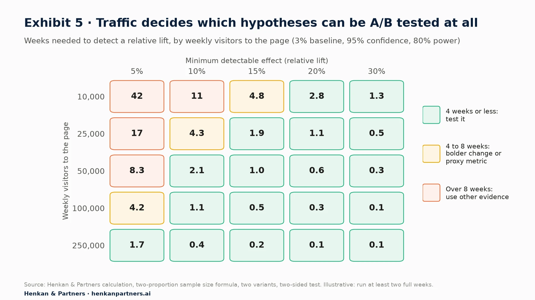
What this shows. A page with 25,000 weekly visitors can detect a 10% lift in about four weeks but would need 17 weeks for a 5% lift. Most small copy or colour changes produce effects well below 10%, so on mid-traffic pages they are rarely testable. Run every test for at least two full weeks, even when the table says less, to cover weekly cycles.
For leaders. If a test brief does not state the MDE and the expected duration, it is not ready. This single field removes most inconclusive tests from the calendar before they waste a slot.
Section 7 · The backlog
A CRO backlog is a system with owners, statuses and a memory, not a spreadsheet of ideas
Backlogs fail quietly. Ideas pile up without evidence, scores go stale, finished tests are never written up, and six months later someone proposes the test that already lost. An experiment backlog that works has four parts: consistent fields, clear statuses with owners, a cadence, and a learning repository.
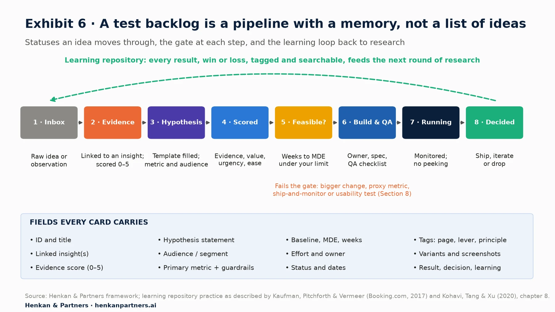
What this shows. Each status has a gate that an idea must pass to move right, and each gate has an owner. The loop back from "decided" to "inbox" is the point of the whole system: results, including losses, become evidence for the next round and can lift a future idea to an evidence score of 5.
Owners and cadence
- Backlog owner (usually the CRO or experimentation lead): runs the weekly review, keeps scores current, protects the gate.
- Research owner: keeps insights and evidence scores up to date as new VoC, replay and analytics findings arrive.
- Analyst: signs off the MDE before launch and the readout after, including sample ratio checks.
- Weekly (30 minutes): triage the inbox, score new hypotheses, confirm the next tests. Monthly: review decided tests and update the repository. Quarterly: run a meta-analysis and re-weight the themes.
The learning repository is the programme's long-term memory
Booking.com's platform, as described in 2017, acts as a searchable repository of all previous successes and failures back to the very first experiment, groupable by team, product area and visitor segment, with descriptions of every iteration and the final decision. Kohavi, Tang and Xu devote a chapter of Trustworthy Online Controlled Experiments (2020) to institutional memory and meta-analysis. The Booking authors also note the hard part: answering a question like "what were the findings related to improving the clarity of the cancellation policies in the past year?" across the repository. That is a search problem, and it is where consistent tagging pays off.
Tag every test on at least three dimensions: page or template (product page, basket, search), lever (clarity, trust, motivation, friction, cost), and psychology principle where one applies (social proof, loss aversion, choice overload, anchoring). Agency frameworks such as Conversion's Levers Framework, organised into master levers, levers and sub-levers, formalise this kind of taxonomy. Consistent tags make three analyses possible:
- Win rate by lever and page. Which kinds of change tend to work on which templates for your customers.
- Effect size by change type. Optimizely reports (vendor data) that experiments with four variations deliver 3.5 times the expected impact of a typical A/B test, and that combining three or more change types delivers the strongest gains. Check whether your own data agrees.
- Open problems. Insights with high evidence that no test has yet solved, which are the best candidates for the next round.
Our view. Record losses with the same care as wins. A lost test with a clear hypothesis is the cheapest research you will ever buy: it tells you a solution does not fix a known problem, and it stops the next team from spending a test slot to find out again. Our article on building a culture of experimentation covers how to make that feel safe.
Section 8 · Low traffic
When traffic is too low to test, change the kind of evidence, not the standard of proof
Ideas that fail the feasibility gate are not rejected. They move to a method that matches the risk of the change and the traffic you have. The right choice depends on two questions: how risky is the change, and how easily can you reverse it?
| Situation | Method | How it works | Watch out for |
|---|---|---|---|
| Low risk, easy to reverse, strong evidence | Ship and monitor | Release, then compare the same weeks before and after and a similar untreated segment; write down the prediction first | Seasonality, campaigns and price changes that coincide with the release |
| Unclear demand for a new feature | Painted-door test | Show an entry point (a button, a link, a menu item) for a feature that does not exist yet and measure clicks; Optimizely defines it as creating the illusion of a feature without building it | Disappointing customers; always explain honestly what happens next |
| Usability doubt on a flow | Moderated or remote usability test | Jakob Nielsen argued in 2000 that testing with about five users finds most usability problems in a design | Shows problems, not the size of the business effect |
| Effect too small to detect on orders | Proxy metric or bolder change | Measure add-to-basket or clicks on the element, which occur more often; or combine several changes into one bolder variant | Proxies that do not relate to revenue |
| High risk, hard to reverse | Staged rollout | Release to one category, country or device first, compare against the rest, then expand | Differences between the pilot group and the rest |
Whatever the method, keep the same discipline as a test: write the hypothesis and prediction before you act, log the result in the repository, and tag it with a lower evidence grade than a controlled test. Before-and-after evidence can justify a decision; it should not be counted as a replicated win.
Section 9 · AI
AI speeds up clustering and drafting, but generic ideas and invented evidence are the main risks
Language models are now useful at almost every step in this workflow. The question is which steps they should do alone, which they should draft for a person to check, and which they should not touch.
| Step | What AI does well | Risk | Guardrail |
|---|---|---|---|
| Clustering insights | Groups thousands of verbatims, tickets or replay summaries into themes in minutes | Invented or merged themes; counts that are guessed, not counted | Validate on a human-coded sample; count with code, not with the model |
| Writing insight statements | Turns a cluster into a clear who, problem, cause statement | States a cause the data does not support | Every claim must cite the source notes it came from |
| Drafting hypotheses | Fills the template quickly and suggests several solutions per insight | Generic best-practice ideas that ignore your evidence | Require the evidence slot to link to a real insight ID |
| Scoring and feasibility | Pre-fills scores and calculates MDE from your traffic data | Confident but wrong arithmetic | Run the sample-size maths in code; a person approves the score |
| Searching the repository | Answers questions like "what have we learned about delivery messaging?" across years of tests | Missing or hallucinated past results | Answers must link to the test records they used |
The generic-idea risk is real and measurable. In a 2024 study in Science Advances, Anil Doshi and Oliver Hauser found that access to generative AI ideas made individual stories better written and more enjoyable, especially for less creative writers, but made the stories more similar to each other. Applied to testing, a backlog seeded by a model's general knowledge will look like every other company's backlog: sticky add-to-basket bars, urgency banners and trust badges. The fix is to feed the model your evidence and nothing else, and to reject any hypothesis whose evidence slot it cannot fill from your data.
Vendors are building this loop into their platforms. Optimizely reports (vendor data) that 19.54% of follow-up tests in its platform are now driven by agent recommendations grounded in prior results. The Model Context Protocol (MCP), an open standard for connecting AI assistants to data sources, lets an assistant query analytics, survey results and an experiment repository directly rather than working from pasted summaries.
Disclosure: Henkan & Partners builds Stuart Repo, an experimentation memory product that stores tests, learnings and decisions and exposes them to AI assistants. The practices in this article apply to any repository, including a well-structured spreadsheet or wiki.
Section 10 · Worked example
In a worked example, one research finding becomes three hypotheses with a clear order
Illustrative example. The retailer, figures and research findings in this section are synthetic, created by Henkan & Partners to show the method. They are not client data and should not be read as benchmarks.
A mid-sized European beauty retailer sees that mobile add-to-basket rate on complexion product pages (foundation and concealer) is 3.1%, against 6.4% on its other mobile product pages. These pages receive about 45,000 mobile sessions a week.
The research
- Analytics (where, how many). The gap is specific to complexion products and to mobile; desktop is close to the site average.
- Session replay (what). Of 40 replays reviewed on complexion pages, 23 show shoppers switching between three or more shade swatches, zooming, and leaving without adding to basket.
- Voice of Customer (why). An on-page poll, "What's stopping you from choosing a product today?", collects 610 answers: 38% say they do not know which shade to pick; 11% worry they cannot return opened make-up.
- Returns data. "Wrong shade" is the top return reason for complexion products.
Insight statement. Mobile shoppers on complexion pages cannot judge their shade from swatches on a small screen, so they hesitate or leave, affecting most of the 45,000 weekly sessions on these pages. Job to be done. "When I'm replacing my foundation, help me find my exact shade so I don't waste money on the wrong one."
Three hypotheses
| Hypothesis | Evidence (score) | Metric and gate |
|---|---|---|
| H1. Because shoppers do not know their shade (38% of poll answers), replays show repeated swatch switching, and wrong shade is the top return reason, we believe a shade finder that matches from the shopper's current brand and shade, for mobile visitors on complexion pages, will increase add-to-basket rate | Analytics, replay, VoC and returns agree; segment sized (4) | Add-to-basket rate; guardrails: revenue per visitor, complexion return rate. 10% MDE on 3.1% takes about 2.3 weeks: test, run three full weeks |
| H2. Because replays show zooming on swatches and poll answers say colours look different on screen, we believe showing each shade on three skin tones for mobile visitors will increase add-to-basket rate | Replay and VoC agree (3) | Add-to-basket rate; same gate result: test |
| H3. Because 11% of poll answers fear being stuck with an opened product, we believe a "free shade exchange" promise next to the button will increase conversion | One source (2) | Conversion to order, 1.2% baseline: a 10% MDE takes about 6 weeks: fails a 4-week gate |
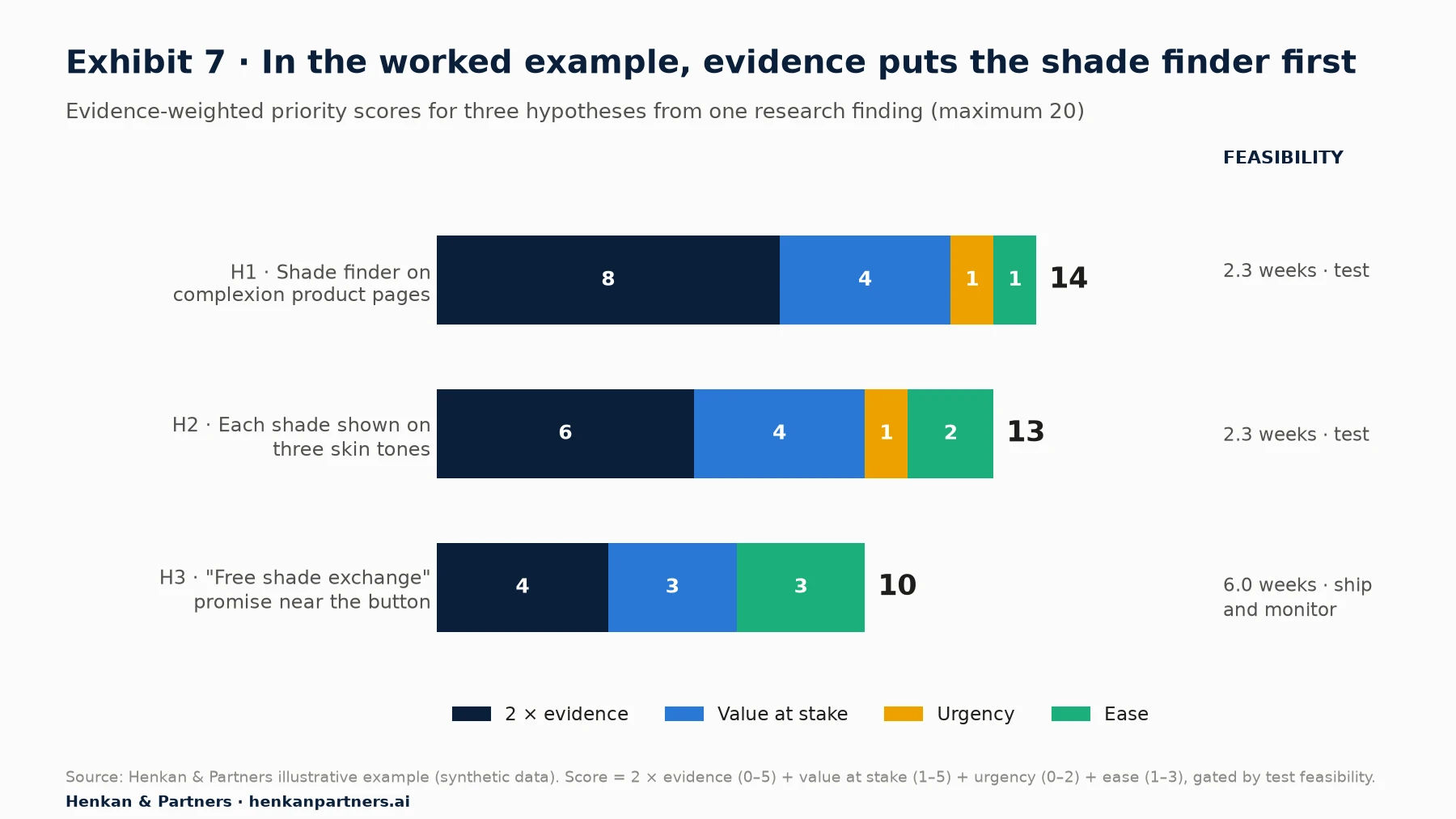
What this shows. The shade finder scores highest because three sources and returns data agree, even though it is the hardest to build. The swatch change is close behind and much easier. The exchange promise is the easiest of all, but its evidence is thin and it cannot be tested on orders in a reasonable time, so it goes to a different method.
The decision
The team runs H2 first, for three weeks, while H1 is being built, because both touch the same page area and should not run at the same time. H1 follows as soon as it passes QA. H3 is a policy change as much as a design change, so operations agree to pilot the exchange promise on one complexion brand, with a written prediction and a before-and-after read on conversion and exchange costs. All three are logged in the repository under the same insight, tagged product page · comprehension · risk reduction, so the next round of research starts from what they teach.
Section 11 · Mistakes
Most backlog failures come from process shortcuts, not from a shortage of ideas
- Starting from solutions. "Let's test a sticky bar" is a solution looking for a problem. Start from an insight and generate several solutions for it.
- Counting one source many times. Two thousand survey answers and a dashboard built on the same survey are one source. Score agreement between independent methods.
- Letting confidence stand in for evidence. ICE's confidence score often measures seniority. Replace it with an evidence score tied to named research.
- Skipping the feasibility check. An underpowered test is worse than no test: it produces false winners and false losers. State the MDE and duration before launch.
- Scoring once and never again. Evidence changes as research and tests come in. Re-score the top of the backlog every week.
- Writing up wins only. A repository of wins is a marketing deck. Record losses and inconclusive results with the hypothesis and what was learned.
- Changing the metric after the test. Pre-register the primary metric and guardrails in the hypothesis, as Booking.com's platform requires.
- Letting AI fill the evidence slot. A model can draft a hypothesis; it cannot observe your customers. Reject any hypothesis whose evidence does not link to your own data.
Section 12 · What to do next
Five steps turn your research into a backlog that learns
1. Audit your current backlog
Take the top 20 ideas and try to fill the hypothesis template for each. Give each one an evidence score. Ideas scoring 0 or 1 go back to research; you will usually find that half the backlog is opinion.
2. Run a two-week triangulation sprint
Pick your highest-value page type. Pull the funnel and segment data, review 30 to 50 replays with a clear question, and run one short on-page poll. Cluster the findings, write three to five insight statements and size each one.
3. Adopt the evidence-weighted score and the feasibility gate
Add columns for evidence, value, urgency, ease, MDE and weeks to your backlog. Agree the scoring bands in one meeting, then score everything once. Move ideas that fail the gate to the methods in Section 8.
4. Set up the learning repository
Whatever tool you use, record every decided test with its hypothesis, metrics, result, decision, screenshots and tags for page, lever and principle. Back-fill the last year of tests. Then run your first meta-analysis by lever.
5. Bring in AI with guardrails, or bring in help
Use an LLM to cluster feedback and draft hypotheses, validated against a human sample and fed only with your evidence. If you would like support designing the research sprint, the scoring model or the repository, Talk to us.
FAQ
Frequently asked questions about turning research into A/B test hypotheses
Frequently asked questions
What is an A/B test hypothesis?
An A/B test hypothesis is a falsifiable prediction that a specific change, for a specific audience, will move a specific metric, based on evidence. A useful template is: because we saw [evidence], we believe [change] for [audience] will [outcome], measured by [metric].
What are good A/B test hypothesis examples?
A good example: because 34% of basket-page poll answers under the free-delivery threshold cite delivery cost, we believe a progress bar to free delivery for baskets under that threshold will raise revenue per visitor. It names the evidence, change, audience and metric. "Make the button green" is not a hypothesis.
What is research-driven testing?
Research-driven testing means generating test ideas from customer evidence, such as analytics, session replay, usability tests, surveys and past experiments, rather than from opinion or generic best practice. Available data suggests research-backed ideas win more often, and a higher share of good ideas also lowers the false positive risk of each win.
What is the ICE score?
ICE, created by Sean Ellis, scores each idea on Impact, Confidence and Ease from 1 to 10 and averages them. It is quick, but subjective, ignores reach and is prone to anchoring when scored in a group.
What is the PXL framework?
PXL is a test prioritisation framework published by Peep Laja at CXL in 2016. It replaces most subjective ratings with yes-or-no questions about visibility, whether the idea is supported by user testing, qualitative feedback, heatmaps or analytics, page traffic, and effort. It rewards research but has no explicit revenue or feasibility column.
Which test prioritization framework is best?
None is neutral. For e-commerce programmes we recommend an evidence-weighted hybrid: double-weighted evidence strength, plus value at stake, urgency and ease, with a hard gate on whether the test can reach its minimum detectable effect within a few weeks.
How do you build a CRO backlog?
Give every idea the same fields (insight link, evidence score, hypothesis, audience, metrics, MDE, effort, owner, status, tags), move ideas through clear statuses with gates, review it weekly, and keep a searchable learning repository of every decided test, including losses.
What should you do if you do not have enough traffic to A/B test?
Change the kind of evidence, not the standard: ship and monitor low-risk changes with a written prediction, use painted-door tests for demand, usability tests for flow problems, proxy metrics or bolder changes for small effects, and staged rollouts for risky ones.
Can AI write A/B test hypotheses?
AI can draft hypotheses quickly from your insight statements and cluster large volumes of feedback, but it tends to produce generic ideas and can invent evidence. Feed it only your research, require every hypothesis to link to a real insight, and keep scoring and sample-size maths checked by a person or code.
Key terms
- A/B test hypothesis
- A falsifiable prediction linking evidence, a change, an audience, an outcome and a metric. It matters because it decides what the test can teach, win or lose.
- Affinity mapping
- Grouping research observations into named clusters of related findings. It matters because it turns scattered notes into customer problems you can size and test.
- Insight statement
- One sentence naming the audience, the problem, its cause and its size. It matters because hypotheses built on a named cause are easier to design and to learn from.
- Jobs to be done
- A framing in which customers "hire" a product to get a job done in a particular circumstance. It matters because it keeps teams focused on customer progress rather than features.
- Triangulation
- Answering a research question with several independent methods. It matters because each method's blind spots are covered by another, which raises confidence in the insight.
- Evidence strength
- A 0–5 score of how well an insight is supported, based on how many independent sources agree and whether past tests confirmed it. It matters because it is the most reliable input to prioritisation.
- False positive risk
- The probability that a statistically significant result is not a real effect. It matters because it rises sharply when few tested ideas are good, which is why research quality affects result quality.
- Minimum detectable effect (MDE)
- The smallest true change a test can reliably detect at a chosen confidence, power and traffic level. It matters because it tells you before launch whether a test can answer its question.
- ICE score
- Impact, Confidence and Ease rated 1–10 and averaged. It matters because it is the most common quick scoring method, and its subjectivity is its main weakness.
- PXL framework
- CXL's prioritisation model based mainly on yes-or-no questions about evidence, visibility, traffic and effort. It matters because it rewards research-backed ideas.
- RICE
- Reach × Impact × Confidence ÷ Effort, from Intercom. It matters because it adds reach, but its effort divisor can favour trivial ideas in a testing context.
- Cost of delay
- The value lost by doing something later rather than now, popularised by Don Reinertsen. It matters for seasonal or launch-bound tests whose value falls with time.
- Painted-door test
- Showing the entry point to a feature that does not exist yet to measure demand. It matters when traffic or build cost rules out a full A/B test.
- Learning repository
- A searchable record of every decided experiment with hypothesis, result, decision and tags. It matters because past results are the strongest evidence for future ideas.
- Meta-analysis
- Analysing many past experiments together, for example win rate by lever or page. It matters because it shows which kinds of change work for your customers.
Sources
All sources were checked in September 2026. Optimizely figures are vendor data from its own customer base; Conversion.com, Further and Speero figures are agency data; all are observational. The Conversion.com, Further and Optimizely win-rate comparisons are reported second-hand by GoodUI. Exhibits 3, 5 and 6 and the evidence-weighted score are Henkan & Partners frameworks or calculations; Exhibit 7 and the worked example use synthetic data. The curve in Exhibit 1 is our calculation using the formula in Kohavi, Deng and Vermeer (2022).
- Kohavi, R., Deng, A. & Vermeer, L. (2022). A/B Testing Intuition Busters. KDD 2022.
- Optimizely (2026). Top 10 takeaways from running 127,000 experiments.
- Linowski, J., GoodUI (2024). Do some sources of experiment ideas lead to higher win rates than others?
- Speero (2025). Experimentation Maturity Benchmark Report 2025, Methods & Process.
- Whitenton, K., Nielsen Norman Group (2021). Triangulation: get better research results by using multiple UX methods.
- Krause, R. & Pernice, K., Nielsen Norman Group (2024). Affinity diagramming.
- Gilad, I. (2018). The tool that will help you choose better product ideas (the Confidence Meter).
- Christensen, C. M., Hall, T., Dillon, K. & Duncan, D. S., Harvard Business Review (2016). Know your customers' jobs to be done.
- Machmouchi, W., Gupta, S., Zhang, R. & Fabijan, A., Microsoft Research (2020). Patterns of trustworthy experimentation: pre-experiment stage.
- Kaufman, R. L., Pitchforth, J. & Vermeer, L. (2017). Democratizing online controlled experiments at Booking.com. arXiv.
- Kohavi, R., Tang, D. & Xu, Y. (2020). Trustworthy Online Controlled Experiments, chapter 8, Institutional Memory and Meta-Analysis. Cambridge University Press.
- Conversion (n.d.). PIE prioritization framework.
- Growth Method (n.d.). ICE framework.
- Laja, P., CXL (2016, updated 2026). PXL: a better way to prioritize your A/B tests.
- McBride, S., Intercom (2018). RICE: simple prioritization for product managers.
- Black Swan Farming (n.d.). Cost of delay.
- Scaled Agile (n.d.). Weighted Shortest Job First.
- Conversion (n.d.). The Levers Framework.
- Optimizely (n.d.). Painted door test.
- Nielsen, J., Nielsen Norman Group (2000). Why you only need to test with 5 users.
- Doshi, A. R. & Hauser, O. P., Science Advances (2024). Generative AI enhances individual creativity but reduces the collective diversity of novel content (arXiv version).
- Henkan & Partners. Sample-size and false-positive-risk calculations (two-proportion formula; FPR formula from Kohavi et al., 2022).