Focus
Product Page and Checkout Optimisation: A Playbook for E-commerce Teams
Alexandre Suon · 2026-09-28
Product page optimization and checkout optimization are where most of an online shop's revenue is won or lost: the visitor has found a product, and the only question left is whether they buy. This playbook sets out what to fix on the product detail page and in checkout, what the evidence from Baymard Institute and other research says, what to A/B test first, how to measure each step, and what the European Accessibility Act, EU consumer law and AI shopping agents change.
Executive summary
- The product page and checkout are where intent turns into revenue, and where most of it leaks. Baymard Institute's average of 50 studies puts documented cart abandonment at 70.22%. Using Dynamic Yield's benchmarks (vendor data), 100 product-page visits produce about 6 add-to-baskets and fewer than 2 orders.
- Most product pages still hide what shoppers need to decide. In Baymard's 2026 benchmark of 155+ leading sites, 62% of mobile product pages are "mediocre" or worse, 67% give no estimate of the total order cost and 44% do not show the returns policy. Reviews carry real weight: Northwestern's Spiegel Research Center found that five reviews raise purchase likelihood by 270% over none.
- Checkout abandonment is mostly about cost, trust and effort. Extra costs are the first reason US shoppers give (40%), ahead of slow delivery (20%), distrust (19%) and forced account creation (18%). The average checkout has 11.3 form fields where most sites need 8, and 94% of sites lack adaptive error messages.
- Offer the payment methods your customers already use, and read express checkout claims carefully. Digital wallets carried 56% of global e-commerce value in 2025, but the mix is local. Vendor claims such as "Shop Pay lifts conversion by up to 50%" and "Apple Pay adds 22.3%" are vendor data with limited published methodology.
- Test high-evidence, low-effort fixes first, and measure every step. Delivery cost and dates on the product page, a prominent guest checkout and fewer fields have the strongest evidence. Instrument the GA4 e-commerce events from view_item to purchase, track field-level errors, and use session replay filtered on checkout errors to find the cause.
- Compliance and AI now shape both pages. The European Accessibility Act has applied to e-commerce services since 28 June 2025, and EU rules on prior prices, pre-ticked boxes and reviews already apply. AI assistants and agentic checkout are real but early: OpenAI moved away from its Instant Checkout in April 2026, while Google launched the Universal Commerce Protocol in January 2026.
Section 1 · Why it matters
Product pages and checkout are where purchase intent becomes revenue, so they deserve the first optimisation effort
Product page and checkout optimisation is the practice of improving the product detail page (PDP) and the checkout flow so that more visitors who show purchase intent complete an order, at a healthy margin. It combines user research, usability best practices, analytics and A/B testing to remove what stops a willing shopper from buying.
Every other part of an e-commerce site feeds these two steps. Acquisition brings visitors, navigation and search help them find a product, and the product page must then answer the questions that stand between interest and a decision. Checkout must turn that decision into a paid order without adding cost, doubt or effort. As we explain in the e-commerce market equation, revenue is traffic multiplied by conversion and order value, so a leak at the bottom of the funnel wastes every euro spent at the top.
The numbers are large. Baymard Institute, an independent UX research firm that benchmarks leading US and European sites, averages 50 studies of cart abandonment and finds that 70.22% of shopping baskets are not turned into orders. Dynamic Yield, a personalisation vendor, reports a global add-to-cart rate of 5.96% and a cart abandonment rate of 77.54% over the past twelve months, with mobile at 79.92% and desktop at 69.19% (vendor data).
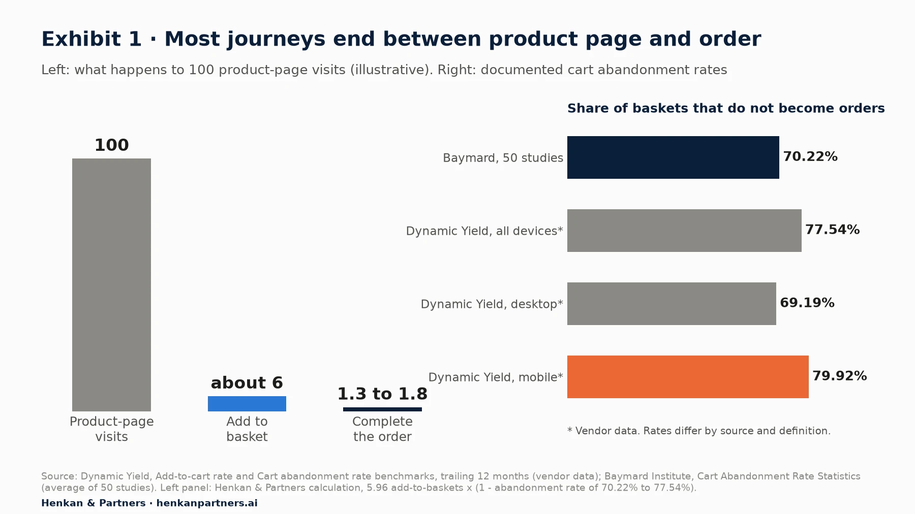
What this shows. Only a small share of product-page visits become orders, and most baskets are abandoned. Mobile, which carries most traffic, abandons more often than desktop. Not every abandoned basket is a lost sale: Baymard finds that 42% of US shoppers abandon because they were "just browsing". The opportunity is the share that leaves because of problems you can fix.
Baymard estimates that the average large e-commerce site could increase its conversion rate by 35.26% through better checkout design alone. Treat that as an upper bound for a site with many problems, not a forecast for yours. The practical point is that the product page and checkout combine the highest intent with a large, well-documented set of fixable issues. That is why, in our experience, they are the first places to look in any conversion rate optimization programme.
For marketers. Before buying more traffic, check what happens to the traffic you already have on product pages and in checkout. A 10% improvement at the bottom of the funnel is worth the same as 10% more visitors, and it compounds with every campaign.
For leaders. Ask for one number each month: the share of sessions that reach checkout and do not order, split by device. If nobody can produce it, measurement is the first project.
Section 2 · Product page
Product page optimization means answering every question a shopper has before they have to ask it
A product detail page has one job: give the shopper enough confidence to add the product to the basket. Baymard's 2026 product page benchmark of 155+ sites rates 52% of desktop sites, 62% of mobile sites and 64% of apps as "mediocre" or worse. The gaps are rarely about aesthetics. They are about missing information.
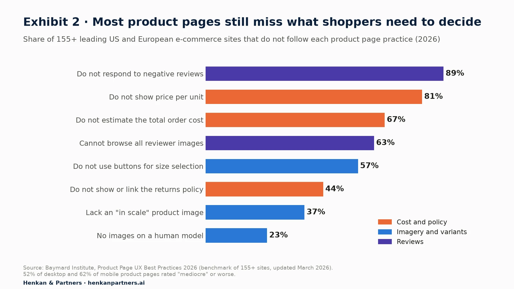
What this shows. The most common gaps concern cost and policy: two-thirds of sites leave shoppers to guess the total price, and almost half hide the returns policy. These are content and data problems, often cheaper to fix than a redesign. Review handling is also weak, which matters because reviews are among the strongest signals shoppers use.
Imagery and video: show scale, detail and the product in use
Shoppers cannot touch the product, so images do the work of the shop floor. Baymard found that 42% of users try to judge a product's size from its images, and recommends at least one "in scale" image that shows the product next to a person or familiar object; its 2026 benchmark finds 37% of sites still lack one. For clothing, accessories and cosmetics, 23% of sites show no images on a human model. On mobile, use thumbnails rather than dots to show that more images exist: in Baymard's testing, 50% of desktop users had difficulty finding additional images when only indicators were used.
- Cover the questions, not just the angles. Front, back, detail, texture, in use, in scale, and each colour variant.
- Use video where movement matters, such as fabric drape, how a mechanism works or how a product is assembled. Keep it optional and light, so it does not slow the page.
- Update the main image when the shopper selects a variant. A shopper who picks "navy" and still sees black loses confidence.
Price and delivery cost: show the total before the basket
Unexpected costs are the first reason for leaving checkout (Section 3), and the product page is where to prevent them. Baymard finds that 67% of sites give no estimate of the total order cost on the product page, and 81% do not show a price per unit where it is relevant. Show delivery cost, or the threshold for free delivery, next to the price. If duties or taxes apply for cross-border orders, say so. In the EU, the selling price and, for many goods, the unit price must be shown clearly (Section 8).
Size, fit and variant selection: make the choice obvious
Variant selection is where many product pages fail quietly. Baymard's benchmark finds that 57% of sites do not use buttons for size selection, relying on drop-down menus that hide options and make unavailable sizes hard to see. Show every size as a button, mark sold-out sizes clearly rather than hiding them, and link a size guide that uses measurements the shopper can check at home. For fashion, fit information from other buyers ("runs small") is often more useful than a generic chart. We return to AI size recommenders in Section 9.
Stock and delivery promise: give a date, not a speed
"Delivery in 3 to 5 working days" makes the shopper do arithmetic. "Arrives Thursday 2 October" does not. Baymard's checkout benchmark finds that 48% of sites still show delivery speeds rather than dates, and 83% do not show order cut-off times as a countdown. Put the delivery date and any click-and-collect option on the product page, not only in checkout. Show stock status honestly: low-stock messages that are always on are a dark pattern that regulators are watching (Section 8).
Reviews and user-generated content: the strongest persuasion you do not write
The best-known evidence comes from the Spiegel Research Center at Northwestern University. Using review and sales data from partner retailers, it found that a product with five reviews has a 270% higher purchase likelihood than one with none. The effect was 190% for lower-priced products and 380% for higher-priced ones, where the risk of a bad choice is greater.
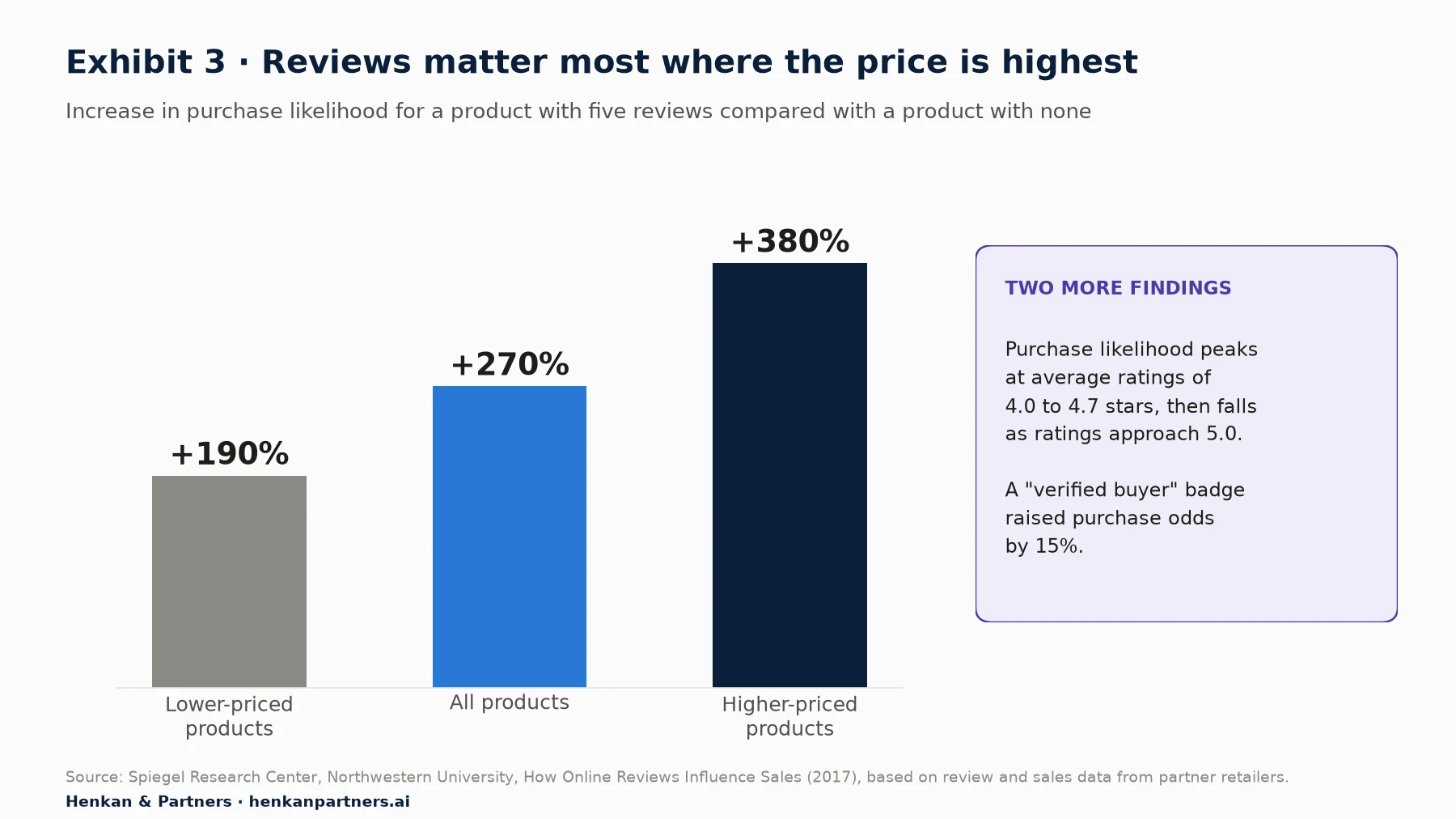
What this shows. The first few reviews matter most, and they matter more as prices rise. A perfect score is not the goal: purchase likelihood peaked at 4.0 to 4.7 stars, because shoppers distrust ratings that look too good. The study is from 2017, so treat the exact figures as directional; in our experience with clients, the pattern still holds.
Practical steps: ask every buyer for a review after delivery, show the distribution of ratings and not just the average, let shoppers filter by the attributes they care about (size, use case), and let them browse reviewer photos (63% of sites do not, per Baymard). Respond to negative reviews: 89% of benchmarked sites do not, which wastes the chance to show how you handle problems. In the EU, you must also say whether and how you check that reviews come from real customers (Section 8).
Trust signals: returns, security and who you are
Nineteen per cent of US shoppers in Baymard's survey abandoned a checkout because they did not trust the site with their card details, and 13% because of an unsatisfactory returns policy. Trust is built on the product page before it is tested in checkout. Show the returns policy (or a short summary with a link) near the add-to-basket button, name the payment methods you accept, and make contact options easy to find. Badges help only when they are recognised; a wall of generic "secure" icons adds clutter, not confidence.
Mobile layout and sticky add-to-basket: keep the action and the answers close
Mobile carries most traffic, and it converts worse. Contentsquare's 2026 benchmark (vendor data, 99 billion sessions across 6,000+ sites) finds mobile accounts for 69.9% of traffic, and desktop converts 74% better. On a small screen, the key information and the add-to-basket button are easily pushed below long descriptions. A sticky add-to-basket bar that appears once the main button scrolls out of view is a common pattern; we have seen it help and we have seen it do nothing, so test it on your own traffic rather than copying it (see Exhibit 7). Make sure it does not cover content or cookie banners, and that it still requires a size selection.
Speed: every tenth of a second counts on mobile
A study commissioned by Google and run by 55 and Deloitte across 37 European and American brand sites and more than 30 million sessions found that a 0.1-second improvement in mobile site speed increased retail conversion rates by 8.4% and retail spend by 9.2%. The study dates from 2019 and is observational, so the exact numbers will not transfer, but the direction is consistent. Google's Core Web Vitals give a practical target: a Largest Contentful Paint within 2.5 seconds, an Interaction to Next Paint of 200 milliseconds or less, and a Cumulative Layout Shift of 0.1 or less, measured at the 75th percentile of page loads. Product pages are often the heaviest on a site because of images, reviews widgets and third-party scripts, so audit them first.
| Element | What good looks like | Evidence |
|---|---|---|
| Images | In-scale image, model images for wearables, thumbnails on mobile, variant-aware gallery | Baymard: 37% lack in-scale images; 42% of users judge size from images |
| Price and cost | Delivery cost or free-delivery threshold next to price; unit price where required | Baymard: 67% give no total cost estimate |
| Variants | Size buttons, clear sold-out states, measurable size guide | Baymard: 57% do not use size buttons |
| Delivery | Delivery date and cut-off time, click-and-collect options | Baymard: 48% show speeds not dates |
| Reviews | Rating distribution, filters, reviewer photos, responses to negative reviews | Spiegel: +270% with five reviews vs none |
| Trust | Returns summary near the button, payment methods shown | Baymard: 19% abandon over card-detail distrust |
| Speed | LCP ≤ 2.5 s, INP ≤ 200 ms, CLS ≤ 0.1 at the 75th percentile | Google/Deloitte: +8.4% retail conversion per 0.1 s (2019) |
Section 3 · Cart abandonment
Most checkout abandonment comes from cost, trust and effort, and much of it can be fixed
Baymard's quantitative study of US online shoppers is the most cited source on why people leave checkout. Once shoppers who were "just browsing" (42%) are set aside, the reasons fall into three groups: the offer, the checkout design, and trust or payment.
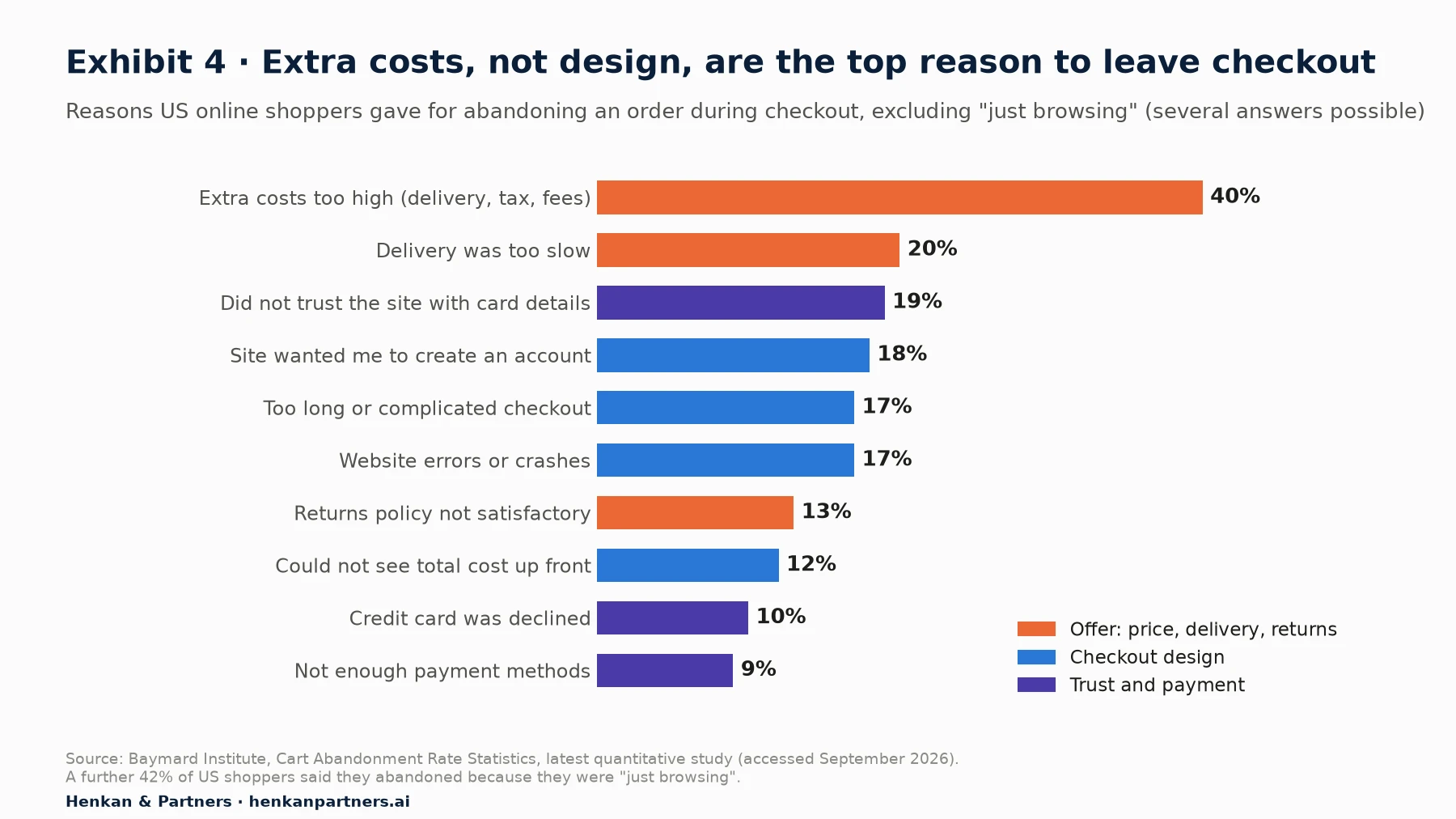
What this shows. The single largest reason is the offer itself: delivery costs, taxes and fees. Design problems (account creation, length, errors, hidden totals) together account for a similar share of mentions. Some reasons, such as declined cards, sit partly outside your control but can be softened with clear messages and alternative payment methods.
Two lessons follow. First, a better checkout cannot fully compensate for an uncompetitive offer; if delivery costs drive abandonment, the fix may be a free-delivery threshold, not a new form. Second, the design problems are the ones with the best-documented solutions, which makes them the natural place to start testing. Baymard's more recent articles quote slightly different figures (for example 39% for extra costs and 21% for slow delivery), so treat these as stable orders of magnitude rather than precise constants.
Our view. Exit-intent pop-ups and discount codes are the reflex answer to cart abandonment. Baymard itself notes that these tactics address price sensitivity or distraction, not the underlying friction. In our experience, they also train customers to wait for a discount. Fix the cause first; use recovery emails for the shoppers who were genuinely interrupted.
Section 4 · Checkout
Checkout optimization starts by cutting the checkout to what the order actually needs
Baymard's 2025 checkout benchmark of 180+ leading US and European sites rates 64% of desktop and 63% of mobile checkouts "mediocre" or worse. Only 2% are rated "good". The problems are consistent, and so are the fixes.
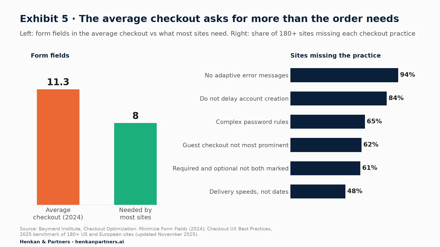
What this shows. The average checkout asks for about 40% more fields than most orders need, and almost every site handles errors poorly. These are among the cheapest problems to fix, because they require removing things rather than building new features.
Form fields: remove, hide or combine
In 2024, Baymard found the average checkout was 5.1 steps long with 11.3 form fields, while most sites need only 8. Counting every element (fields, checkboxes, drop-downs), the average US checkout has 23.48 form elements against an ideal of 12 to 14. Most of the excess is easy to remove:
- Use a single "full name" field where your systems allow it (89% of sites do not).
- Hide "Address line 2" and the coupon code field behind a link (75% and 35% of sites do not).
- Default billing address to delivery address and hide the billing fields (24% of sites do not).
- Explain why you need a phone number, or make it optional. Baymard reports that over 70% of survey respondents are reluctant to give one, and 49% of sites do not explain why it is required.
- Mark both required and optional fields. When only optional fields were marked, 32% of Baymard's test participants failed to complete required fields; 61% of sites do not mark both.
Guest checkout and account creation: make buying without an account the obvious path
Forced account creation is one of the clearest, most fixable causes of abandonment: 18% of US shoppers cite it in Baymard's latest study, and a 2022 Baymard survey of 4,384 US adults found 24% had abandoned at least one basket in the past quarter solely because of it. Offering a guest option is not enough. Baymard's 2025 benchmark finds that 62% of sites fail to make guest checkout the most prominent option, 65% impose complex password rules, and 84% do not delay account creation until after the order.
The recommended pattern: put "Guest checkout" at the top of the account step as a button, do not ask for an email before showing the choice, and offer to create an account on the confirmation page using details the shopper has already entered. You keep the customer relationship; the shopper keeps momentum.
Delivery options and costs: dates, all options, no surprises
Show delivery dates rather than speeds, and include every fulfilment option (home delivery, collection point, in-store pickup) in one selector: Baymard finds 52% of sites do not. If delivery is free above a threshold, show the remaining amount in the basket. Above all, make sure the total the shopper saw on the product page and in the basket matches the total at payment. Twelve per cent of US shoppers abandoned because they could not see the total cost up front.
Address autocomplete: fewer keystrokes, fewer errors
Address entry is the longest part of most checkouts. Baymard recommends an address lookup that fills the fields automatically, while still allowing manual entry for addresses the service does not know. Make sure your fields support browser autofill with the correct autocomplete attributes, which on mobile often saves more effort than any custom widget. Validate postcodes against the selected country before submission, not after.
Error handling: say exactly what went wrong and how to fix it
Website errors or crashes drove 17% of US shoppers away in Baymard's study, and 94% of benchmarked sites do not use adaptive error messages, which name the specific problem ("The card number is missing a digit") rather than a generic "Invalid input". Validate inline as the shopper completes each field, keep what they typed after an error, place the message next to the field, and never clear the payment form because of a problem elsewhere. Track every error as an event (Section 7): error rates are one of the most direct measures of checkout friction.
One-page vs multi-step checkout: the evidence points both ways
There is no universal winner. Baymard's long-standing position is that a one-page checkout "won't necessarily perform better than a comparatively optimized multi-step checkout", and that its test participants rarely struggle with the number of steps; they struggle with the fields and choices inside them. Many published A/B tests that favour one-page designs compare a new, optimised one-page flow against an old, unoptimised multi-step one, which confounds the layout with the clean-up.
In practice, a one-page checkout can suit short orders and returning customers with saved details; a multi-step flow can suit complex orders (several delivery options, gift messages, business invoices) because each step asks for less at once. Platform constraints often decide for you. If you do test layouts, change the layout only, keep the fields identical, and measure completed orders and revenue per visitor rather than step progression.
For marketers. You can make most of the changes in this section without a new checkout: remove fields, reorder the account step, rewrite error messages, and add delivery dates. Several are safe to ship without a test if your platform allows it.
For leaders. The checkout is usually owned by several teams (e-commerce, IT, payments, legal). Give one person the authority to remove fields and change the order of steps, or nothing will move.
Section 5 · Payments
Offer the payment methods your customers already use, and treat express checkout claims with care
Nine per cent of US shoppers in Baymard's study abandoned because there were not enough payment methods, and 10% because their card was declined. Which methods matter depends on where your customers are. Worldpay's Global Payments Report 2026 found that digital wallets, such as Apple Pay, Google Pay, PayPal and regional apps, carried 56% of global e-commerce transaction value in 2025, up from 53% in 2024 according to the previous edition.
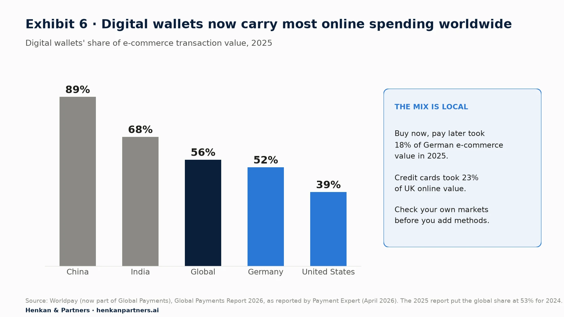
What this shows. Wallets now carry most online spending worldwide, but their share ranges from 39% in the United States to 89% in China. Buy now, pay later (BNPL) is a significant method in some markets, such as Germany at 18%. Start from your own payment data by country before adding or removing methods.
Wallets and buy now, pay later: follow your customers, not the hype
Worldpay's 2025 report estimated global BNPL online spending at $342 billion in 2024, and the 2026 edition projects $500 billion of e-commerce value by 2030. BNPL can raise order value on higher-priced baskets, but it carries fees and, in several markets, new consumer-credit rules. Offer it where your customers use it and where the margin allows, and check how it is presented: a BNPL message on the product page is a price communication and must not mislead.
Express checkout: what the evidence says, and whose evidence it is
Express or accelerated checkouts let returning shoppers pay with stored details in one or two taps. The best-known claims come from the vendors who sell them, so read them for what they are:
- Shop Pay (Shopify). Shopify states that Shop Pay "lifts conversion by up to 50% compared to guest checkout" and outperforms other accelerated checkouts by at least 10%, citing an April 2023 study by "a Big Three global management consulting firm". The methodology is not published. Vendor data.
- Apple Pay via Stripe. Stripe reports that businesses that offered Apple Pay saw an average 22.3% increase in conversion and 22.5% in revenue, from a holdback experiment across its Optimized Checkout Suite; surfacing at least one relevant method beyond cards increased conversion by 7.4% on average. Vendor data, but from a controlled holdback design, which is stronger than a before-and-after comparison.
The honest conclusion: express wallets are very likely to help on mobile, where typing card and address details is hardest, but your gain depends on how many of your customers already use the wallet. Place express buttons in the basket and at the top of checkout, not only on the payment step, and measure the share of orders that use them.
Strong customer authentication: design for it rather than around it
In the European Economic Area, the second Payment Services Directive (PSD2) requires strong customer authentication (SCA), meaning two of three factors (something the customer knows, has or is), for most online card payments. The requirement came into force in September 2019, and the European Banking Authority set 31 December 2020 as the deadline for e-commerce card migration. Exemptions exist, including low-value remote payments up to €30 (with cumulative limits) and transaction risk analysis, but it is the card issuer that decides whether to apply them. Wallets that authenticate with biometrics on the device can make SCA almost invisible. PSD2's successors, the PSD3 directive and the Payment Services Regulation, reached political agreement in November 2025 and are expected to apply from around late 2027; they tighten fraud rules rather than remove SCA.
Section 6 · Testing
A/B test the high-evidence fixes first, and discount the published lift numbers
Not every change needs an A/B test. Some are simply broken things to fix: a failing postcode validation, a misleading total, a missing returns policy. Others are uncertain and worth testing because they have both upside and downside. Our essential guide to A/B testing explains the method. Here we focus on what to test first on these two pages.
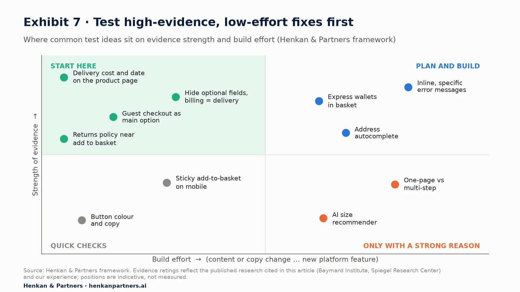
What this shows. The top-left quadrant holds changes with strong research support that are cheap to build. Start there. Button colours and copy are cheap but rarely matter much. Layout changes such as one-page checkout and new AI features are expensive and uncertain, so run them only when research points to them.
| Priority | Test idea | Effort | Evidence | Typical primary metric |
|---|---|---|---|---|
| 1 | Show delivery cost, free-delivery threshold and delivery date on the product page | Low | Strong: top abandonment reason; 67% of sites lack a cost estimate (Baymard) | Revenue per visitor; checkout completion |
| 2 | Make guest checkout the most prominent option; move account creation to confirmation | Low | Strong: 18% abandon over forced accounts; 62% of sites fail (Baymard) | Checkout completion rate |
| 3 | Remove or hide fields (address line 2, coupon, billing address, single name field) | Low to medium | Strong: 11.3 fields vs 8 needed (Baymard) | Checkout completion; form error rate |
| 4 | Returns summary and trust information near add-to-basket | Low | Medium: 13% abandon over returns, 19% over distrust (Baymard) | Add-to-basket rate; revenue per visitor |
| 5 | Express wallets in the basket and at checkout start | Medium | Medium: vendor data only (Shopify, Stripe) | Checkout completion on mobile; revenue per visitor |
| 6 | Inline, specific error messages and postcode validation | Medium | Strong on usability: 94% of sites lack adaptive errors (Baymard) | Form error rate; checkout completion |
| 7 | Review display: distribution, filters, reviewer photos | Medium | Medium: Spiegel (2017); Baymard | Add-to-basket rate |
| 8 | Size buttons and size guide improvements | Low to medium | Medium: 57% of sites lack size buttons (Baymard) | Add-to-basket rate; return rate (guardrail) |
| 9 | Sticky add-to-basket on mobile | Low | Weak: mostly vendor or anecdotal | Add-to-basket rate (mobile) |
| 10 | One-page vs multi-step checkout | High | Mixed: Baymard sees no inherent winner | Orders and revenue per visitor |
Three rules keep the results honest:
- Use revenue per visitor or orders per visitor as the primary metric, not add-to-basket rate or step progression. A change can push more people into checkout without producing more orders.
- Watch guardrails such as return rate (for size and imagery changes), average order value (for BNPL and delivery thresholds) and payment failure rate (for payment changes).
- Be sceptical of published lift numbers. Most "this change lifted conversion by 30%" case studies come from vendors or agencies, are selected because they won, and rarely report confidence intervals. Across companies, most experiments do not win. Use published results to choose what to test, never to forecast what you will gain.
Many product page tests can be built as client-side variations. If your team does this itself, read our guide to DOM manipulation for A/B testing first, because product pages are full of dynamic elements (variant pickers, price widgets, stock messages) that break easily. Checkout tests often need to be server-side or run through your platform's checkout extensibility, because many hosted checkouts restrict scripts.
Our view. The most valuable checkout "test" is often a usability session. Watch five customers try to buy a product on their own phone. In our experience you will see the three biggest problems in the first hour, and some of them will not need a test to fix.
Section 7 · Measurement
Measure every step, every field and every error, or you will optimise blind
Build the funnel in GA4 with the recommended e-commerce events
Google Analytics 4 defines a standard set of e-commerce events. For these two pages, the sequence that matters is:
view_item → add_to_cart → view_cart → begin_checkout → add_shipping_info → add_payment_info → purchase
Implement each one with consistent item parameters (item ID, variant, price). In GA4's funnel exploration you can build up to 10 steps, choose an open funnel (users can enter at any step) or a closed one (they must start at the first), break the funnel down by a dimension such as device, and show the elapsed time between steps and the most common next action. Break the checkout down by device, traffic source, new versus returning customers and payment method: the average hides the leak.
Standard events do not tell you why people leave. Add context with custom dimensions such as stock status, delivery promise shown, checkout type (guest or account) and error type; our article on which custom dimensions to collect in e-commerce analytics lists the ones we use most.
Field-level analytics: find the field that breaks the form
Form analytics, available in most experience-analytics tools or built with custom events, records for each field how often it is started, corrected, left empty or returned with an error, and where people abandon the form. Track at least: error message shown (with the field and message), payment failure (with the reason code from your payment provider) and field abandonment. A single field with a high error rate, such as a phone number with a strict format, can cost more orders than any design change will win.
Session replay: watch the sessions that failed
Funnels tell you where; session replay shows you why. The key is filtering, not watching at random. Useful filters on these pages: sessions that reached begin_checkout without a purchase; sessions with an error event; rage clicks on the add-to-basket button or the payment button; repeated changes of size or delivery option; and mobile sessions that scrolled the product page without adding to basket. Mask all personal and payment data. Our session replay guide covers tool choice, privacy settings and how AI now summarises replays.
Ask the customers who did not buy
Numbers and replays show behaviour, not motive. A one-question survey on exit from checkout ("What stopped you from completing your order today?") or after a failed payment often reveals the offer problems that no analytics tool can: delivery cost, delivery date, a missing payment method. Our Voice of Customer guide explains how to run these surveys without annoying customers.
| Question | Where to look | Metric or signal |
|---|---|---|
| Do product pages persuade? | GA4 funnel from view_item | Add-to-basket rate per product view, by device and category |
| Where does checkout leak? | GA4 closed funnel from begin_checkout | Step-to-step completion, elapsed time |
| Which field causes errors? | Form analytics or custom error events | Error rate and abandonment per field |
| Do payments fail? | Payment provider reports, add_payment_info vs purchase | Authorisation and SCA failure rate by method |
| Why do people leave? | Session replay filtered on errors; exit survey | Recurring patterns and stated reasons |
Section 8 · Accessibility and law
Accessibility and consumer law are now part of product page and checkout design, not an afterthought
In the EU, several rules apply directly to how you present products and take payment. None of what follows is legal advice; check with your counsel for your markets.
The European Accessibility Act applies to e-commerce since June 2025
The European Accessibility Act (Directive (EU) 2019/882) has applied since 28 June 2025. It covers e-commerce services, defined broadly as the online sale of any product or service and including all the steps that lead to a consumer transaction, for any provider selling to EU consumers. Microenterprises providing services (fewer than 10 employees and annual turnover or balance sheet total of no more than €2 million) are exempt. Compliance with the harmonised standard EN 301 549, which incorporates the Web Content Accessibility Guidelines (WCAG), gives a presumption of conformity. Enforcement is national: Germany's implementing law, for example, provides for fines of up to €100,000 per infringement.
For product pages and checkout, the practical implications are concrete: text alternatives for product images, variant pickers and size buttons that work with a keyboard and screen reader, error messages that are announced and linked to their field, sufficient colour contrast (sale prices in pale red often fail), no time limits without a way to extend them, and payment and authentication steps that work with assistive technology. Many of these also improve conversion for every shopper. Clear, specific error messages are both an accessibility requirement and one of Baymard's most neglected checkout practices.
EU price, review and checkout rules already apply
| Rule | What it requires on the product page or checkout | Source |
|---|---|---|
| Price indication | Show the selling price and, for many goods, the unit price in a way that is unambiguous, easily identifiable and clearly legible | Price Indication Directive 98/6/EC |
| Price reductions | When announcing a reduction, show the prior price: the lowest price in the 30 days before the reduction | Article 6a, added by Omnibus Directive (EU) 2019/2161, applicable since 28 May 2022 |
| Reviews | Say whether and how you ensure published reviews come from consumers who used or bought the product; fake or commissioned reviews are banned | Unfair Commercial Practices Directive, as amended by the Omnibus Directive |
| Pre-ticked boxes | No pre-ticked boxes for extra paid options such as insurance, gift wrap or donations | Consumer Rights Directive 2011/83/EU |
| Order button | The final button must make clear that ordering implies an obligation to pay, for example "Order with obligation to pay" or an equally unambiguous wording | Consumer Rights Directive, Article 8; CJEU case C-249/21 (2022) |
| Strong customer authentication | Two-factor authentication for most online card payments, with limited exemptions | PSD2 and Delegated Regulation (EU) 2018/389 |
More is coming. The European Parliament's legislative tracker lists the Commission's proposal for a Digital Fairness Act as planned for the fourth quarter of 2026, targeting dark patterns, addictive design and unfair personalisation. Fake countdown timers, permanent "only 2 left" messages and confusing opt-outs are the kind of dark patterns it targets. If a tactic only works because shoppers misunderstand it, stop testing it now.
Section 9 · AI
AI can help shoppers decide on the product page, but the checkout still has to be yours and has to be trusted
AI-generated product descriptions: faster content, same responsibility
Platforms now generate product copy on demand. Shopify Magic, for example, drafts descriptions from a product title, keywords and features. The gain is speed and coverage, especially for long-tail products with thin content. The risk is accuracy: Shopify's own help centre warns that generated text may include inferred facts based on similar products and that merchants remain "responsible for the accuracy of all of the content" they publish. An invented material or dimension on a product page is a consumer-law problem, not just a quality one. Generate drafts, check every factual claim against the product data, and A/B test descriptions like any other change.
Size and fit recommenders: promising, but test against returns
AI size recommenders predict a shopper's size from their answers, past purchases or other buyers' feedback. They target a real problem, since size and fit are a common reason for fashion returns, but we have not found independent, peer-reviewed evidence of their conversion effect that we could verify, and vendor figures vary widely. If you test one, measure both conversion and return rate for at least one full return cycle; a recommender that raises conversion but also returns has not helped.
Conversational shopping assistants: large scale at Amazon, self-selected users
Amazon reported that its Rufus assistant reached 300 million customers in 2025 and generated nearly $12 billion in incremental annualised sales, and that customers who use Rufus are 60% more likely to complete a purchase. These are company-reported figures, and the 60% compares shoppers who chose to use the assistant with those who did not, so part of the gap is likely to be selection rather than effect. Contentsquare's 2026 benchmark (vendor data) finds that traffic referred by AI assistants converted at 1.3%, up 55% year on year. The lesson for most retailers: an assistant on the product page is worth testing where products are complex and questions are frequent, and structured, accurate product data is the precondition for any of it. The same data also determines whether AI assistants recommend your products at all, a topic we cover in our work on generative engine optimisation.
Agentic checkout: real, early and moving fast
Agentic checkout lets an AI agent complete a purchase on the shopper's behalf. Two initiatives show both the promise and the uncertainty:
- OpenAI. In September 2025, OpenAI launched Instant Checkout in ChatGPT for US users, built on the Agentic Commerce Protocol co-developed with Stripe, starting with Etsy sellers and Shopify merchants. In April 2026, OpenAI moved away from Instant Checkout, routing shoppers to merchants' own sites or to experiences powered by the merchant's payment infrastructure, according to Checkout.com.
- Google. In January 2026, Google announced the Universal Commerce Protocol (UCP), an open standard co-developed with Shopify, Etsy, Wayfair, Target and Walmart and endorsed by partners including Adyen, Mastercard, Stripe, Visa and Zalando. It powers a checkout on eligible product listings in AI Mode in Search and the Gemini app for US shoppers, using Google Pay or PayPal.
Our reading: checkout is being unbundled from the website, but merchants are pushing to keep control of it because it connects to inventory, payments, fraud checks and customer data. For now, the practical steps are the same ones that help human shoppers: clean product feeds, accurate prices and stock, clear delivery dates and returns policies, and a payment set-up that works with the wallets these agents use. Agents cannot read a delivery promise hidden in an image or a returns policy buried in a PDF.
For marketers. Treat AI features on the product page like any other test: define the metric, include returns as a guardrail, and check that generated content is accurate.
For leaders. Agentic commerce does not require a big bet yet. It requires product, price, stock and policy data good enough for a machine to trust. That investment pays off on your own site too.
Section 10 · Common mistakes
Most product page and checkout programmes fail for the same eight reasons
- Optimising the design when the offer is the problem. If delivery costs or dates drive abandonment, no layout change will fix it. Look at Exhibit 4 before redesigning.
- Measuring the wrong thing. Add-to-basket rate and step progression are not revenue. Make revenue or orders per visitor the primary metric, with returns and margin as guardrails.
- Copying competitors' patterns. A sticky bar or a one-page checkout that works for one retailer may do nothing for yours. Test it, or at least research it with your own customers.
- Forcing or pushing account creation. Still common, still costly. Put guest checkout first and offer an account after the order.
- Hiding costs until the last step. Surprises at payment are the single largest reason for leaving. Show delivery cost and date on the product page.
- Ignoring errors. Few teams track error messages as events, so they never see the one field that quietly blocks mobile shoppers.
- Treating accessibility and consumer law as a legal checklist. They are now enforceable in the EU, and most requirements also make the pages easier to use for everyone.
- Believing vendor lift numbers. Use them as hypotheses, never as forecasts. Most tests do not win, and the winners are usually smaller than the case study.
Section 11 · Next steps
What to do next: fix the evidence-backed basics, then test and measure your way forward
1. Measure the funnel you have
Check that the GA4 e-commerce events from view_item to purchase fire correctly, with consistent item data, and add error and payment-failure events. Build a closed checkout funnel by device. You cannot prioritise what you cannot see.
2. Audit both pages against the evidence
Use the product page checklist in Section 2 and the checkout practices in Section 4. Walk through your own site on a mid-range phone, as a new customer, with a real address. Note every question you could not answer and every field you did not need.
3. Watch and ask
Review 30 to 50 session replays of failed checkouts, filtered as described in Section 7, and add a one-question exit survey. Combine what you see with the funnel data to rank problems by the orders they cost.
4. Fix the obvious, test the uncertain
Ship clear fixes such as broken validation, hidden costs and missing returns information. Then work through the prioritised test table in Section 6, starting with delivery cost and date, guest checkout and form fields, using revenue per visitor as the primary metric.
5. Get compliant and AI-ready at the same time
Run an accessibility audit of the product page and checkout against EN 301 549 and WCAG, and review price reductions, review disclosures and the order button. Clean product data, delivery promises and policies serve accessibility, compliance and AI shopping agents alike. If you would like an independent audit of your product pages and checkout, or help building a test roadmap, Talk to us.
FAQ
Frequently asked questions about checkout optimization and product page optimization
Frequently asked questions
What is checkout optimization?
Checkout optimization is the process of improving the steps between the basket and the order confirmation so that more shoppers who start checkout complete a purchase. It covers form fields, guest checkout, delivery options, payment methods, error handling and page speed, and it uses analytics, user research and A/B testing to decide what to change.
What is product page optimization?
Product page optimization is the practice of improving the product detail page so that more visitors add the product to their basket and go on to buy. It focuses on imagery, price and delivery-cost visibility, variant selection, delivery promises, reviews, trust signals, mobile layout and speed.
What is a good cart abandonment rate?
There is no universal good rate. Baymard Institute's average of 50 studies is 70.22%, and Dynamic Yield reports 77.54% across its data (vendor data), with mobile higher than desktop. Compare yourself with your own history by device and traffic source, and focus on the share of abandonment caused by fixable problems rather than browsing.
What are the main reasons for cart abandonment?
In Baymard's latest US survey, excluding shoppers who were just browsing, the top reasons were extra costs such as delivery, tax and fees (40%), slow delivery (20%), not trusting the site with card details (19%), being asked to create an account (18%), a long or complicated checkout (17%) and website errors (17%).
Is a one page checkout better than a multi-step checkout?
Not inherently. Baymard's research finds that a one-page checkout will not necessarily beat a comparably optimised multi-step checkout; the fields and choices inside the checkout matter more than the number of steps. Many tests that favour one-page designs also include other improvements, which confounds the result.
Should I offer guest checkout?
Yes. Forced account creation caused 18% of US shoppers to abandon in Baymard's latest study. Make guest checkout the most prominent option, do not require an email before showing it, and offer account creation on the confirmation page.
How many form fields should a checkout have?
Baymard found that the average checkout in 2024 had 11.3 form fields, while most sites need only 8. Remove or hide address line 2, coupon code and billing address fields, and use a single name field where your systems allow.
Do express checkouts like Apple Pay and Shop Pay increase conversion?
Probably, especially on mobile, but most published figures are vendor data. Shopify claims Shop Pay lifts conversion by up to 50% versus guest checkout, and Stripe reports a 22.3% average conversion increase for businesses offering Apple Pay. Measure the share of your orders that use each wallet and test placement in the basket.
Does the European Accessibility Act apply to my online shop?
If you sell to consumers in the EU, it probably does. The Act has applied to e-commerce services since 28 June 2025, regardless of where the seller is based. Microenterprises providing services, with fewer than 10 employees and turnover or balance sheet of no more than €2 million, are exempt.
What should I A/B test first on a product page?
Start with changes backed by strong evidence and low build effort: showing delivery cost and delivery date near the price, adding a returns summary near the add-to-basket button, improving review display and using size buttons. Use revenue per visitor as the primary metric and return rate as a guardrail.
Key terms
- Product detail page (PDP)
- The page that presents a single product with its images, price, variants and add-to-basket button. It is where the buying decision is made, so its content drives add-to-basket rate.
- Add-to-basket rate
- The share of product views or sessions in which a product is added to the basket. It measures how well product pages persuade, but it is not a substitute for orders.
- Cart abandonment rate
- The share of baskets created that do not become orders. Baymard's average of 50 studies is 70.22%; it sizes the opportunity in basket and checkout.
- Checkout abandonment
- Leaving after starting the checkout process. It is a narrower, more actionable measure than cart abandonment because the shopper has shown clear intent.
- Guest checkout
- Buying without creating an account. Making it the most prominent option removes one of the most common, fixable causes of abandonment.
- Express checkout
- An accelerated payment option, such as Apple Pay, Google Pay, PayPal or Shop Pay, that uses stored details. It reduces typing on mobile, but published gains are mostly vendor data.
- Digital wallet
- An app or service that stores payment credentials and authenticates the payer, often with biometrics. Wallets carried 56% of global e-commerce value in 2025, so the right mix matters.
- Buy now, pay later (BNPL)
- A payment method that splits the price into instalments, usually interest-free for the shopper. It can raise order value in some markets but carries fees and credit rules.
- Adaptive error message
- An error message that names the specific problem and how to fix it, rather than a generic warning. It reduces failed submissions and is also an accessibility requirement.
- Strong customer authentication (SCA)
- The PSD2 requirement to verify most online card payments in the EEA with two of three factors. Checkout and payment flows must handle it without losing the shopper.
- European Accessibility Act (EAA)
- EU Directive 2019/882, applicable since 28 June 2025, which requires e-commerce services to be accessible to people with disabilities. It makes accessibility enforceable, not optional.
- Prior price
- Under EU rules, the lowest price in the 30 days before a price reduction, which must be shown when announcing a discount. It prevents inflated "was" prices.
- Revenue per visitor (RPV)
- Revenue divided by visitors, equal to conversion rate times average order value. It is the preferred primary metric for product page and checkout tests because it captures both.
- Agentic checkout
- A purchase completed by an AI agent on the shopper's behalf, through protocols such as the Agentic Commerce Protocol or the Universal Commerce Protocol. It depends on accurate, machine-readable product and policy data.
- Core Web Vitals
- Google's page experience metrics: Largest Contentful Paint, Interaction to Next Paint and Cumulative Layout Shift. They give concrete speed targets for heavy product pages.
Sources
All sources were checked in September 2026. Figures from Dynamic Yield, Contentsquare, Shopify, Stripe and Worldpay are vendor data from companies that sell related products or services, and are flagged as such in the text. Amazon's Rufus figures are company-reported. Exhibit 7 and the testing and measurement tables are Henkan & Partners frameworks; the left panel of Exhibit 1 is a Henkan & Partners calculation from the cited benchmarks. Disclosure: Henkan & Partners provides CRO, experimentation and analytics services, including product page and checkout audits.
- Baymard Institute (2026). Cart Abandonment Rate Statistics.
- Baymard Institute (2025). Checkout UX Best Practices 2025.
- Baymard Institute (2026). Product Page UX Best Practices 2026.
- Baymard Institute (2024). Checkout Optimization: Minimize Form Fields.
- Baymard Institute (2023). Make "Guest Checkout" Prominent.
- Baymard Institute (2026). How to Reduce Cart Abandonment.
- Baymard Institute (2011). One Page Checkout.
- Baymard Institute (2017). Provide at Least One "In Scale" Image.
- Baymard Institute (2020). Always Use Thumbnails to Represent Additional Product Images.
- Spiegel Research Center, Northwestern University (2017). How Online Reviews Influence Sales.
- Dynamic Yield (2026). Add-to-cart rate benchmark.
- Dynamic Yield (2026). Cart abandonment rate benchmark.
- Contentsquare (2026). Conversion Rates in 2026: Digital Experience Benchmark.
- Google, web.dev (2020). Milliseconds make millions.
- Google, web.dev. Web Vitals.
- Google (2026). Measure ecommerce, Google Analytics 4.
- Google (2026). Funnel exploration, Analytics Help.
- Payment Expert (2026). Digital wallets account for 56% of global e-com in 2025.
- Worldpay (2025). 10 Years of Cash, Cards and Crypto: Global Payments Report.
- Global Payments (2026). Global Payments Report 2026.
- Shopify (2023, updated). Shop Pay: The Best-Converting Accelerated Checkout on the Internet.
- Stripe (2025). Testing the conversion impact of 50+ global payment methods.
- European Commission. Payment services (PSD2 and PSD3/PSR timeline).
- European Banking Authority (2019). Opinion on the deadline for migration to SCA for e-commerce card payments.
- Commission Delegated Regulation (EU) 2018/389. Regulatory technical standards for SCA, Chapter III exemptions.
- Morrison Foerster (2026). PSD3 and the Payment Services Regulation: Key Developments.
- Bird & Bird (2025). A guide to navigating the European Accessibility Act for online retailers.
- Noerr (2025). Accessibility in e-commerce: new obligations from June 2025.
- Wikipedia. European Accessibility Act.
- EUR-Lex. Price indications on consumer products (summary of Directive 98/6/EC).
- iubenda. Obligations when announcing a price reduction: the Omnibus Directive.
- EY (2022). The Omnibus Directive: the new way to enhance protection of EU consumers.
- European Commission. Consumer Rights Directive.
- Society for Computers & Law (2022). CJEU rules on requirements for obligation to pay button.
- European Parliament. Legislative Train: Digital Fairness Act.
- Shopify Help Center. Automatically generating product descriptions.
- Modern Retail (2026). Amazon says its AI shopping assistant is gaining traction.
- OpenAI (2025). Buy it in ChatGPT: Instant Checkout and the Agentic Commerce Protocol.
- Checkout.com (2026). OpenAI's agentic commerce shift: what it means for merchants.
- Google (2026). New tech and tools for retailers to succeed in an agentic shopping era.