Focus
Mobile UX Audit for E-commerce: A Step-by-Step Method to Find What Costs You Sales
Alexandre Suon · 2026-09-29
Most e-commerce visits now happen on a phone, yet phones still convert far worse than desktops. A mobile UX audit finds out why, and how much it costs you. This deep dive sets out a method a CRO or UX team can run in one to two weeks: size the mobile gap in GA4, review every journey stage on real phones, check speed, tap targets, forms and sticky elements, watch and ask real mobile users, then score each finding and decide whether to fix it, test it or research it further.
Executive summary
- Phones bring most of the traffic but a smaller share of the orders, so the mobile gap is usually the largest single opportunity on the site. Contentsquare's 2026 benchmark (vendor data) puts mobile at 69.9% of traffic, converting at about 2.0% against 3.4% on desktop. Salesforce's 2024 holiday data (vendor data) shows mobile at 79% of traffic but nearly 70% of orders.
- Quantify the gap in your own analytics before you review a single screen. Break down traffic, conversion rate and each funnel step by device category in GA4. The step where mobile falls furthest behind desktop tells you where to look first, and a simple formula turns the gap into a revenue figure leadership understands.
- Review each journey stage on real phones, because mobile lags desktop almost everywhere. Baymard Institute rates 78% of mobile sites mediocre or worse on product lists, against 58% on desktop, with similar gaps on navigation, search and product pages. Checkout is the exception: mobile and desktop are equally weak.
- Use field data for speed and tap-target standards for touch. Only 48% of mobile sites passed all three Core Web Vitals in July 2025, against 56% on desktop. WCAG 2.2 sets a 24 × 24 CSS pixel minimum for targets; Apple recommends 44 × 44 points and Android 48 × 48 dp.
- Forms, keyboards and sticky elements are the cheapest wins. Correct input types and autocomplete attributes cost a developer minutes. Sticky add-to-cart bars, cookie banners and chat widgets compete for a small screen, so audit them together rather than one at a time.
- Score every finding and route it: fix, test or research. A Henkan & Partners scoring grid rates severity, reach and evidence. Clear defects are fixed without a test; plausible but uncertain changes go to the A/B test backlog; issues with an unclear cause go back to session replay and surveys.
Section 1 · Why it matters
Phones bring most visits but fewer orders, so the mobile gap is where the money is
A mobile UX audit is a structured review of how well an e-commerce site works on smartphones. It quantifies the conversion gap between mobile and desktop, checks each step of the shopping journey against mobile usability heuristics, performance and accessibility standards, adds evidence from session replay and customer feedback, and ends with a scored list of fixes and test ideas.
On most e-commerce sites, the phone is now the default device. Contentsquare's 2026 Digital Experience Benchmark, built on 99 billion sessions across more than 6,000 sites, finds that mobile accounts for 69.9% of traffic. Salesforce's analysis of the 2024 holiday season, covering more than 1.5 billion shoppers, puts mobile at 79% of global e-commerce traffic. Both companies sell software to retailers, so treat their numbers as vendor data, but they point the same way.
Orders do not follow traffic one for one. In the same Salesforce data, mobile's share of orders grew to nearly 70%, about nine points below its share of traffic. Contentsquare reports that mobile web converts at around 2.0% on average, against 3.4% on desktop: desktop converts 74% better. Each mobile session is worth less than each desktop session, and there are many more of them.
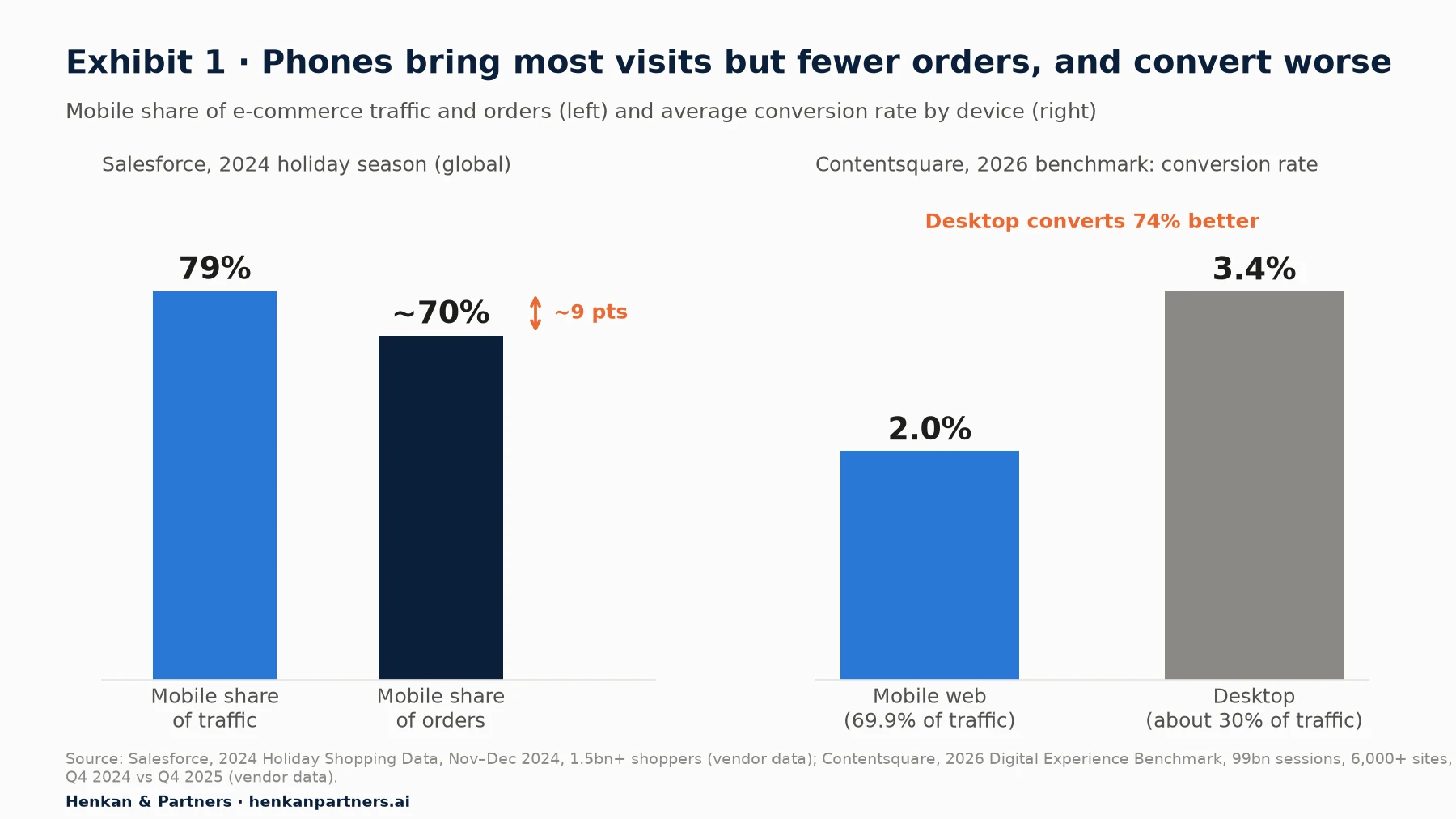
What this shows. The gap between mobile's share of traffic and its share of orders is the mobile opportunity in one picture. Part of that gap is not a UX problem at all: some people browse on the phone and buy later on a laptop, and some mobile visits are low-intent clicks from social media. The audit's job is to separate the part you can fix from the part you cannot.
Not all of the gap is fixable, and that is the point of measuring it
A mobile UX audit does not aim to make mobile convert like desktop. Desktop sessions are longer: Contentsquare finds desktop delivered 47% of total time spent from just 30% of visits. Cross-device journeys also shift credit: a shopper who discovers a product on Instagram on their phone and orders on their work laptop shows up as a mobile non-conversion and a desktop conversion, unless they sign in on both.
What the audit can do is find the friction that is specific to the phone: menus that hide the category you need, filters that reset when you go back, product images that cannot be zoomed, keyboards that show letters for a card number, buttons too small for a thumb, pop-ups stacked on top of each other, and pages that freeze for half a second after every tap. These are fixable, and they compound across every visit. The audit is one input to a wider programme; our essential guide to conversion rate optimisation explains how it fits with research, testing and measurement.
Our view. We run CRO audits for e-commerce clients, and the mobile gap is almost always where we start. Not because mobile design is always worse, but because it carries most of the traffic and is the device the internal team uses least. Most stakeholders review the site on a large laptop on a fast office connection. Your customers do not.
Disclosure: Henkan & Partners runs CRO and UX audits for clients.
Section 2 · Quantify the gap
Quantify the mobile gap in GA4 first, so the audit starts where mobile loses most
Before anyone opens a phone, spend half a day in your analytics tool. The goal is to answer three questions with numbers: how much of the traffic and revenue is mobile, how much worse mobile converts, and at which step of the funnel the gap opens. The examples use Google Analytics 4 (GA4), but any analytics tool with a device dimension works.
1. Device split and conversion gap
In GA4, the device category dimension classifies each session as desktop, tablet or mobile. Build a free-form exploration with device category as rows and sessions, purchases, session conversion rate, revenue and average order value as values, for the last 90 days. Compare the same period last year to see whether the gap is widening. Then add two breakdowns that change the picture on most sites: traffic source (in our experience, paid social traffic is mostly mobile and often low-intent) and new versus returning visitors.
Keep tablets separate. In our experience they behave more like desktop than like phones on most sites, and lumping them into "mobile" makes the phone look better than it is. If you have a native app, keep app and mobile web apart too: they are different products with different users.
2. Funnel by device
Next, build a funnel exploration with device category as the breakdown dimension. Use the GA4 recommended e-commerce events as steps: view_item_list, view_item, add_to_cart, begin_checkout, add_shipping_info, add_payment_info, purchase. Google's documentation notes that in a funnel breakdown, users are attributed to the first value they had when entering the funnel, such as the device they used at the first step. Use a closed funnel if you want to follow users who start at the top, and an open funnel to see entries at any step.
Compare step-to-step completion rates between mobile and desktop. The step where the mobile rate falls furthest below desktop is where your heuristic review should spend most time. In our experience, on many sites it is listing-to-product or product-to-cart, not the checkout everyone assumes. Our guide to funnel and cohort analysis explains how to read these reports and avoid common mistakes.
3. Put a value on the gap
Leadership responds to money, not to percentages. Turn the gap into a monthly revenue figure with a deliberately modest assumption: that the audit and resulting fixes close only part of the difference between mobile and desktop conversion.
Monthly value of closing part of the gap = mobile sessions × (desktop CR − mobile CR) × share of gap closed × mobile AOV

Illustrative: 360,000 × (2.8% − 1.5%) × 20% × €90 = 936 extra orders ≈ €84,000 a month
In this illustrative example, a site with 500,000 monthly sessions, 72% on mobile, converts at 1.5% on mobile and 2.8% on desktop, with an average order value (AOV) of €90. Closing a fifth of the gap is worth roughly €84,000 a month. The inputs are invented for the example; the logic is what matters. Use your own figures and a conservative share. Our e-commerce KPIs and benchmarks article explains why an external benchmark is a weak target compared with your own desktop rate and your own history.
| Question | GA4 report | Dimensions and metrics | What to look for |
|---|---|---|---|
| How much is mobile? | Free-form exploration | Device category; sessions, purchases, revenue | Mobile share of sessions vs share of revenue |
| How much worse does it convert? | Free-form exploration | Device category × new/returning × session source; session conversion rate, AOV | Gap that persists within the same traffic source |
| Where does the gap open? | Funnel exploration | Breakdown by device category; e-commerce events as steps | Step with the largest mobile vs desktop difference |
| Which devices and browsers? | Free-form exploration | Mobile device model, operating system, browser, screen resolution | Devices to test on; browser-specific drops (for example iOS Safari) |
| Which pages? | Pages and screens, filtered to mobile | Page path or template; views, engagement rate, exits | High-traffic templates with low engagement on mobile |
| Is it getting worse? | Any of the above | Same period last year; weekly trend | A widening gap after a release or redesign |
For marketers. Always compare mobile and desktop within the same traffic source. If most of your paid social budget lands on phones, a campaign push can widen the device gap overnight without any change to the site.
For leaders. Ask for the gap as a revenue figure with a stated, conservative assumption, not as a conversion rate. It makes the audit's priority obvious and gives you a baseline to measure against later.
Section 3 · Scope and set-up
Scope the audit on real phones, top templates and the journeys that carry revenue
A mobile UX audit that tries to review every page ends up reviewing none of them well. Scope it before you start, around three choices: which devices, which journeys and which conditions.
Choose devices from your own data
Use the GA4 device model, operating system and browser reports, filtered to mobile, to pick two or three real phones that cover most of your traffic. On most European sites that means at least one recent iPhone on Safari and one mid-range Android phone on Chrome. Add an older or cheaper Android phone if a meaningful share of your traffic uses one: performance problems that are invisible on a flagship phone are obvious on a budget device.
Browser emulators in developer tools are fine for checking layout, but they are not phones. They do not reproduce the on-screen keyboard, the browser's own toolbars that appear and disappear as you scroll, thumb reach, or the processor of a mid-range device. Do the heuristic review on real hardware.
Choose the journeys that carry revenue
Pick three to five journeys that represent how customers really buy, based on your landing pages and funnel data. A typical set: arrive from a paid social ad on a product page and buy as a guest; arrive on the homepage, browse a category with two filters and buy; search for a specific product by name; return as a logged-in customer and reorder; pay with a digital wallet. Run each journey end to end, including the order confirmation and emails, using a test payment method or a real low-value order that you cancel.
Test in realistic conditions
Test logged out, with a cleared browser, with the cookie banner showing, and at least once on a throttled or real mobile connection. Accept and refuse cookies in separate runs, because consent choices often change what loads. Record each run with the phone's screen recorder: the recordings become your evidence and save arguments later.
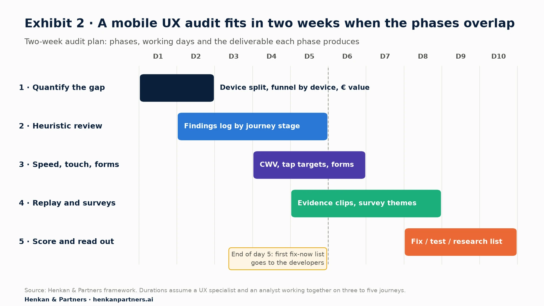
What this shows. The phases overlap on purpose. Qualitative evidence from session replay often confirms or kills a heuristic finding within a day, so it should run alongside the review rather than after it. A small team of a UX specialist and an analyst can run this plan in ten working days; a single person should allow two to three weeks, or narrow the scope to fewer journeys.
Section 4 · Heuristic review
Review each journey stage against mobile heuristics, because mobile lags desktop almost everywhere
A heuristic review is an expert inspection of an interface against a set of established usability principles. For e-commerce, the largest published body of such principles comes from Baymard Institute, which has run more than 20,000 hours of usability testing on mobile behaviour and publishes over 400 mobile UX guidelines. Its benchmarks rate leading US and European sites on each journey stage, separately for desktop and mobile.
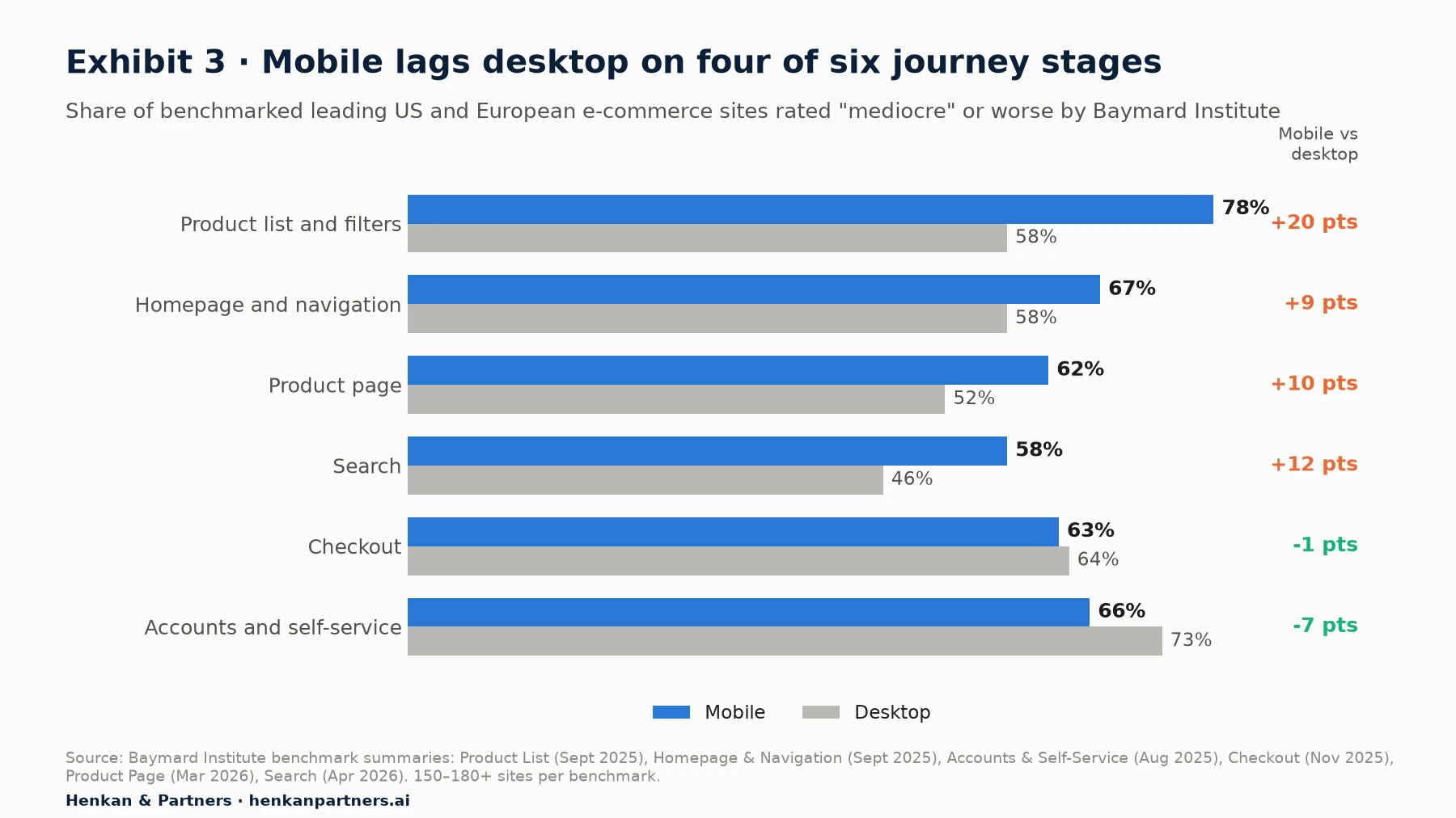
What this shows. Mobile is weaker than desktop on four of six journey stages, and the widest gap is on product lists, where 78% of mobile sites are mediocre or worse against 58% on desktop. Checkout and accounts are the exceptions: they are weak on both devices. The practical conclusion is that the pages people use to find and choose products deserve at least as much of your audit time as the checkout.
Baymard's overall mobile benchmark is blunt: 75% of mobile sites are rated mediocre and only one site in its 150+ site benchmark is rated good. Use the checklist below as a starting point for each stage. It is our summary of the checks we find most often fail on mobile, informed by Baymard's public findings; it does not replace a full guideline set.
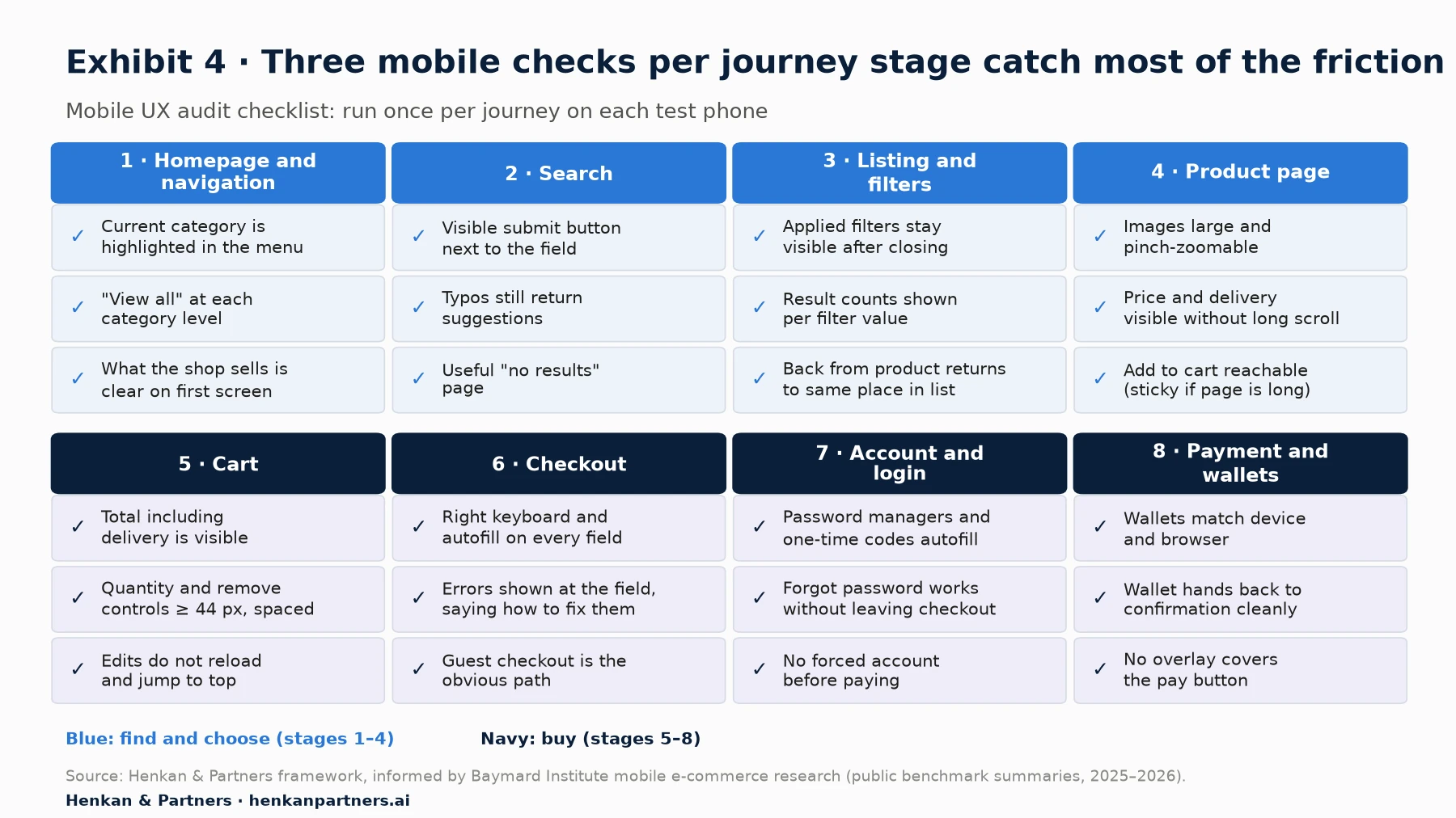
What this shows. The checklist is deliberately short so it can be run in one pass per journey on each test device. Each check is phrased as something you can see or do on the phone, so two reviewers should reach the same answer. Findings from the checklist feed straight into the scoring grid in Section 10.
Homepage and navigation: can people see where they are and get to the right category?
On a phone, the main menu is hidden behind an icon, so users lose the constant orientation desktop navigation provides. Baymard finds that 67% of mobile sites are mediocre or worse on homepage and category navigation. Its 2025 summary reports that 95% of sites fail to highlight the user's current scope in the main navigation, and 59% do not give full scope for mobile homepage links. Check that the menu shows where you are, that each category level offers a "view all" option, and that the homepage makes clear what the shop sells within the first screen.
Search: does the search box work like people expect?
On a small screen, search is often the quickest route to a product. Baymard rates 58% of mobile sites mediocre or worse on search, against 46% on desktop. Its 2026 mobile guidance notes that 27% of sites omit a visible search submit button next to the field, which matters because not everyone recognises the search key on the phone's keyboard, and that 28% do not offer autocomplete for misspelled queries. Type a product name with a typo, a colour plus a category ("black ankle boots") and a non-product query ("returns"), and see what happens.
Product lists and filters: can people narrow down without losing their place?
This is where mobile lags desktop most. Baymard finds 78% of mobile sites are poor to mediocre on product lists. Across the benchmarked sites, 80% do not provide three or more product thumbnails in product lists and search results, and 69% of mobile sites (68% on desktop) lack all four essential sort types (price, user rating, best-selling, newest). One site in five (20%) does not show an overview of applied filters. On the phone, check that filters open in a panel that shows how many results each choice gives, that applied filters stay visible after the panel closes, and that returning from a product page brings users back to the same place in the list rather than the top.
Product page: can people see the product and act on it with one thumb?
Baymard rates 62% of mobile product pages mediocre or worse, against 52% on desktop. The mobile-specific checks are about space: are images large and zoomable with a pinch, is the price and delivery information visible without scrolling far, does the size selector work with a thumb, and is the add-to-cart button reachable once you have scrolled into the details? The full product page checklist, including reviews, delivery dates and trust signals, is in our product page and checkout optimisation playbook. Here, focus on what breaks only on the phone.
Cart: can people check the total and edit without fighting the layout?
On mobile, cart pages often push the checkout button and the order total below a long list of items and cross-sell carousels. Check that the total, including delivery, is visible, that quantity and remove controls are large enough and far enough apart to avoid mis-taps, and that editing a line does not reload the whole page and jump the user back to the top.
Checkout: is every field necessary, and does the phone help fill it in?
Checkout is weak on both devices: Baymard rates 63% of mobile and 64% of desktop checkouts mediocre or worse, and reports that 62% of sites fail to feature guest checkout prominently. On a phone, every extra field means another keyboard switch and scroll. Section 7 covers keyboards and autofill in detail; the broader checkout checklist is in our playbook.
Account and login: can returning customers get in without a password battle?
Baymard rates 66% of mobile sites poor to mediocre on accounts and self-service. On a phone, forced account creation and password rules are particularly painful: passwords are harder to type on a touch keyboard, and switching apps to fetch a code can lose the page. Check that sign-in is optional for buying, that password managers can fill the fields, that one-time codes can be filled automatically, and that the "forgot password" route works without leaving the checkout. WCAG 2.2 added criterion 3.3.8, Accessible Authentication, which asks sites not to rely on cognitive tests such as remembering or transcribing a password without an alternative.
Payment and wallets: does the phone's own wallet appear where people expect it?
Digital wallets let mobile shoppers pay without typing card and address details, which removes most of the typing in a mobile checkout. Check which wallets appear on each test device and browser, where they appear (product page, cart, checkout), and whether the wallet flow hands back to your confirmation page cleanly. Wallet adoption varies a lot by market; our product page and checkout playbook covers the market data and the vendor claims about express checkout.
Section 5 · Performance
Measure speed with mobile field data, because a fast laptop hides the problem
Performance is a UX issue that shows up most on phones: slower processors, variable networks and heavier pages than the team realises. Google's Core Web Vitals measure three aspects of the experience, and Google recommends assessing them at the 75th percentile of page loads, separately for mobile and desktop.
- Largest Contentful Paint (LCP) measures loading: how long until the largest image or text block is visible. Good is 2.5 seconds or less; poor is above 4 seconds.
- Interaction to Next Paint (INP) measures responsiveness: the delay between a tap, click or key press and the next visual update. Good is 200 milliseconds or less; poor is above 500 milliseconds. INP replaced First Input Delay as a Core Web Vital on 12 March 2024. It counts taps and key presses, not scrolling.
- Cumulative Layout Shift (CLS) measures visual stability: how much content jumps around while the page loads. Good is 0.1 or less; poor is above 0.25.
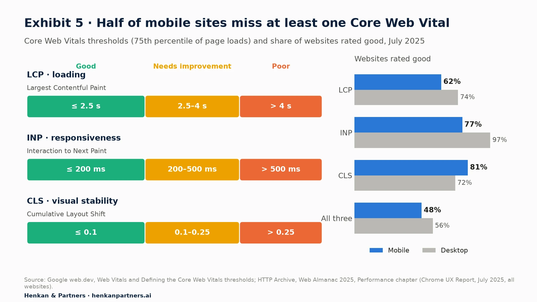
What this shows. Only 48% of mobile websites pass all three Core Web Vitals, against 56% on desktop. Loading is the weakest metric on phones, and responsiveness shows the widest device gap: 77% of mobile sites have good INP, against 97% on desktop. CLS is the one metric where mobile does better. The population is all websites, not only e-commerce, so use it as context rather than a target.
Use field data first, lab data second
Field data comes from real users. The Chrome UX Report (CrUX) is Google's public dataset of how real Chrome users experience popular sites; PageSpeed Insights shows it for your pages and origin over the previous 28-day collection period, split by mobile and desktop, when a page has enough traffic. Lab data comes from a simulated test: PageSpeed Insights runs Lighthouse on an emulated mid-tier phone on a mobile network. Lab data is useful to debug a template; field data tells you what customers actually experienced. When the two disagree, trust the field.
CrUX only covers pages with enough Chrome traffic and does not tell you which interaction was slow. To go further, collect the vitals yourself. Google's open-source web-vitals JavaScript library measures LCP, INP and CLS on real users, and its attribution build reports diagnostic detail such as the element the user interacted with and the longest script during a slow interaction. Sent to GA4 as event parameters, it lets you compare vitals by template, device and browser, and join them to conversion.
What to look for on mobile templates
- Slow LCP on product and listing pages: oversized hero images, images lazy-loaded above the fold, fonts that block text, and client-side rendering of the main content.
- Poor INP on filters, size selectors and add-to-cart: heavy JavaScript running on every tap, third-party tags, and A/B testing or personalisation scripts that re-render the page. Our guide to client-side and server-side testing covers the performance trade-offs of testing tools.
- Layout shifts: promotional banners, cookie notices and review widgets that load late and push the content down, often just as the user reaches for a button.
The business case: real, but read the small print
Google's web.dev case studies include several e-commerce examples. Vodafone ran an A/B test on a landing page in which the version with a 31% better LCP in the field produced 8% more sales. Trendyol reduced INP on its product listing page by 50% and reports a 1% uplift in click-through from listings to product pages. The most quoted study, Milliseconds Make Millions, was run by 55 and Deloitte and commissioned by Google: across 37 European and US brand sites and more than 30 million sessions at the end of 2019, a 0.1-second improvement in mobile speed metrics was associated with 8.4% more conversions on retail sites, with retail shoppers spending 9.2% more. It is observational and vendor-commissioned, so use it as direction, not as a forecast for your site.
Section 6 · Touch and accessibility
Check tap targets and accessibility, because thumbs are less precise than cursors and the law now applies
A mouse pointer is a single pixel. A fingertip is not: the Nielsen Norman Group, citing MIT Touch Lab research, notes that the average fingertip is 1.6 to 2 cm wide and recommends touch targets of at least 1 × 1 cm. Small, tightly packed links and buttons lead to mis-taps, and mis-taps on a shop mean the wrong size, the wrong product or an accidental removal from the cart.
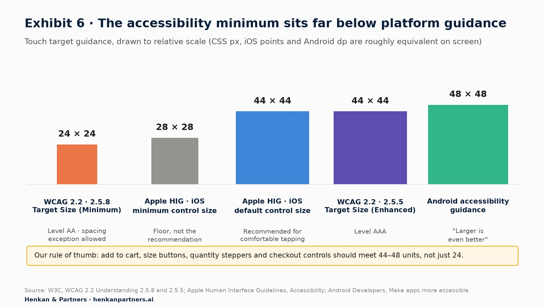
What this shows. The accessibility minimum and the design recommendation are far apart. WCAG 2.2's AA criterion only requires 24 × 24 CSS pixels (or enough spacing around smaller targets), while Apple and Android recommend 44 and 48 units for comfortable use. For the controls that make you money, such as add to cart, size buttons, quantity steppers and the checkout button, aim for the larger figure.
What the standards say
WCAG 2.2, published as a W3C Recommendation on 5 October 2023, added criterion 2.5.8 Target Size (Minimum) at level AA: targets must be at least 24 × 24 CSS pixels, with exceptions for targets with enough spacing, inline links in text, browser-default controls and cases where the size is essential. The stricter 2.5.5 Target Size (Enhanced), at level AAA, asks for 44 × 44 CSS pixels. Apple's Human Interface Guidelines give a default control size of 44 × 44 points on iOS and a minimum of 28 × 28, and recommend about 12 points of padding around bezelled elements. Android's accessibility guidance recommends touch targets of at least 48 × 48 dp.
Three other WCAG 2.2 criteria matter directly on mobile shops. 2.4.11 Focus Not Obscured (Minimum) means a focused element must not be entirely hidden by author-created content, which is exactly what sticky bars and cookie banners tend to do. 2.5.7 Dragging Movements asks for a single-pointer alternative to drag-only controls such as price sliders and swipe-only carousels. 3.3.8 Accessible Authentication (Minimum) is covered in the login section above.
Why it is no longer optional in Europe
The European Accessibility Act covers e-commerce services and has applied since 28 June 2025. The harmonised standard used to show conformity, EN 301 549, is still cited in its v3.2.1 version, built on WCAG 2.1 level AA, which has no AA target-size criterion; v4.1.1, published in September 2026, adopts WCAG 2.2 but had not yet been cited in the EU Official Journal when we checked. The Act does not replace good UX practice, but it turns many of the checks in this section from nice-to-have into compliance risk. Our product page and checkout playbook summarises what it means for shops; take legal advice for your own situation.
How to check tap targets and accessibility quickly
- Measure targets on the key controls with your browser's developer tools at a phone viewport: add to cart, size and colour buttons, quantity steppers, filter toggles, remove-from-cart, checkout and payment buttons.
- Look for crowded clusters: size buttons, pagination, footer links and icons in the header are the usual culprits.
- Zoom and reflow: zoom the page to 200% and check that nothing overlaps and the add-to-cart button stays reachable.
- Screen reader pass: run one journey with VoiceOver on iOS or TalkBack on Android. Unlabelled icon buttons (search, basket, close) show up immediately.
- Accidental taps: In mobile testing, Baymard observed users tapping items by accident while scrolling, adjusting their grip or using a finger to follow the text. For destructive actions such as removing an item, prefer an undo option to a confirmation dialog.
Section 7 · Forms and keyboards
Fix forms and keyboards first, because they are the cheapest mobile wins
Every form field on a phone costs a tap, a keyboard, a scroll and a chance of error. The good news is that the fixes are small. Two HTML attributes do most of the work. The inputmode attribute tells the phone which on-screen keyboard to show: numeric, decimal, telephone, email, URL or search. The autocomplete attribute tells the browser and password manager what the field is for, so it can fill it: tokens include email, tel, given-name, street-address, postal-code, cc-number, cc-exp and one-time-code. WCAG criterion 1.3.5, Identify Input Purpose (level AA), expects the purpose of personal data fields to be programmatically identifiable, which in practice means using these tokens.
| Field | Keyboard (type or inputmode) | Autocomplete token | Also check |
|---|---|---|---|
| type="email" | Auto-capitalisation and autocorrect off | ||
| Phone | type="tel" | tel | Explain why you need it; accept spaces and + |
| Postcode | inputmode="numeric" only where postcodes are numeric | postal-code | UK and other alphanumeric postcodes need a text keyboard |
| Card number | inputmode="numeric" | cc-number | Accept spaces; format as the user types |
| Expiry date | inputmode="numeric" | cc-exp | One field rather than two drop-downs |
| Name and address | Default text keyboard | given-name, family-name, street-address | Autocorrect off; address lookup |
| One-time code | inputmode="numeric" | one-time-code | Code can be filled from SMS without switching apps |
| Search | type="search" or inputmode="search" | (none) | Visible submit button next to the field |
How common are the mistakes? Baymard's most detailed keyboard benchmark is old: in 2015 it found that 54% of mobile sites failed to show an optimised keyboard for phone, postcode or card fields. We cite it for scale, not as today's rate, and in our audits these errors are still easy to find. More recent Baymard figures point at error handling and address entry: its 2026 mobile guidance reports that 93% of sites do not use adaptive validation error messages (messages that say exactly what is wrong with the specific input) and 54% lack an address validator or lookup.
How to test a mobile form in fifteen minutes
- Complete checkout on each test phone, noting every field where the wrong keyboard appears or the browser does not offer to fill.
- Submit the form with typical mistakes: a missing house number, a phone number with spaces, an expired card. Check that each error message says what to do and appears next to the field, not only at the top of the page.
- Rotate the phone and open and close the keyboard: check that the field in focus stays visible and is not hidden behind a sticky button or banner.
- Count the fields and the screens. Our product page and checkout playbook explains how to cut them.
Section 8 · Sticky elements
Audit everything that sticks to the screen together, because it all competes for the same space
On a phone, fixed or "sticky" elements are tempting: they keep an action or message in view as the user scrolls. The trouble is that every team adds its own. Marketing adds a promotion bar, legal a cookie banner, customer service a chat bubble, the app team an install banner, and the CRO team a sticky add-to-cart bar. Each one looks reasonable in isolation. Together they can cover a third of the screen.
Sticky add-to-cart: test it, do not assume it
A sticky add-to-cart bar appears at the top or bottom of the product page once the main button scrolls out of view, so the user can buy from anywhere on the page. It is a common pattern and many vendors publish large uplifts for it; treat those as marketing claims. In our experience it helps on long product pages with a lot of content below the fold, and does little on short ones. Audit it for three things: it must not hide content or the focused field (WCAG 2.4.11), it must still require a size or variant choice rather than adding a default, and it must not stack on top of a chat bubble or cookie banner. Then test it on your own traffic.
Measure how much of the screen is left for the shop
Take a screenshot on your most common phone, on the product page and in checkout, with every overlay that can appear on a first visit. Estimate the share of the viewport covered by fixed elements. As a Henkan & Partners rule of thumb, if more than about a quarter of the screen is covered in the default state, something should go, be merged or appear later. Check also what happens when the on-screen keyboard is open: sticky bottom bars often ride up above it and hide the field being typed in.
- Cookie banner: compact, dismissable, and not covering the add-to-cart button. Consent design is covered in our guide to user consent in e-commerce.
- Promotion and delivery bars: one line, not two; merge them if both exist.
- Chat and help bubbles: positioned so they do not cover the sticky add-to-cart or the checkout button; consider hiding them in checkout until needed.
- App install banners: use the platform's native smart banner rather than a full-screen interstitial on arrival.
- Pop-ups and email capture: not on the first page view of a mobile visit from an ad, and never in checkout.
Section 9 · Qualitative evidence
Watch and ask mobile users, because analytics shows where people drop but not why
The heuristic review tells you what could go wrong. Analytics tells you where people leave. Neither tells you what actually happened to a customer on a phone. Two qualitative sources close that gap: session replay and on-site surveys, with remote usability tests as a third when budget allows.
Session replay: filter to mobile and to failure
Session replay reconstructs individual visits from recorded page changes and interactions, so you can watch what a user did. For the audit, filter replays to mobile sessions that reached the step where your funnel gap is largest and did not continue. Watch 20 to 30 of them per step, note each problem you see and how often it recurs, and link the best examples to your findings. Our session replay guide compares tools, free tiers and privacy settings.
Most replay tools flag frustration signals automatically. Microsoft Clarity, for example, defines a rage click as several clicks in rapid succession in a clustered area, and a dead click as a click on an element that produces no visible change or navigation. On phones these are rage taps and dead taps: users tapping a product image that does not zoom, a price that looks like a link, or a filter that is slow to respond. Sort pages by these signals on mobile only; in our experience the ranking often differs from desktop.
On-site surveys: one question, at the right moment
Surveys on a phone must be short and must not block the page. Ask one open question at the moment of doubt, for example on exit from the cart ("Is anything stopping you from completing your order today?") or after purchase ("Was anything difficult about ordering on your phone?"). Make sure the survey widget itself passes the tap-target and overlay checks above. Our guide to on-site survey design covers wording, triggers and sample sizes, and analysing surveys with LLMs shows how to code open answers at scale.
Where AI helps, and where it does not
AI speeds up the evidence-gathering parts of the audit. Several replay tools now summarise sessions automatically, which helps you choose which ones to watch. Large language models can cluster hundreds of survey answers into themes in minutes. Google publishes an official, read-only MCP server for GA4 (MCP, the Model Context Protocol, is an open standard that lets AI assistants call external tools), with tools such as run_report and run_funnel_report, so an assistant can pull the device-split funnel for you. Three cautions apply: an assistant can choose the wrong metric or date range, summaries can miss the one detail that matters, and nothing replaces holding the phone yourself. Treat AI output as a first draft to check, never as the finding. Our article on AI agents in experimentation goes further.
Section 10 · Scoring and prioritisation
Score every finding, then route it to fix, test or research
In our experience, a typical mobile UX audit produces 40 to 100 findings. Presented as a flat list, they overwhelm the team and the easiest items get done first, not the most valuable. Score each finding the same way, then decide what kind of action it needs.
Priority score = Severity (1–3) × Reach (1–3) × Evidence (1–3)   → range 1 to 27

Severity: 1 = irritation, 2 = slows or confuses, 3 = blocks or causes errors
Reach: 1 = under 10% of mobile sessions, 2 = 10–40%, 3 = over 40%
Evidence: 1 = heuristic only, 2 = heuristic plus one data source, 3 = confirmed by analytics, replay or survey
This is a Henkan & Partners framework, not an industry standard. Its value is consistency: two reviewers scoring the same finding should land within a point or two. Estimate reach from GA4 (the share of mobile sessions that see the affected template or step), and raise evidence only when a second source genuinely confirms the problem.
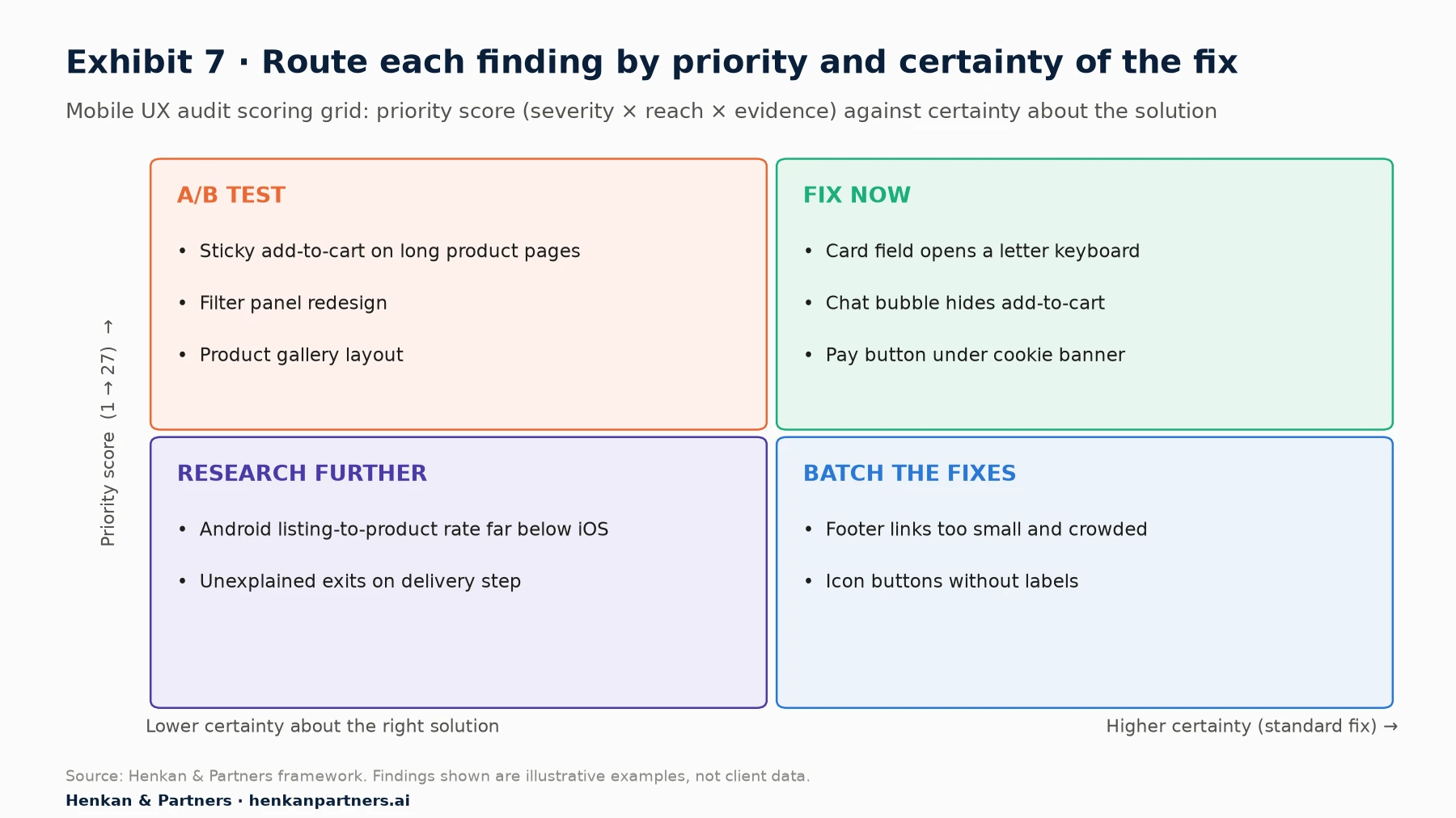
What this shows. The routing decision depends on two things, not one. A high-priority finding with an obvious, standard solution, such as a card number field that opens a text keyboard, should simply be fixed: testing it wastes traffic. A high-priority finding where the right solution is uncertain, such as a new filter design, belongs in the A/B test backlog. Low-certainty, unexplained findings go back to research before anyone designs anything.
| Finding (illustrative) | Score | Route | Why |
|---|---|---|---|
| Card number field opens a letter keyboard on iOS | 3 × 3 × 3 = 27 | Fix now | Clear defect with a standard fix; no test needed |
| Chat bubble covers the sticky add-to-cart on small phones | 3 × 2 × 3 = 18 | Fix now | Visible in replays; move or hide the bubble on product pages |
| Applied filters disappear after closing the filter panel | 2 × 3 × 2 = 12 | A/B test | Solution options differ (chips, counter, sticky bar); test the best candidate |
| No sticky add-to-cart on long product pages | 2 × 3 × 1 = 6 | A/B test | Plausible but unproven for your pages; test before rolling out |
| Listing-to-product rate on Android 30% below iOS | 3 × 2 × 1 = 6 | Research | Cause unknown; check INP on mid-range Android and watch replays |
| Footer links 18 px high and tightly packed | 1 × 1 × 1 = 1 | Batch fix | Low impact, clear fix; include in the next accessibility sprint |
From findings to the test backlog
Each finding routed to testing needs a proper hypothesis: the problem and its evidence, the change, the expected effect and the metric. Mobile tests have one extra constraint: segment the test to mobile (or run it on all devices and analyse mobile as a pre-registered segment), and make sure the variant does not add flicker or slow INP, or you will be testing the side effects of the tool rather than the idea. Our guide to turning customer insight into a test backlog covers hypothesis writing and prioritisation, and the A/B test QA checklist covers mobile QA before launch.
For marketers. Share the fix-now list with the development team in week two, not at the final readout. The quick fixes start paying back while the test backlog is still being designed.
For leaders. Judge the audit by the decisions it produces, not by the number of findings. A good readout fits on one page: the size of the gap, the top ten findings with their route, and the revenue at stake.
Section 11 · What to do next
What to do next: measure the gap, audit on real phones, then fix, test and re-measure
1. Put a number on your mobile gap this week
Build the device-split exploration and the funnel by device in GA4. Calculate the monthly value of closing a modest share of the gap. That single figure decides how much audit effort is justified.
2. Pick your phones and journeys
Choose two or three real devices from your own device and browser reports, and three to five journeys that carry most revenue. Record every run.
3. Run the checklist, the speed checks and the form test
Work through the journey-stage checklist, pull mobile Core Web Vitals from PageSpeed Insights, measure the key tap targets and complete checkout on each phone. Note every finding with a screenshot or recording.
4. Confirm with replays and a survey
Watch mobile sessions that fail at your weakest step and launch a one-question survey on mobile. Upgrade the evidence score of findings they confirm, and drop the ones they contradict.
5. Score, route and re-measure
Score every finding, ship the fix-now list, write hypotheses for the test list, and re-run the device-split report a month after the fixes go live. If you want an experienced team to run the audit with you or for you, Talk to us.
FAQ
Frequently asked questions about mobile UX audits
Frequently asked questions
What is a mobile UX audit?
A mobile UX audit is a structured review of how well a website works on smartphones. For e-commerce it measures the conversion gap between mobile and desktop, reviews each journey stage against mobile usability heuristics, checks performance, accessibility, forms and overlays, adds evidence from session replay and surveys, and ends with a prioritised list of fixes and test ideas.
How long does a mobile UX audit take?
A focused audit of three to five key journeys takes about ten working days for a small team of a UX specialist and an analyst. A single person should allow two to three weeks. Large sites with several countries or brands can take longer, mainly because of the number of templates and devices to cover.
Why does mobile convert worse than desktop?
Partly because of friction that is specific to phones, such as hidden navigation, small targets, slow interactions and awkward forms, and partly because of behaviour: many shoppers research on a phone and buy on a computer, and mobile traffic contains more low-intent visits from social media. Contentsquare's 2026 benchmark (vendor data) finds desktop converts 74% better than mobile web.
What is a good mobile conversion rate for e-commerce?
Published averages are around 2% for mobile web: Contentsquare's 2026 benchmark reports roughly 2.0% on mobile and 3.4% on desktop (vendor data). Your own desktop rate and your own history are better comparisons than any external benchmark, because product, price and traffic mix vary so much between sites.
How do I compare mobile and desktop performance in GA4?
Use a free-form exploration with the device category dimension as rows and sessions, purchases, conversion rate and revenue as values. Then build a funnel exploration with device category as the breakdown dimension, using the e-commerce events from view_item_list to purchase as steps, and compare step-to-step completion rates.
What size should tap targets be on mobile?
WCAG 2.2 criterion 2.5.8, at level AA, requires at least 24 × 24 CSS pixels or enough spacing around smaller targets. Apple recommends 44 × 44 points on iOS and Android recommends 48 × 48 dp. For key e-commerce controls such as add to cart and size buttons, aim for the larger figures.
Which Core Web Vitals matter most on mobile?
All three matter, but on mobile LCP (loading) is the metric sites fail most often and INP (responsiveness) shows the biggest gap with desktop. In July 2025, 62% of mobile sites had good LCP and 77% had good INP, against 74% and 97% on desktop, according to the HTTP Archive Web Almanac.
Should I A/B test mobile UX fixes or just ship them?
Ship clear defects with standard solutions, such as the wrong keyboard on a card field or a button hidden behind a chat widget, without testing. Test changes where the right solution is uncertain or could have side effects, such as a new filter panel or a sticky add-to-cart bar.
Is a sticky add-to-cart button worth it on mobile?
Sometimes. It tends to help on long product pages where the main button scrolls far out of view, and to do little on short ones. Published uplifts come mostly from vendors selling the feature. Make sure it does not cover content or other overlays, still requires a variant choice, and then A/B test it on your own traffic.
Key terms
- Mobile UX audit
- A structured review of a site's smartphone experience, from analytics to heuristics to user evidence. It matters because mobile carries most e-commerce traffic but converts worse than desktop.
- Device category
- The GA4 dimension that classifies sessions as desktop, tablet or mobile. It matters because every mobile gap analysis starts with this split.
- Funnel exploration
- A GA4 report showing how many users complete each step of a defined sequence, optionally broken down by a dimension. It matters because it locates the step where mobile falls behind.
- Heuristic review
- An expert inspection of an interface against established usability principles. It matters because it finds likely problems quickly, before you invest in research or tests.
- Core Web Vitals
- Google's three user-experience metrics for loading (LCP), responsiveness (INP) and visual stability (CLS). They matter because they are measured on real users, separately for mobile and desktop.
- Interaction to Next Paint (INP)
- The delay between a tap, click or key press and the next visual update, good at 200 ms or less. It matters on mobile because slower processors make heavy scripts feel sluggish after every tap.
- Chrome UX Report (CrUX)
- Google's public dataset of real Chrome users' experience of popular sites. It matters because it shows field performance by device without installing anything.
- Field data vs lab data
- Field data is measured on real users; lab data comes from a simulated test on one device and network. It matters because lab scores can look fine while real mobile users struggle.
- Tap target
- The touchable area of a link or control. It matters because targets that are too small or too close cause mis-taps and errors on phones.
- WCAG 2.2
- The W3C's Web Content Accessibility Guidelines, version 2.2, published in October 2023. It matters because it defines testable accessibility criteria, including target size, that accessibility audits check against.
- inputmode and autocomplete
- HTML attributes that tell the phone which keyboard to show and the browser what a field is for. They matter because they cut typing and errors in mobile forms at almost no cost.
- Sticky add-to-cart
- A bar that keeps the add-to-cart action on screen once the main button scrolls out of view. It matters because it can help on long pages but competes with other overlays for space.
- Rage tap and dead tap
- Repeated rapid taps in one spot, and taps that produce no response. They matter because they point session replay reviewers straight to frustrating elements.
- Priority score
- The Henkan & Partners score of severity × reach × evidence, from 1 to 27. It matters because it ranks findings consistently across reviewers.
Sources
All sources were checked in September 2026. Contentsquare and Salesforce figures are vendor data from their own customer bases. The Milliseconds Make Millions study was commissioned by Google. Baymard Institute figures are from its public benchmark summaries; its 2015 keyboard benchmark is cited for historical scale only. Exhibits 2, 4 and 7 and Tables 1 and 3 are Henkan & Partners frameworks based on our experience; findings and figures labelled illustrative are invented for the example.
- Contentsquare (2026). 2026 Digital Experience Benchmark: traffic and conversions (vendor data).
- Contentsquare (2026). 15 mobile analytics stats from the 2026 benchmark report (vendor data).
- Salesforce (2025). Salesforce Shares 2024 Holiday Shopping Data (vendor data).
- Baymard Institute (2026). Mobile UX Trends 2026: 10 Best Practices.
- Baymard Institute (n.d.). Mobile E-Commerce Usability Guidelines.
- Baymard Institute (2025). Product List UX Best Practices 2025.
- Baymard Institute (2025). Homepage & Navigation UX Best Practices 2025.
- Baymard Institute (2026). Ecommerce Search UX Best Practices 2026.
- Baymard Institute (2026). Product Page UX Best Practices.
- Baymard Institute (2025). Checkout UX Best Practices 2025.
- Baymard Institute (2025). Accounts & Self-Service UX Best Practices 2025.
- Baymard Institute (2015). 'Touch Keyboard' Implementations Have Improved Just 9% Since 2013.
- Baymard Institute (2017). 3 Strategies for Handling Accidental 'Taps' on Touch Devices.
- Google (n.d.). Web Vitals, Defining the Core Web Vitals metrics thresholds and Interaction to Next Paint. web.dev.
- Google (2024). Interaction to Next Paint becomes a Core Web Vital on March 12. web.dev.
- HTTP Archive (2025). Web Almanac 2025: Performance.
- Google (n.d.). Chrome UX Report overview and About PageSpeed Insights.
- Google Chrome (n.d.). web-vitals JavaScript library. GitHub.
- Google (2021). Vodafone: A 31% improvement in LCP increased sales by 8% and The business impact of Core Web Vitals. web.dev.
- Google (2023). How Trendyol reduced INP by 50%. web.dev.
- Google, 55 and Deloitte (2020). Milliseconds make millions (commissioned by Google).
- W3C (2023). What's New in WCAG 2.2; Understanding 2.5.8 Target Size (Minimum), 2.5.5 Target Size (Enhanced) and 1.3.5 Identify Input Purpose.
- Apple (n.d.). Human Interface Guidelines: Accessibility.
- Android Developers (n.d.). Make apps more accessible.
- Harley, A., Nielsen Norman Group (2019). Touch Targets on Touchscreens.
- MDN Web Docs (n.d.). inputmode and autocomplete.
- Google (n.d.). Funnel exploration and Data API dimensions and metrics. Analytics Help and Developers.
- Google (n.d.). Google Analytics MCP server. GitHub.
- Microsoft (n.d.). Clarity semantic metrics: rage clicks, dead clicks, excessive scrolling, quick backs.
- European Commission (n.d.). European Accessibility Act; Davis Wright Tremaine (2025). European Accessibility Act Goes Live.
- AccessibleEU (2026). The European accessibility standard EN 301 549 has been updated.