Focus
Measuring Feature Adoption in GA4: Funnel, Path, Segment Overlap and Cohort Explorations Step by Step
Alexandre Suon · 2026-10-02
You shipped the feature. Did anyone use it, and did they come back? This step-by-step guide to measuring feature adoption in GA4 shows product managers how to answer those questions with the Funnel, Path, Segment overlap, Cohort and User lifetime explorations: the clicks, the settings, the segments to build once and reuse, and how to compare adopters with non-adopters without fooling yourself.
Executive summary
- Feature adoption is a sequence, not a number. Measure five stages: exposed, tried, repeated, retained and valuable. Each stage has its own metric and its own GA4 exploration, and the drop between stages tells you what to fix: discovery, first use or lasting value.
- GA4 can only measure what you track, so check the events before the analysis. You need an exposure event, a first-use event and a way to recognise repeat use, ideally with Google's recommended event names and registered custom dimensions. Explorations only reach back as far as your data retention setting: 2 or 14 months on standard properties.
- Four explorations cover most product questions. A closed Funnel exploration (up to 10 steps) shows where adoption stalls. A Path exploration, run backwards from the feature event, shows how people find it. Segment overlap (up to 3 segments) shows who adopts. A Cohort exploration with the feature event as inclusion and return criteria shows whether use sticks.
- Build three reusable segments once: exposed, adopters and repeat adopters. The segment builder supports user scope, sequences and permanent exclusion, so you can define "saw it but never used it" precisely. An exploration holds up to 10 segments, and each technique compares up to 4.
- Adopters will almost always look better than non-adopters, and that alone proves little. Engaged users find and try more features. Even controlled experiments mostly fail: Kohavi and Thomke report that only 10% to 20% of experiments at Google and Bing produce positive results. Treat an adopter gap as a hypothesis, then test it.
- Know the limits before you present. Explorations are sampled above 10 million events per query on standard properties, thresholds hide small groups, and users who decline analytics consent are missing or modelled. For exact counts, long histories or matched comparisons, move to the BigQuery export.
Section 1 · What feature adoption means
Feature adoption is a funnel of exposure, first use and repeat use, so measure each stage
Feature adoption is the share of users who, having had the chance to use a feature, use it for the first time and then keep using it. In GA4 it is measured with events that mark exposure, first use and repeat use, analysed in Explorations such as Funnel, Path, Segment overlap and Cohort.
Most product teams report adoption as one number: "12% of users used saved lists last month". That number hides three different problems. If few people saw the feature, the fix is discovery. If many saw it but few tried it, the fix is the value proposition or the interaction. If many tried it once and never returned, the feature may not solve a real need.
Measuring adoption matters because most features are not used much. Pendo's 2019 Feature Adoption Report, based on three months of anonymised usage data from 615 Pendo customer subscriptions, found that 80% of features in the average product are rarely or never used, and that 12% of features generate 80% of daily usage volume. That is vendor data from software products, not online shops, but the lesson travels: shipping is not the same as succeeding.
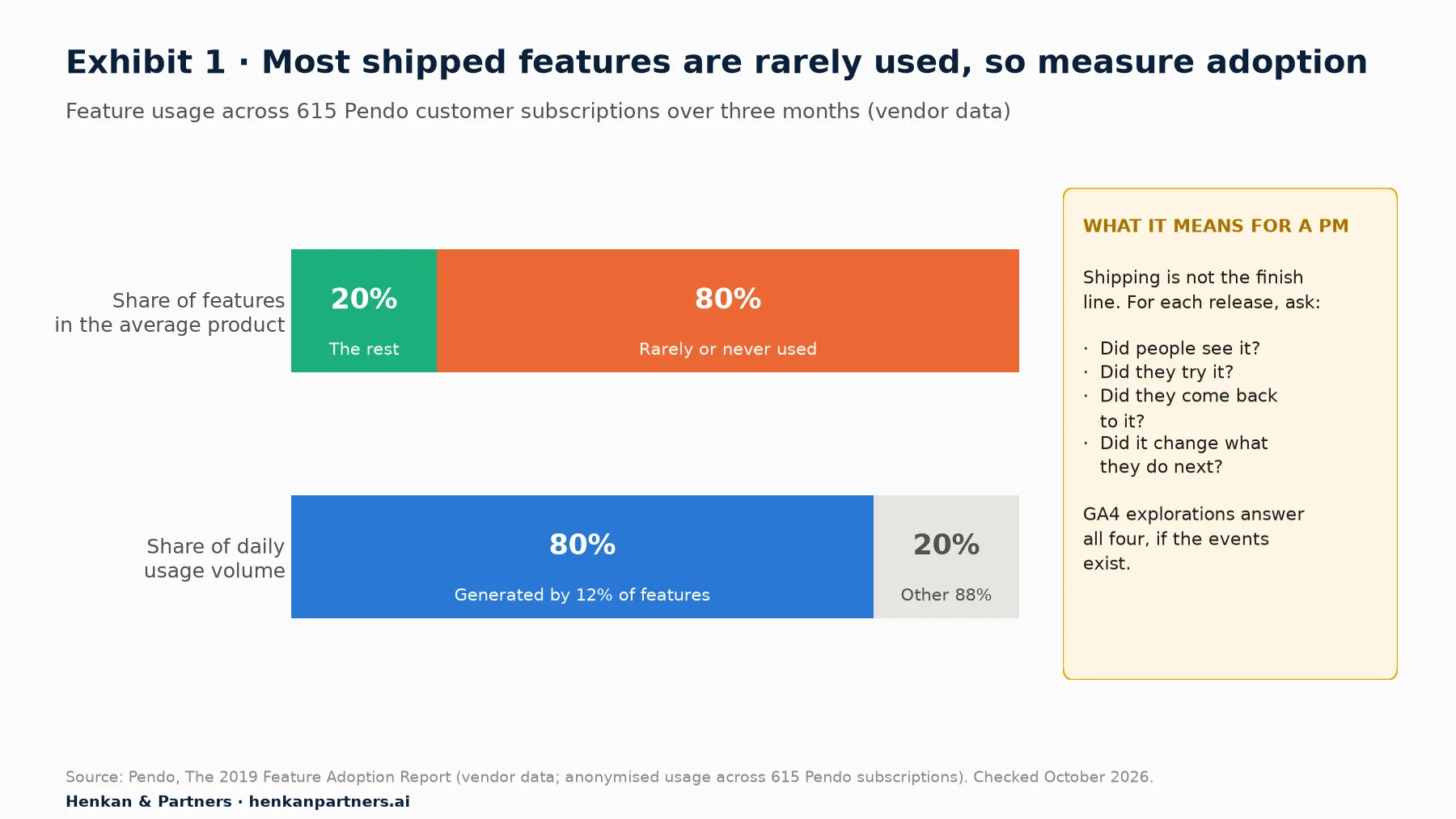
What this shows. Usage is concentrated in a small set of features, and most of what teams ship gets little use. For a product manager this turns adoption measurement from a nice-to-have into the only way to know whether a release earned its place. It also argues for measuring adoption by stage, because the remedy for a feature nobody finds differs from the remedy for a feature nobody returns to.
GA4 is the most common place to do this on the web. In October 2026, W3Techs reported that Google Analytics was used by 47.2% of all websites, and by 82.7% of the websites whose traffic analysis tool it can identify. If you are new to how GA4 counts users, sessions and events, read our explainer on how GA4 works and the first article in this path, GA4 for product managers, before going further.
Five stages, five metrics
We use five stages. Each one is a ratio, so each needs a numerator and a denominator you can define in GA4.
Exposure rate   = users who saw the feature ÷ active users in the period
Adoption rate   = users who used it at least once ÷ users who saw it
Repeat rate     = users who used it two or more times ÷ users who used it once
Feature retention = share of a weekly cohort of first users who use it again in week N
Value gap       = key event rate of adopters − key event rate of exposed non-adopters
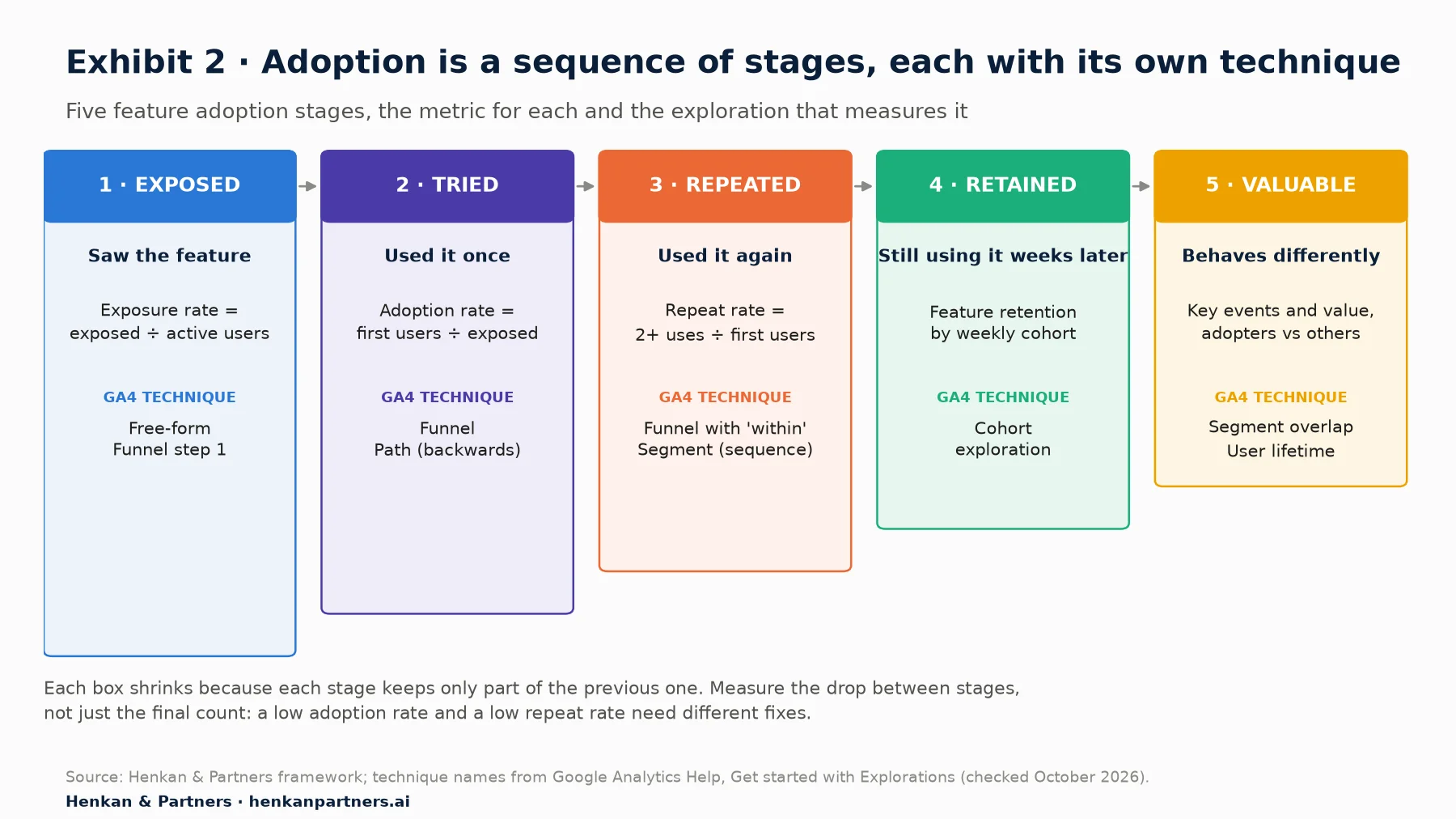
What this shows. Each stage keeps only part of the previous one, and each has a natural exploration. The point of the framework is diagnosis: a low adoption rate with a healthy repeat rate says the feature works once found, while a high adoption rate with a poor repeat rate says people are curious but not served. Report the stage ratios, not only the final count.
Section 2 · Before you open Explore
GA4 can only measure the adoption you tracked, so check four things before any analysis
Explorations do not create data. They slice the events your site already sends. Before you build anything, check these four points with your analyst or developer. If one fails, fix the tracking first; the second article in this path explains how to ask for GA4 tracking as a product manager.
- An exposure event exists. You need to know who had the chance to use the feature. Sometimes an existing event is enough: if a "save for later" button sits in the cart for everyone, view_cart marks exposure. If the feature is behind a menu or shown to some users only, ask for a dedicated event when it is displayed.
- A first-use event exists, with a recognisable name. Use Google's recommended events where they fit. For a save-for-later feature, add_to_wishlist is a recommended e-commerce event with currency, value and an items array. Use a custom event only when no recommended event fits.
- Repeat use can be told apart. Either the same event fires each time, or a later event carries a parameter that links it to the feature, for example add_to_cart with the item-level item_list_name set to "saved_for_later". Parameters you want to report on must be registered as custom dimensions (Admin > Data display > Custom definitions). Google says data appears 24 to 48 hours after the data is sent and the dimension is created, so register before launch.
- Your retention window covers the period you need. Explorations only see data inside the data retention setting: 2 or 14 months for event data on standard properties (on Large and XL properties the event-data setting is reduced to 2 months), up to 50 months on Analytics 360. Standard reports are not affected. If your property is still on 2 months, change it now; it does not bring back data already deleted.
| Adoption stage | Example event (illustrative feature) | Type | What to check in DebugView |
|---|---|---|---|
| Exposed | view_cart (button shown in the cart) | Recommended | Fires once per cart view, on mobile and desktop |
| Tried | add_to_wishlist, items array, value, currency | Recommended | Fires on click, not on page load; item_id matches the SKU |
| Repeated | add_to_cart with item_list_name = saved_for_later | Recommended + parameter | Parameter present only when the item comes from the saved list |
| Valuable | purchase (a key event) | Recommended | One per order, unique transaction_id |
Two smaller points. First, GA4 renamed "conversions" to key events in 2024; you mark them in Admin > Data display > Events, up to 30 per standard property. Some menus and help pages, such as Google's description of the cohort criteria, still use the word "conversion". Second, consent: with consent mode, users who decline analytics cookies are either missing from explorations or, if your property is eligible for behavioural modelling and uses the Blended reporting identity, represented by modelled data. Either way, adoption rates mostly describe consenting users. Our note on user consent in e-commerce explains the mechanics.
For product managers. Write the adoption events into the user story's acceptance criteria, not into a later analytics ticket. A feature that ships without its exposure event can never have an adoption rate, only a usage count.
For leaders. Ask for the five stage ratios in every release review. A single "usage" number invites the wrong debate.
Section 3 · The weekly adoption number
Start with a weekly adoption rate in a Free-form exploration, then go deeper
Before building funnels, get the trend. A Free-form exploration gives you weekly exposed and adopting users in five minutes.
- Open Explore in the left navigation and choose the Free form template.
- Import dimensions. In the Variables column, click + next to Dimensions and add Event name and Week.
- Import metrics. Add Active users and Event count.
- Build the table. Drag Week to Rows and Event name to Columns, then Active users to Values.
- Filter. Under Filters, set Event name exactly matches one of view_cart, add_to_wishlist. You now have exposed and adopting users per week.
- Compute the rate. Export to a sheet and divide adopters by exposed users per week. Users are de-duplicated within each cell, so never add weeks together to get a monthly figure; change the row dimension instead.
Read the first two launch weeks separately: curiosity, release notes and internal traffic inflate them.
Section 4 · Funnel exploration
A closed Funnel exploration shows where adoption stalls between seeing a feature and using it again
The Funnel exploration is the workhorse of adoption analysis. Our guide to funnel and cohort analysis covers funnel settings in depth for purchase journeys. Here we focus on the adoption funnel: exposure, first use, repeat use and outcome.
Step by step
- Create it. Explore > Funnel exploration template. Name it after the feature and date range.
- Define the steps. Click the pencil next to Steps. Step 1: view_cart. Step 2: add_to_wishlist. Step 3: add_to_cart with the condition item_list_name = saved_for_later. Step 4: purchase. You can define up to 10 steps, and add parameter conditions to any of them.
- Set the ordering. For each step after the first, choose is indirectly followed by (other events may happen in between). Use is directly followed by only for strict micro-sequences; a background event firing in between will silently remove users.
- Add a time limit where it matters. On step 3, add within 7 days so that repeat use means use soon after saving, not by accident months later.
- Keep it closed. Leave Make open funnel off: users must enter at step 1, so every number is a share of exposed users. An open funnel lets users enter at any step, which suits a feature reached from several places (an email link to the saved list, for instance) but cannot give you an adoption rate.
- Turn on Show elapsed time. GA4 then shows the average time between steps: your time to adopt.
- Add a breakdown. Choose Device category in Breakdown. Users are attributed to the first instance of the breakdown value, so a user who saves on mobile and buys on desktop counts under mobile.
- Use Next action. Set the Next action dimension to Event name. The Top 5 Next Actions card shows what users did after each step, including "(no next action)" for those who left.
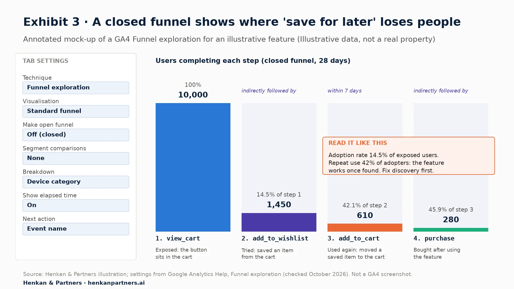
What this shows. In this illustrative case 14.5% of exposed users try the feature, but 42% of those come back to it within a week and almost half of them buy. The feature works once found; the weak stage is discovery. The right next step is a design change to visibility, tested properly, not more promotion of a feature that people abandon.
Switch to the trended funnel to watch adoption over time
In Tab settings, change Visualisation from Standard funnel to Trended funnel. GA4 draws each step as a line over the date range. After a launch, this is the quickest way to see whether the adoption rate is stabilising, rising with a design change or decaying after the novelty wears off.
Our view. Put the funnel's settings in one line under every chart you share: steps, open or closed, ordering, time limits, date range, segment. Two people can build "the adoption funnel" and get different answers because one used users and the other used an open funnel. The settings line ends that argument.
Section 5 · Path exploration
Run a Path exploration backwards from the feature event to see how people find it
A funnel tells you how many people adopt. A Path exploration tells you how they got there and where they went afterwards, which is where discovery ideas come from.
- Create it. Explore > Path exploration template, then click Start over to clear the default.
- Choose an ending point. Click Ending point, choose Event name and select add_to_wishlist. GA4 now builds the path backwards: the right-hand column is the feature event, and each column to the left is the step before.
- Choose the node type per step. Above each column you can switch between Event name, Page title and screen name and Page path and screen class. Pages are usually more useful for discovery (which page did they come from?); events for behaviour (what did they do just before?).
- Turn on View unique nodes only so that repeated page views of the same page do not fill the chart.
- Expand the nodes that matter. Click a node to expand it. GA4 shows the top 5 nodes per step by default; click + More to show up to 20, with the rest grouped into an "Others" node.
- Then flip it. Start a second tab with add_to_wishlist as the Starting point to see what adopters do next. If the next step is often leaving the site, saving may be a polite way of abandoning.
| Question | Path set-up | What to look for |
|---|---|---|
| Where do adopters discover the feature? | Ending point: first-use event; node type: page path | A single page dominating discovery, which means other entry points are invisible |
| What happens just before first use? | Ending point: first-use event; node type: event name | Events such as a failed search or a sold-out item that trigger the need |
| What do adopters do next? | Starting point: first-use event | Return to browsing (healthy) versus session end (possible exit ramp) |
| Why do exposed users not adopt? | Starting point: exposure event, segment: exposed non-adopters | The most common next action instead of using the feature |
Paths are descriptive and noisy. Use them to generate hypotheses, then check them with session replay or a short survey before acting. Our guide to session replay covers how.
Section 6 · Segments
Build three reusable segments once: exposed users, adopters and repeat adopters
Every later analysis compares groups. Build the groups carefully once, name them clearly and reuse them. In any exploration, click + next to Segments in the Variables column and choose User segment.
The three segment definitions
- Exposed users. Include users when Event name = view_cart. Leave the condition scope at Across all sessions.
- Adopters. Include users when Event name = add_to_wishlist.
- Repeat adopters. Click Add sequence: step 1 add_to_wishlist, indirectly followed by step 2 add_to_wishlist, optionally with a time constraint. Sequences are available for user segments only.
- Exposed non-adopters (the comparison group). Include users when Event name = view_cart, then Add group to exclude and choose Permanently exclude users when Event name = add_to_wishlist. This is the fair comparison group: people who had the chance and did not take it.
Two limits shape how you work. An exploration holds up to 10 segments, and each technique (each tab) can apply up to 4. Segments are evaluated on the data inside the exploration's date range, so "adopters" means adopters during the selected period. Right-clicking a row, a funnel step or an overlap area also lets you create a segment from selection, which is the fastest way to turn "users who dropped at step 2" into a group you can study.
Segments live inside explorations. If you want to reach a group, for example to send adopters a tip by email or to personalise the page for exposed non-adopters, you need an audience instead; GA4 lets you build one from similar conditions. Our article on GA4 personalisation segments covers audiences in detail.
For product managers. Name segments with the feature, the stage and the definition: "SFL · Adopters · add_to_wishlist". In six months nobody will remember which "feature users" segment was the right one.
For leaders. If two teams report different adoption numbers, ask to see the segment definitions side by side. The difference is almost always there.
Section 7 · Segment overlap
Segment overlap shows who your adopters are and how they relate to your best customers
The Segment overlap technique compares up to 3 user segments in a Venn-style diagram. For adoption, a useful first set is adopters, purchasers and one audience dimension such as mobile users or new users.
- Create it. Explore > Segment overlap template.
- Add segments. Drag up to three segments into Segment comparisons, for example Adopters, Purchasers and Mobile users.
- Add a breakdown and values. Add Device category or New / established as a Breakdown, and up to 10 metrics in Values, such as Active users, Key events and Total revenue.
- Read exclusive versus inclusive numbers. Hovering inside a shape shows the exclusive count (excluding overlaps); hovering on a border shows the inclusive count.
- Turn an intersection into a segment. Right-click an area, such as adopters who did not purchase, and create a segment from it. Apply that segment in a Path exploration to see where these users went.
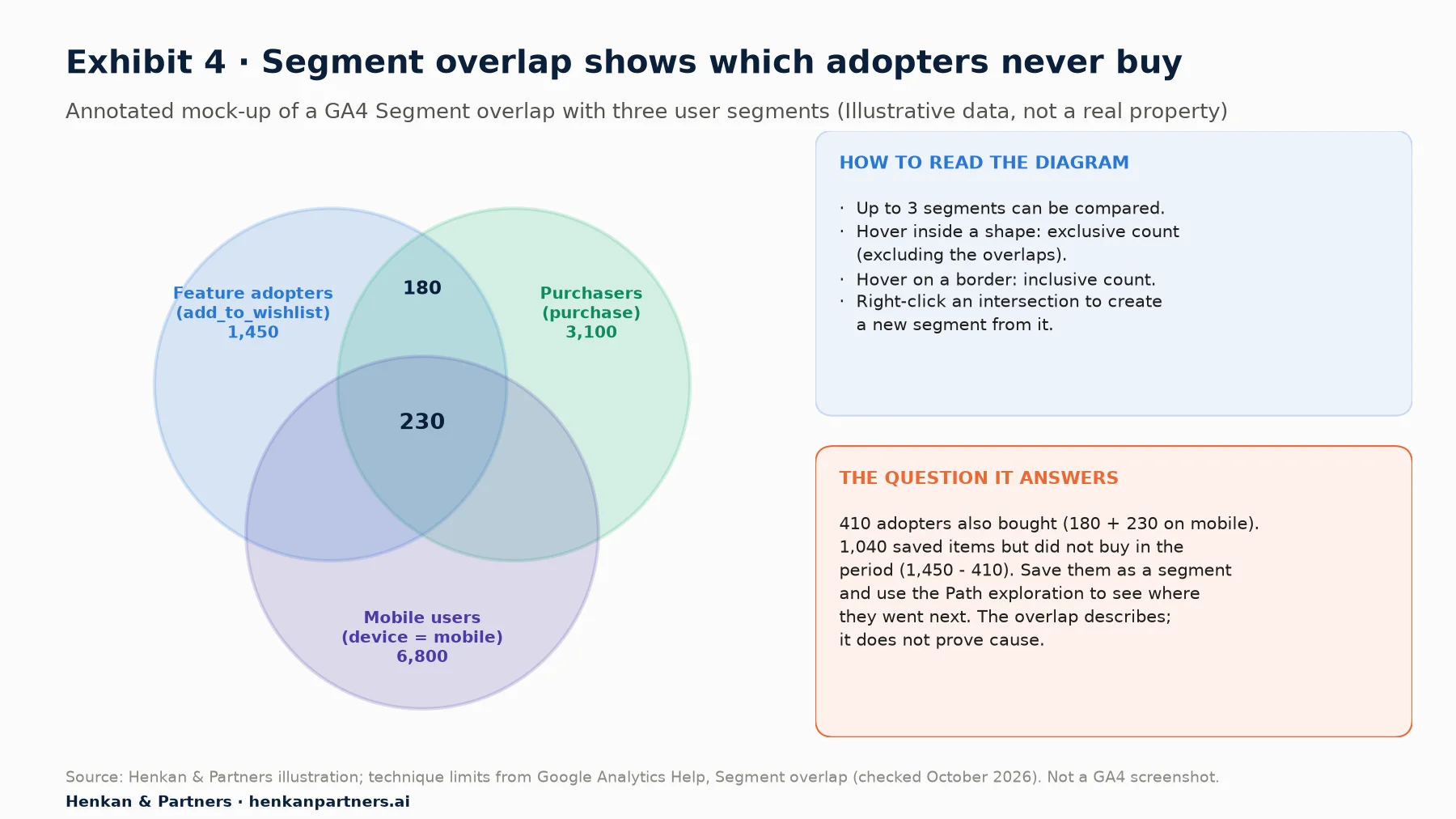
What this shows. In this example 410 of 1,450 adopters bought in the period, and 1,040 saved items without buying. That second group is the interesting one: either they are planning a later purchase, which a cohort will show, or saving is where they park items before leaving. The overlap describes who is where; it does not tell you whether the feature caused any purchase.
For lifetime value questions, the User lifetime technique adds a different lens: first and most recent interaction dates, lifetime revenue and engagement, and predictive metrics such as purchase and churn probability. It only covers users active after 15 August 2020, its end date is fixed to yesterday, and on standard properties it samples above 1 million users. Use it to describe users, not to prove the feature's value.
Section 8 · Cohort exploration
Cohort exploration shows whether adoption sticks after the launch spike
A launch week always looks good. Cohorts tell you whether people who tried the feature keep using it, and whether later adopters behave differently from the curious first wave.
- Create it. Explore > Cohort exploration template.
- Set the inclusion criteria. Under Cohort inclusion, choose Others and pick the first-use event, add_to_wishlist. Each cohort is the users who first did it in a given period.
- Set the return criteria. Choose the same event to measure feature retention, or Any transaction to measure whether adopters come back and buy.
- Choose granularity. Weekly is right for most features. GA4 weeks run Sunday to Saturday, not rolling seven days, so a launch on a Thursday gives a short first cohort.
- Choose the calculation. Standard counts users who returned in each period; Rolling counts users who returned in that period and every previous one (strict loyalty); Cumulative counts users who met the return criteria in any period, as a running total.
- Add a breakdown such as Device category. GA4 shows the top 15 values, and up to 60 cohorts in the table.
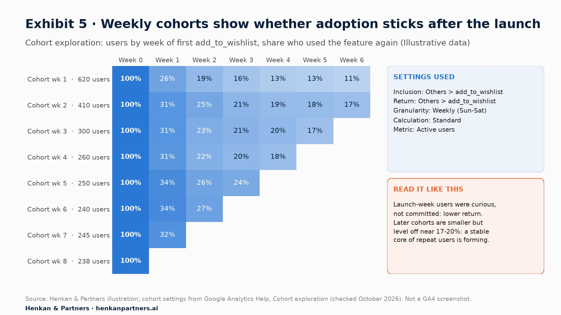
What this shows. The launch cohort is the largest and the least loyal, which is typical of curiosity-driven trial. Later cohorts are smaller but level off around 17% to 20%, well above the launch cohort's 11% to 13%, a sign that a stable core finds lasting value. Read cohort tables down the columns (are newer cohorts better at week 2?) as well as along the rows (how fast does each cohort decay?).
Compare adopters with exposed non-adopters on the same return criterion
To see whether adopters come back more, build a second tab with the same settings but view_cart as the inclusion event and Any transaction as return criterion. You now have repeat purchase for everyone exposed and for adopters. Expect adopters to look better. The next section explains why that is not yet evidence.
Section 9 · Adopters versus non-adopters
Adopters will look better than non-adopters, and that gap alone proves almost nothing
This is the most common mistake in feature reporting: "users of saved lists convert three times better, so saved lists triple conversion". The comparison is real; the conclusion is not. Three biases inflate it.
- Selection. Engaged, high-intent users explore more of the product and try more features. They would have converted more without the feature.
- Exposure. Frequent visitors have more chances to see and use the feature, and more chances to buy.
- Timing. Users are counted as adopters at their most active moment, often in the middle of a purchase decision.
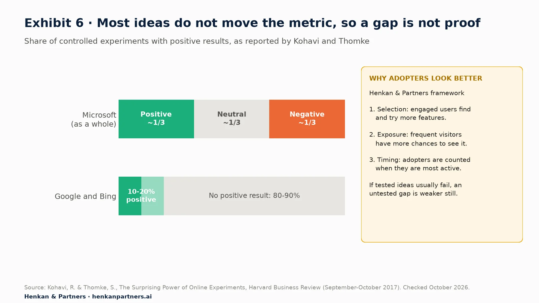
What this shows. When ideas are tested properly, most do not move the metric they target. If carefully designed experiments at Microsoft, Google and Bing succeed so rarely, a raw gap between adopters and non-adopters is weak evidence of impact. Treat it as a hypothesis worth testing.
How to make the comparison fairer in GA4
- Compare with exposed non-adopters, never with all users. Users who never saw the feature differ in many ways.
- Hold engagement constant. Add a condition to both segments, such as users with three or more sessions in the period, and compare again. If the gap shrinks sharply, most of it was selection.
- Look at behaviour before adoption. In BigQuery you can compare adopters' purchase rate in the weeks before they first used the feature with that of non-adopters over the same weeks. GA4's interface cannot do this cleanly.
- Test when the decision matters. If you need to know whether the feature drives revenue, run an A/B test or a holdout. The next article in this path covers measuring a product launch, including when you need an A/B test, and our A/B testing guide covers the method.
| Comparison | Purchase rate, adopters | Purchase rate, comparison group | Ratio |
|---|---|---|---|
| Adopters vs all active users | 28% | 6% | 4.7× |
| Adopters vs exposed non-adopters | 28% | 11% | 2.5× |
| Same, users with 3+ sessions only | 33% | 24% | 1.4× |
In this illustrative example the headline "4.7 times" becomes 1.4 times once you compare like with like. The feature may still be valuable, but the honest claim is far more modest, and only a controlled test can settle it.
Section 10 · Limits, BigQuery and AI
Sampling, thresholds, retention and consent decide what an exploration can see
Explorations are flexible, but they have documented limits. Know them before you present a number to leadership.
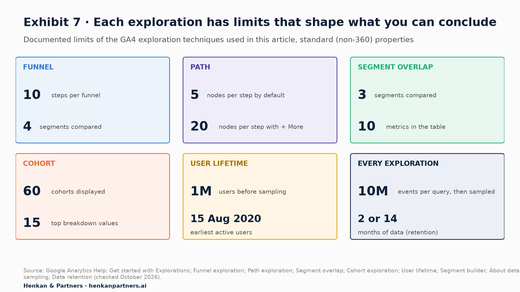
What this shows. Each limit maps to a reading trap. Ten funnel steps is plenty, but four segments per tab caps comparisons. Path charts hide everything beyond the top nodes. Above 10 million events a query is sampled, which matters for long date ranges on large sites. And no exploration can see past your retention window.
- Sampling. On standard properties, exploration queries above 10 million events are sampled; Analytics 360 allows up to 1 billion. The data quality icon shows the share of data used. Shorten the date range to remove sampling.
- Thresholds. GA4 withholds rows when user counts are low, particularly with demographic data or Google signals. Thresholds are system-defined and cannot be adjusted. A small feature segment can simply disappear.
- Retention. Year-on-year adoption comparisons usually exceed the retention window and need BigQuery.
- Consent. Users who decline analytics cookies are absent or modelled. If consent rates differ by device or country, so will your apparent adoption rates.
When to move to BigQuery
Move to the BigQuery export when you need exact unsampled counts, histories longer than your retention window, pre-adoption behaviour, or matched comparisons. The developer path covers the BigQuery export and first queries. Remember that modelled consent data is not in the export, so warehouse and interface numbers will differ.
AI assistants can run the reports, but you still own the settings
Google publishes an experimental Google Analytics MCP server (Model Context Protocol, a standard way for AI assistants to call tools). It lets assistants such as Gemini or Claude run core reports, realtime reports and funnel reports through the Data API, whose funnel method is still in alpha. It does not open saved explorations. That is useful for quick questions, but an assistant will pick funnel settings, date ranges and segments for you. Ask it to state them, check them against your definitions, and never forward a number you could not reproduce in the interface. Our article on AI agents in the experimentation workflow covers the wider risks.
Section 11 · What to do next
What to do next: five steps to an adoption readout you can defend
1. Define the stages and events for your next feature
Before the feature ships, write down the exposure, first-use and repeat-use events and the five ratios. Put them in the ticket's acceptance criteria. The shared capstone of this series, the GA4 tracking plan, shows how product, design, engineering and marketing keep these specs in one place.
2. Build and name the reusable segments
Create exposed users, adopters, repeat adopters and exposed non-adopters in one exploration, with clear names. Share the exploration with your team as read-only so everyone starts from the same definitions.
3. Set up one funnel and one cohort per feature
A closed adoption funnel with elapsed time on, and a weekly cohort with the feature event as inclusion and return. Review them two weeks and six weeks after launch. To speed this up, download the GA4 Tracking Request Kit: it includes the question bank, event spec template and QA checklist we use with product teams.
4. Diagnose the weakest stage before changing anything
Use the Path exploration and the overlap to understand the weakest stage, then check your hypothesis with qualitative research. Our product analytics guide shows how GA4 fits alongside dedicated product analytics tools when you outgrow it.
5. Prove impact with a test, then talk to us
When a decision depends on the feature's value, test it rather than comparing adopters with non-adopters. If you want help designing the events, the explorations or the test, Talk to us.
Disclosure: Henkan & Partners provides analytics implementation and experimentation services, including GA4 audits and product analytics set-ups.
FAQ
Frequently asked questions about measuring feature adoption in GA4
Frequently asked questions
What is feature adoption in GA4?
Feature adoption in GA4 is the share of users who, having been exposed to a feature, use it for the first time and then keep using it, measured with events for exposure, first use and repeat use. You analyse it in Explorations: Funnel for the stage-by-stage rates, Path for discovery routes, Segment overlap for who adopts and Cohort for whether use sticks.
How do I calculate feature adoption rate in GA4?
Divide the users who triggered the feature's first-use event by the users who triggered its exposure event in the same period. A closed Funnel exploration with the exposure event as step 1 and the first-use event as step 2 gives this rate directly, as the step 2 completion rate.
Which GA4 exploration is best for feature adoption?
Start with a closed Funnel exploration, because it gives the adoption and repeat rates in one view. Add a Cohort exploration to see whether usage lasts, a Path exploration run backwards from the feature event to see how people find it, and Segment overlap to see who adopts.
What is the difference between an open and a closed funnel in GA4?
In a closed funnel users must enter at the first step; in an open funnel they can enter at any step. Use a closed funnel for adoption rates, because every number is then a share of exposed users. Use an open funnel when a feature can be reached from several places and you want to see all of them.
How do I create a segment of feature users in GA4?
In an exploration, click + next to Segments, choose User segment and include users when Event name equals your feature event. For repeat users add a sequence of the event followed by itself. For a comparison group, include exposed users and permanently exclude users who triggered the feature event.
How many segments can I compare in a GA4 exploration?
An exploration can hold up to 10 segments, and each technique can apply up to 4. Segment overlap compares up to 3 segments. Funnel explorations also accept up to 4 segments.
Why do feature adopters always convert better than other users?
Mostly because of selection: engaged, high-intent users find and try more features and would convert more anyway. Frequent visitors also have more chances to see the feature. Compare adopters with exposed non-adopters of similar engagement, and use an A/B test or holdout to measure the feature's real effect.
Why does my GA4 cohort or funnel show sampled data?
On standard properties, exploration queries above 10 million events are sampled. The data quality icon shows the percentage of data used. Shorten the date range, or use the BigQuery export for exact counts.
How far back can a GA4 exploration go?
Only as far as your data retention setting: 2 or 14 months of event data on standard properties, up to 50 months on Analytics 360. Standard reports are not affected by this setting, which is why a standard report can show older data than an exploration.
Key terms
- Feature adoption
- The share of exposed users who use a feature and keep using it. It matters because shipping a feature does not mean users get value from it.
- Exposure event
- An event that records that a user had the chance to use a feature. Without it you can count usage but not compute an adoption rate.
- Adoption rate
- Users who used a feature at least once divided by users exposed to it. It isolates discovery and first-use problems from retention problems.
- Repeat rate
- The share of first-time users who use a feature again. It separates curiosity from lasting value.
- Explorations
- GA4's advanced analysis area (Explore), with techniques such as Free form, Funnel, Path, Segment overlap, Cohort, User explorer and User lifetime. Most adoption questions need it.
- Closed funnel
- A funnel in which users must enter at the first step. It is the right set-up for adoption rates because every step is a share of exposed users.
- Path exploration
- A tree of the events or pages users go through from a starting point or towards an ending point. Run backwards, it shows how users discover a feature.
- Segment overlap
- A technique that compares up to 3 user segments in a diagram. It shows how adopters relate to purchasers or other groups and lets you build segments from intersections.
- Cohort exploration
- A table of user groups defined by when they first met an inclusion criterion, tracked over later periods. It shows whether feature use lasts.
- User segment
- A group of users defined by conditions, sequences or exclusions inside an exploration. Reusable segments keep adoption numbers consistent across analyses.
- Key event
- An event marked as important to the business, formerly called a conversion in GA4. It is the usual outcome when comparing adopters with others.
- Sampling
- Estimating results from a subset of data when an exploration query exceeds the quota, 10 million events on standard properties. It makes small segments less reliable.
- Data thresholds
- System-defined rules that hide rows with low user counts to protect privacy. Small feature segments can disappear because of them.
- Selection bias
- A difference between groups caused by who chooses to be in them, not by the treatment. It is why adopters look better than non-adopters even when a feature has no effect.
Sources
All sources were checked in October 2026. GA4 interface paths, limits and terminology come from Google's official documentation and may change; check the linked pages before relying on a specific limit. Pendo's figures are vendor data from software products. Exhibits 2 and 6 (side panel) and the comparison table in Section 9 are Henkan & Partners frameworks or worked examples; Exhibits 3, 4 and 5 are mock-ups with illustrative data, not GA4 screenshots.
- Google Analytics Help (2026). Get started with Explorations.
- Google Analytics Help (2026). Funnel exploration.
- Google Analytics Help (2026). Path exploration.
- Google Analytics Help (2026). Segment overlap.
- Google Analytics Help (2026). Cohort exploration.
- Google Analytics Help (2026). User lifetime.
- Google Analytics Help (2026). Segment builder.
- Google Analytics Help (2026). Apply segments and filters, and view users.
- Google Analytics Help (2026). About data sampling.
- Google Analytics Help (2026). About data thresholds.
- Google Analytics Help (2026). Data retention.
- Google Analytics Help (2026). Mark events as key events.
- Google Analytics Help (2026). About behavioral modeling for consent mode.
- Google Analytics Help (2026). Create event-scoped custom dimensions.
- Google for Developers (2026). Recommended events reference.
- Google for Developers (2026). Funnel reporting, Google Analytics Data API.
- Google for Developers (2024). Google Analytics Data API changelog: key events replace conversions (6 May 2024).
- Google Analytics on GitHub (2026). Google Analytics MCP Server (Experimental).
- Pendo (2019). The 2019 Feature Adoption Report.
- Kohavi, R. & Thomke, S., Harvard Business Review (2017). The Surprising Power of Online Experiments.
- W3Techs (October 2026). Usage statistics and market share of Google Analytics.