Focus
Combining GA4 with Qualitative Research and Measuring a Redesign
Alexandre Suon · 2026-10-02
GA4 tells you where users struggle and how many of them do. It cannot tell you why. This guide shows UX and product designers how to combine GA4 with qualitative research (session replay, heatmaps, surveys and usability tests), carry the same segment from one tool to the other, and then measure a redesign honestly: before/after traps, A/B tests, staged rollouts, guardrails and a one-page evidence summary your team can act on.
Executive summary
- GA4 is a map of where and how many; qualitative research is the explanation of why. A funnel drop is a symptom; five replays are a story. Use them in a loop: spot in GA4, explain with research, size the cause back in GA4, then decide.
- Start every study with one research question written from a GA4 number. Name the page or step, the segment, the size of the gap and the competing explanations. The question decides the method: replays for what happened, surveys for what people intended, moderated usability tests for why.
- Study the same people in both tools, or you will explain the wrong problem. Rebuild the GA4 segment (device, step, landing page, source, dates) inside your replay, survey and recruiting tools. Integrations help less than people expect: Microsoft Clarity, for example, pulls GA data into Clarity but does not support GA4 segments.
- Small qualitative samples are fine for finding problems, not for sizing them. Nielsen's model finds about 85% of usability problems with five users, which is why three rounds of five beat one study of fifteen. To size a problem, go back to GA4: track the error, count the sessions it touches and estimate the revenue at stake.
- A before/after comparison is the weakest way to judge a redesign. Seasonality, campaigns, traffic mix, consent changes, broken tracking and change aversion all move the numbers. In our illustrative example a redesign with no real effect reads as +11% before/after and −3% year on year. Use an A/B test where you can, a staged rollout where you cannot, and a controlled before/after only as a last resort.
- Agree the metrics, guardrails and readout before launch, and put the evidence on one page. Published win rates for tested changes range from 8% to about 33%, so a redesign bundles many changes that would not win on their own. A UX evidence one-pager (signal, question, method, finding, size, decision, measurement plan) keeps the decision honest.
Section 1 · The loop
GA4 shows where users struggle; qualitative research shows why, so run them as one loop
Combining GA4 with qualitative research means using Google Analytics 4 to find and size a user problem (where it happens, for whom, how often) and using qualitative methods such as session replay, heatmaps, on-site surveys, usability tests and interviews to explain its cause. Triangulation, the use of several data sources to check one conclusion, turns the two into evidence a team can act on, and the same pair of tools is then used to measure whether a redesign fixed the problem.
Our guide to web analytics for product designers covers quantitative and qualitative research in general terms. This article assumes your numbers live in GA4 and answers three practical questions: how do you get from a GA4 number to the right research method, how do you make sure both tools look at the same people, and how do you measure a redesign without fooling yourself?
It is the fourth step of our path The ABC of GA4 for UX & Product Designers. It follows GA4 for UX and product designers, how designers should ask for GA4 tracking and finding UX friction in GA4. Here we pick up where the last one stops: you have found a signal, and now you need to explain it and act on it.
The Nielsen Norman Group defines triangulation as using multiple sources of data or approaches to analysis to make a study more credible, and recommends matching the effort to the risk: a full redesign deserves robust triangulation of qualitative and quantitative data, while a small, reversible change needs less. That principle is the backbone of everything below.
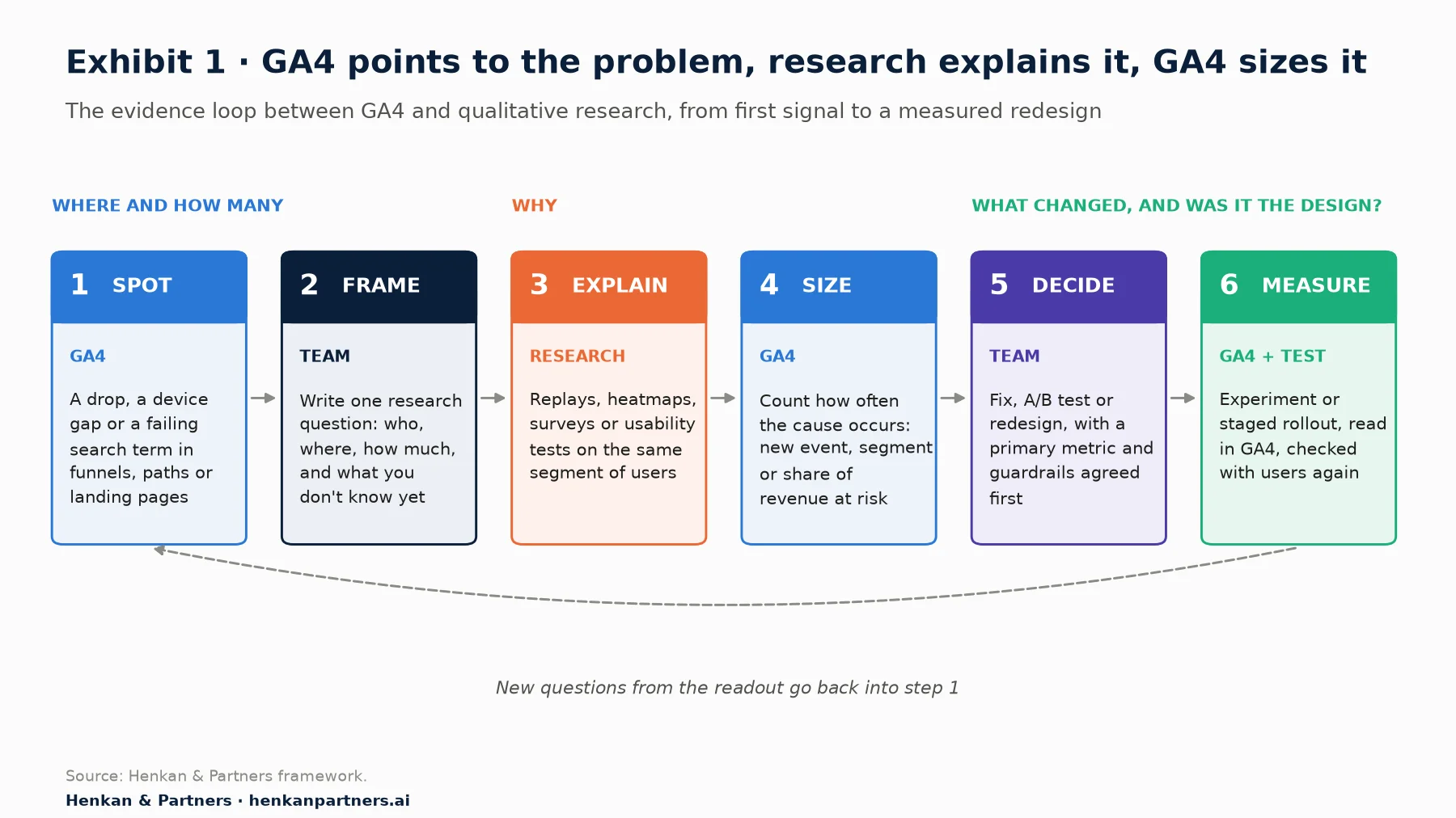
What this shows. GA4 appears twice in the loop, at the start and in the middle. Most teams use it only at the start, to spot the problem, and then jump straight from a few replays to a redesign. Step 4, sizing the cause back in GA4, is the one that separates a hunch from a business case, and step 6 is where the loop learns whether the change worked.
Section 2 · The question
Turn the GA4 signal into one research question before you pick a method
A GA4 signal is a number that looks wrong: a step that loses more users than it should, a device that converts far less than another, a landing page where few sessions are engaged, a search term that leads nowhere. The trap is to go from the number straight to a solution ("the shipping page needs a redesign"). Write a research question first. It forces you to say what you know, what you do not, and what would change your mind.
A research question template you can copy
On [page or step], [segment] [behaviour] at [rate],
compared with [benchmark segment or period] at [rate].
We do not know whether this is caused by [explanation A], [explanation B] or [explanation C].
We will treat the question as answered when [evidence threshold].
A worked example (illustrative): On the shipping step of checkout, mobile users continue to payment in 58% of sessions, compared with 74% on desktop over the last 28 days. We do not know whether this is caused by a surprise in delivery cost, the address form, or delivery options people do not understand. We will treat it as answered when at least two independent sources point to the same cause.
Where to pull the numbers in GA4
Keep the signal reproducible, so anyone can check it. Write down the exact report, settings and date range with the number. The paths below were checked against Google's documentation in October 2026; GA4 changes its interface often, so expect small differences.
| Signal | Where in GA4 | Settings to note |
|---|---|---|
| Step drop-off | Explore > Funnel exploration | Steps, open or closed funnel, breakdown dimension (for example Device category), date range |
| Landing page with weak engagement | Reports > Engagement > Landing page | Sessions, average engagement time per session, key events; add engagement rate if needed (Customise report) and a device comparison |
| Site search that fails | Event view_search_results with the search_term parameter (enhanced measurement) | Which URL query parameter carries the search term (q, s, search, query or keyword by default) |
| Device or browser gap | Any report: add a comparison (up to four at once) | Comparison definitions, date range |
| A small group of odd journeys | Explore > User exploration | Use to read individual event streams, never to count |
Two reading rules save wasted research. First, know what the metric means. An engaged session in GA4 is one that lasts longer than 10 seconds, has a key event, or has two or more page or screen views; a low engagement rate on a page people read quickly is not automatically a design problem. Second, check the data quality icon. Explorations on standard properties are sampled above 10 million events per query, and GA4 applies thresholds to hide rows that could identify users. Our explainer on how GA4 works covers both in detail.
Section 3 · The method
Match the method to the question: replays for what happened, surveys for intent, usability tests for why
Each qualitative method answers a different question. Session replay shows what users did on screen, but not what they were trying to do. Heatmaps and scroll maps show where attention and clicks pile up across many sessions. On-site surveys capture intent and self-reported reasons at the moment of the problem. Moderated usability tests let you watch a person think aloud, and ask follow-up questions. Interviews explain motivations and context that never appear on the page.
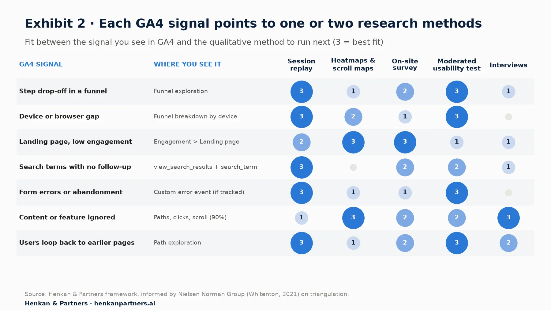
What this shows. Session replay and moderated usability tests cover most behavioural signals, which is why they are the default pair for a funnel or form problem. Heatmaps and surveys come first for landing pages and ignored content, where the question is about attention and intent rather than a broken interaction. Interviews matter most when the feature is ignored because it does not fit people's needs, which no on-page tool can reveal.
How many sessions or users do you need?
Qualitative samples are small by design. Their job is to find and explain problems, not to measure how common they are. Jakob Nielsen's classic model, based on work with Tom Landauer, says a single test user finds on average 31% of usability problems, and five users find about 85%. His advice was to spend the budget on three rounds of five users, fixing the design between rounds, rather than one study of fifteen. When a site serves very different user groups, he suggested three or four users per group with two groups, and at least three per group with three or more.
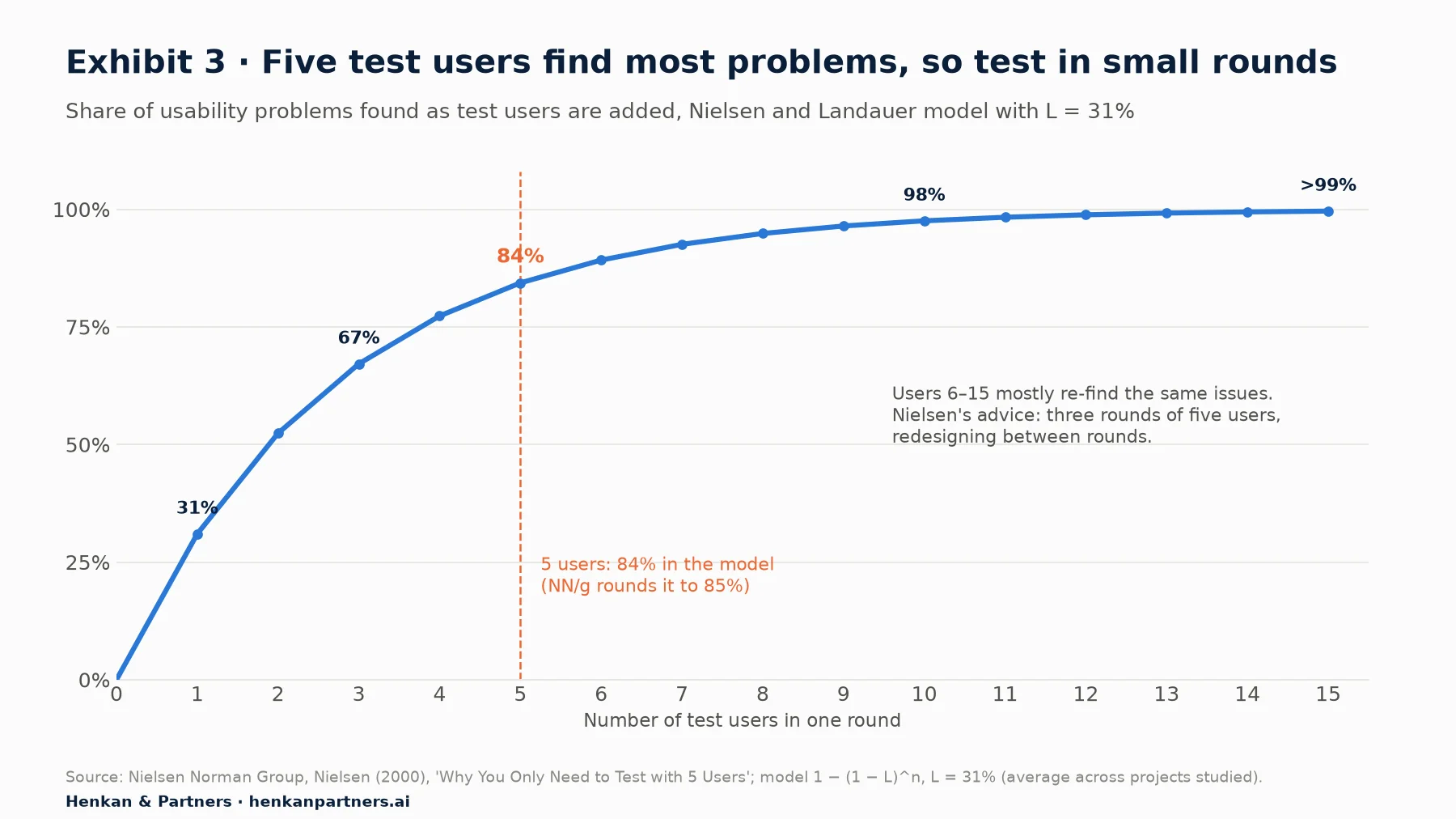
What this shows. The curve is steep up to five users and almost flat after ten, so a fifteen-person study mostly re-finds the same problems. The model assumes one fairly homogeneous group, so treat it as a planning rule. A qualitative finding tells you a problem exists; the frequency has to come from analytics.
| Method | Typical sample | Answers | Does not answer |
|---|---|---|---|
| Session replay | 20–50 replays from the GA4 segment | What happened on screen, in what order | What the user intended or felt |
| Heatmaps and scroll maps | A few thousand page views per template | Where clicks and attention concentrate | Why, and what people expected to find |
| On-site survey | 100–300 answers for a stable picture | Intent and self-reported reasons | Behaviour people do not notice or report |
| Moderated usability test | 5 users per round, 2–3 rounds | Why people struggle, in their own words | How common the problem is |
| Interviews | 6–12 people per segment | Needs, context, mental models | Behaviour on the current page |
For the details of each method, see our guides to session replay and on-site survey design.
Section 4 · Same segment
Hand the same segment from GA4 to your research tools, or you will study the wrong people
The most common failure we see is a mismatched sample. GA4 shows a problem on the mobile shipping step; the team then watches 30 random homepage replays, or recruits testers who shop on desktop. The research is sound, and it explains a different problem.
Rebuild the GA4 segment, condition by condition
Write the GA4 segment down as plain conditions, then rebuild it in each tool. The conditions that travel well are the ones every tool understands: device category, browser, page or URL pattern, step reached and step not reached, traffic source or campaign, country, new or returning, and the date range.
- In GA4, build the segment in Explore (user, session or event segment). Segments are fully retroactive over the date range, you can create up to 10 per exploration and apply up to four at once. If you want the same users for remarketing or for a survey tool that reads GA4 audiences, build an audience instead. Audiences are not retroactive: new members can take 24 to 48 hours to appear, and only the linked Google Ads lists are prefilled with up to 30 days of past data.
- In the replay tool, filter on the same conditions: mobile, visited the shipping URL, did not reach payment, same dates. Replay tools typically let you filter on pages, devices and their own custom events or tags.
- In the survey tool, target the same page and trigger, for example on exit intent or after a period of inactivity on the shipping step, on mobile only.
- For usability tests, write the screener from the segment, for example people who shop on their phone.
Integrations rarely do this for you. Microsoft's documentation for Clarity, its replay and heatmap tool, says its Google Analytics integration pulls GA data into Clarity, supports one GA web property per Clarity project, does not support GA4 segments, and does not send the replay URL to GA4 because GA4 cannot accept such high-cardinality values. Check what your own vendor's integration actually moves, and in which direction, before you rely on it.
Connect the tools with events, never with personal data
You can make the link stronger with a few simple events, specified in the way our tracking request guide for designers describes:
- A survey event. Send an event such as survey_shown and survey_answered with a parameter for the answer category (for example "delivery cost"), never the free text. You can then compare the behaviour of respondents and non-respondents in GA4.
- An error event. If replays show a validation message blocking users, ask for an event such as form_error with the field name and error type, so GA4 can count how often it fires.
- An experiment event. Testing tools can send Google's recommended experience_impression event with an exp_variant_string parameter, which GA4 turns into one audience per variant.
Google's policy is strict: no data that Google could use or recognise as personally identifiable information may be sent to Analytics. That includes email addresses or names in URLs, page titles, search terms and event parameters. Survey free text and form field values are the usual leaks. Consent applies too: replay and survey scripts, like GA4, need a lawful basis, and our article on user consent in e-commerce explains what changes before 2027.
Our view. One shared segment definition, written in plain language at the top of the research brief, does more for research quality than any integration. If the definition changes, every tool changes with it.
Section 5 · Size it
Close the loop: take what research found back to GA4 and count it
A replay is a story, and a usability test is five stories. Stories are persuasive, which is the risk: one vivid clip can push a team into a redesign that affects a tiny share of sessions. Before you decide, go back to GA4 and measure how often the cause occurs.
- Turn the finding into something countable. If users fail on a postcode format, ask for an error event with the field and error type. If users miss a delivery option, track the option's selection and the toggle that reveals it.
- Wait for clean data. GA4 can take 24 to 48 hours to process data, and figures can change in that time. New events only count from the day they ship; GA4 cannot apply them to the past.
- Count the affected sessions and users. Build a segment of sessions with the error event and compare them with the rest: how many sessions are affected, and how much lower is their step completion?
- Estimate the value at risk. Multiply affected sessions by the completion gap and by average order value. Label it an estimate: it assumes the fix closes the whole gap, which it rarely does.
- Grade the confidence. Note how many independent sources agree. One replay pattern alone is weak; replays, a test round and a GA4 count pointing the same way are strong.
Revenue at risk per month (estimate)
= sessions reaching the step with the problem
  x share of those sessions affected (from the new GA4 event)
  x completion gap between affected and unaffected sessions
  x downstream conversion to order x average order value
Use User exploration (Explore > User exploration) to read the event stream of a handful of affected users and check that the event fires where you expect. Do not quote it as evidence of frequency: it is a magnifying glass, not a counter. For prioritising several problems against each other, the impact score in our friction analysis article and the evidence-weighted backlog in our insight-to-backlog guide work well together.
Section 6 · Before and after
A simple before/after comparison misleads more often than it informs
When a redesign goes live, the natural move is to compare the weeks after launch with the weeks before. It feels like evidence. It usually is not, because many things change at the same time as the design.
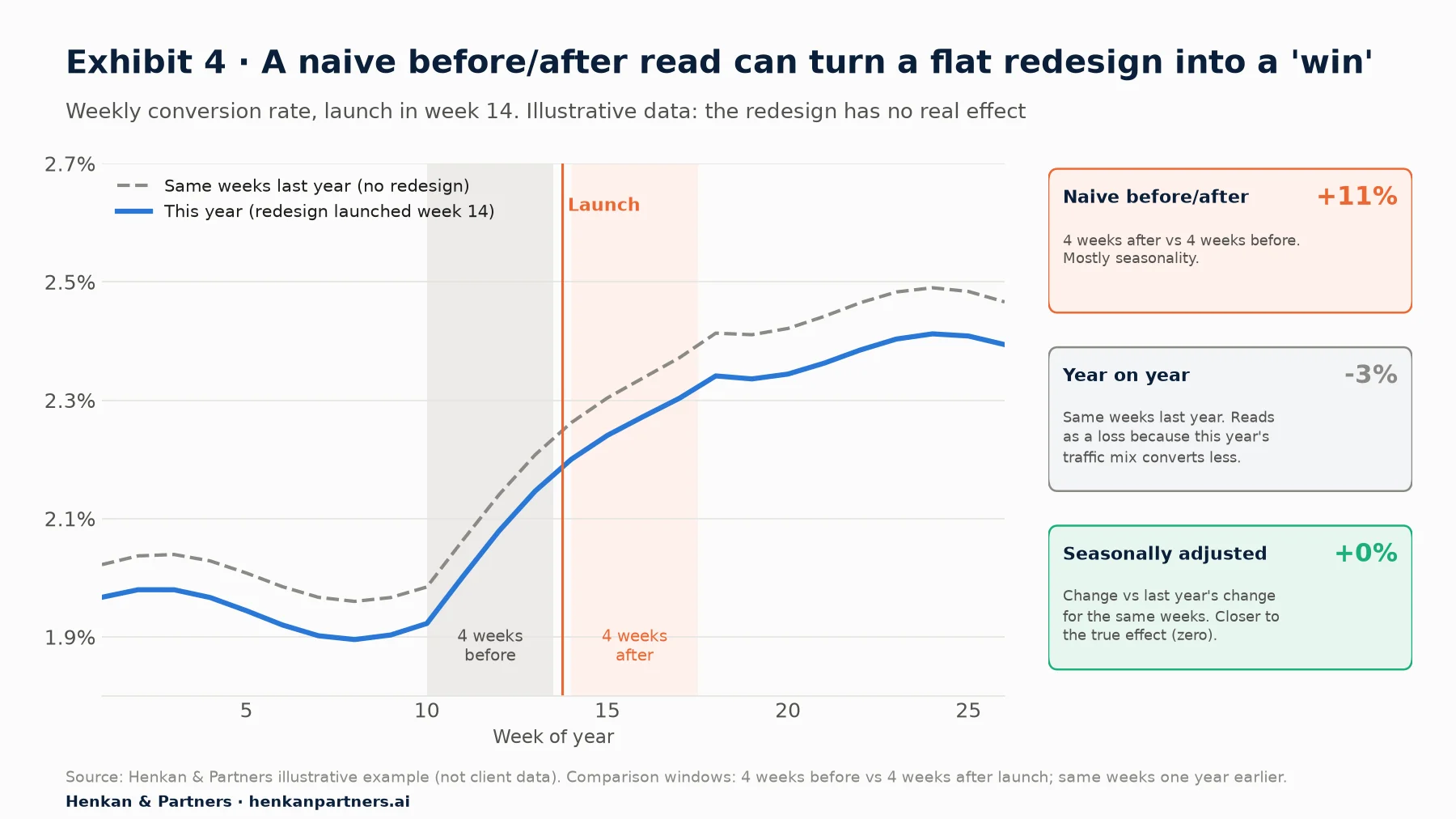
What this shows. The naive comparison credits the redesign with the seasonal rise, and the year-on-year view blames it for a weaker traffic mix that was there before launch. Only the comparison of this year's change with last year's change for the same weeks lands near the true effect of zero. Even that adjustment assumes nothing else changed, which is why a controlled experiment remains the better tool.
Seven traps that move the numbers around a launch
| Trap | What happens | What to check in GA4 |
|---|---|---|
| Seasonality | Demand rises or falls whatever the design | Compare the same weeks last year (date picker > Compare > Previous year) |
| Campaigns and traffic mix | A sale, a TV slot or more paid social changes who visits | Session default channel group and campaign, before and after |
| Tracking breaks in the rebuild | Events renamed, items array or key events lost, double page views | Event counts by name and day; DebugView before launch |
| Consent changes | A new banner shifts the share of users GA4 can see | Consent rate trend; annotate banner changes |
| Novelty and change aversion | Returning users explore the new thing, or dislike any change, for a while | New vs returning users, week by week after launch |
| Regression to the mean | A page redesigned because of a bad month recovers on its own | A longer baseline (8–12 weeks, or last year) |
| Data still processing | Recent days change for 24–48 hours | Leave the last two days out of any readout |
Change aversion deserves a note of its own. Google researchers Aaron Sedley and Hendrik Müller described it as discomfort and anxiety when something familiar is replaced with something unfamiliar. For the Google Drive launch they staged the change, warned users in advance, let them switch between old and new, and tracked satisfaction over time with surveys. Early negative reactions can fade, so a redesign judged on its first week may be judged unfairly, in either direction.
Marks & Spencer is a well-known reminder of the stakes. The retailer launched a £150 million website after seven years on Amazon's platform; in the 13 weeks to 28 June 2014 its online sales fell 8.1%, which its chief executive attributed to the new site "settling in". A big-bang launch made it hard to separate the design, the platform and the trading conditions.
Two GA4 settings to fix before launch day
- Annotations. GA4 lets you add notes to line charts in reports: right-click a data point and choose Add annotation. You need the Analyst role or above; titles are limited to 60 characters, descriptions to 150, and each property to 1,000 annotations. Annotate the launch, each phase of a rollout, banner changes and big campaigns.
- Data retention. Explorations and funnel reports only reach back as far as your event data retention setting, which offers two or 14 months on standard properties (longer options exist on Analytics 360). If you want to compare explorations with last year, change the setting to 14 months now: data already past the old limit cannot be brought back. Standard aggregated reports are not affected.
Section 7 · Test it
Test the redesign where you can, and stage it where you cannot
A controlled experiment is the only design that separates the effect of the redesign from everything else happening at the same time, because both groups live through the same season, campaigns and consent rates. It also protects you from a quieter risk: most changes do not work.
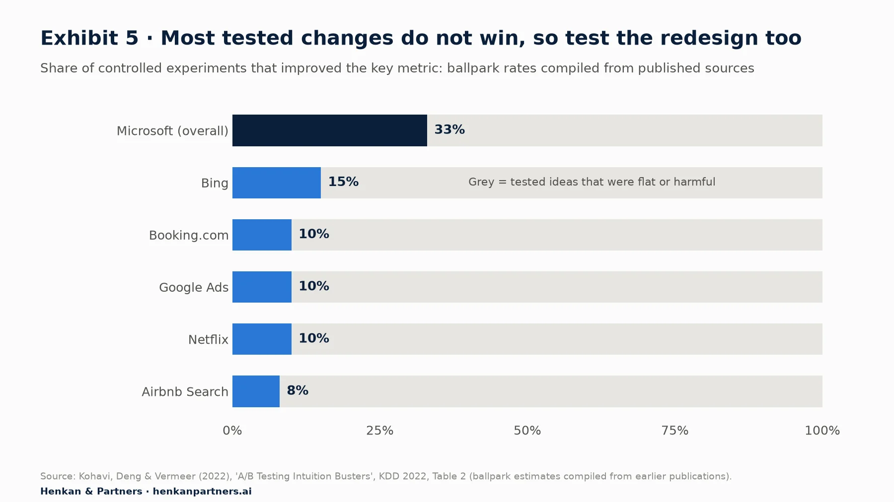
What this shows. If only one idea in three to one in twelve improves the metric when tested alone, a redesign that ships twenty changes at once almost certainly contains some that hurt. The figures are ballpark estimates from large digital companies, but the point holds: confidence in a design is not evidence that it works.
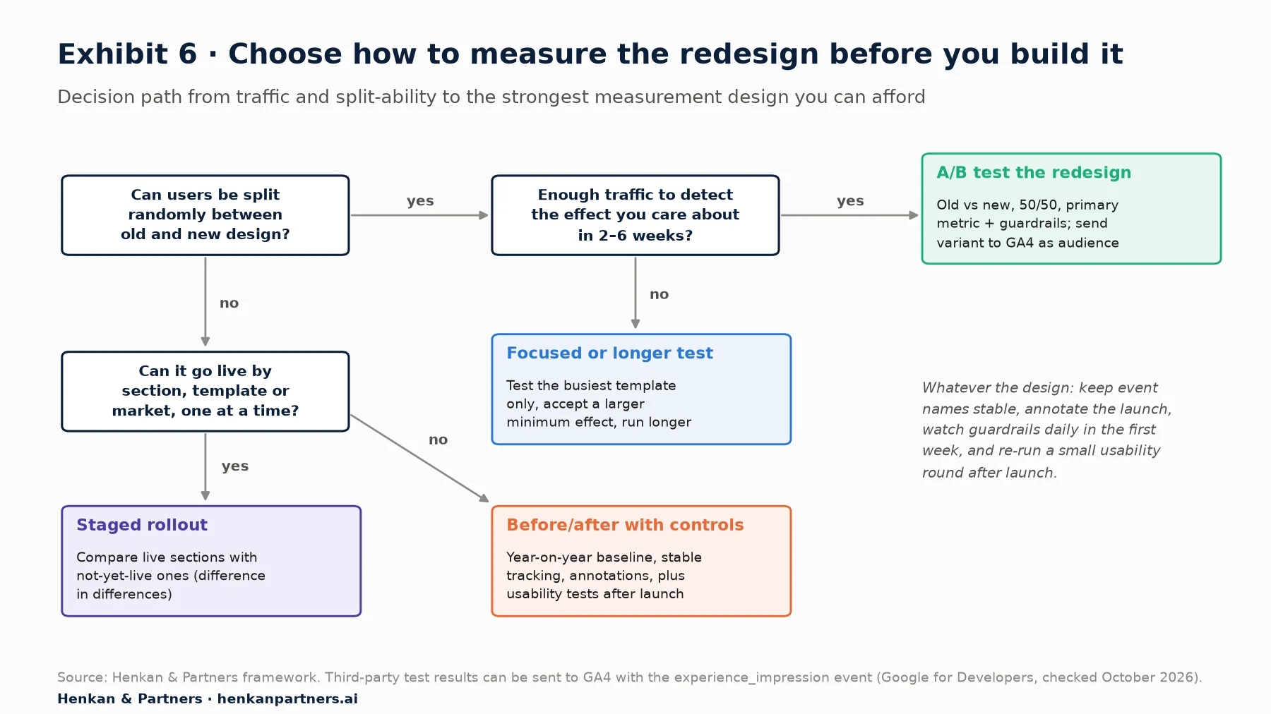
What this shows. The A/B test is the default, not a luxury, for any redesign of a high-traffic template. When randomisation is impossible, a staged rollout still gives you a comparison group that lives through the same weeks. The before/after branch is the fallback, and it should always come with a year-on-year baseline and a fresh round of usability tests.
Running the A/B test with GA4 as the reporting layer
Google Optimize closed on 30 September 2023, and GA4 has no built-in A/B testing. Google points to third-party testing platforms that integrate with GA4. The integration pattern is documented by Google: the testing tool sends an experience_impression event with an exp_variant_string parameter, ideally formatted as tool, experiment and variant IDs, and GA4 creates one audience per variant. You can then compare variants in reports (up to four comparisons at once) and in explorations.
- Let the testing tool decide the winner. Its statistics, assignment and sample ratio checks are built for the job. Use GA4 to understand behaviour inside each variant: paths, devices, search use, error events.
- Check the split. A sample ratio mismatch, where the share of users in each group differs from the planned split, signals a broken test. Microsoft researchers found it in about 6% of their A/B tests, and report that LinkedIn found it in about 10% of its triggered, or zoomed-in, tests.
- Size the test before you build. Our guide to A/B test sample size and duration shows how to check whether you have enough traffic, and what to do when you do not.
When you cannot randomise: a staged rollout
Some redesigns cannot be split by user: a new navigation that changes every URL, a platform migration, a brand refresh. Release them in stages instead, by section, template or country, and compare the change in sections that have gone live with the change in sections that have not yet. Statisticians call this difference in differences. Annotate each stage in GA4 and leave at least two full weeks between stages.
Section 8 · Metrics
Agree the success metric and guardrails before launch, and keep the tracking stable through the change
Decide what success means while the design is still in Figma; a redesign judged after launch is judged on whichever metric moved the right way. Write down one primary metric, a few diagnostic metrics and three to five guardrails, with a rollback threshold.
| Role | Example for a checkout redesign | Where it comes from |
|---|---|---|
| Primary metric | Share of sessions reaching payment that complete a purchase | GA4 funnel or the testing tool's goal |
| Diagnostic metrics | Step completion per step, form_error rate, use of the delivery options | GA4 events added for the redesign |
| Business guardrail | Revenue per user, average order value | Testing tool and GA4 purchase event |
| Experience guardrails | Page load (Largest Contentful Paint), JavaScript errors, support contacts | Speed monitoring, error logging, service desk |
| Attitude check | Task ease or satisfaction score, before and after | On-site survey on the same step |
Our guide to guardrail metrics explains how to set harm thresholds and when to stop. Two GA4-specific points matter for redesigns.
- Keep event names and parameters stable. If the redesign renames add_to_cart or drops the items array, your before/after and your test readout both break. Map old events to new ones in the tracking plan, and QA them in DebugView and Tag Assistant before launch. The shared GA4 tracking plan article describes the review.
- Add the new interactions before launch, not after. A new filter panel, accordion or delivery selector needs its events in the first release, or your first weeks of data are lost for good.
For designers. Add a measurement frame to the Figma file: primary metric, guardrails, events to add or keep, and the date of the first readout.
For leaders. Approve the metric system and the rollback rule at the same meeting where you approve the design. It costs ten minutes and saves the argument after launch.
Section 9 · One page
Put the evidence on one page so the decision survives the meeting
Research reports are long, and the people who decide rarely read them. A one-page summary that puts the GA4 numbers and the user voices side by side shows how strong the evidence is, records what was decided and why, and sets the measurement plan in advance. Two rules make it work: every finding carries the number of sources that support it, and box 5 says what the evidence does not explain.
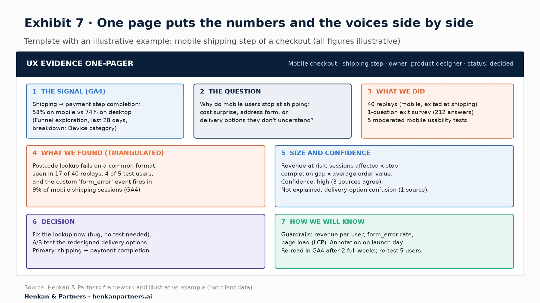
What this shows. Each box answers one question a decision-maker will ask, and box 5 states what the evidence does not explain. In the illustrative example the bug is fixed without a test, because the cause is clear and the fix is not a design choice, while the delivery options are tested because several designs are plausible. That split between fix, test and research is the main output of the page.
Section 10 · AI
AI speeds up the synthesis, but it cannot be your evidence
AI tools now help at almost every step of the loop. Replay tools summarise sessions and flag frustration patterns. Language models cluster thousands of open survey answers in minutes. Google has published an experimental Google Analytics MCP server, a connector that lets AI assistants query GA4 through the Admin and Data APIs with read-only credentials; it exposes tools such as run_report and run_funnel_report, so an assistant can pull the numbers for your one-pager.
Three risks come with the speed. Summaries can invent patterns that no session shows, so open the cited replays. Assistants can pick the wrong date range, metric or segment, so check the exact query. And AI personas, however fluent, are not users: our article on synthetic users in customer research explains where they help with hypotheses and where they cannot replace real participants.
Our view. Use AI to go faster from raw material to a draft one-pager, and keep people responsible for the question, the sample and the decision. If you cannot trace a claim back to a replay, a quote or a GA4 query, it does not go on the page.
Disclosure: Henkan & Partners runs analytics, UX research and A/B testing programmes for clients and works with several testing and analytics vendors. This article names tools only to illustrate documented features.
Section 11 · Next steps
What to do next
1. Pick one signal and write the question
Choose the largest gap you found in GA4, ideally with the method in our friction analysis article, and write it as a research question with competing explanations and the exact report path.
2. Run one small, matched round of research
Watch 20 to 50 replays from the same segment, run one short survey on the same step, and test with five users who match the segment. Write the segment definition at the top of the brief.
3. Count what you found in GA4
Ask for the events that make the cause countable, using the request format in our tracking request guide. Wait for clean data, then size the problem and grade your confidence.
4. Choose the measurement design before the redesign
Use Exhibit 6 to choose between an A/B test, a staged rollout and a controlled before/after. Set data retention to 14 months, agree the metrics and guardrails, and annotate the launch. To brief everyone in the same format, download the GA4 Tracking Request Kit, which includes a question bank, an event spec template and a QA checklist.
5. Publish the one-pager, re-test and get a second opinion
Share the evidence one-pager with the decision, then read the result at the planned date and run a second round of five users on the new design. Continue with the next step of the path, our mobile UX audit, and the shared GA4 tracking plan. If the redesign is high stakes, an independent review of the evidence and the measurement plan is cheap insurance: Talk to us.
FAQ
Frequently asked questions about combining GA4 with qualitative research and measuring a redesign
Frequently asked questions
What is combining GA4 with qualitative research?
It means using GA4 to find and size a user problem (where it happens, for whom and how often) and qualitative methods such as session replay, heatmaps, surveys and usability tests to explain why it happens. The two are run as a loop, and the same pair is used to measure whether a redesign worked.
Can GA4 tell me why users drop off?
No. GA4 shows where and how often users drop off, on which device and from which source. The reason comes from qualitative research: replays show what happened, surveys show intent, and usability tests let you ask people directly.
How do I measure a website redesign in GA4?
The most reliable way is an A/B test run in a testing tool that sends the experience_impression event to GA4, so each variant becomes an audience you can compare. If you cannot randomise users, release the redesign in stages and compare live with not-yet-live sections. Use a simple before/after comparison only with a year-on-year baseline, stable tracking and annotations.
Why is a before and after comparison of a redesign unreliable?
Because seasonality, campaigns, traffic mix, consent changes, tracking breaks, novelty and change aversion all move the numbers at the same time as the design. A redesign with no real effect can look like a double-digit win or a loss depending on the comparison window.
Does GA4 have built-in A/B testing?
No. Google Optimize closed on 30 September 2023. Google documents an integration for third-party testing tools: they send an experience_impression event with an exp_variant_string parameter, and GA4 creates an audience per variant.
How many usability test users do I need?
For finding problems, five users per round is the classic rule: Nielsen's model finds about 85% of problems with five users. Run two or three rounds, fixing the design in between. To measure how common a problem is, use GA4, not a bigger usability study.
Can I connect session replay recordings to GA4 users?
Only partly, and never with personal data. Rebuild the same conditions (device, pages, dates, source) in both tools, or share non-personal events. Microsoft Clarity's integration, for example, pulls GA data into Clarity but does not support GA4 segments.
How do I add an annotation for a redesign launch in GA4?
Open a report with a line chart, right-click the launch date and choose Add annotation. You need the Analyst role or above. Titles can have up to 60 characters and descriptions up to 150, with a limit of 1,000 annotations per property.
How long should I wait before reading the results of a redesign?
At least two full weeks, longer if change aversion may be at play. Leave out the most recent two days, because GA4 data can change for 24 to 48 hours. For an A/B test, use the duration from your sample size calculation.
Key terms
- Triangulation
- Using several data sources or methods to check one conclusion. It matters because a finding supported by GA4, replays and users is far more reliable than any single source.
- Research question
- A written statement of the problem, the segment, the size of the gap and the competing explanations. It matters because it decides which method to use and when the study is finished.
- Session replay
- A reconstruction of a visitor's session from recorded page changes and interactions. It matters because it shows what happened on screen behind a GA4 drop-off.
- Moderated usability test
- A session where a researcher watches a participant attempt tasks and asks follow-up questions. It matters because it is the most direct way to learn why people struggle.
- Segment (GA4)
- A subset of users, sessions or events defined in an exploration, applied retroactively over the date range. It matters because the same segment should be studied in every research tool.
- Audience (GA4)
- A group of users with membership rules that GA4 builds going forward from its creation (linked Google Ads lists are prefilled with up to 30 days of data). It matters for remarketing, survey targeting and comparing A/B test variants.
- Engaged session
- A GA4 session that lasts longer than 10 seconds, has a key event, or has two or more page or screen views. It matters because engagement rate is often misread as a measure of design quality.
- experience_impression
- The event Google recommends for third-party testing tools to tell GA4 which variant a user saw, via the exp_variant_string parameter. It matters because it turns each variant into a GA4 audience.
- Annotation (GA4)
- A note attached to a date or date range on GA4 line charts. It matters because it records launches, rollout stages and campaigns next to the numbers they affect.
- Change aversion
- Discomfort when something familiar is replaced with something unfamiliar. It matters because early reactions to a redesign can be worse, or better, than the long-run effect.
- Sample ratio mismatch
- A significant difference between the planned and the observed split of users across test variants. It matters because it signals a broken experiment whose results cannot be trusted.
- Staged rollout
- Releasing a redesign section by section or market by market and comparing live with not-yet-live areas. It matters when users cannot be randomised between old and new designs.
- Guardrail metric
- A metric that must not get worse, such as revenue per user or page speed, even if the primary metric improves. It matters because redesigns often trade one gain for a hidden loss.
- UX evidence one-pager
- A one-page summary of signal, question, method, findings, size, decision and measurement plan. It matters because it makes the strength of the evidence visible to people who decide.
Sources
All sources were checked in October 2026. Google and Microsoft documentation is cited as published on their help and developer sites at that date; both update pages without version numbers, so interface paths may differ slightly. Win rates in Exhibit 5 are ballpark figures compiled by Kohavi, Deng and Vermeer from earlier publications. Exhibits 1, 2, 6 and 7 and Tables 3 and 4 are Henkan & Partners frameworks; Exhibit 4 and the figures in Exhibit 7 are illustrative examples, not client data; sample sizes in Table 2 are Henkan & Partners rules of thumb except the five-user round.
- Google Analytics Help (n.d.). GA4: Explorations.
- Google Analytics Help (n.d.). GA4: About segments.
- Google Analytics Help (n.d.). GA4: Audiences.
- Google Analytics Help (n.d.). GA4: Landing page report.
- Google Analytics Help (n.d.). GA4: Enhanced measurement events.
- Google Analytics Help (n.d.). GA4: Engaged sessions, engagement rate and bounce rate.
- Google Analytics Help (n.d.). GA4: Data sampling.
- Google Analytics Help (n.d.). GA4: Data thresholds.
- Google Analytics Help (n.d.). GA4: Data freshness.
- Google Analytics Help (n.d.). GA4: Data retention.
- Google Analytics Help (n.d.). GA4: Change and compare date ranges in reports.
- Google Analytics Help (n.d.). GA4: About annotations.
- Google Analytics Help (n.d.). Best practices to avoid sending personally identifiable information (PII).
- Google Analytics Help (n.d.). Google Optimize sunset, September 2023.
- Google for Developers (n.d.). Create an experiment integration with Google Analytics.
- Google Analytics, GitHub (n.d.). Google Analytics MCP server (experimental).
- Microsoft Learn (n.d.). Getting started with GA integration (Clarity).
- Microsoft Learn (n.d.). Google Analytics 4 integration with Clarity.
- Nielsen, J., Nielsen Norman Group (2000). Why You Only Need to Test with 5 Users.
- Whitenton, K., Nielsen Norman Group (2021). Triangulation: Get Better Research Results by Using Multiple UX Methods.
- Kohavi, R., Deng, A. & Vermeer, L. (2022). A/B Testing Intuition Busters. KDD 2022.
- Fabijan, A. et al., Microsoft Research (2020). Diagnosing Sample Ratio Mismatch in A/B Testing.
- Sedley, A. & Müller, H. (2013). Minimizing Change Aversion for the Google Drive Launch. CHI 2013 Extended Abstracts.
- The Drum (2014). M&S CEO blames new website's "settling in" period for 8.1% online sales drop.
- Campaign (2014). M&S £150m website launch ends Amazon partnership.